There’s a saying about the carpenter’s house always having a leaky roof. For us, the branding agency equivalent was a website that no longer reflected the quality or point of view of the work we were doing. Yet it continued to bring in leads, perform strongly in search, and technically function just fine.
In fact, it wasn’t just performing. It was one of our highest performing tools, which made the idea of replacing it feel like a risk. The old site had great SEO, which was responsible for a steady stream of inquiries. That made the redesign feel high stakes. But at some point we realized the larger risk was in leaving it untouched. The more we evolved, the more pressure built behind a site that wasn’t keeping up.
We create websites all the time for clients, but it’s much different when it’s your own. Here’s what the process of doing our own site helped surface.
1. A website update can turn into a full-blown identity check.
This wasn’t a rebrand, but as soon as we started working on the new site, we could see how much we had changed since the last one. The services we offer now are more specialized. The language we use to talk about branding is more nuanced. Our understanding of what makes a brand effective has changed in real ways, reflecting shifts not only in our process but also in the broader landscape of branding.
We had originally scoped this as a refresh to improve the user experience, clean up the site structure, and sharpen the design. But the more we got into it, the more we realized that the previous site didn’t just need polishing, it needed to be rethought. We had grown, and the brand voice, structure, and storytelling hadn’t grown with us.
Much of the previous copy had been structured around our “Guide” archetype and branding as a journey metaphor. While that still holds true, our tone has expanded to reflect a wider range of thinking that is still strategic, but with a little more texture and range. And while our approach to branding has always been about uncovering and expressing values in a compelling way, we now think differently about how that takes shape across a full system of visual, verbal, and experiential tools.
This is part of why we believe every two to three years, even if your brand doesn’t feel outdated, it’s worth revisiting what your website is saying. It’s one of the fastest ways to see where you’ve drifted or grown, and whether your most public brand expression is still aligned with who you are now.
2. Some of your best brand moments happen off your homepage.
For us, one of those moments is the team page. After home and work, it’s the third most visited page on our site, and the one we hear about the most in conversations with clients. People remember it, reference it, and ask about specific team members based on what they’ve seen there.
In the previous version of the site, that page used “high school alter-egos” as a visual concept. It was quirky and personal and it tied to the renovated high school building we were based in at the time. But once we moved into a new space, the concept no longer fit. We needed something just as memorable, but more in line with the way we currently work.
Over the past few years, we’ve made a quiet but important shift to an all-senior team model. That means the people clients meet are the same people doing the work. We’re not handing projects off to junior teams, and we’re not running a traditional agency pyramid. That’s one of our most meaningful differentiators, and it’s something we wanted to highlight with more intention.
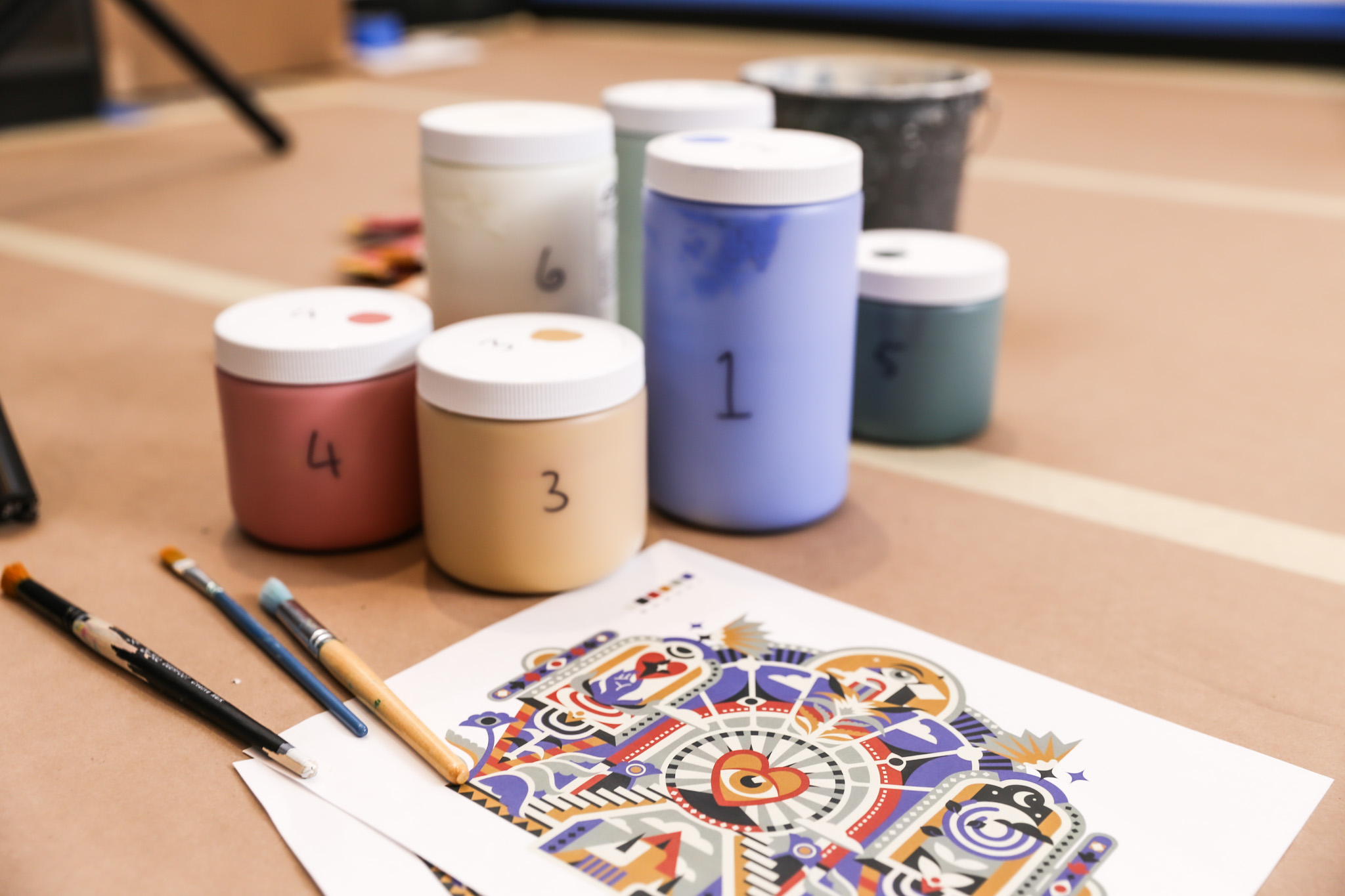
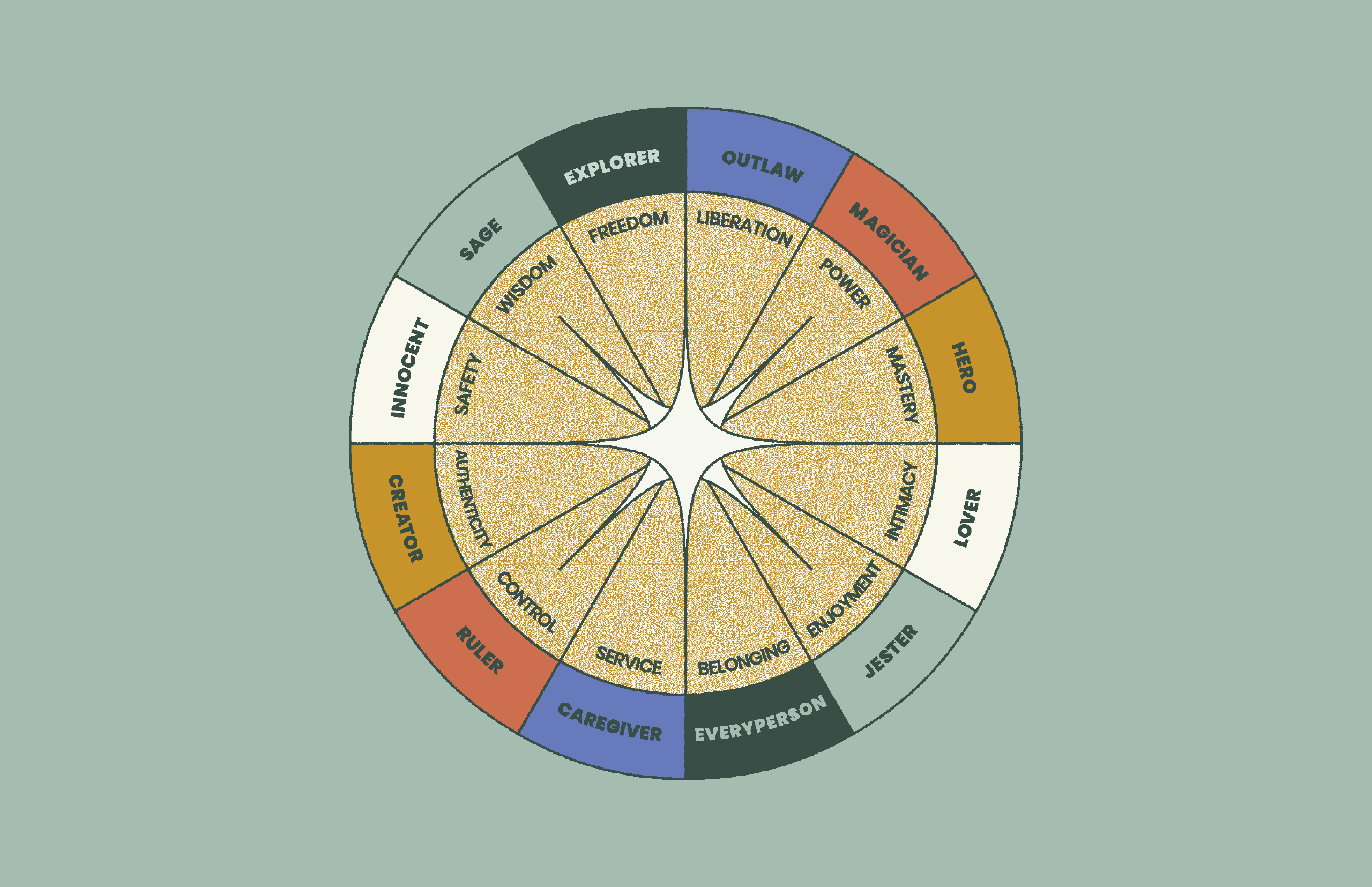
At the same time, we wanted to showcase the kind of brand thinking we bring to our clients, especially when it comes to personality. One framework we often use is brand archetype theory, and in this case, we applied it to ourselves. Each team member now has a custom archetype based on their working style, their role, and the qualities they bring to the creative process. We paired that with illustrated personas, small narrative blurbs, and a quiz so that visitors can find their own archetype as well.
The result is a page that captures both how we think and who we are. Not in a tagline, but in a structure and experience that allows for personality, specificity, and curiosity. If you’re curious where you’d land, you can take the same quiz we used for ourselves: Discover Your Archetype.
The takeaway isn’t to build your own archetype system or a quiz. It’s to lean into the pages that are already doing the work of building trust. Those moments might not be where you expect them, but they’re worth investing in. 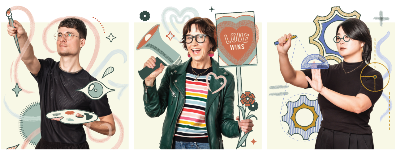
3. A website isn’t a monument. It’s a living thing.
One of the biggest lessons for us was the cost of perfectionism. As soon as we internally agreed that the old site no longer reflected our brand, we stopped updating it. That created a holding pattern and it put mounting pressure on the next version to be fully resolved.
Internally, we ran into a lot of creative tension. The biggest one was around SEO versus visual impact. Some team members wanted bold creative expression and high-level narrative flow. Others were focused on performance, clarity, and conversion. Those debates were constant, and also valuable. They helped us push past a single viewpoint and build something more layered.
We also made structural decisions that would support flexibility over time. Our case study system now includes a set of shared modules that allow for variety without reinventing the page structure each time. Our team page grid shifted from four-across to three-across to create more presence and scale. And our homepage animation, which originally tried to represent the full brand journey, was simplified to something more immediate and values-led, after we realized the first version looked beautiful but made sense to no one but us.
Even our contact form went through multiple rounds of revision. We wanted to reduce friction for people reaching out, while still collecting enough information to learn if there was a mutual fit. Adding a few embedded testimonials into that page was a small decision, but one that reflects how we want the experience to feel: welcoming, thoughtful, and clear.
Ultimately, what helped most was treating the launch as a starting point rather than a conclusion. Not everything is done, and not every feature is live. But we’re building from a place that feels aligned.
We’ve created a system that allows us to keep going rather than getting stuck.
(Credits: Written by Angela Larisch, with editorial support from ChatGPT.)