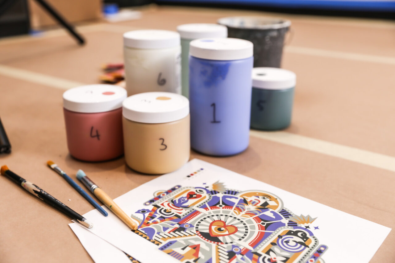
I went to Expo West for the first time this year. I wasn’t there as a buyer or seller, I just wanted to see how brands were showing up out in the wild. From my perspective as a brand strategist in the food, beverage, and wellness space, it was a chance to observe how brands are trying to connect with people: what’s sticking, what’s blending in, and what’s working (or not).
I came away both inspired and challenged. There were moments of real creativity and discipline, and also places where brands seemed to be leaving opportunity on the table. That contrast is what made it interesting.
Here’s what’s in this article, feel free to jump around:
- Distinctive Brands that Stood Out
- The Cult of Positivity
- How Rainbow SKUs Can Help or Hurt
- Say Something Worth Saying
- Multisensory Brand Experiences
The Scale of it All
The volume of brands and booths was overwhelming. It was an overstimulating experience, but also a rare chance to see so many brands and products activated in the same space, side by side. A lot stood out. A lot blurred together. That’s when the real insights started to take shape.

Distinctive Brands that Stood Out
Before getting into broader trends, a few brands stood out for how effectively they got noticed and stayed memorable. They weren’t necessarily the largest or the loudest, but they used distinct brand assets with creativity and consistency. Branding is about more than logos or colors, it’s about building mental shortcuts through repeatable cues that help people recognize, remember, and choose you. The brands that carried those cues across every touchpoint felt more cohesive, more intentional, and more likely to stick in people’s minds after the event.
Clean Cult: Packaging brought to life in three dimensions
In retail, packaging is often the center of a brand’s universe. It’s the primary touchpoint most people see, feel, and remember. What made Clean Cult’s booth stand out was how cleverly they expanded their packaging language into the physical environment. Their signature blue semi-circle motif wasn’t just on the bottle, it became an architectural element, echoed in arches, cutouts, and layered forms throughout the booth. The visual language of the packaging came to life in three dimensions. Even the illustrated flowers used to signal scent variations on the package were brought into the display as real floral arrangements, reinforcing the color system in a tangible way. It was a smart example of brand storytelling through spatial design.

Pomi: Bold, cultural cues add instant recognizability
Pomi’s booth caught attention from a distance with its bold use of red, simple layouts, and unmistakable Italian cues. The use of a single, saturated color paired with sleek textures and photography created a look that felt both bold and premium. What made it especially compelling was how the branding worked on multiple levels. It reinforced the quality of their tomato products while also tapping into a broader cultural shorthand: Italy as a symbol of food expertise and ingredient quality. Unlike other brands that leaned heavily on Italian cues without much else to say, Pomi felt like a well-developed brand that just happened to be Italian, not a brand that was relying on Italy as its sole benefit.

Liquid Death: A fully committed brand world, from visuals to voice
Liquid Death continues to show what happens when a brand commits fully. Their booth leaned into their irreverent identity, both visually and verbally. The elaborate white coffin cooler served samples under their “Murder Your Thirst” tagline, and messaging like “Now Available in Beginner-Sized Cans” extended the tone even further. It was a clever nod to their usually oversized cans compared to most sparkling waters. Every detail carried their brand perspective, even down to the branded skull wallpaper. They didn’t have the largest booth there but their brand presence was impossible to miss.

Rishi Tea: Elegant design with multisensory cues
Rishi’s booth offered one of the most refined and one of the only truly multisensory experiences at Expo West. Large arrangements of real flowers created a gorgeous scent environment that felt literally like a breath of fresh air in a space full of food samples and visual clutter. The scent wasn’t just decorative either. It reinforced one of Rishi’s core brand attributes: their high-end, highly aromatic teas. Paired with elegant design and tea sampling, the experience felt calm, immersive, and sophisticated. With so many brands shouting and vying for attention visually, this was a standout moment of restraint, presence, and attention to detail.

MUD\WTR: A cohesive, ritual-driven experience
MUD\WTR created a full brand world that went beyond color and logo. Their booth mirrored the feel of their café space and leaned into a layered aesthetic with black and white visuals, tactile materials, and the theme of ritual experience. Among a crowded field of beverage brands, this was one of the few with a clear and unique point of view. Everything centered around the idea of a morning ritual. Instead of leading only with functional benefits, MUD\WTR told a cohesive story through mystical and psychedelic-inspired storytelling that drew people in. One of the most thoughtful takeaways at the show came from their booth: a printed card paired with a sample, product info, and QR codes for guided meditations so you could bring the ritual experience home with you, literally.

The Cult of Positivity
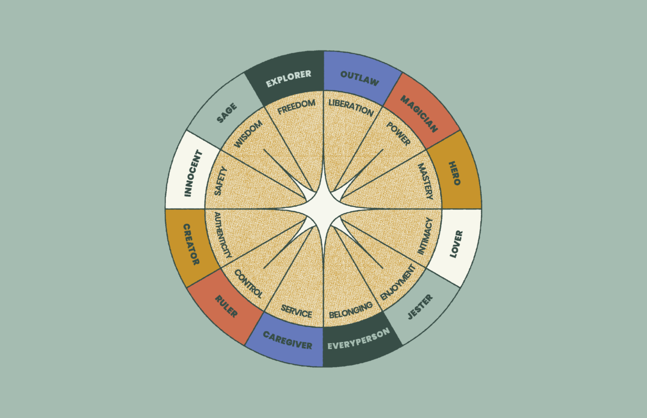
While “brand personality” can sometimes sound like marketing fluff, it actually plays a practical role in creating a distinctive brand. The way a brand shows up visually and tonally helps make it easier to recognize and remember. In categories where products and claims often blur together, personality becomes another mental shortcut, a way to build memory and stand out.
By far, the most common personality type at Expo West was characterized by hyper-animated positivity. Everywhere I turned, there were brands dripping in sunshine, hearts, rainbows, pastel gradients, plusses, and cheerful encouragements. Everything was good vibes only. These brands are clearly rooted in the idyllic and optimistic Innocent archetype, which makes sense given the natural products category, but it has become such a crowded space that it’s hard to distinguish one sunshine brand from the next.
This personality style isn’t inherently ineffective. There’s a reason it’s so common. It’s friendly, approachable, and rooted in optimism. But when it becomes the dominant default, it stops working as a distinct identity. Even good strategies can lose their power when overused. The opportunity for brands is to keep the positivity, but bring more nuance, texture, or contrast to how it’s expressed.

That said, positivity wasn’t the only pattern. As a kind of tonal counterbalance, there was also a cluster of clinical expert brands. These leaned into minimalism, black and white palettes, and messaging focused on ingredients or functionality. They were clean and credible, but also increasingly interchangeable. Again, not a bad strategy, just one that now requires more specificity to stay memorable.

None of this is meant as a knock. These are common moves for a reason. But they also highlight how much opportunity there is for brands to differentiate more intentionally.
The good news? All that sameness is actually a huge opportunity. Add a little tension in your tone. An unexpected edge in your visuals. A lot more specificity and idiosyncrasy in how you show up. All of that goes a long way in building a brand that will stand out in this landscape.
The takeaway: These, or other, archetypes can be a useful starting point, but distinctiveness requires more than just picking a personality lane. What matters most is how specifically and memorably you bring it to life.
The Prevalence of Rainbow SKUs
One of the packaging trends at Expo West was what I started calling the “rainbow SKU effect.” This is when each flavor or product variant gets its own bold color that completely dominates the package, and it is then arranged a bright rainbow lineup across the shelf or booth.
Color-coding can be a smart strategy. It helps shoppers navigate a lineup quickly and, in the right context, it can add energy and visual impact to a dull shelf set. But there are two strategic risks that are very real:
- When the rainbow becomes the whole story. This strategy often shows up alongside a growing trend of minimal branding—stripped-down layouts, small logos, and generic type systems. Without stronger identity anchors like a clear logo, distinct structure, or consistent typography, the brand itself can start to disappear.
- When you’re not the only one doing it. In categories like beverage, where many brands use prominently rainbow-colored SKUs, the impact of this strategy drops fast. If you’re the only rainbow block in a shelf set, it can work beautifully. But the second even one of your competitors does the same, the whole shelf begins to blur. Color becomes less of a brand cue and more of a crowd.
That also means there’s a real opportunity. Brands that pair SKU-level color variation with stronger identity elements can create something more memorable and recognizable than the rest. You can still bring energy and flavor navigation to your lineup, you just need a strong center to hold it together.

The takeaway: Color-coded packaging is a smart tool for navigation, but when it takes over the whole design, it can hurt more than it helps. The key is applying it strategically, with a strong brand center to hold it all together.
Say Something Worth Saying
Another big opportunity: the lack of compelling messaging. Many brands had beautiful design and expensive booths and great swag, but very little to say. Messaging was often an afterthought, or worse—generic.
And when there was messaging, it often repeated the same tropes. So here’s a quick list of words I’m officially retiring:
- “Good” (good for you, do good, made with good intentions)
- “Better” (better for the planet, better for your gut, _____ but better)
- “Beyond” (beyond sustainable, beyond organic, beyond good)
- “Elevate”
- “Redefine”
These might have sounded less ubiquitous a few years ago, but now they’re just noise. If everyone’s elevating, no one is. If everything is good, nothing is remarkable. These words don’t communicate anything distinct and they certainly don’t build memory.

The booths that used messaging effectively stood out precisely because they used language with clarity and character. Headlines that told you what the product was, what made it different, and why you might care felt like a breath of fresh air.

The takeaway: strong messaging isn’t optional. If your headline is used by a dozen other brands, it’s not doing its job. Be specific. Be bold. Say something!
Multisensory brand experiences
One of the most overlooked, but potentially most effective, ways to differentiate at a crowded event like Expo West is through multisensory design. Most booths were built around visuals and samples, but very few engaged other senses in a meaningful way.
When a brand incorporated scent, sound, and texture, it created a notable shift in experience. One booth used fresh flowers to change the scent profile of their space and literally felt like walking into fresh air. Another brand used physical materials like corrugated metal and neon lighting to create visual texture and emotional contrast.
The takeaway: Sensory inputs influence perception. Texture, scent, sound all leave a deeper imprint than visuals alone. There’s real opportunity here for brands to build memory in ways others aren’t even trying.
Final thoughts
It’s tempting to chase trends or lean on aesthetics alone. But strong brand-building takes discipline. Brand equity is built through repetition and recognition. Most brands at Expo West were chasing attention. Very few were doing the slower, steadier work of building memory. But that’s the work that actually lasts.
These patterns aren’t failures. They’re invitations. When so many brands are reaching for the same ideas, it opens up space for the ones willing to push further. The door is wide open for brands that want to lead with stronger assets, more clarity, and a bit more edge. That’s where the real opportunity lies.
Credits: All insights and content by Angela Larisch, with structural and editorial support from ChatGPT.