The Cobbler’s Dilemma
Here at Murmur we’ve got some dirty laundry to air. We’re embarrassed to admit we’ve been running with the same branding since we were a little 5-person operation, almost 5 years ago. We recommend that our clients evaluate their branding every few years to make sure their organization’s visual identity is still effective and relevant. We weren’t exactly walking the walk. As with any good creative agency, however, our clients take priority over our virtually endless list of internal projects, and our personal branding has fallen by the wayside. Today we’re a close-knit powerhouse of 14 talented designers, strategists, writers, developers, comedians, and brand evangelists. It was high time that we engaged in some self-reflection.
Strategy First
When our clients opt for a strategy-focused process we tailor our workshopping approach to them, uncovering the true core of their brand. We think of ourselves as the ghostwriters of our clients’ personal memoirs. Our workshops distill the very essence of who they are and what they stand for, even if they don’t know any of those things at the time. Applying that process to ourselves led to some difficult introspection and overdue conversations, but we came away from it with a better understanding of who we are today and who we want to be tomorrow. These internal workshops laid the foundation of integral strategy elements like our values, mission, vision, voice, tone, and aesthetics.
We developed four key brand pillars that represent our team and our work:
Smart: We create holistic brands where every element, from logo to web functionality, is connected to a larger purpose. We work strategically, employing brand thinking throughout every part of our process.
Artisan: We know that every brand is unique and so our work is always customized and crafted to the highest quality.
Spark: We believe in the creative spark, the “wow” factor, the delight that comes with catching lightning in a bottle. We work towards that spark, always leaving space for inspiration.
Genuine: We’re an earnest bunch who value our clients, partners, and work. Though our work can be edgy, silly, serious, and everything in between, we always approach it with a genuine sense of heart.
With these ideas forming the skeleton, it was time for our anxious and excited designers to put a skin on it.
Design
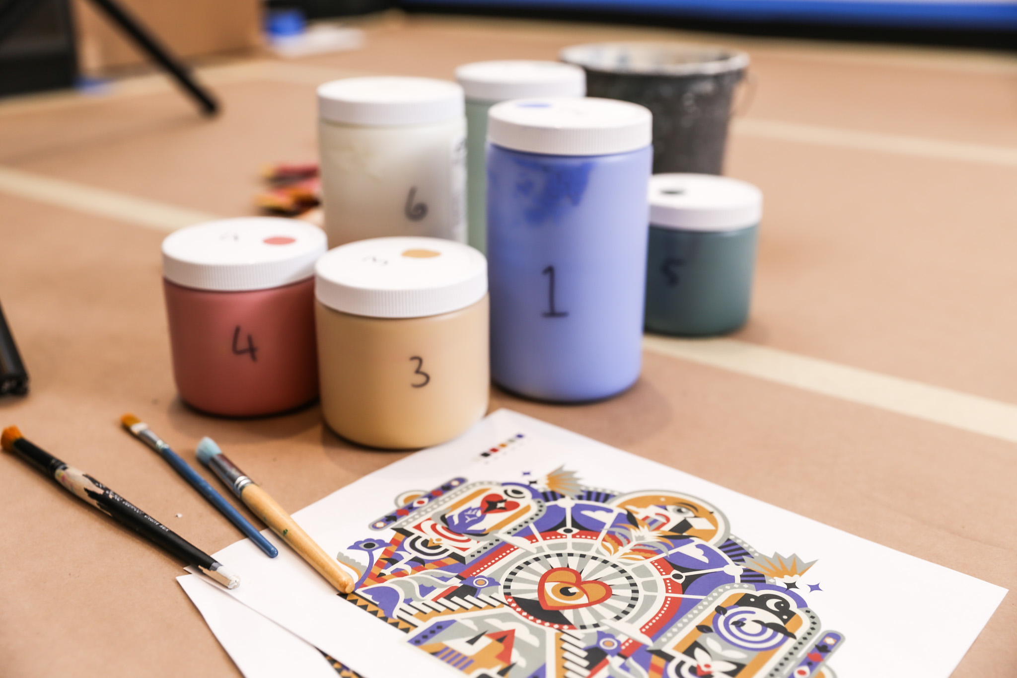
We consistently ask our clients to limit the number of cooks in the kitchen and instead run the design process with a small internal group, so in another attempt to follow our own advice, we formed a special team for this project which included our executive team and two of our brand designers. It felt odd to exclude our co-workers, but keeping our team small made decision making easier (not that it was easy).
Our first goal was to address a number of aesthetic and functional issues with our old mark. A stacked wordmark was versatile and readable, but lead to chronic misspellings of our name as “Mur Mur.” Our signature gold Pantone was becoming reminiscent of a different era in our history as a company. We needed more energy! The iconic lightbulb felt true to us, but only by virtue of having lived with it for so long. We were willing to throw it all out the door and start from scratch to create something memorable and own-able. When our designers presented ideas ranging from paper airplanes to tin-can telephones, one thing became clear: We are a forward-thinking, technology-focused company with a passion for doing things the analog way. Our digital team is constantly problem-solving with the latest and greatest methodologies, while our brand designers are setting type with the same level of detail required 60 years ago.
In the end, we came right back to the lightbulb. Not just any lightbulb: An older, more recognizable Edison bulb. Our former leafy filament has been replaced by a unique lightning bolt—or rather, a “Lightning Bolton”—that creates a cleverly hidden double-M monogram. The new icon is about capturing something powerful and turning it into something functional. This is what we do at Murmur, after all: We turn inspiration into practical solutions. The typeface Louize is set in all lowercase to create a wordmark that feels rhythmic and friendly, like the word “murmur,” and gives our new “lightning bulb” a smart, academic quality.
Onward!
I’d like to say we’ve updated our signage, our stationery, our proposals, and countless other extensions but as it stands we’re only just now getting around to new business cards. Honestly, we couldn’t wait to let our new branding see the light of day. That’s how excited we are for Murmur’s bright new future. Stay tuned for some of the sexiest swag you’ve ever seen and a shiny new website! In the meantime, here’s a cake:
Contributing authors: Renee Dimalla, Ben Martinez-Bateman, Miranda Schmidt.
Murmur Creative is recognized as a top Cosmetic Package Design Company on DesignRush