Sound on! 🙂
How it Began
A branding agency rebranding itself is not unlike a barber cutting their own hair or a director directing themself in a film. It’s a bit of a magic trick. This is not to say that we didn’t succeed. We are in love with our new brand! It was just quite an effort, especially since we are generally very busy with client work.
A rebrand becomes necessary when a brand identity no longer encapsulates the breadth and value of the organization it represents. We could feel this happening at Murmur. Big changes had happened over the last handful of years. There was a pandemic. There were civil rights movements. We went from 5 days-a-week in an office to Zoom all day every day. We had to literally change how we did everything! But it was actually our shifting approach to our work that had the biggest impact on our identity.
Bringing Strategy Forward
Murmur has slowly grown from an agency that conducts a few strategy workshops a year to one that runs sometimes 3 or 4 in a month. And the more foundational strategy work we do, the more important it is that we build systems that integrate this strategy into the design and website work we do. As these systems took shape, we realized it was time to define and articulate our approach.
Our Applied-Values Approach
We’ve always been a very values-focused agency, and this governed our internal operations–how we engage with our community, how we treat our employees (we’re a B-Corp), who we choose to work with, and how we talk about ourselves, etc. What we hadn’t totally articulated and refined was how we can help other companies be more “values-based” through the work we do.
What we came up with was pretty simple, and it was really just a refinement of what we’ve always been doing. But it has allowed us to put our partner’s values at the center of all the work we do. And by values, we’re not talking about a vague alignment with concepts like “doing good.” Every business wants to be “Authentic” and “Trustworthy.” These concepts won’t cut it on their own. For our work, we need really concrete and actionable values, like 4 or 5 razor sharp statements that can govern an organization. When we have this foundation, our work is always stronger.
Beginning Our Rebrand
Armed with our new approach and lots of ideas, we put ourselves through our own brand strategy process: two intensive workshops run by our strategy department. It was difficult to squeeze it in, but we managed in our downtime.
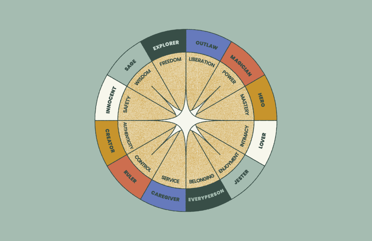
The biggest changes seemed to be how we viewed ourselves more as guides than our former archetype: the magician. We weren’t just trying to awe our audience with amazing design, we were leading them toward discovery.
Why a New Logo?
It’s hard letting things go. We loved our old logo. Especially the clever lightning bolt composed of two “m”s that created the filament in the bulb. But the concept of “lightbulb” (a metaphor for creativity) did not communicate “guidance” or “journey.” Lightbulbs are on/off. They illuminate creativity but not the road to get there. And so we decided to take our identity in a new direction.
The Pillars
“Pillars” are what we use at Murmur to bridge the gap between brand strategy and design. They’re concepts developed in our brand strategy process that are meant to be used by designers to influence the aesthetic of a brand. Here’s what we came up with:
Guiding
We are deeply curious and focused on guiding others toward discovery and insight.
Genuine
We are open about both our strengths and weaknesses. We are trustworthy and values based.
Timeless
We are eclectic but fine-tuned. Our brand evokes both history and modernity for timeless appeal.
Captivating
We weave together elements in a way that makes everything we say and do more intriguing, exciting, and magical.
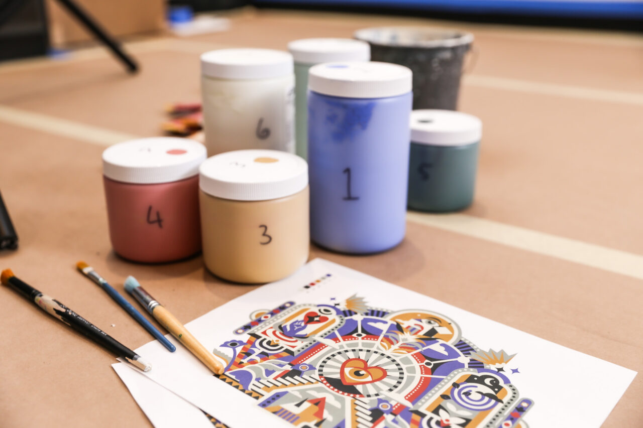
The Design Process
In our initial work, we tried to leverage the brand equity of the lightbulb icon that we’ve used for years. We explored adjacent symbols like flashlights and lanterns that had more of a relationship to journeying and guiding. Ultimately though, we felt we’d moved past any single visual icon. It was time to fully own the word Murmur in all its beauty, subtlety, and rhythm. From typographic styles to visual devices, we explored all the ways to convey change, transition, connection, travel, and guidance through typography alone.
The New Logo
The new Murmur wordmark is a custom serif with the nostalgic charm of literary typefaces like Bookman. We felt there was a close connection between stories and journeys and this theme would be explored throughout our new brand. Each letterform was painstakingly connected and each counter measured and refined in ways that are imperceptible on their own, but work together in concert to make it feel “just right”.
There’s a rhythm and a pathway to the shape of the word, yet it sits on a solid foundation. All these little things, leading up to one big thing: an inclusive, approachable logo that sums up Murmur’s ethos of being your friendly force for good on the road to better branding.
Brand Expression
Something we constantly preach internally is that a logo is just one small facet of a brand. Our new logo needed a layer of brand expression that might change over time, but would give us a visual tool kit to support our brand pillars in everything we do. We developed an analog line-work illustration and icon style that combines surreal, alchemical motifs with friendly, colorful landscapes. It creates a language that feels at once conversational and mysterious. Your branding journey, no matter how small or large, will have twists, turns, surprises, and breakthroughs along the way. Our new brand language captures the wonder of that creative process.