- ... / Work / Laughing Planet
Laughing Planet
Goal
Laughing Planet wanted to retain their existing logo concept but update it with more personality, movement, and a refined look.
Services
Logo Refresh
Brand Guidelines
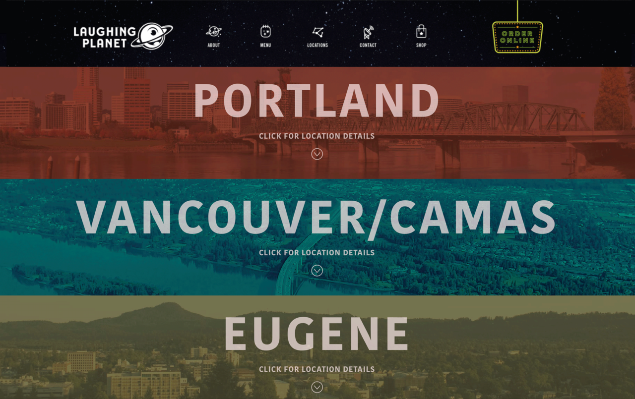
Website Design
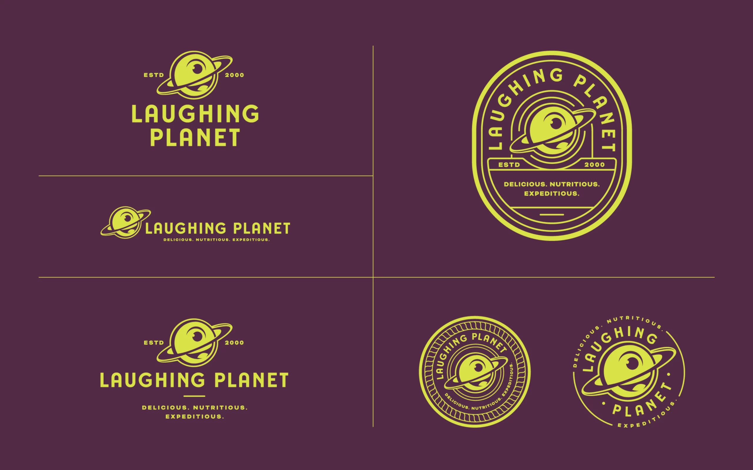
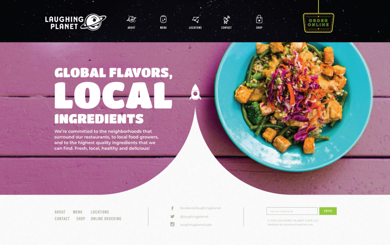
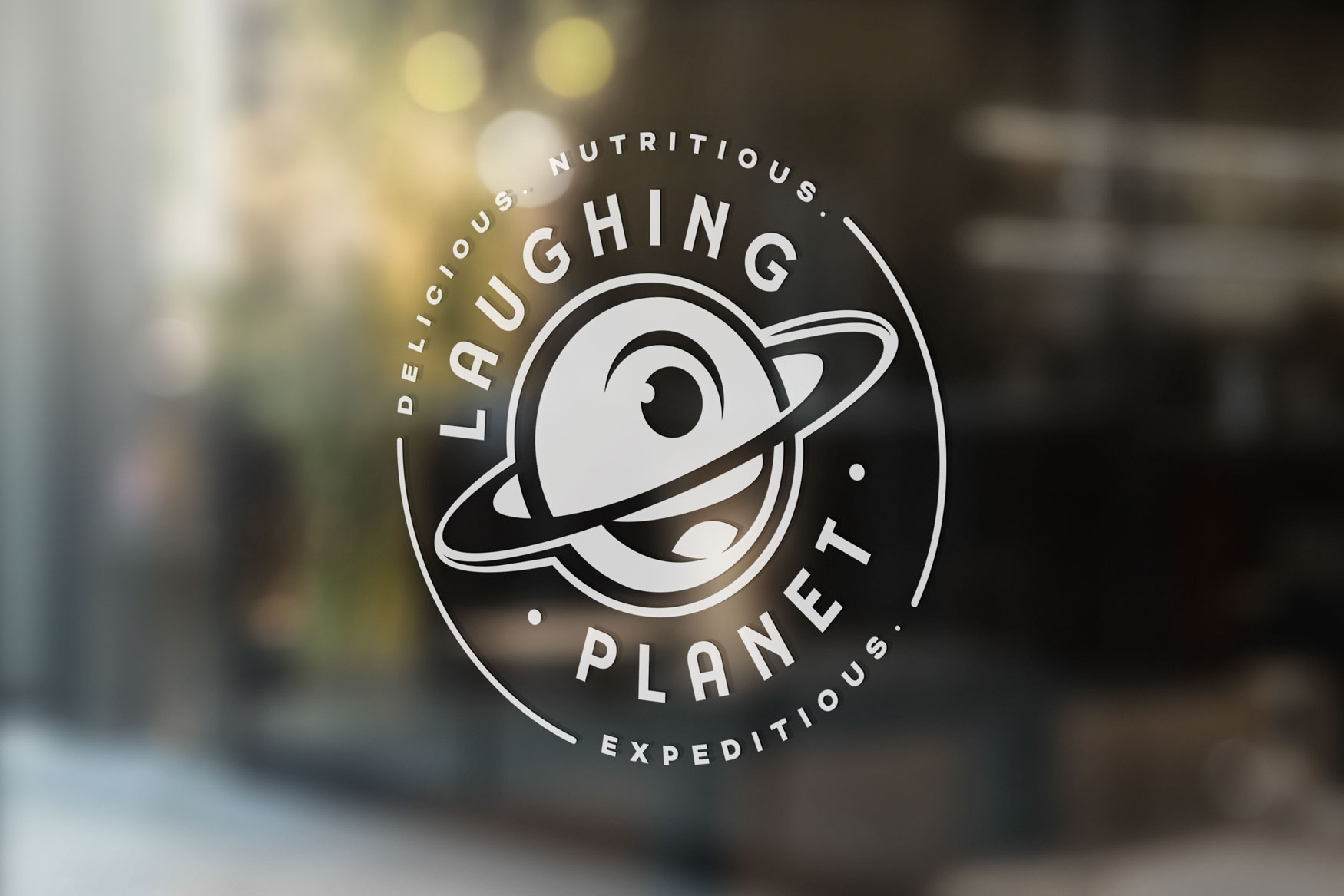
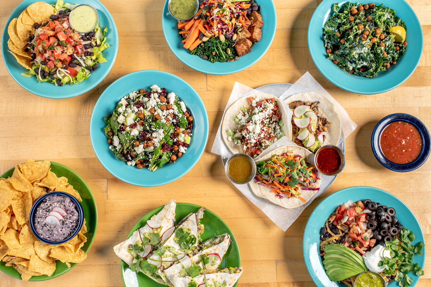
The Laughing Planet logo has come a long way since its original debut in 1995. The most recent refresh of the logo reflects the updated name (removing the word “cafe”) and is simplified to one color. The owner, Franz, wanted to breathe new life into the existing branding by pairing typefaces that better reflected the personality of the Laughing Planet brand.
Brand Book
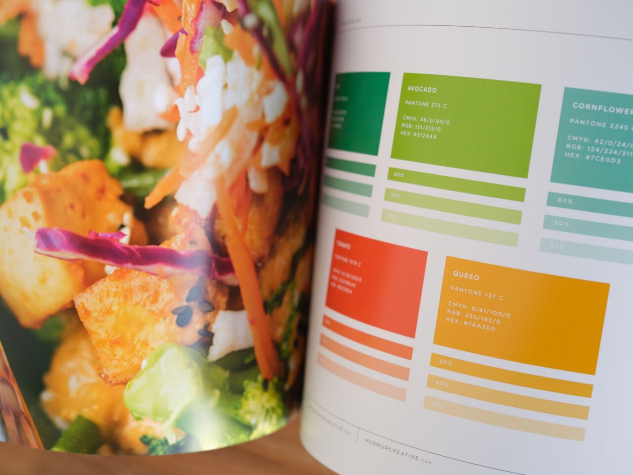
We created a brand book for Laughing Planet that includes brand colors, dos and don’ts, font guidelines, and more. We also designed a fully responsive website for Laughing Planet with an easy-to-update WordPress backend. We have partnered with Laughing Planet since 2006 and continue to work with them on various print and digital projects.

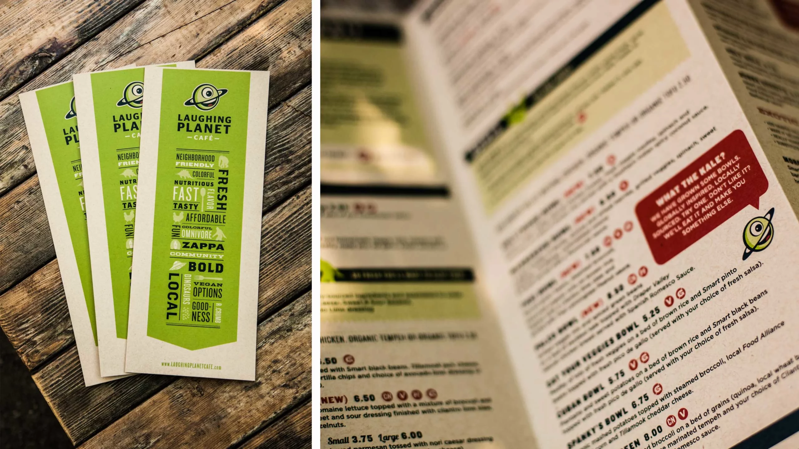


“Laughing Planet’s green one-eyed planet is an icon in the Pacific Northwest. It was important that it remains recognizable and retain its quirky charm. Our goal was to continue to modernize the mark while simplifying it so it could easily be reproduced in one color.”
Andrew Bolton
Owner & Exec. Creative Director