Lion Heart Kombucha
Goal
Lion Heart Kombucha is a longtime studio favorite. We were thrilled by the opportunity to reimagine this unique beverage brand.
Services
Visual Identity
Packaging Design
Photography
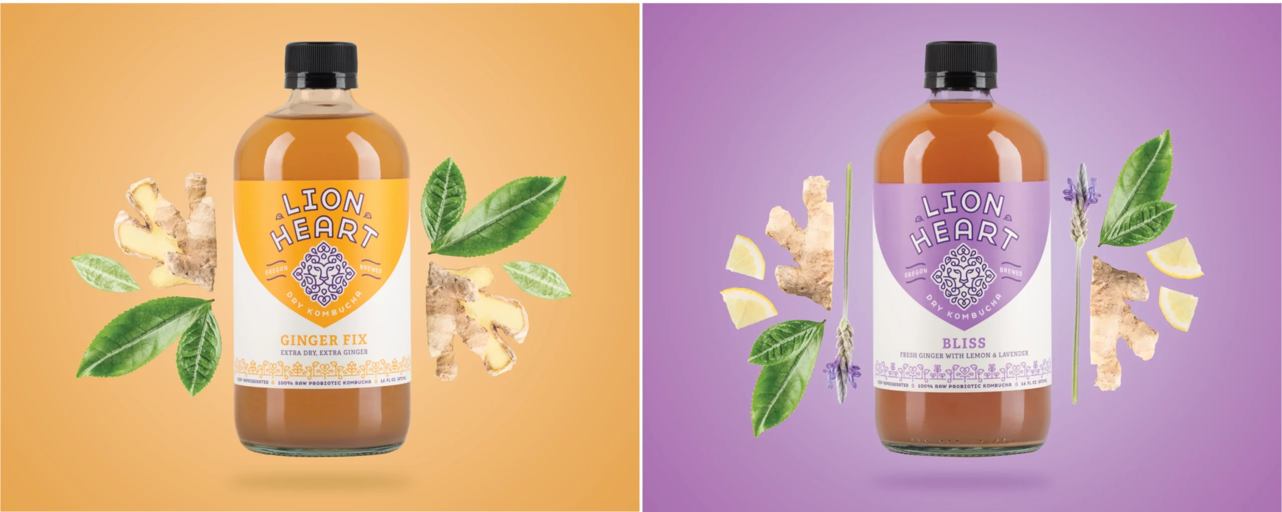
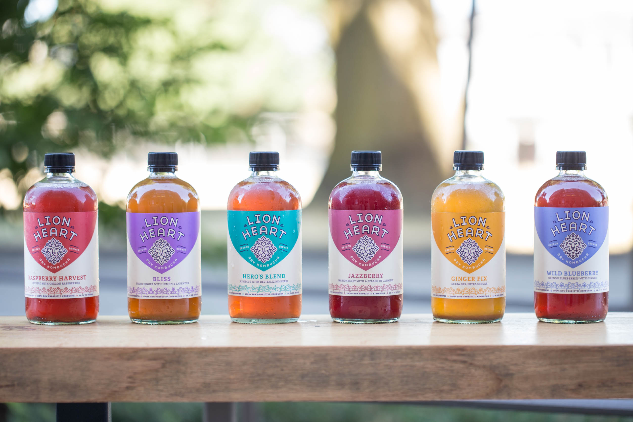
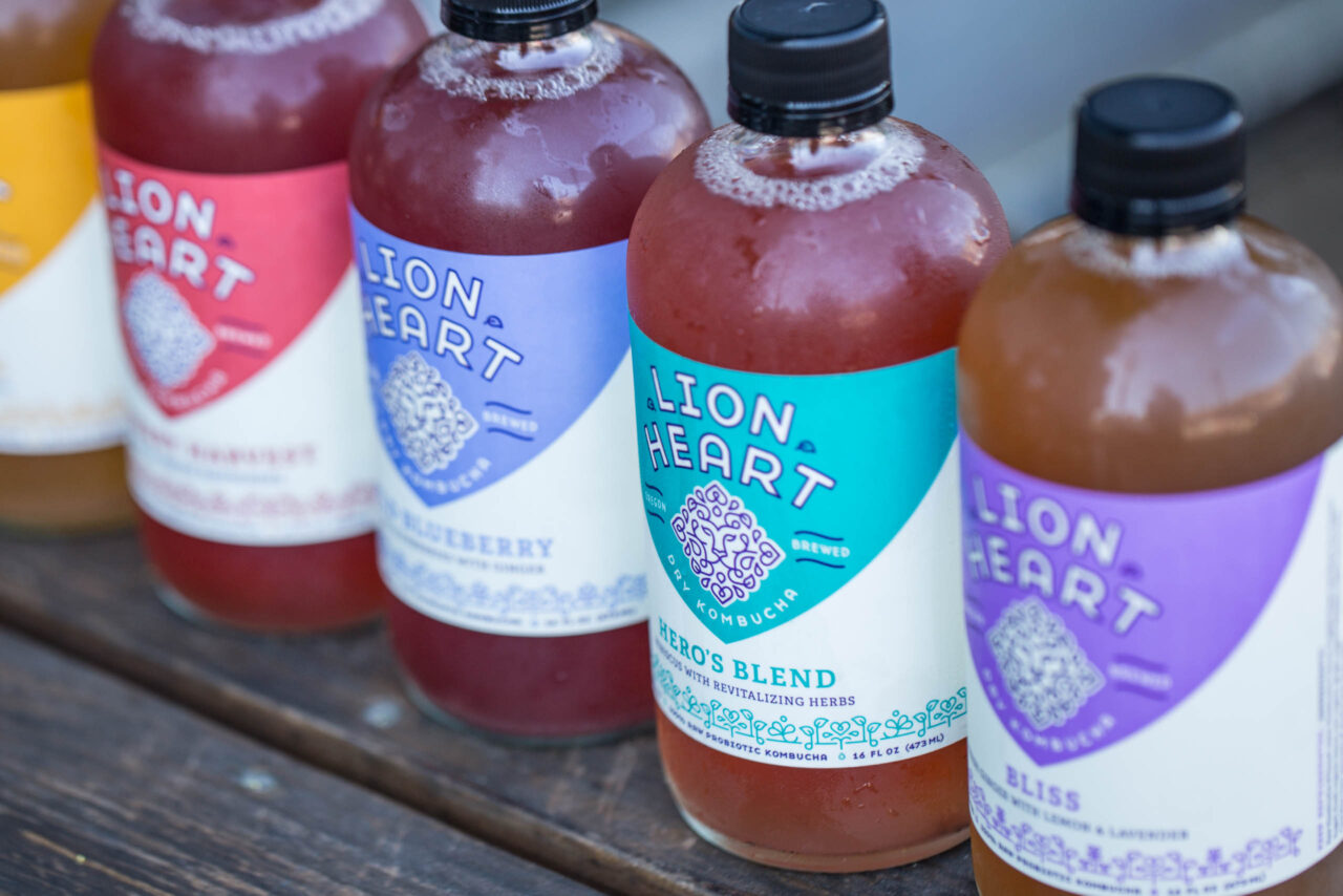
Lion Heart liked the way their former logo incorporated a heart to represent love and positivity and a lion for courage and strength. We decided to steer away from the representational imagery of their former logo and focus instead on more symbolic elements. We wanted the logo to reflect the fresh and lively qualities of the brand in a more mature context. The lion’s face is secretive and wise, while the mane holds Lion Heart’s playful, more whimsical, qualities.
Packaging
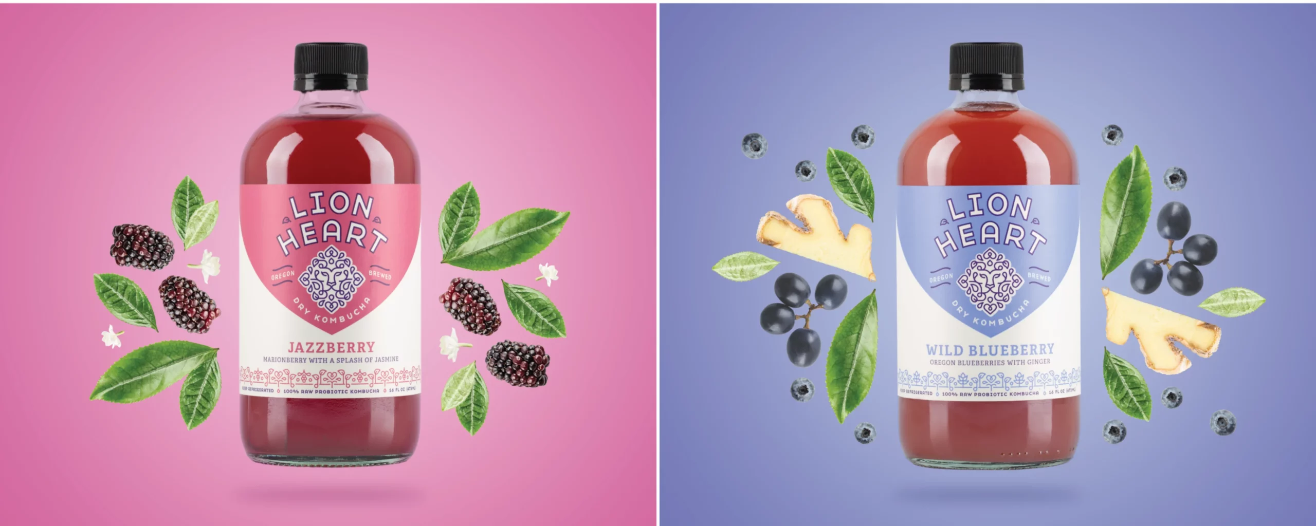
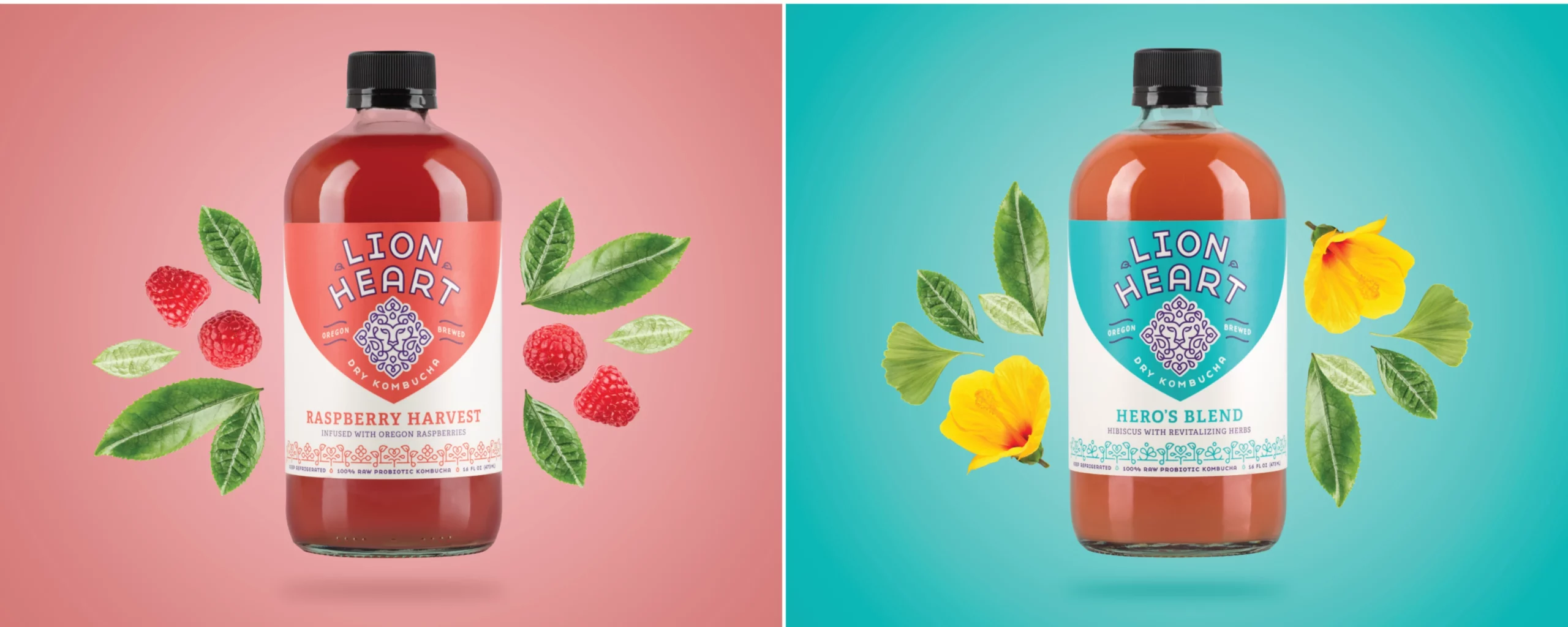
Using Lion Heart’s new brand identity as our guide, we developed new packaging for all 6 of their flavors. We spent hours in grocery aisles developing a color palette and style that would make Lion Heart stand out on the shelf. We also recommended a new tagline “Dry Kombucha” in order to call attention to their low sugar profile. And we called attention to Lion Heart’s Oregon locale.
From the Client
“Sales increased 50% in two months, with further growth potential. They blew away all our expectations... The owner himself came to meetings with good ideas and enthusiasm.”
Jared Englund
Owner, Lion Heart Kombucha

“I have been a huge fan of Lion Heart for many years, so it was incredibly satisfying we were able to make the outside of their bottle match the high-quality product inside of the bottle!”
Mary Breslin
Exec. Director of Client Services

“Our goal was to create a brand that was approachable yet sophisticated, whimsical yet pure.”
Zipporah Vannata
Senior Designer