Goal
As a new tech startup, Stackery’s branding needed to appeal to both corporate and tech communities.
Services
Visual Identity
Website Design
Website Strategy
Outcome
increase in traffic
increase in new users
increase in visit durations
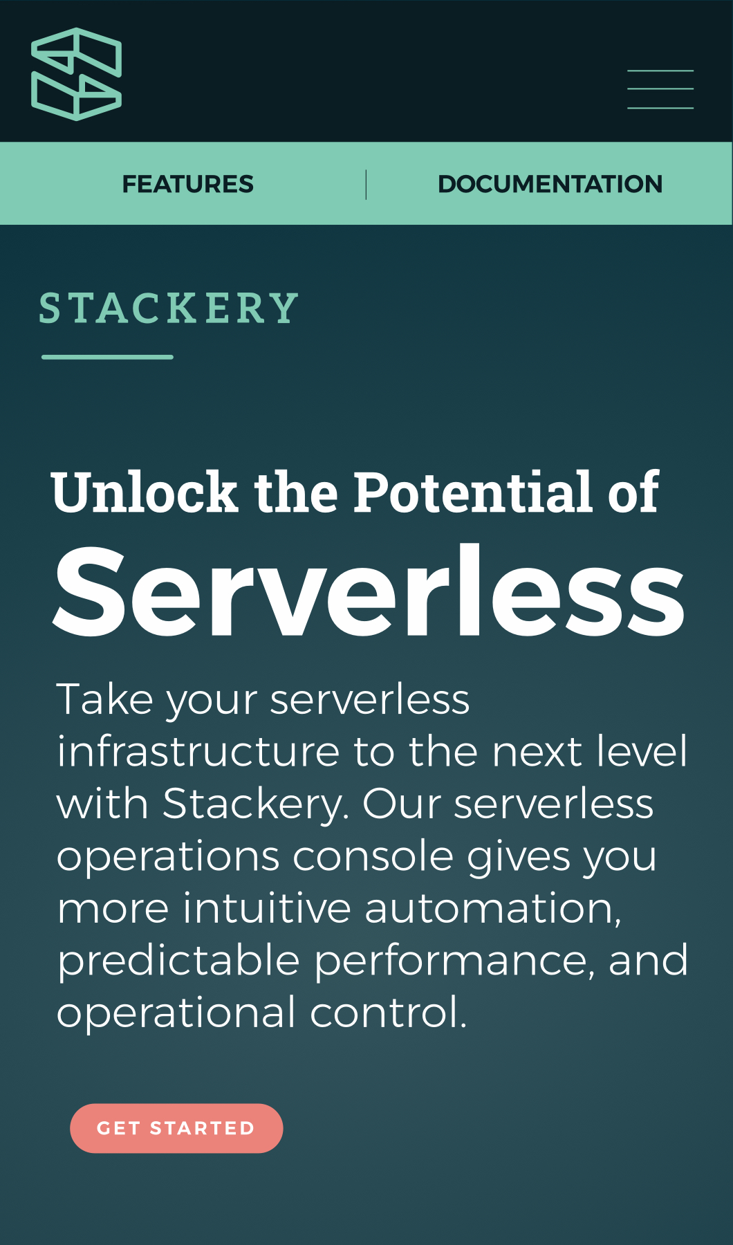
Stackery is a serverless technology startup dedicated to helping companies to implement and optimize their serverless infrastructure.
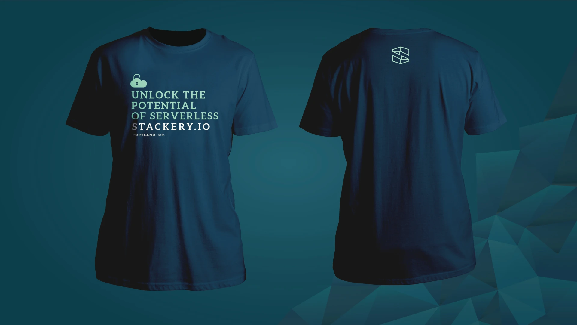
Stackery’s branding unites a technical aesthetic with creative design. Drawing inspiration from the flexibility of serverless infrastructure, Stackery’s branding creates a visual sense of expansion by evoking complex technologies through color and shape.
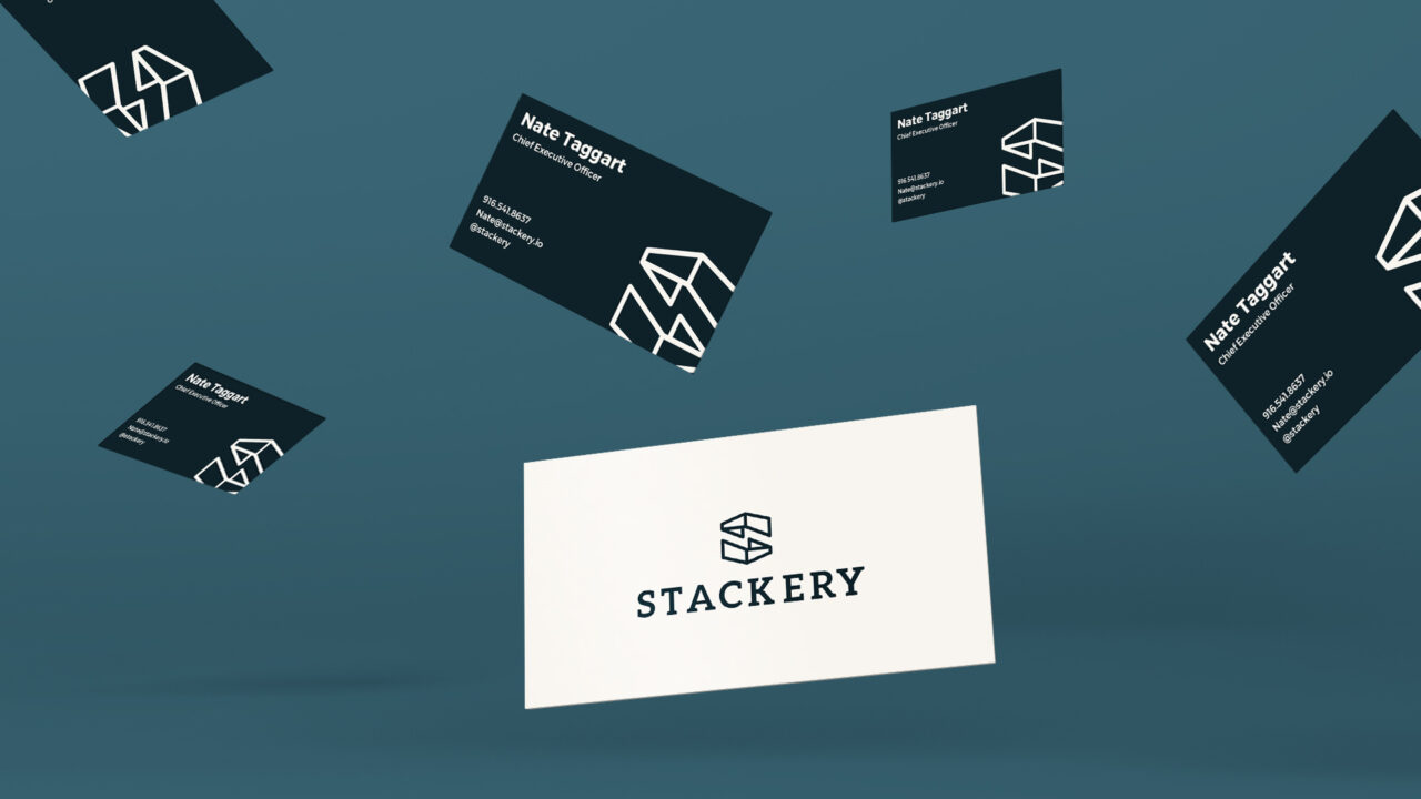
Logo Design
The logo, which is a dimensional S that comes together to create the shape of an expanding box illustrating the concept of expandable serverless technology. When looking at the mark, the top of the S and the bottom of the S are the same pieces flipped to evoke the symmetry and balance of serverless. The logo is appealing to developers and has a hint of corporate appeal.
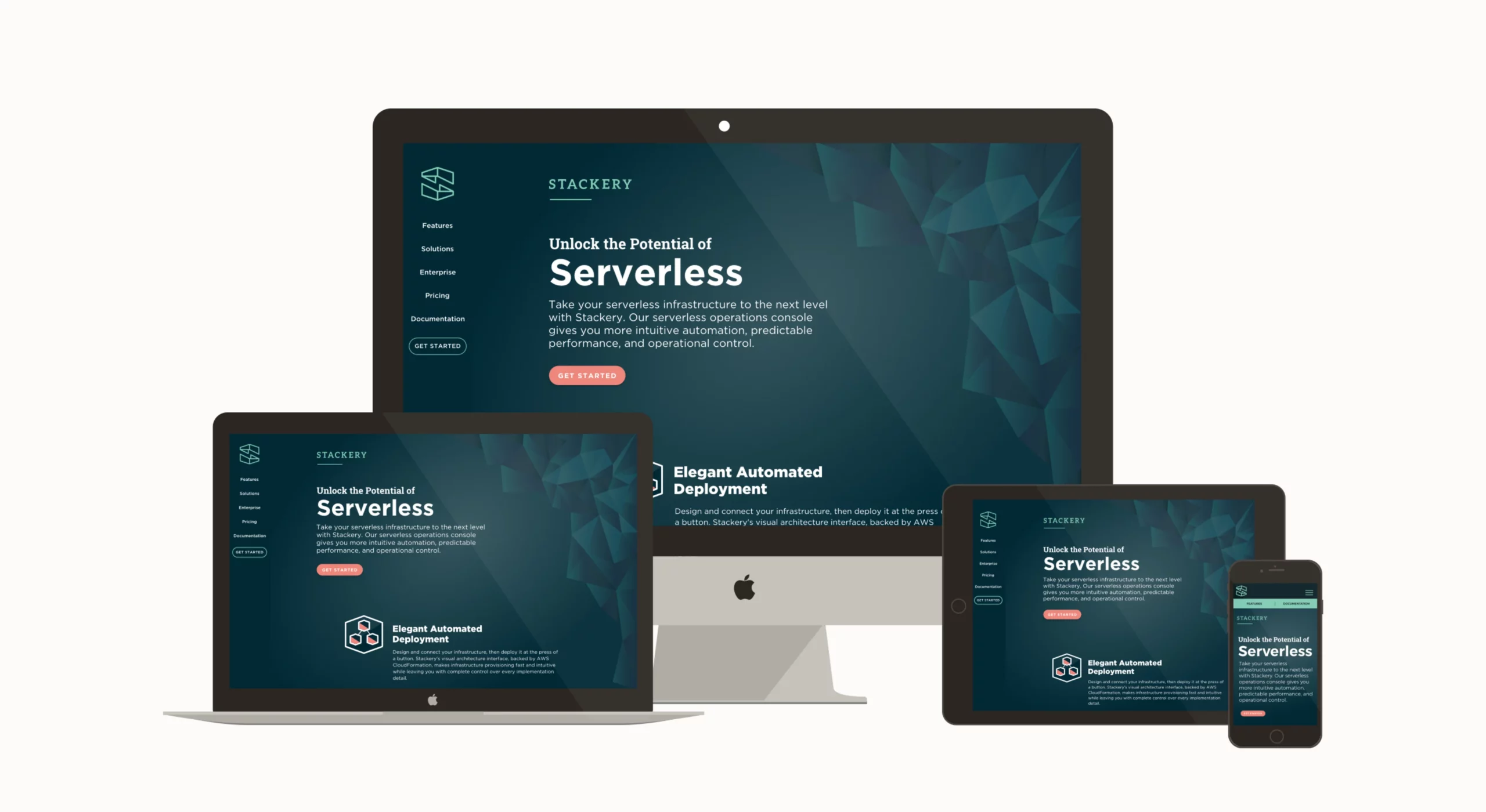
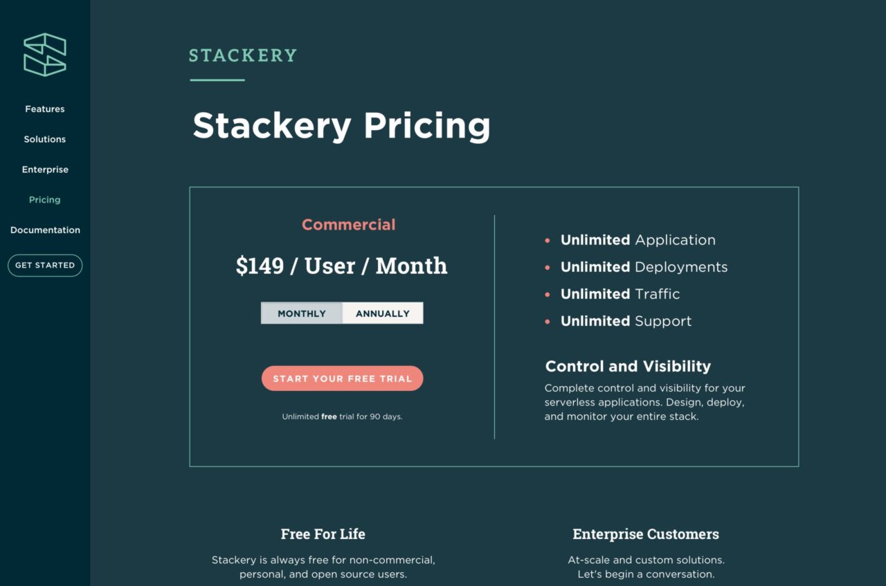
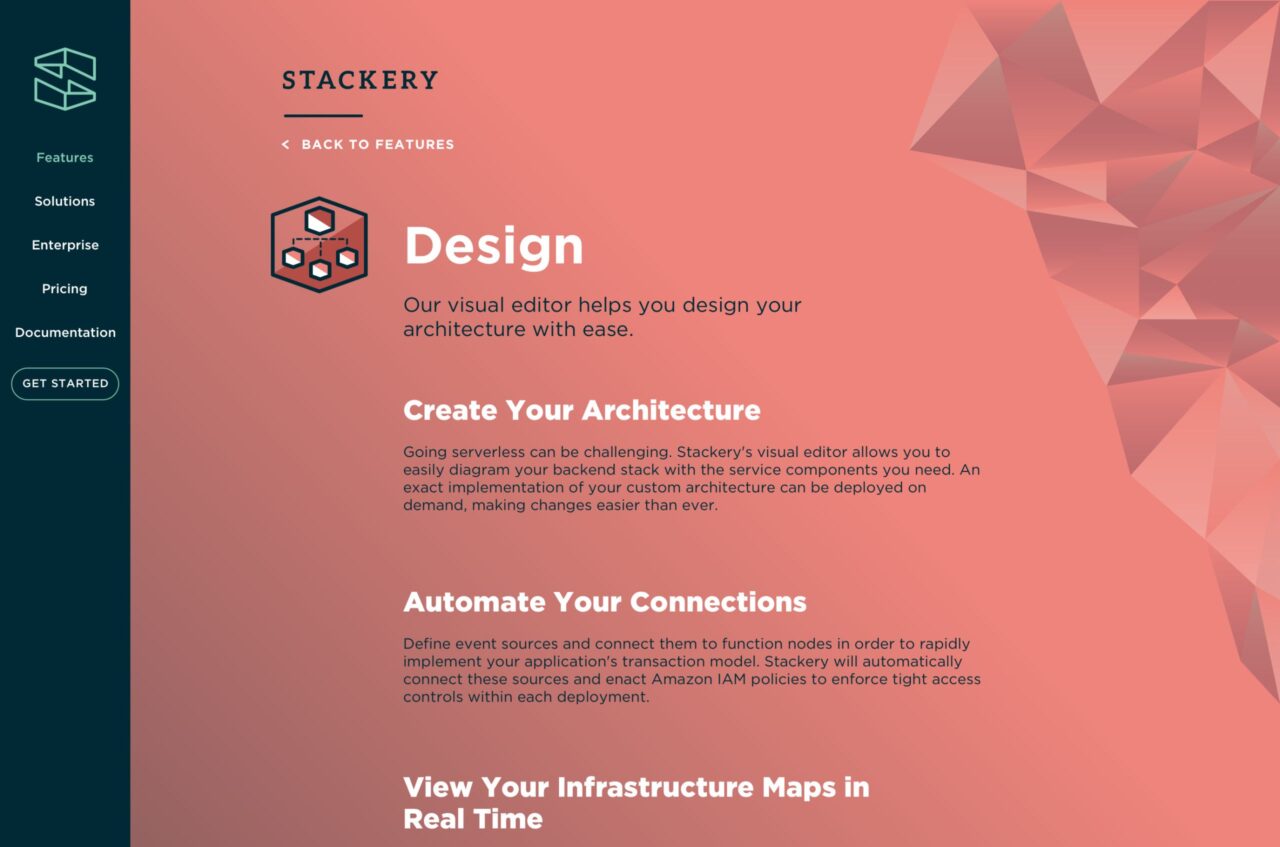
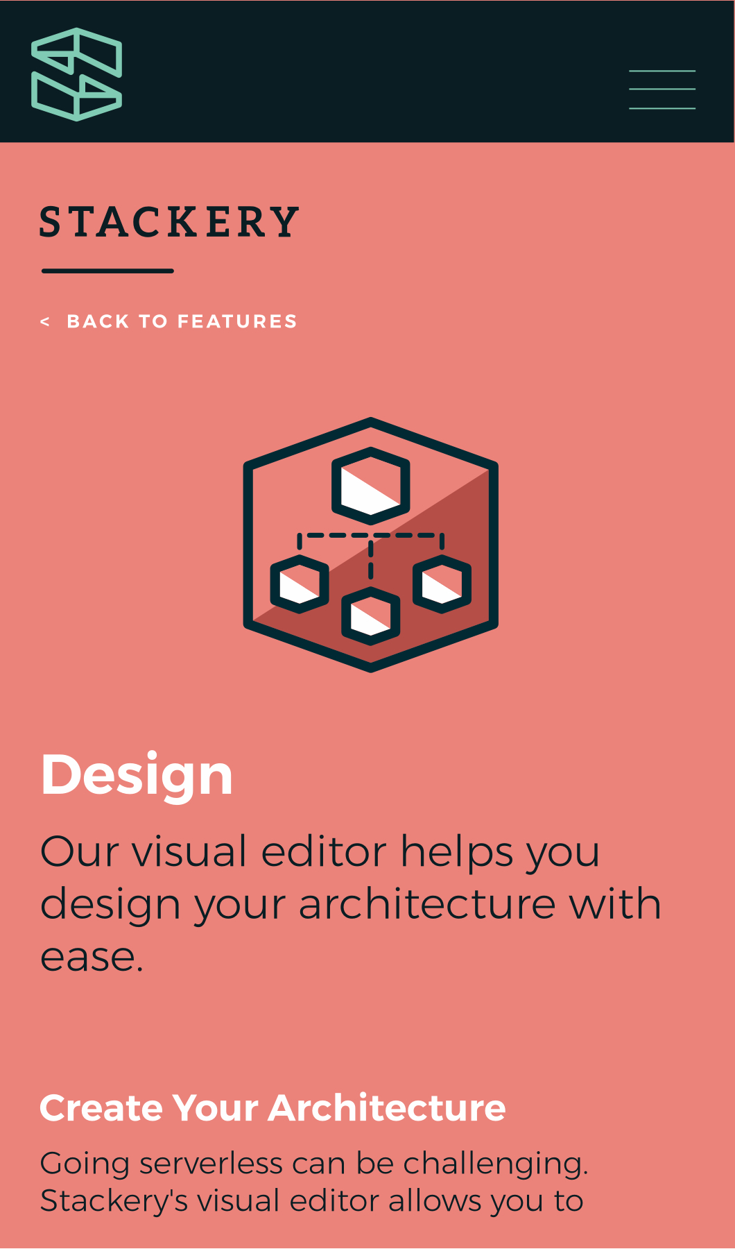
Website
The website expands the brand’s concept into full pages of shapes that build into structures. The atmospheric nature of the site differentiates it from other tech companies while also visually embodying the concepts behind serverless technology. We worked with Stackery and our own developers to hone the site’s marketing copy in order to reward technical expertise while also appealing to non-experts.
“Stackery needed the performance of their website to imply the performance of their software, so we optimized everything we could: Instead of a slower, dynamic backend like WordPress, Stackery runs off a pre-generated set of static files generated by Jekyll. Nearly all the image assets on the site are SVG illustrations instead of bitmaps.”
Ben Martinez-Bateman
Developer