Otto’s Sausage Kitchen
Goal
Otto’s Sausage Kitchen needed a logo refresh and website to illustrate their heritage while giving them room to grow.
Services
Visual Identity
Website Design
Photography
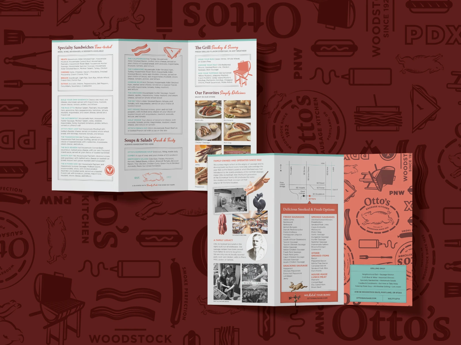
The Logo
Otto’s logo is a beloved part of the family business so they wanted a few small changes, not a complete overhaul. We kept the heart of the design while refreshing the logo by updating the typography and moving text inside the logo’s profile. We also created a sense of motion for the pig and added “Woodstock Since 1922” to the text to reference Otto’s neighborhood standing. The overall impression of this refreshed logo is one of joy: a marriage of the past and present.

“Otto's logo refresh is a perfect example of how you can breathe new life into a brand without changing the logo concept. We introduced new illustrations, fonts, and color palettes while retaining the logo's historical elements.”
Zipporah Vannata
Senior Designer
“I loved bringing the character of the store to the website through fun surprises with elements like flying pigs. We also focused on the importance of heritage to this fourth-generation family business through the aesthetic of the design and photography.”
Erin Shorthill
Web Designer
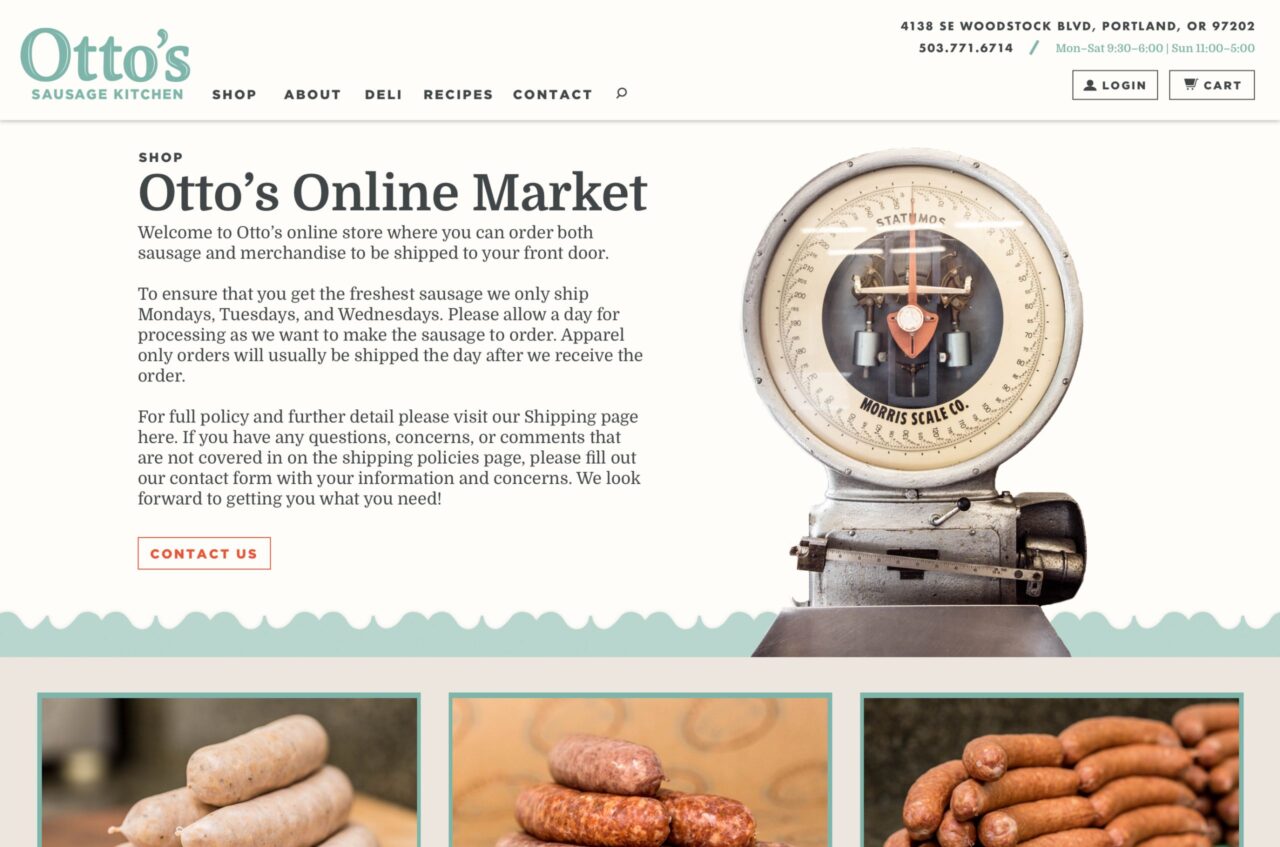
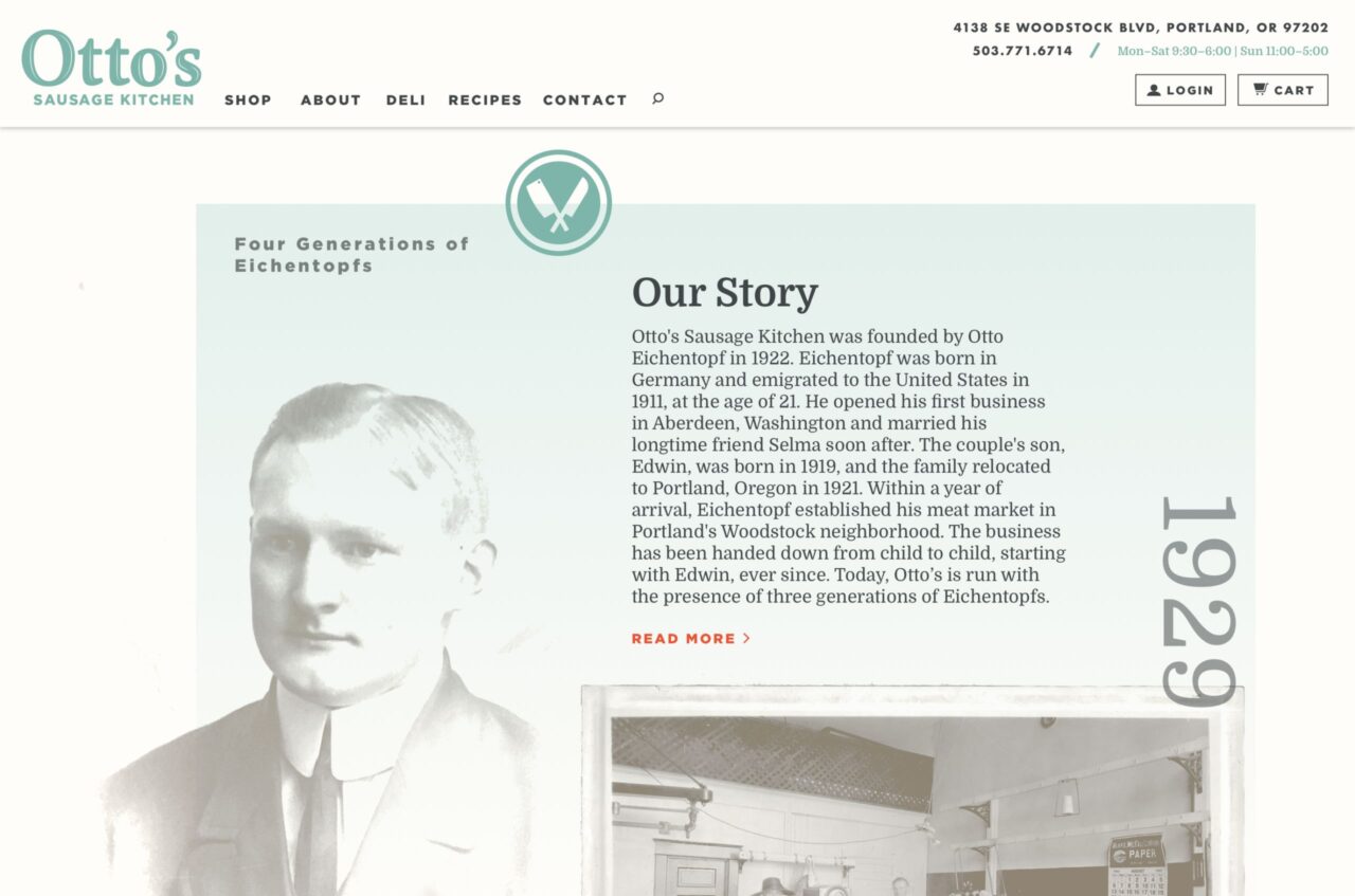
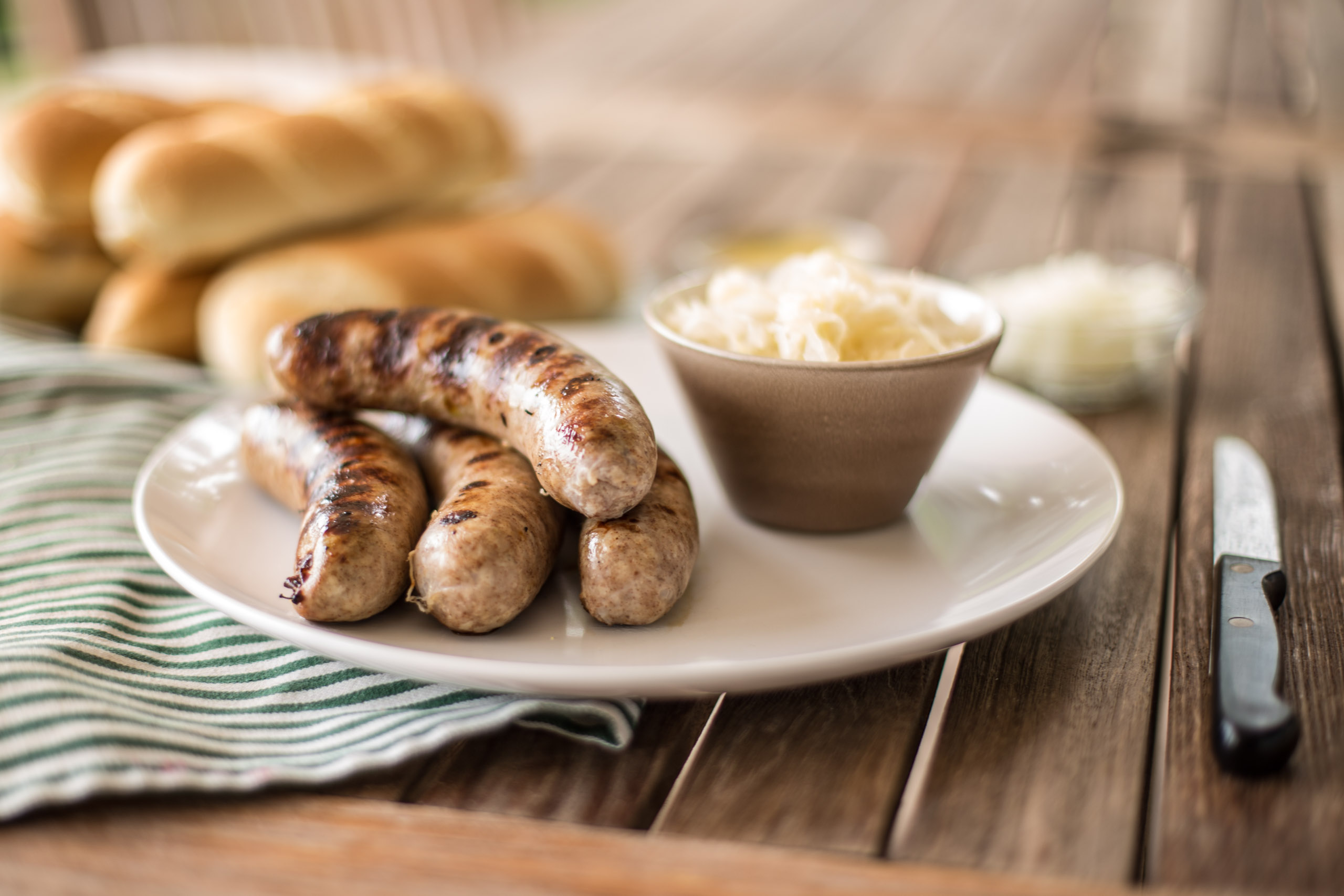
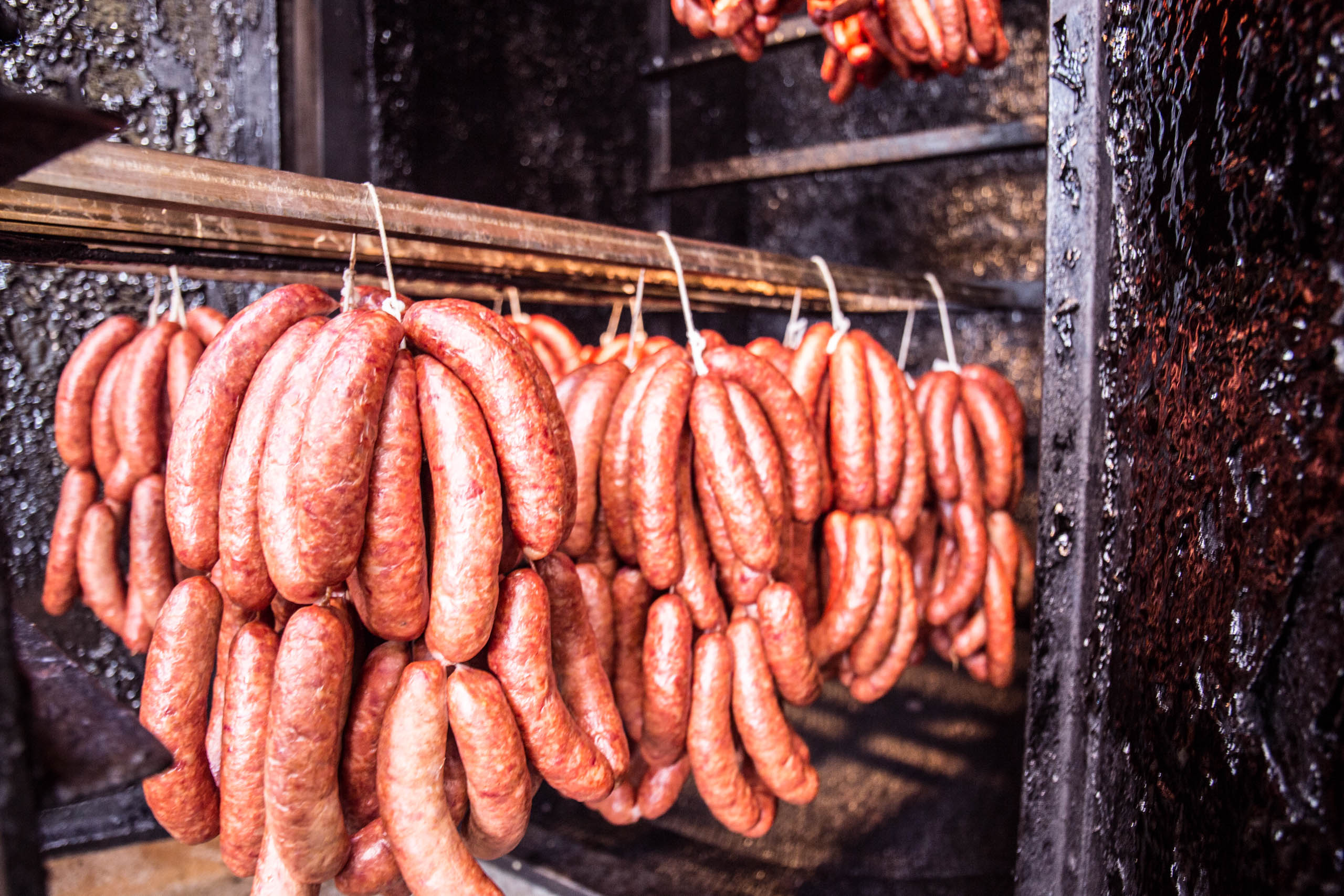
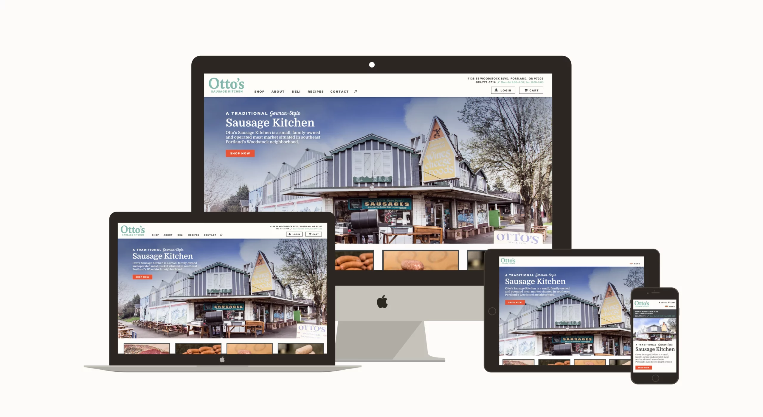
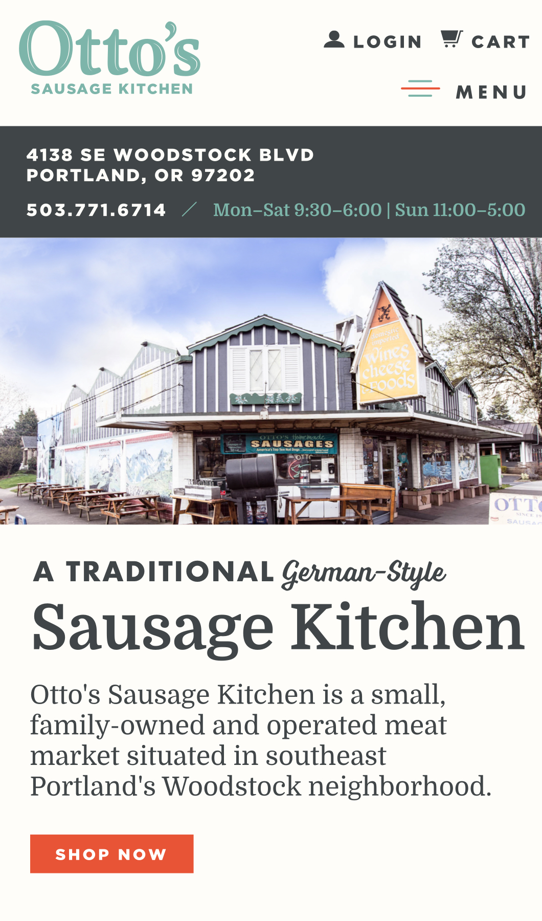
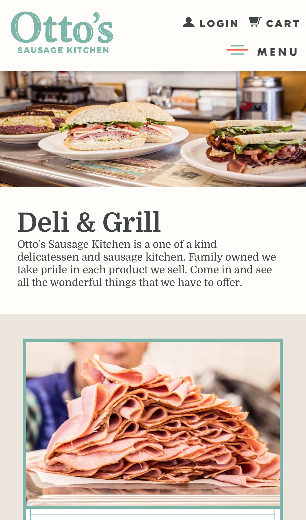
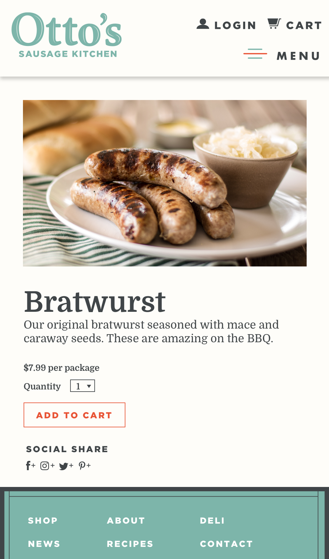
Otto’s website showcases their unique space, products, and story. Using photography we took at their historic restaurant and store, we created a web space that felt like being at Otto’s itself. Each page features a specific object found at Otto’s: a scale, a rooster statue, a flying pig. These objects are surrounded by copy that describes Otto’s past and present.
“Our workflow and expertise allowed us to build a simple, functional eCommerce implementation that gave a small family business the capability to manage a professional-looking storefront with minimal effort, and provide their fans across the United States with a chance to get some of that sweet, sweet sausage any time they want.”
Ben Martinez-Bateman
Web Developer