- ... / Work / Pnw Kale Chips
PNW Kale Chips
Goal
From food startup to #2 best selling Kale Chip in the U.S.
Services
Visual Identity
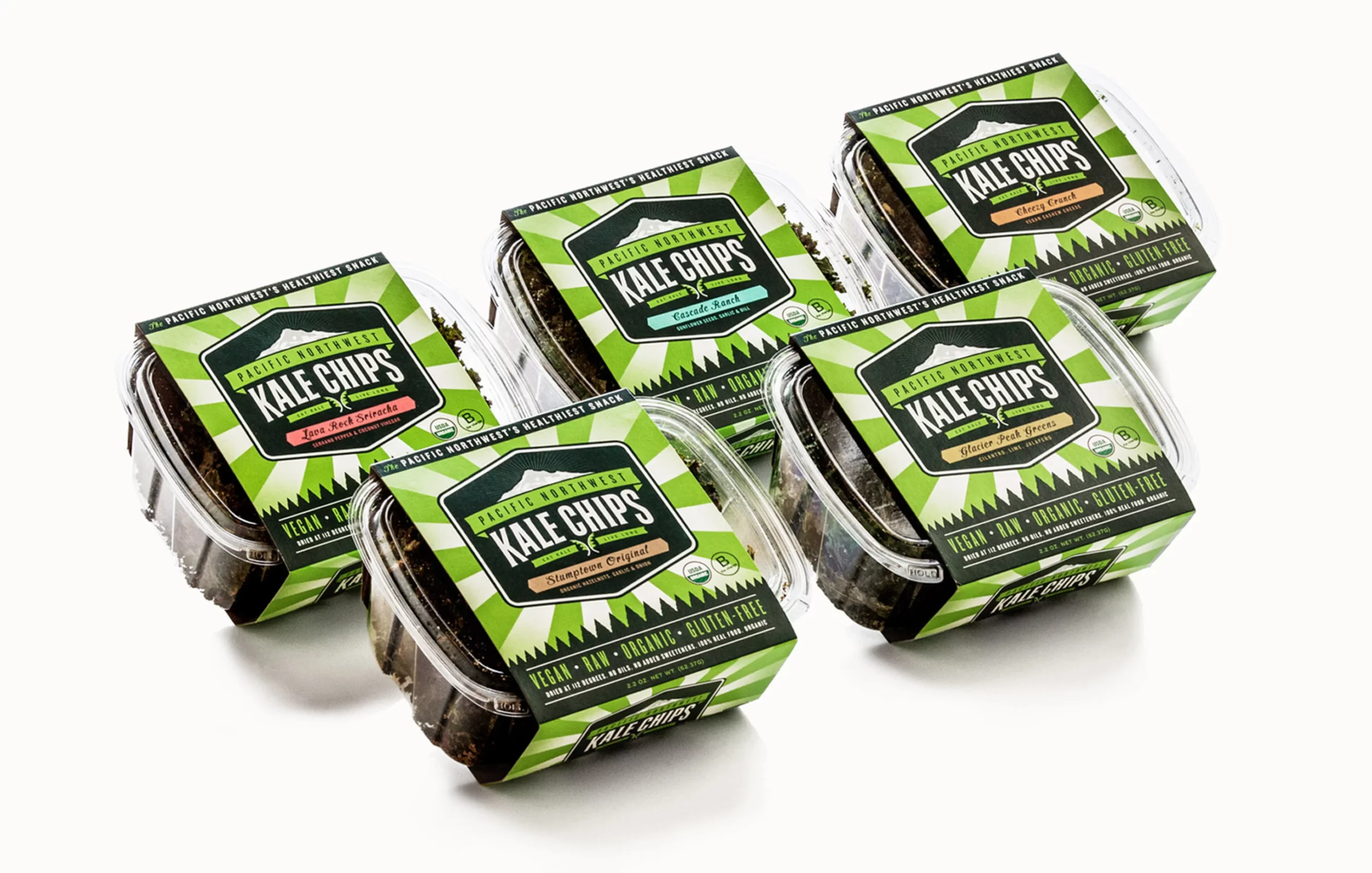
Packaging Design
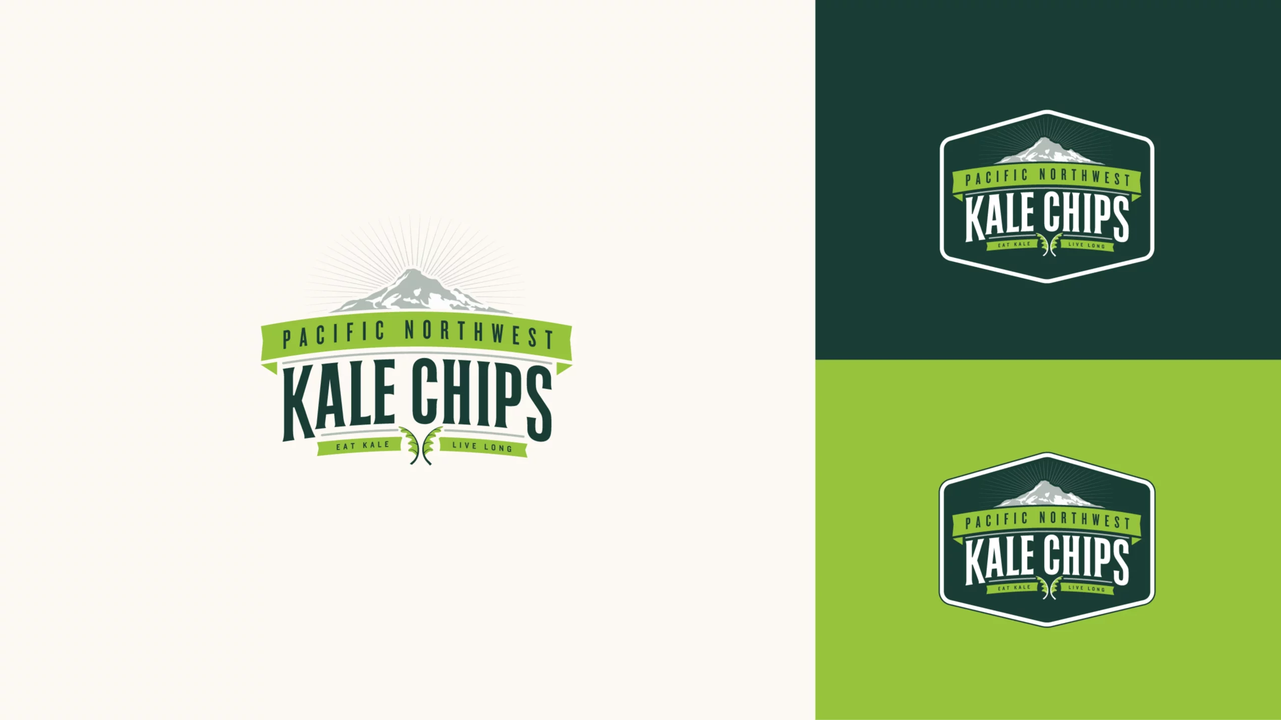
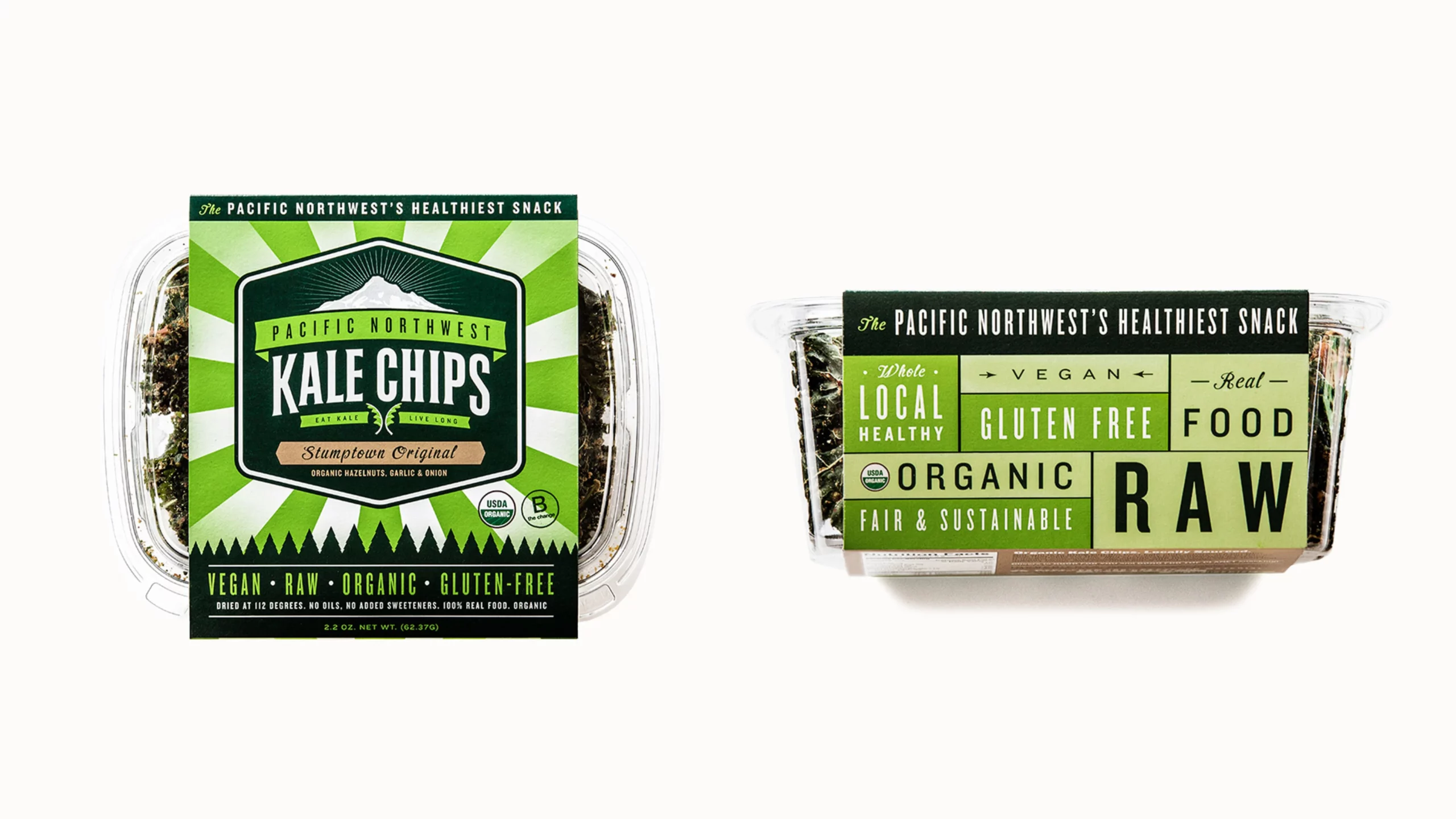
When Pacific Northwest Kale Chips came to Murmur they were a new business in a quickly growing market. They were having trouble getting into stores with their current logo and packaging and knew they needed an upgrade
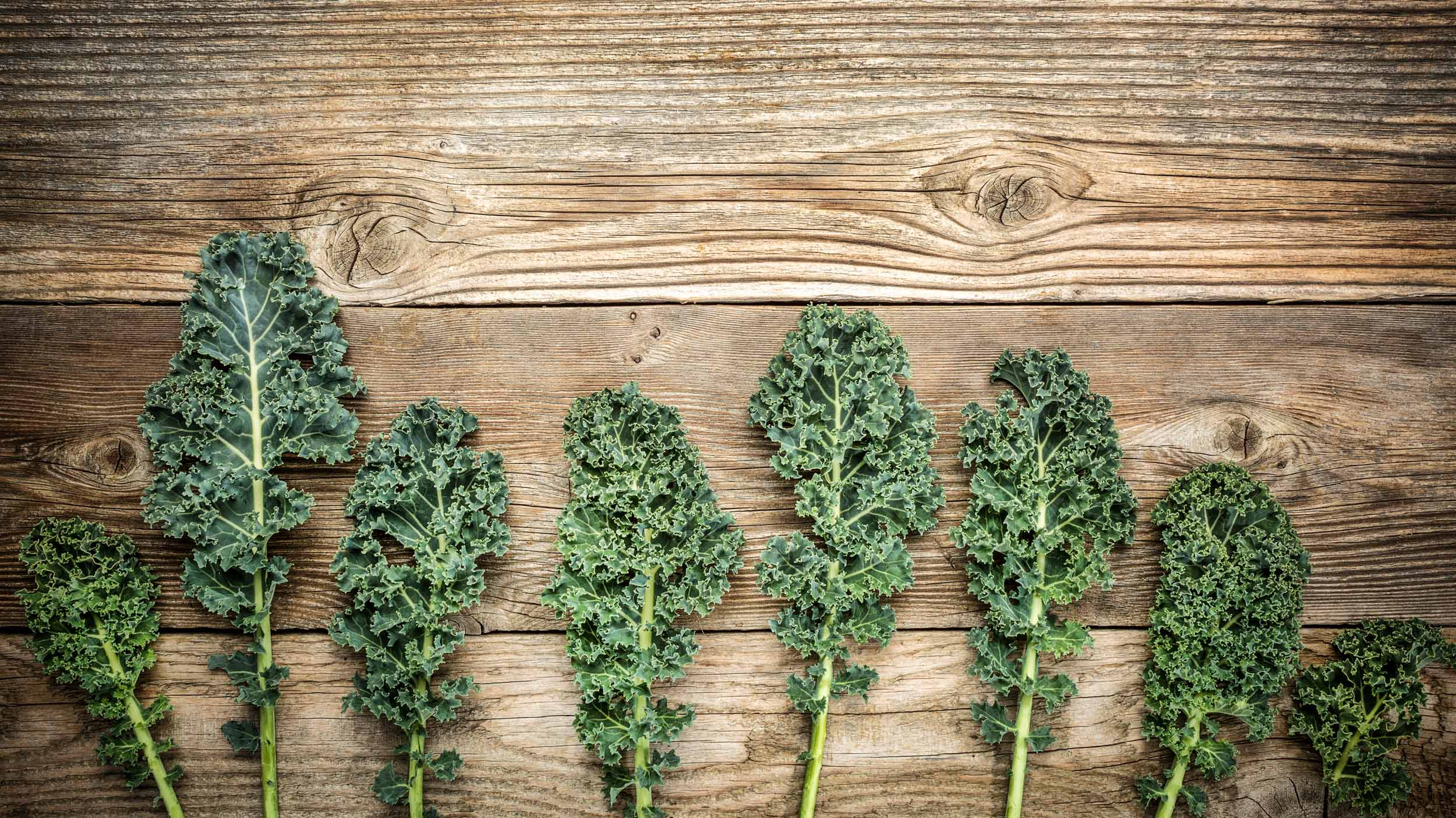
We wanted the Pacific Northwest Kale Chips colors to be bright, but not so bright that the brand no longer looked like health food. To enhance the packaging, we chose colors that contrasted with the desaturated green of the kale chips themselves.
The original packaging was a paper pouch, but because of the fragile nature of kale chips it often contributed to chip breakage. We chose a recyclable clamshell case to prevent this.
The eye-catching colors and clamshell case lent itself well to grocery store displays where the product could be stacked in a pyramid and other formats.
Within a year of launching their new brand identity, Kale Chips made it into dozens of nationally-known grocery stores (New Seasons, Whole Foods, Costco, Walmart, and more) and was purchased by the natural foods brand, Made In Nature.
From the Client
“We knew that in order for a small regional brand to compete on a national scale we had to have best-in-class packaging. Murmur captured the essence of our company, our mission, and our desire to delight customers. There is great design, excellent design, and then there is true genius design (authentic, original, unique, timeless) — Murmur delivers the latter.”
Jerek Lovey
Founder