Goal
KPA’s branding and website needed to reflect the forward-thinking nature of their business.
Services
Visual Identity
Naming
Website
Digital Collateral
Iconography
KPA provides Environment, Health & Safety (EHS) and Workforce Compliance software and services for mid-sized businesses. For over 30 years, KPA has helped 10,000 + clients achieve regulatory compliance, protect assets, and retain top talent. KPA solutions help clients identify, remedy, and prevent workplace safety and compliance problems across their entire enterprise.
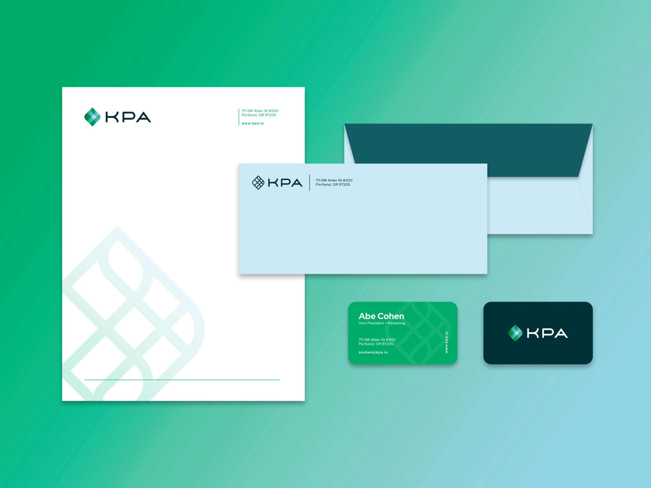
Branding
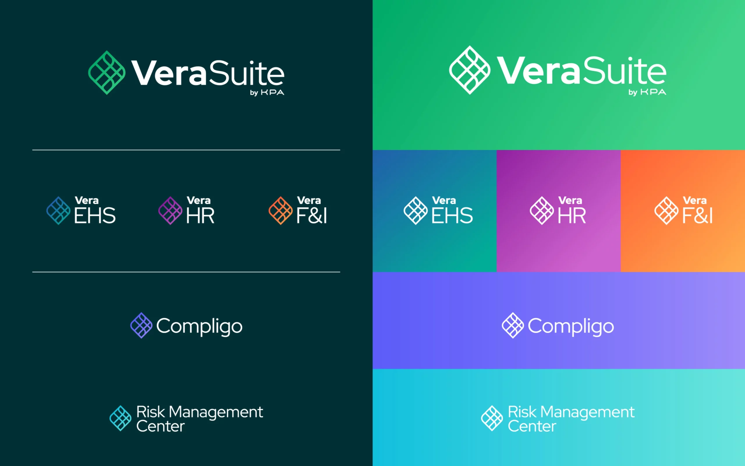
The KPA mission to help clients improve safety, lower risk, and save money calls for a company logo mark that exudes stability. We re-envisioned KPA’s existing logo by honing in on its diamond shape and adding gradations to reflect the old logo’s multiple colors. The KPA gemstone’s structural integrity mirrors the KPA core ethos and is symbolic of KPA’s multifaceted product offerings.
This enduring logo reflects the brand’s aspirational legacy with a creative foundation and color scheme that will separate KPA from the competition. KPA’s new logo and product line logo set are versatile, with both gradient and linework versions that can be used in different contexts.

“We explored various options on how to refresh KPA's signature diamond in their previous logo. We ultimately decided on a gradated gemstone that calls back to their old logo but modernizes their new branding.”
Renee Dimalla
Senior Art Director

Subbrands & Naming
Vera is a take on verify because that’s what their software does, but it also means “truth.” We came up with hundreds of names and ran all our favorites past copyright lawyers. Vera was well liked and passed copyright inspection for our use. We wanted short names that could be appended to a wide variety of services because they are a fast growing company that is buying other companies and quickly adding services. Formerly, they had lots of services with different names that had been inherited from their acquisitions.

“We came up with hundreds of potential naming options for KPA's software (Vera Suite). It was tough to narrow it down. We loved how versatile "vera" was when paired with a descriptor.”
Angela Larisch
Strategy Director
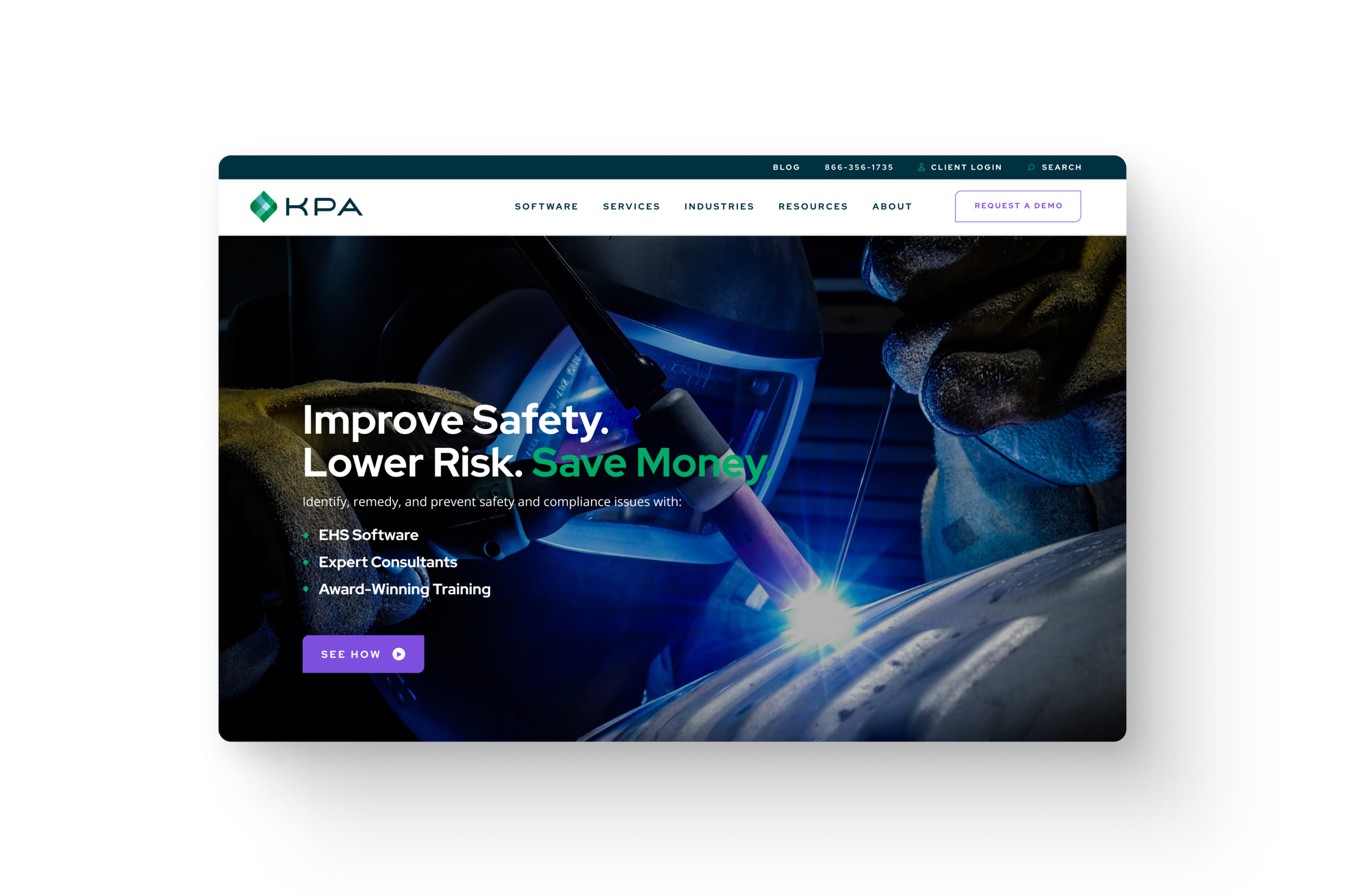
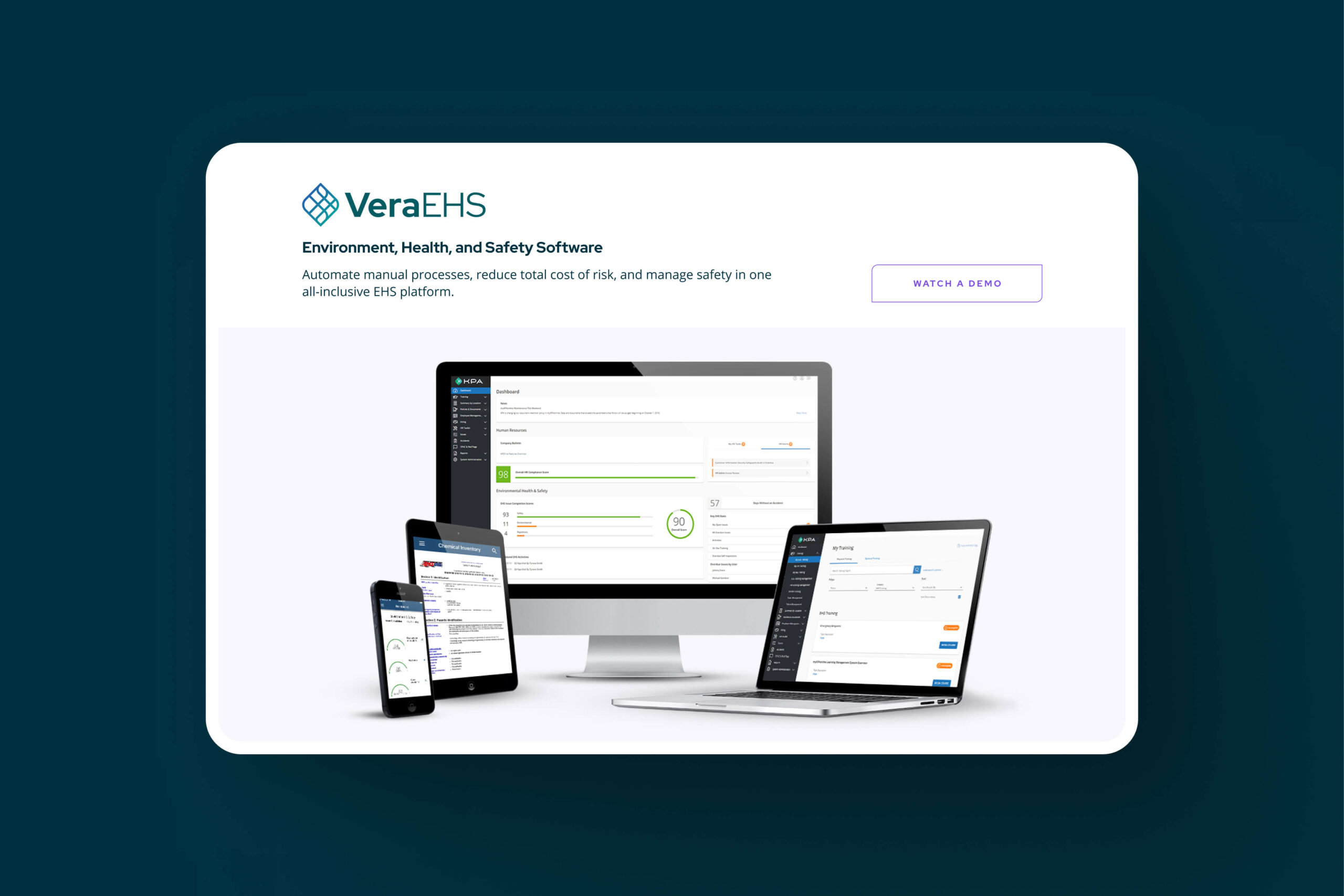
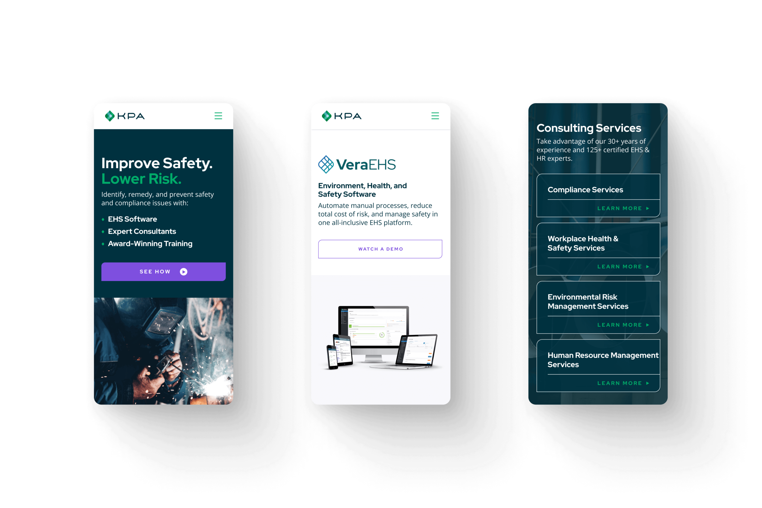
Website Design
In a somewhat crowded market, KPA’s wealth of knowledge and accessibility are what give them a competitive edge. Their new branding solidifies this identity, while their new website really shows it in action. Whether it’s a new visitor looking for a demo or an existing customer looking to access their robust resource library, every click through KPA’s new site guides the user towards creating a continuing connection with the company.


“Branding lays the foundation for a website’s design, so I was excited for the opportunity to expand upon our team’s beautiful work. Our open, collaborative process ensured the delivery of a cohesive, well-rounded website highlighting the client’s position at the leading edge of compliance software.”
Dani Ramsby
Lead UI/UX Designer
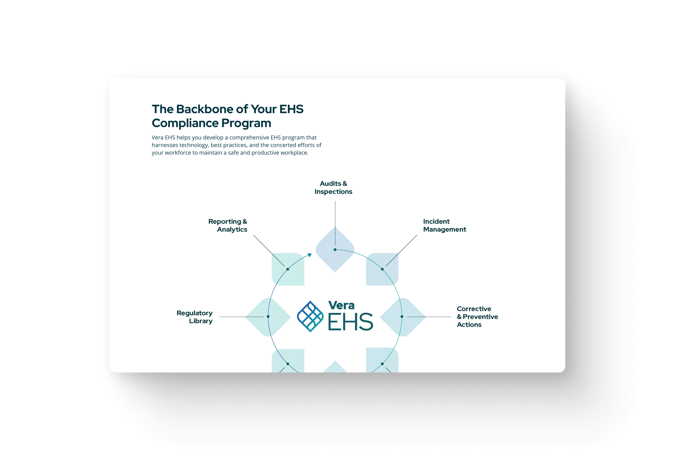

Iconography Set
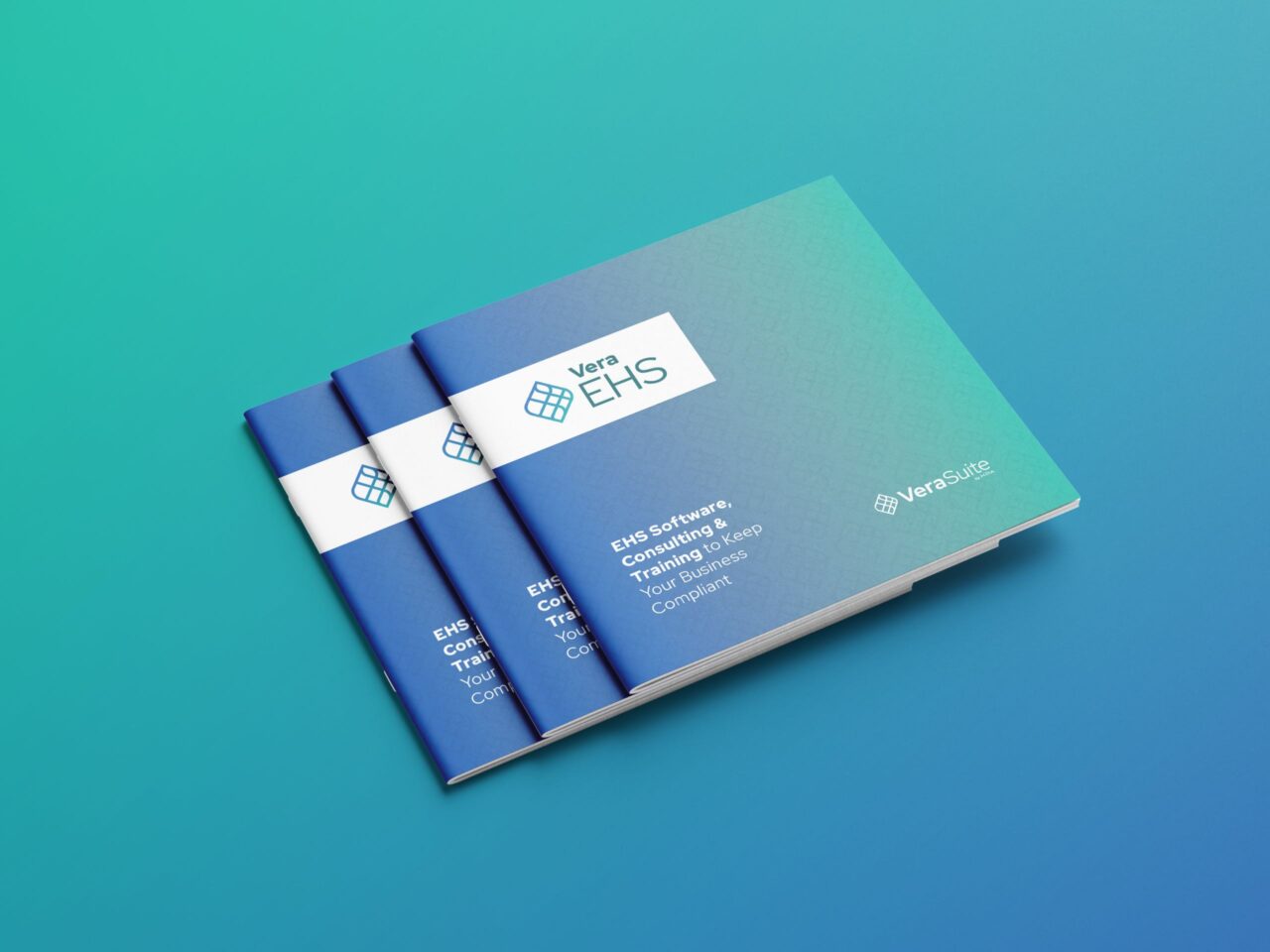
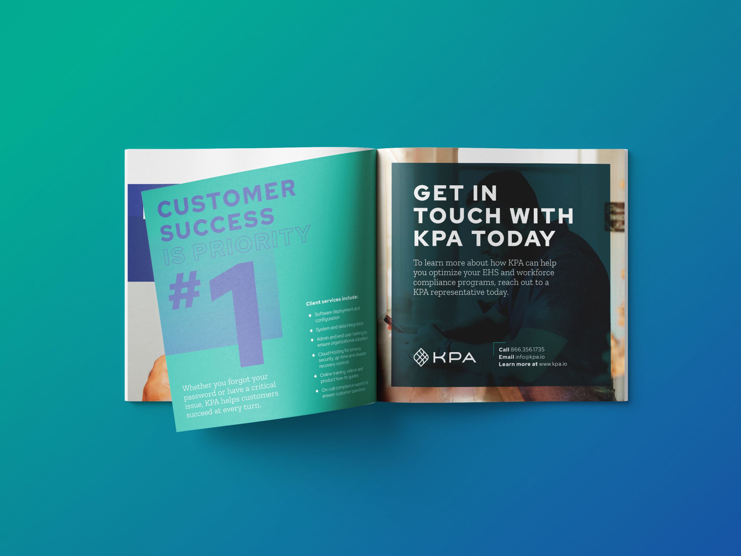
Print Collateral
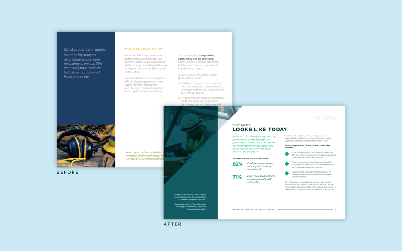
As KPA’s branding was made with versatility in mind, applying their new branding to collateral was a breeze. Carefully chosen gradients for their brand can be seen used throughout their collateral, paired with their secondary logo to bring their branding across anything from tablecloths to business cards.

“Many don’t realize that a page full of text can be difficult for viewers to digest. We created new templates for software brochures and eBooks using a new type of hierarchy and color palettes so that viewers can easily absorb the information.”
Zipporah Vannata
Senior Designer


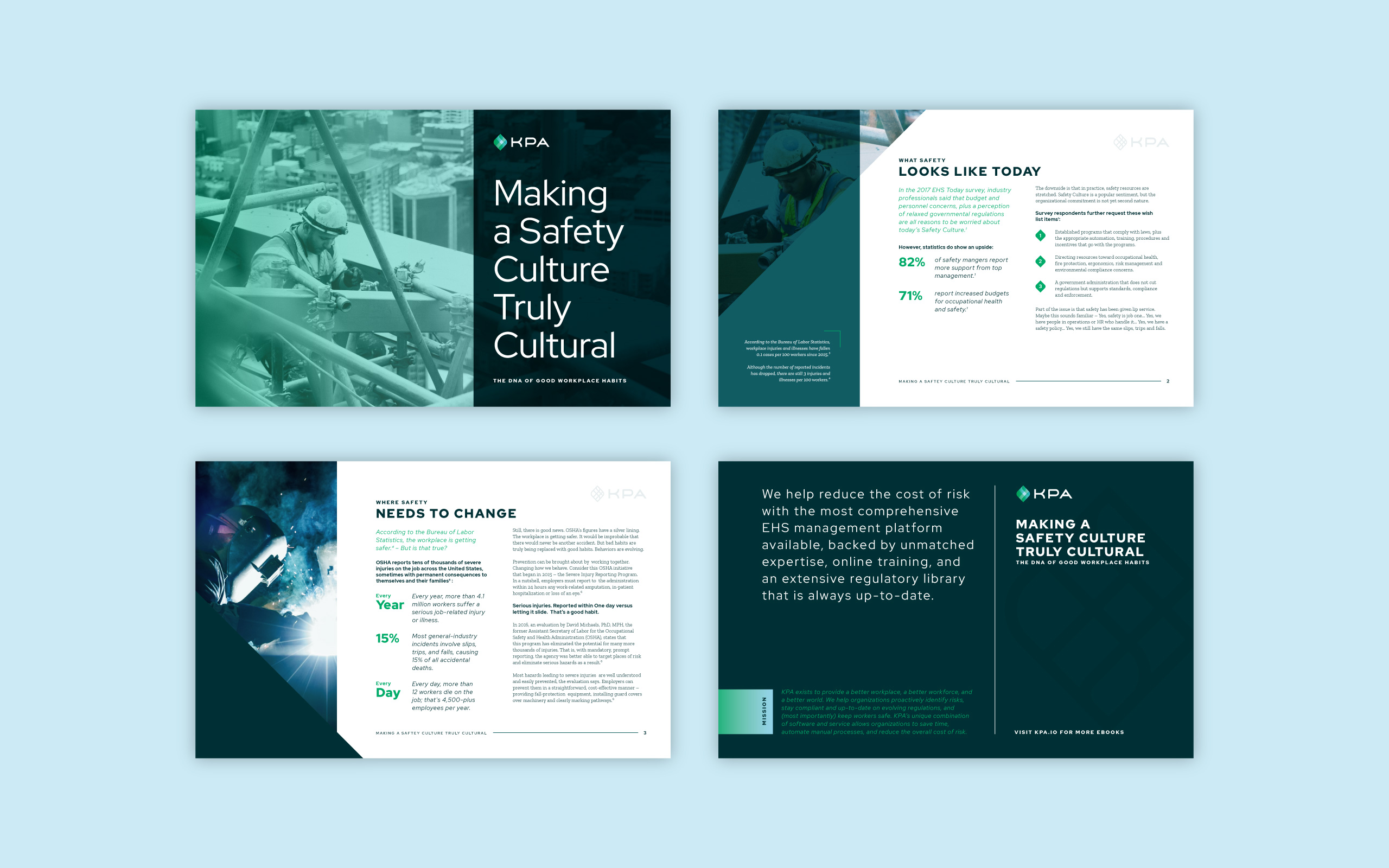
Digital Collateral
We incorporated KPA’s new branding into downloadable eBooks for compliance training. We created a clear type hierarchy for ease of reading. Flexible formatting allows updates for multiple circumstances, and dimensions are optimized for online viewing.
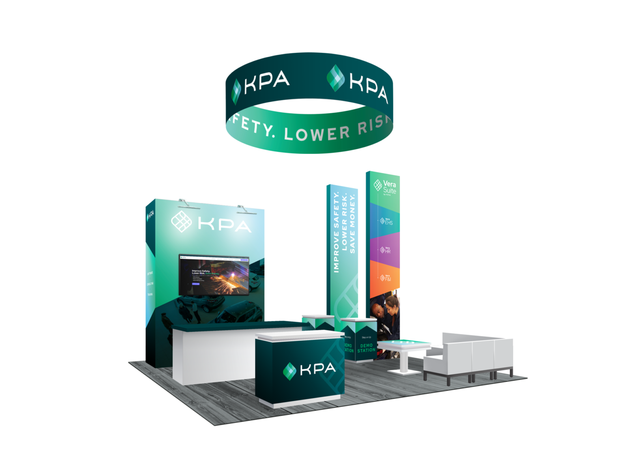
Environment
We designed KPA’s trade show environment to be color forward to promote brand recognition, and we utilized all the space of their environment. We designed both the front and back of the booth elements to ensure that onlookers knew they were KPA from any angle.