- ... / Work / Burnside Co
Burnside & Co.
Goal
We endeavored to create a logo and brand that looked professional and trustworthy without blending into the uninspired landscape of financial services branding.
Services
Visual Identity
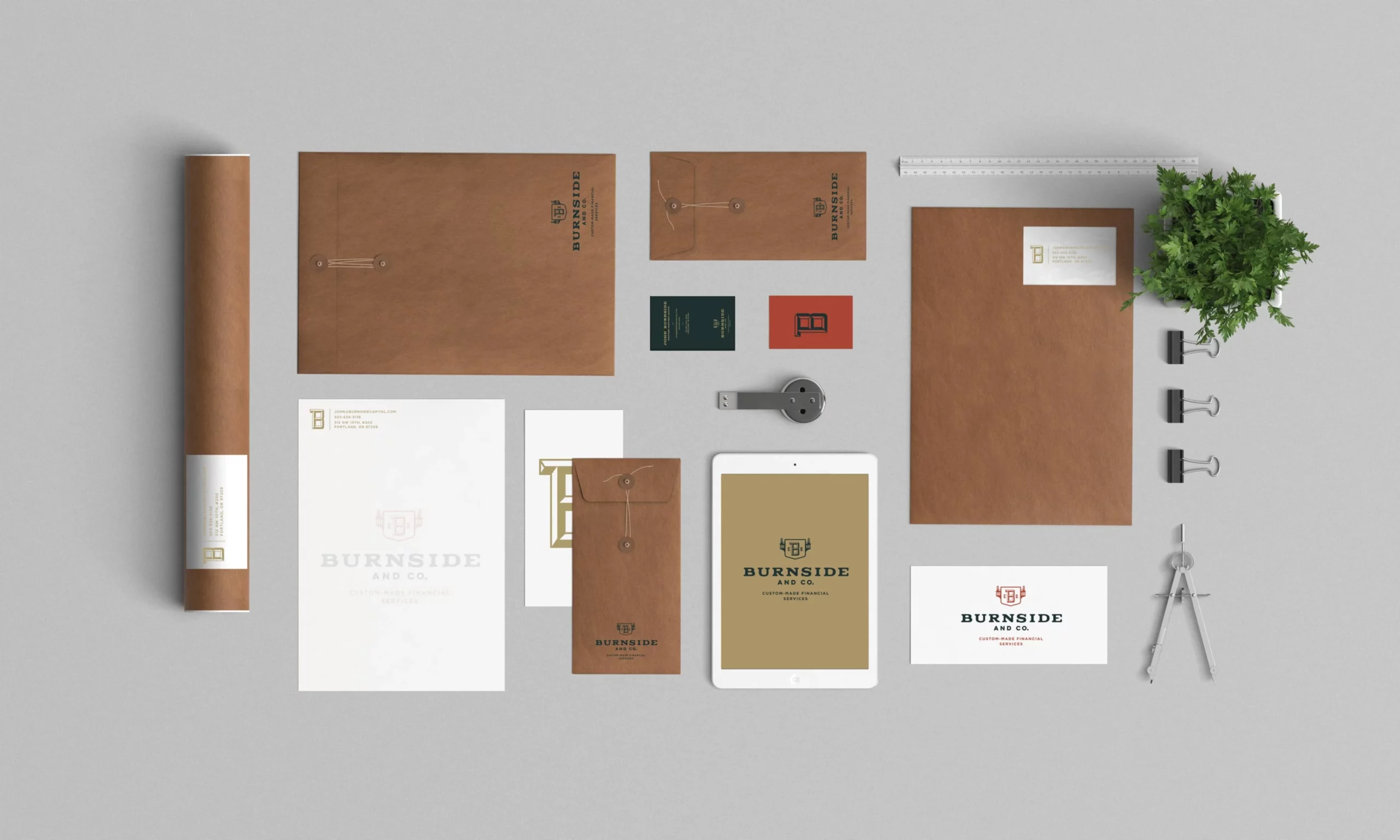
Burnside and Co. is a capital management company that believes in favoring the individual and their ideals through adaptable services & straightforward communication.
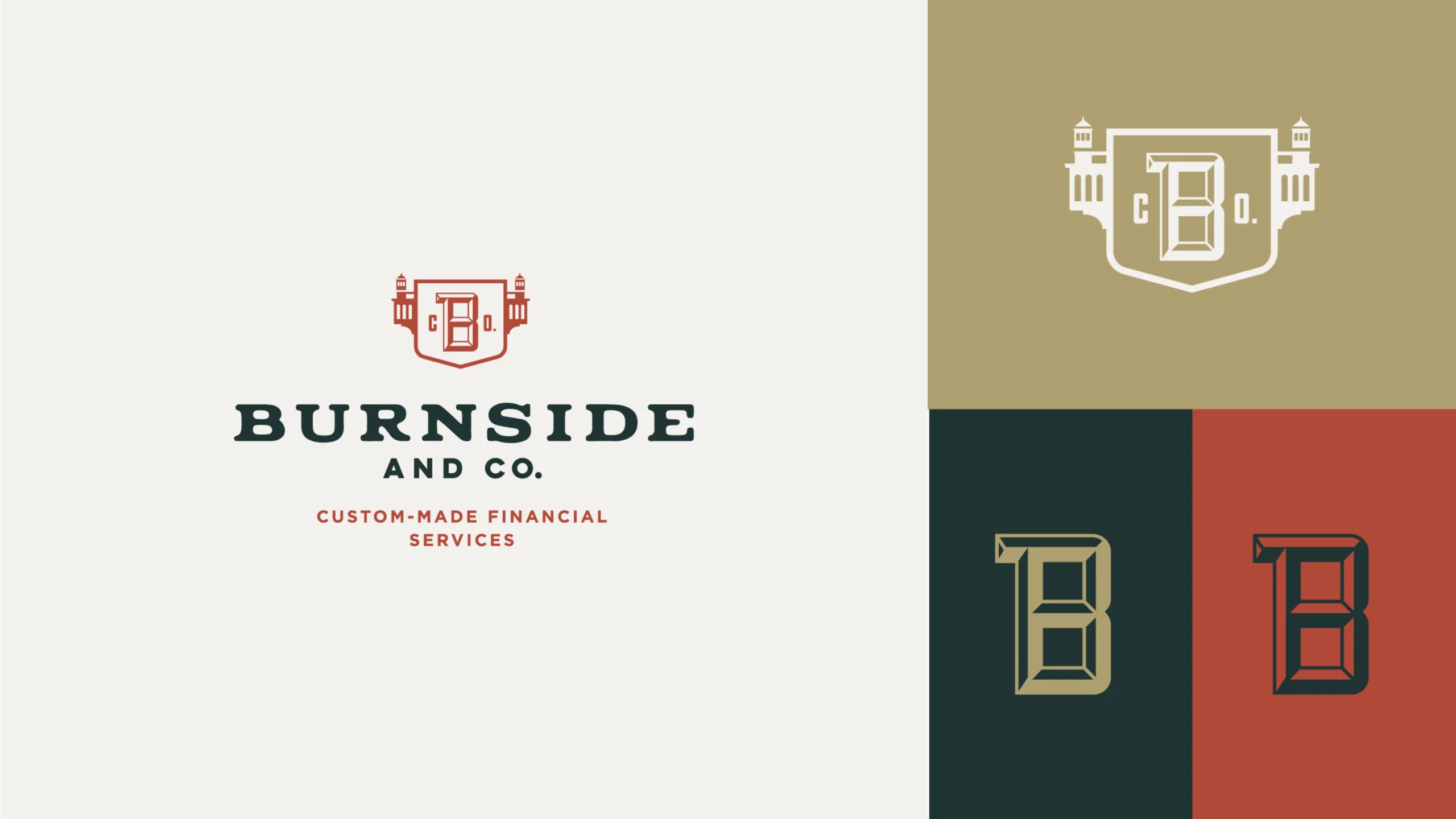
John Burnside’s last name just happens to be the same as one of the most famous streets and bridges in Portland, Oregon. His office also just happens to be on Burnside Street and just a few blocks from the iconic bridge. We felt it was only appropriate to incorporate the Bridge into his mark. John wanted a logo for his business that was both trustworthy and approachable.
We chose a crest which gives an old world feel, but with a modern treatment. We illustrated the recognizable lookout towers from the actual Burnside bridge and attached them to a shield. For the word “Burnside” we used a custom engraved serif with wide proportions and rounded the lettering to give the text a weathered feel. We then paired it with a more modern-looking sans serif. We chose colors from Burnside and Co’s historic brick building downtown.