Goal
Canvas needed a rebrand that would showcase the science behind their Fiber + Protein Shakes using great design and smart, accessible copy.
Services
Brand Strategy
Visual Identity
Packaging Design
Photography
Outcome
Natural foods stores visited
Protein shakes tasted
Articles about prebiotics read
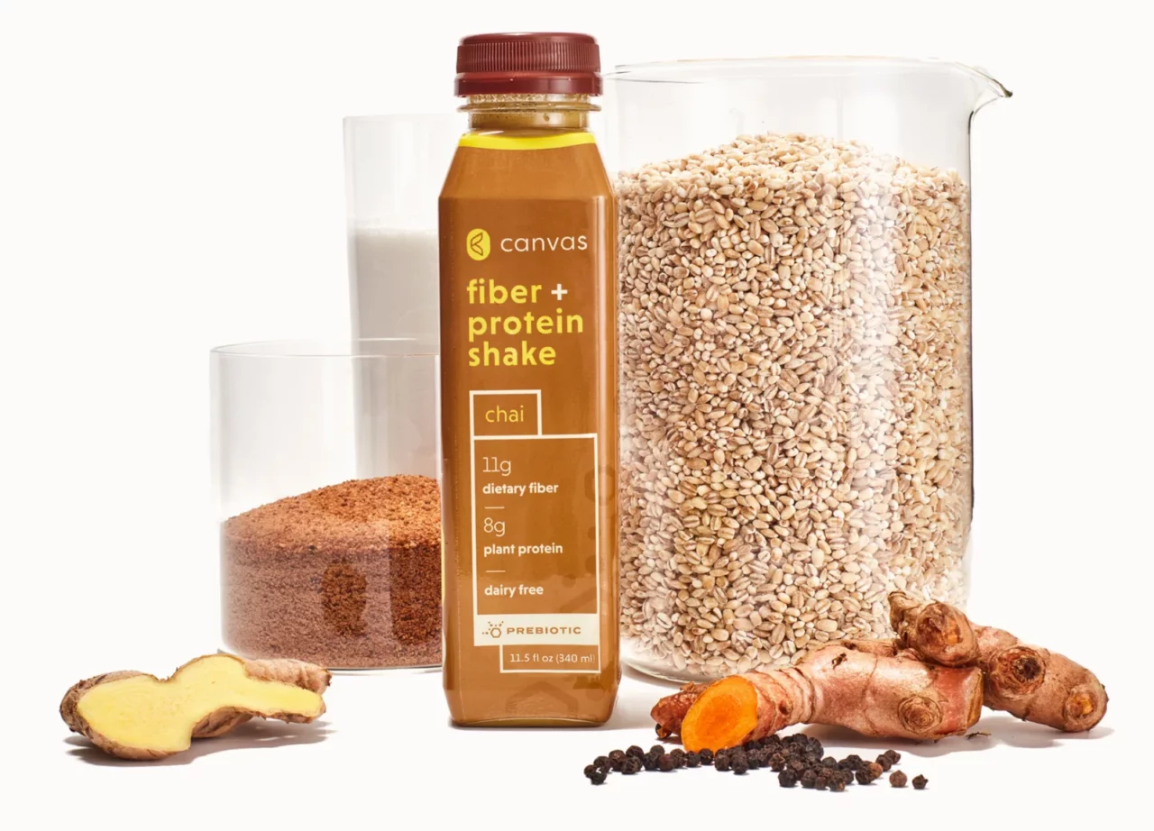
Canvas is a healthy, plant-based beverage made from saved grain. High in fiber and protein, it's an easy way to add key nutrition to a healthy diet.
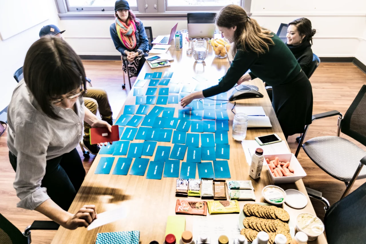
Canvas came to us with a tough proposition: complete a full rebrand and help them relaunch their health shakes in just three weeks. They needed to reexamine their positioning, their target customers, and the way they expressed their brand. We were thrilled to take on the challenge.
Brand Strategy and Positioning
Our work began with brand strategy, honing in on what made Canvas unique in a crowded beverage market. Canvas had previously focused their branding on plant-based sustainability. This is an important aspect of Canvas, but we found that further focus on the science of health would help Canvas reach a wider market. Many of their target customers were interested in digestive health and eager to learn more. Canvas’s branding had the opportunity to educate consumers about the links between prebiotic fiber, probiotics, and the exciting new science of microflora and digestive health.
Logo Design
Canvas’s new logo is a simple leaf-like C-shape that nods to their connection to barley and sustainable saved grain. It also evokes their commitment to plant-based nutrition. This logo is versatile and easy to use in an array of colors and circumstances. The simplicity of this logo also speaks to the way making simple changes in our habits (like adding a nutritious beverage) can optimize our health.

“Creating a graphic motif for prebiotics was challenging. We landed on an abstraction of fiber’s molecular structure for a visual language that’s simultaneously playful and academic.”
Renee Dimalla
Senior Art Director
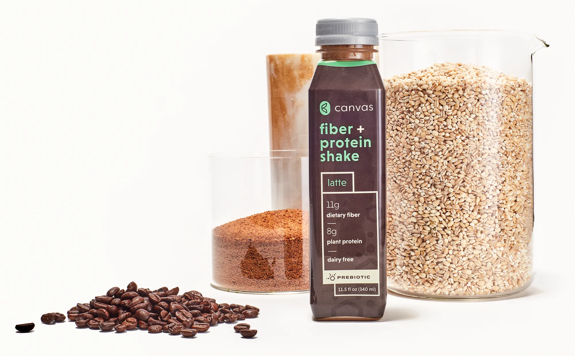
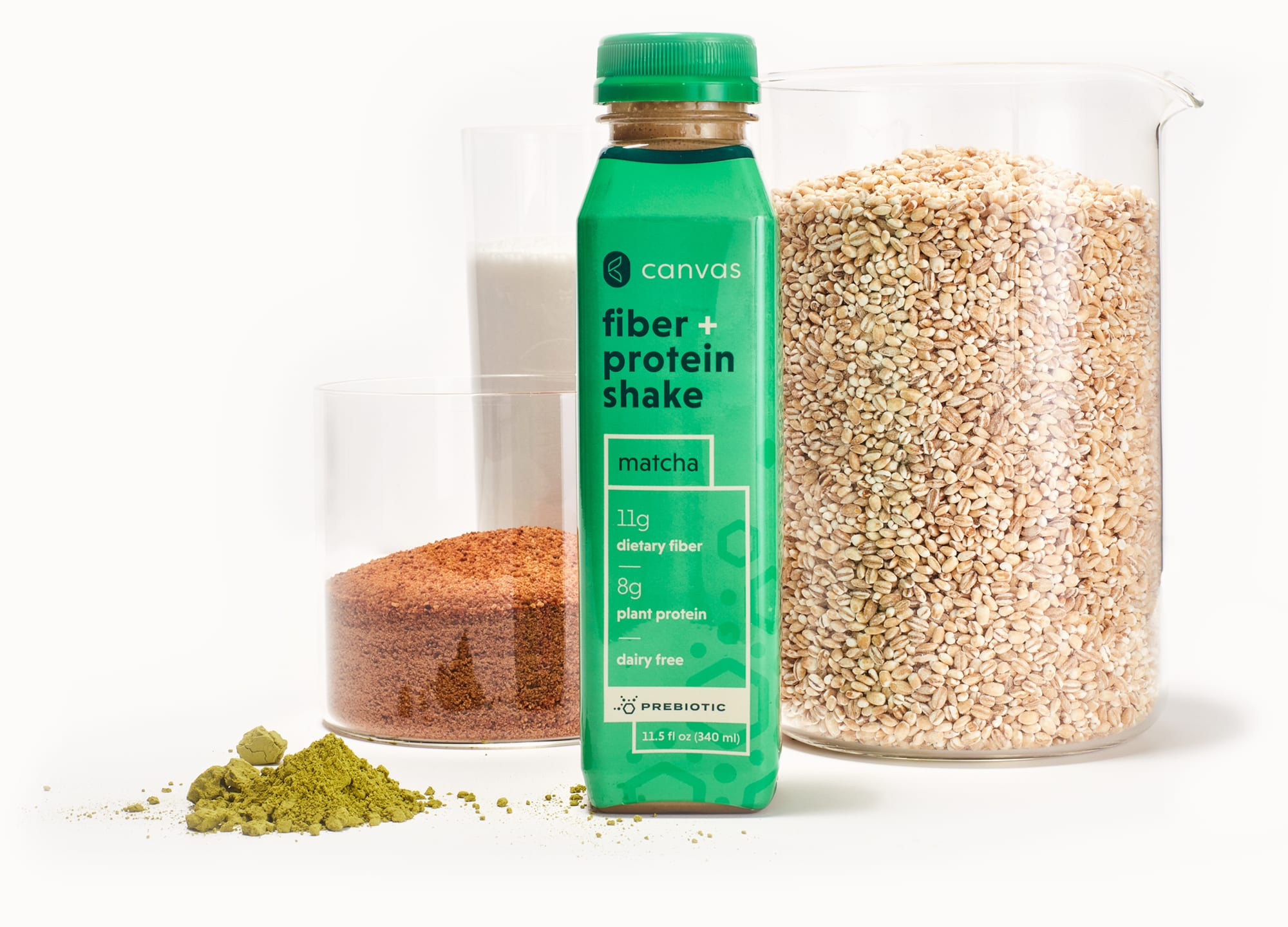
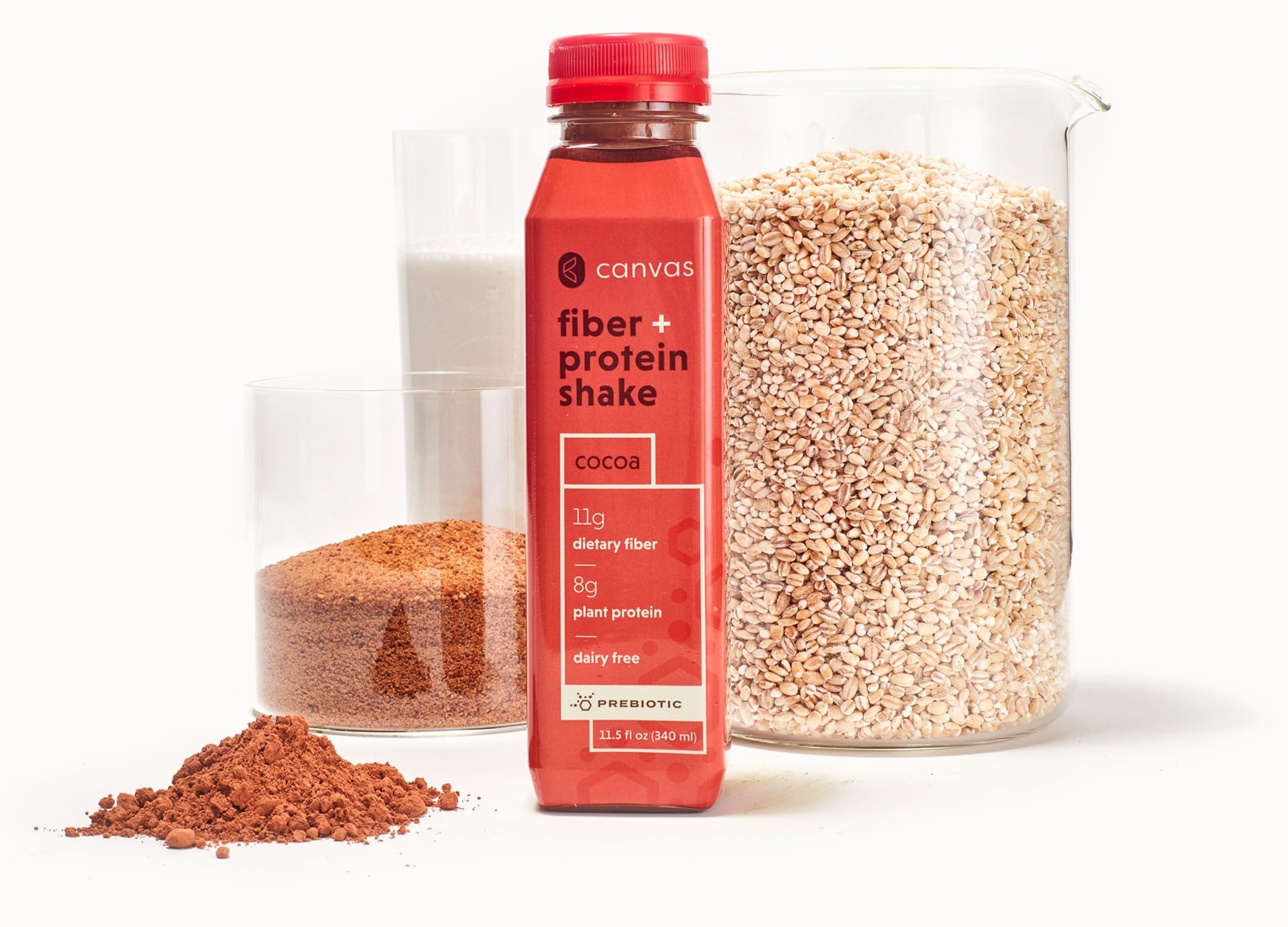
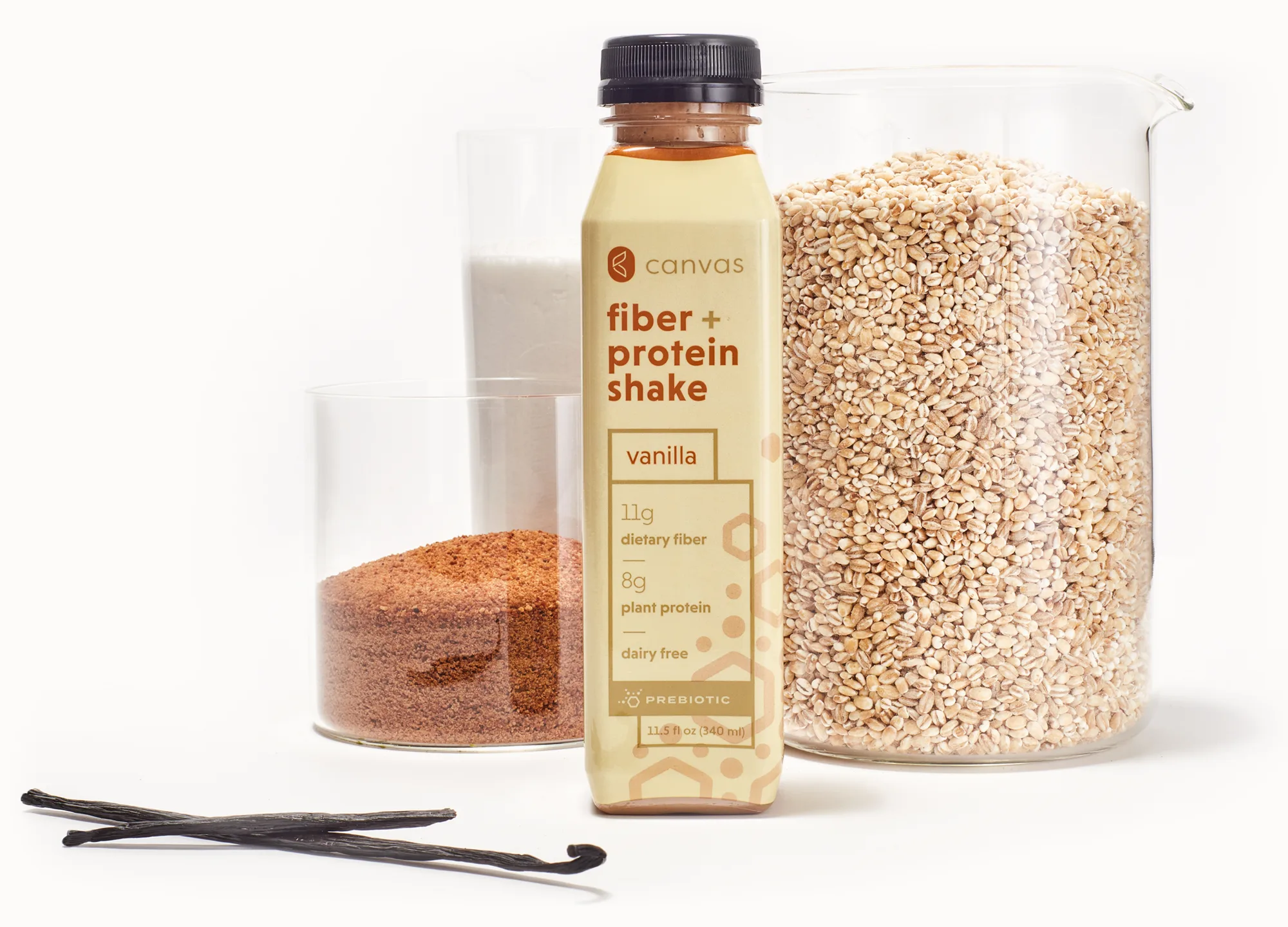
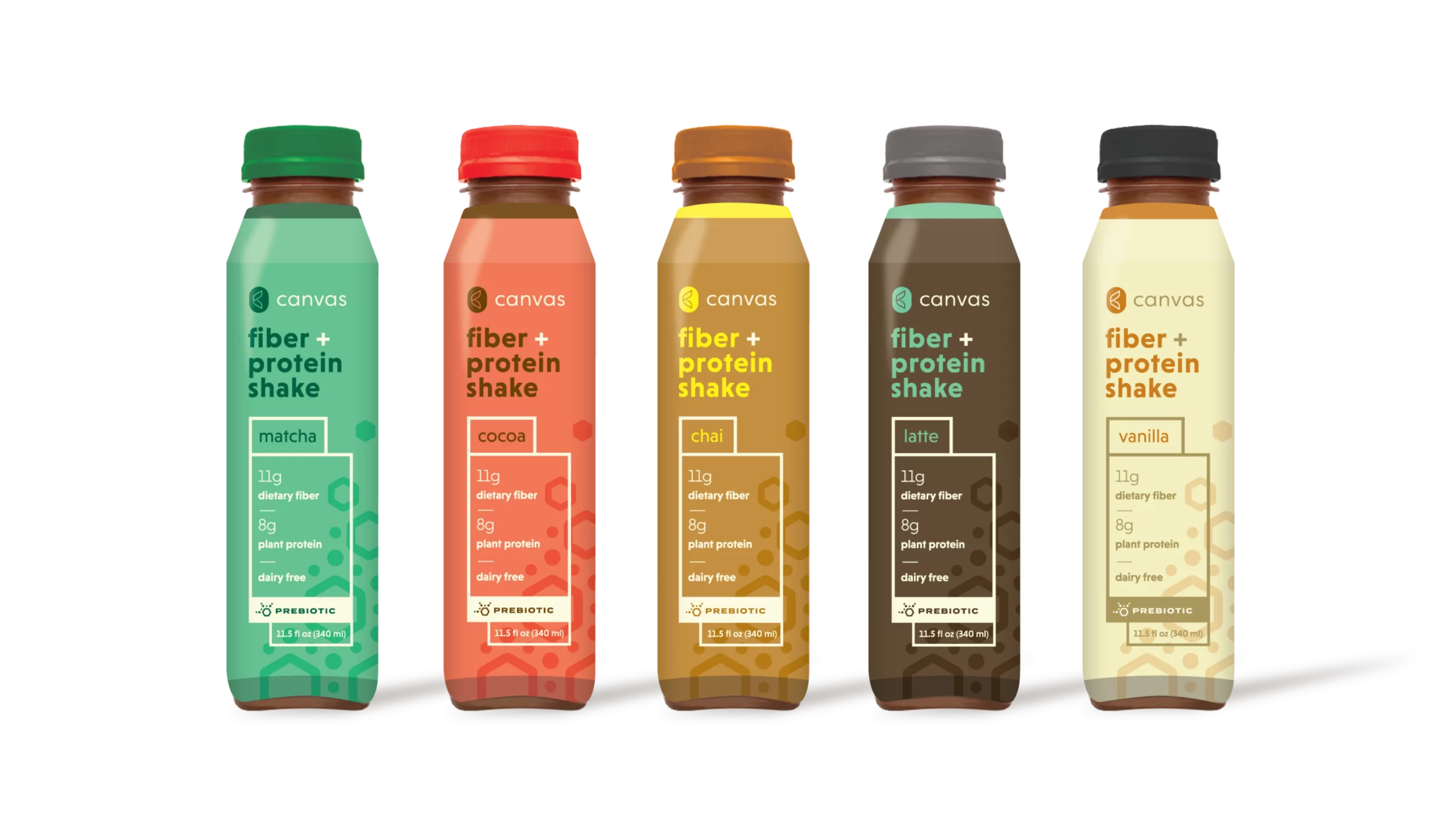
Packaging Design
Canvas’s new bottles embody this strategy of accessible science with patterns that evoke the microscopic shape of fiber molecules and graphics that illustrate the connections between fiber and good microflora. We also noticed that, among Canvas’s competitors, color was severely underused in packaging. Color could make Canvas feel more accessible and fun: a healthy, and enjoyable, daily ritual. We chose a different packaging color scheme for each of Canvas’s flavors to help consumers differentiate between them and to help Canvas stand out in the healthy beverage aisle.
From the Client
“Murmur has created world class packaging design – the designs themselves, have single-handedly played the most critical role in communicating our products’ value, and increased our ROI at least 1000%. They are great at nailing the ‘essence’ of a brand and company, discovering the nuances that create true differentiation in the marketplace.”
Jerek Lovey
CEO, Canvas

Copywriting and Style Guide
Finding the right voice for Canvas was an essential part of the rebrand. Through our branding workshops, we determined that Canvas’s brand personality should be that of a humanistic scientist, a mentor who would educate consumers in a caring and accessible way. We worked with Canvas scientists to create a communication style guide that could be used for future marketing endeavors. This style guide had to elucidate the Canvas voice and also determine and define the scientific terms that Canvas would use in future marketing materials. With this style guide and these subject experts, we created packaging copy that conveyed truly useful information to consumers about digestive health and the science behind it.