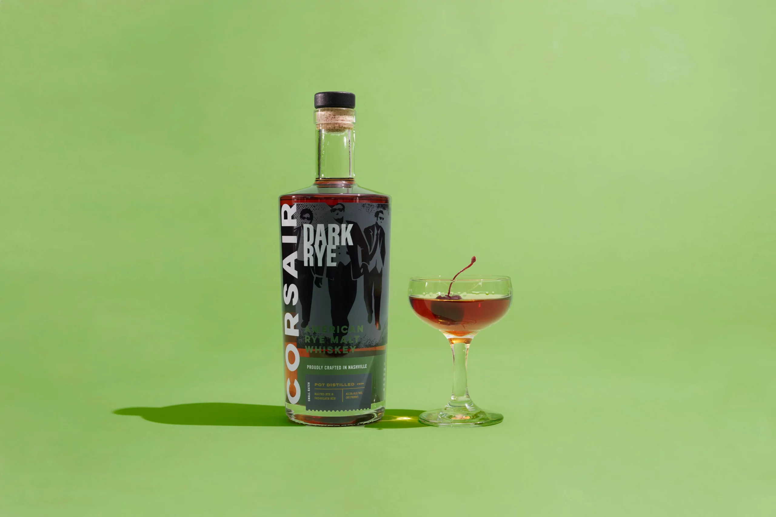
Corsair Distillery
Goal
The first craft distillery in Nashville since prohibition, Corsair’s new brand pays homage to its renegade roots.
Services
Packaging Design
Photography
With spirits that have been praised in publications like Food and Wine, Saveur, Imbibe, Whisky Magazine, Whisky Advocate, and the Atlantic, it was time to put a polished and modern face on this innovative distillery.

“Being truly original in the alcoholic beverage marketplace involves taking design risks to create something memorable. Honoring the existing brand and bringing out its best qualities has allowed Corsair to stand out on a back bar and in the liquor store.”
Renee Dimalla
Senior Art Director
Packaging
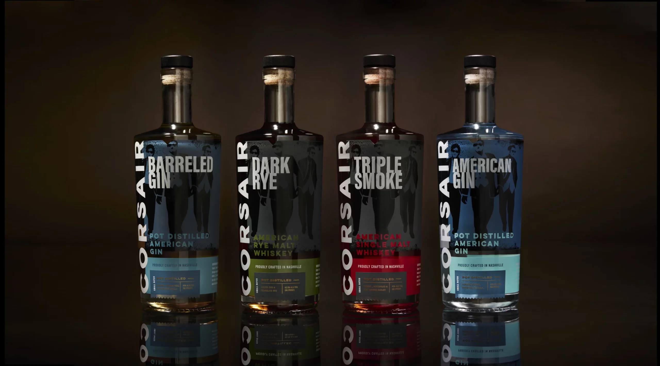
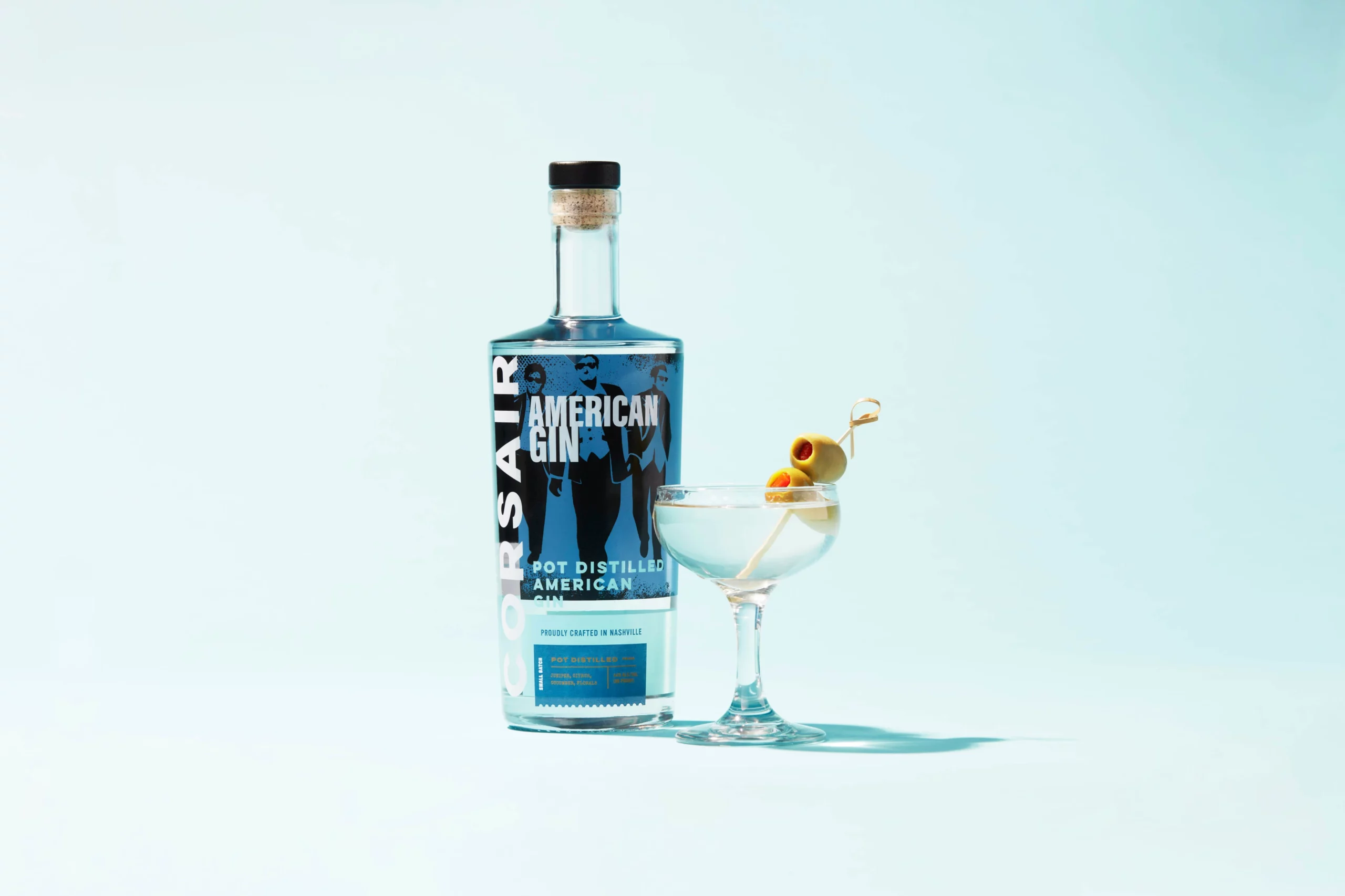
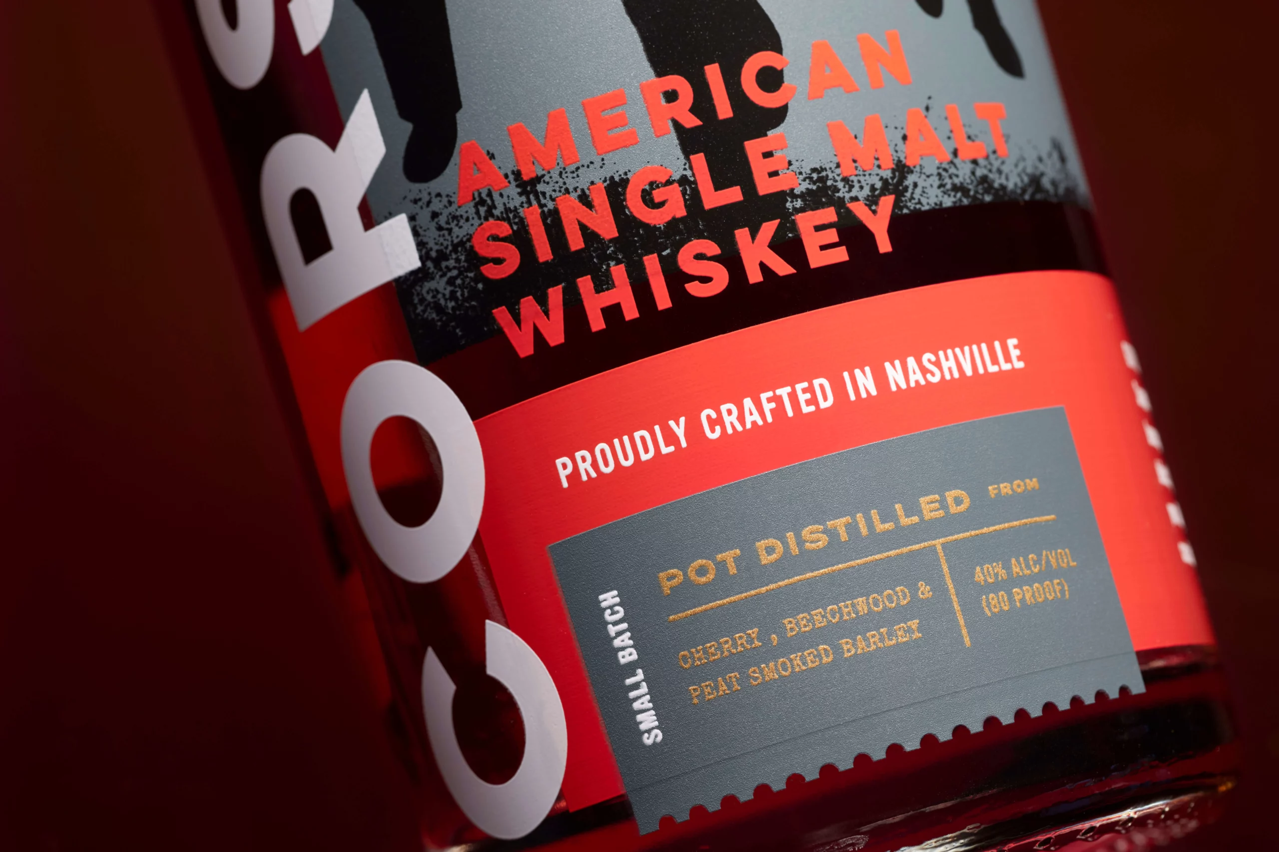
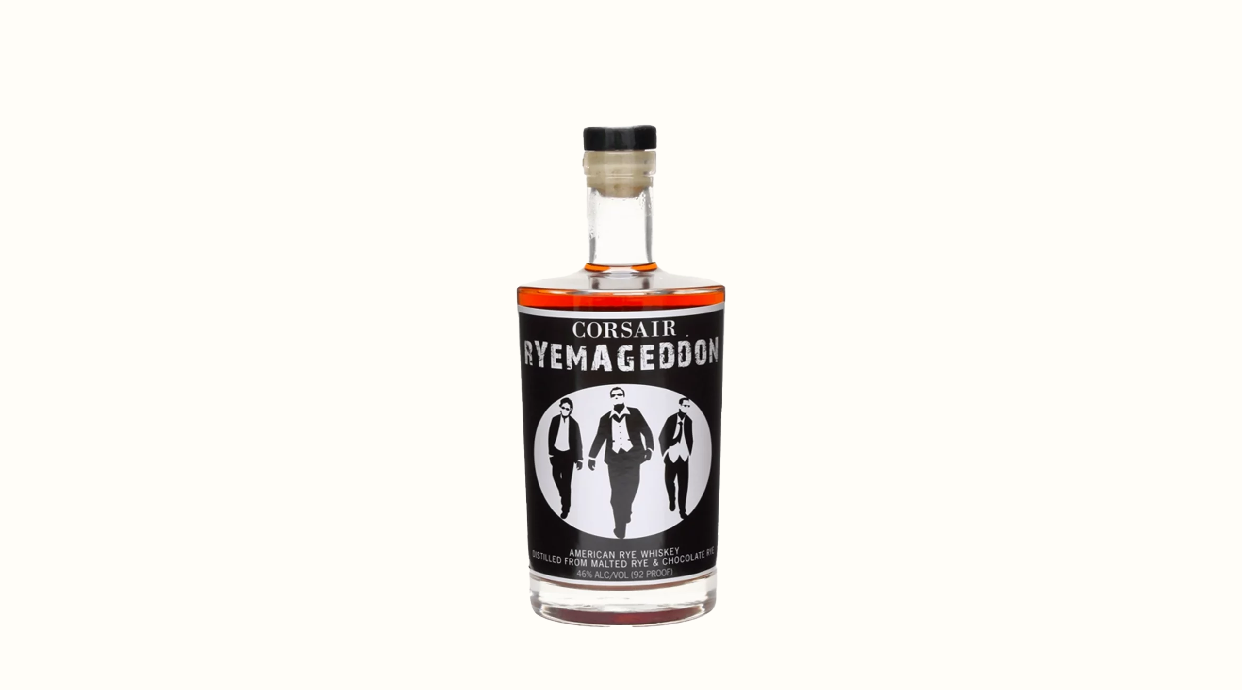
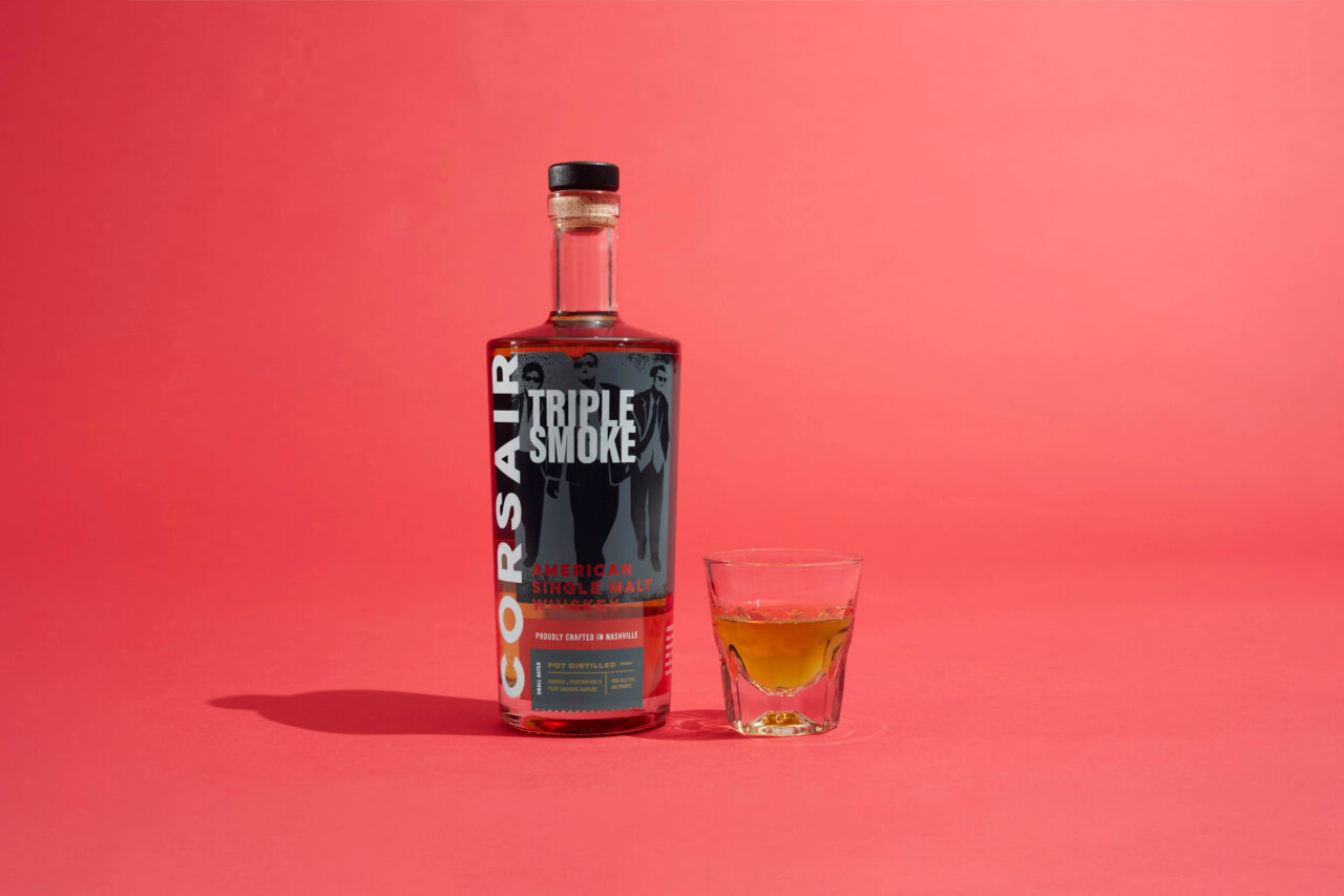
With a flagship whiskey, it’s important to stand out in that aisle of the liquor store. A walk down said aisle shows copious amounts of elegant foiling, ornamentation, “fauxhibition” design, and callbacks to Americana roots. Corsair set out to be a different brand from the beginning, and we set our sights on a modern and down-to-earth packaging line.
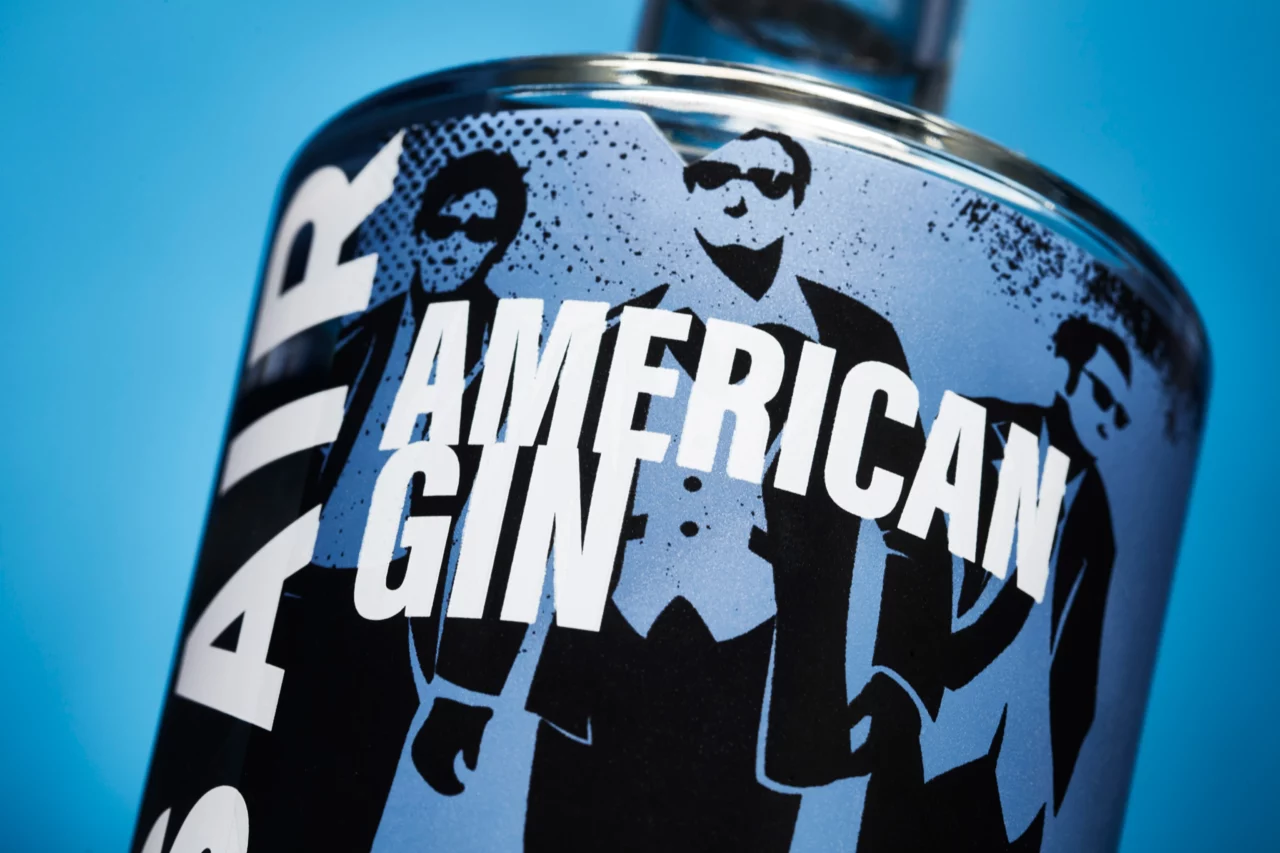
The bold vertical Corsair logo is the anchor point of the brand’s shelf presence, while the original “three guys” have been properly finessed and polished. Overlapping type and labels add an experimental quality to the brand, and a strongly color-coded line-up helps create product recognition.
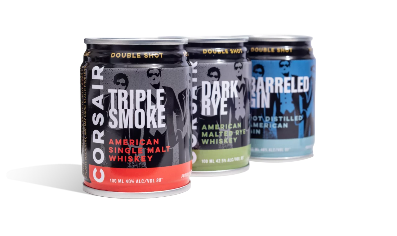
A Shot in a Can
Our design for the can line retains the ownable and unique qualities of the core liquor line but takes a more flavor-forward approach with heavier use of color.
Logo Evolution
Extracting the “three guys” emblem to use strictly as a graphic element and not in tandem with the wordmark was a critical move towards usability. Without a graphic mark, we chose to emphasize Corsair with a bold yet minimalist sans serif and a complimentary wide set sans for simplicity and clarity.