GladRags & XO Flo
Goal
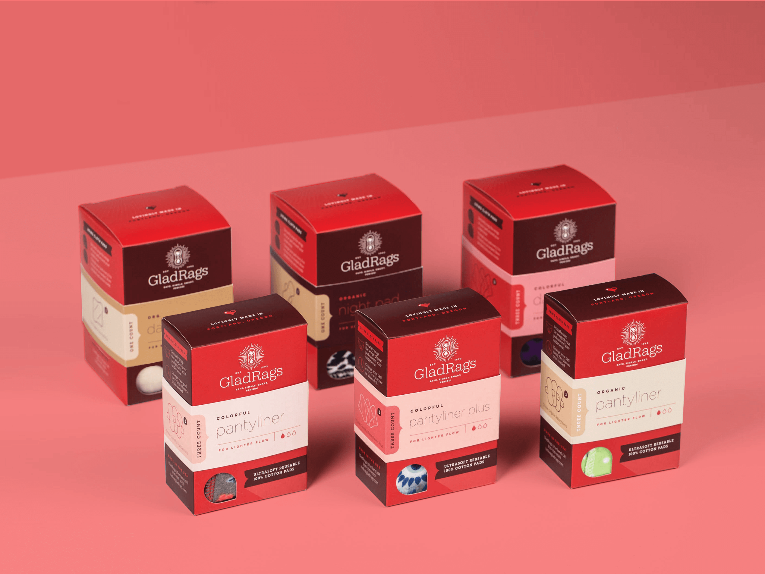
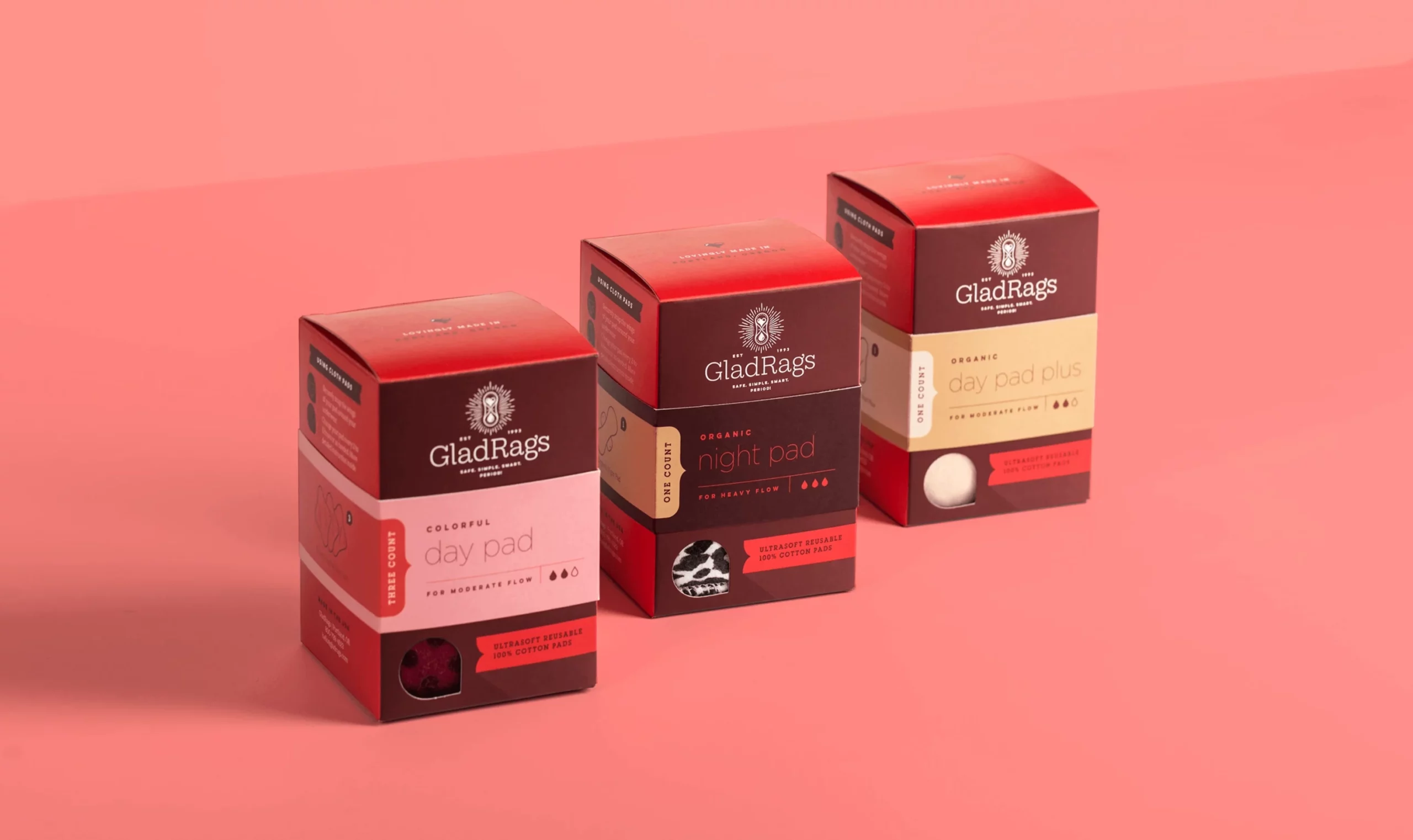
Both GladRags and XO Flo were looking for period-friendly packaging and stereotype-free branding.
Services
Visual Identity
Packaging Design
Photography
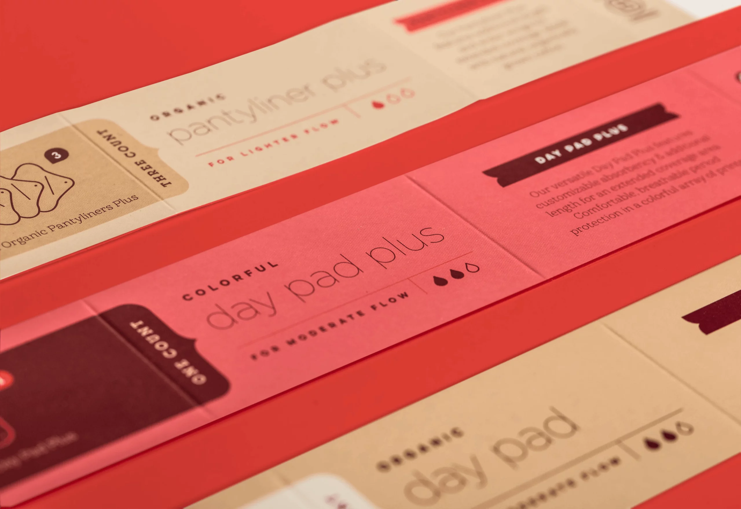
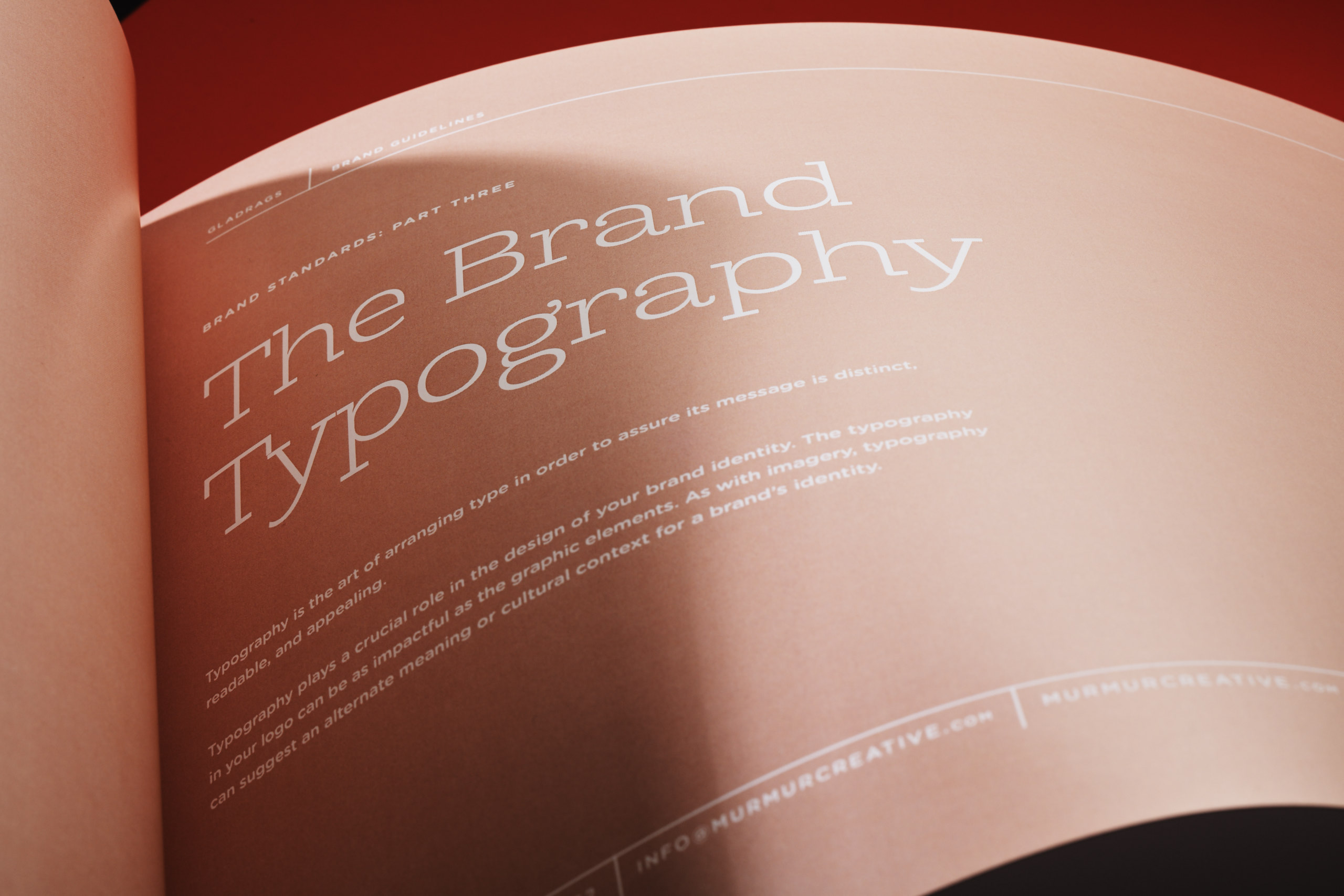
GladRags was founded in 1993 and its first logo invoked the somewhat traditional “moon time” imagery. With the new logo, we wanted to help GladRags step away from tired iconography and amplify the glory of common menstruation instead.
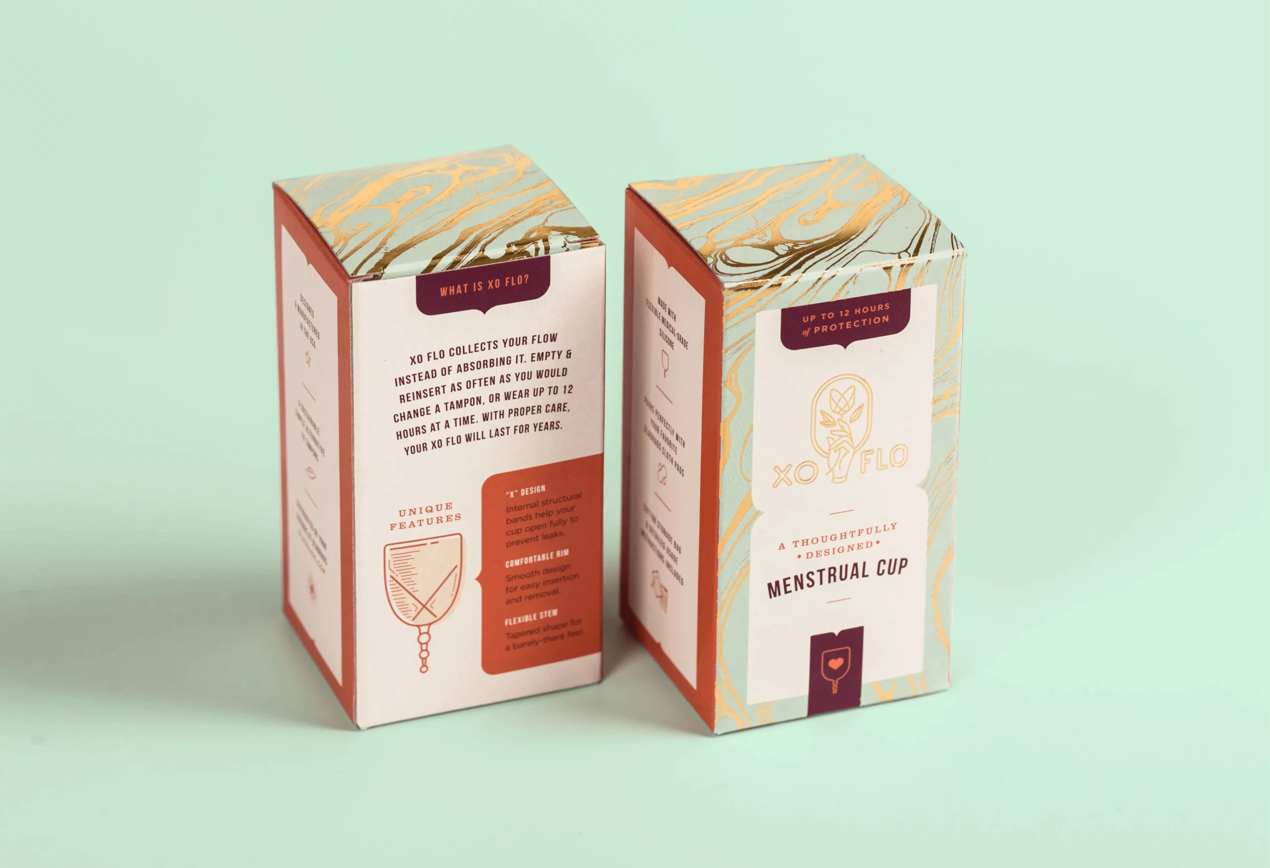
XO Flo is a new, state-of-the-art silicone menstrual cup designed with comfort and ease in mind. The cup was launched in early 2017 under the GladRags family banner. Because it was a new design and logo (opposed to a refresh) we were able to go a little more “out there.” The unique, feminine boxes move away from traditional, more medical menstruation packaging of the past. What we developed has been called “an absolute period changer,” among other fabulous things.
Together, the XO Flo + GladRags combo is the ultimate progressive monthly package.
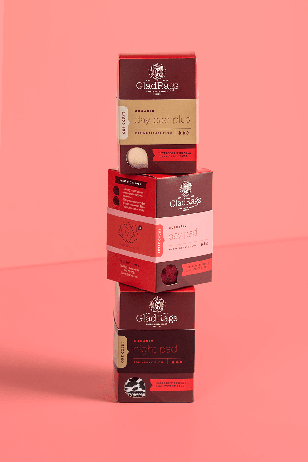
“Working with clients that are proud of what they do and brave in their design choices is really rewarding. It's not often that you get to break taboos through branding.”
Renee Dimalla
Senior Art Director
From the Client
“Our new branding and packaging took our business to the next level, and everyone comments on how perfect it is! Murmur was super fun to work with, and their designers were quick to understand exactly what we needed. Choosing to work with Murmur was one of the best decisions I’ve made for GladRags and XO Flo!!”
Tracy Puhl
President/Owner of GladRags and XO Flo
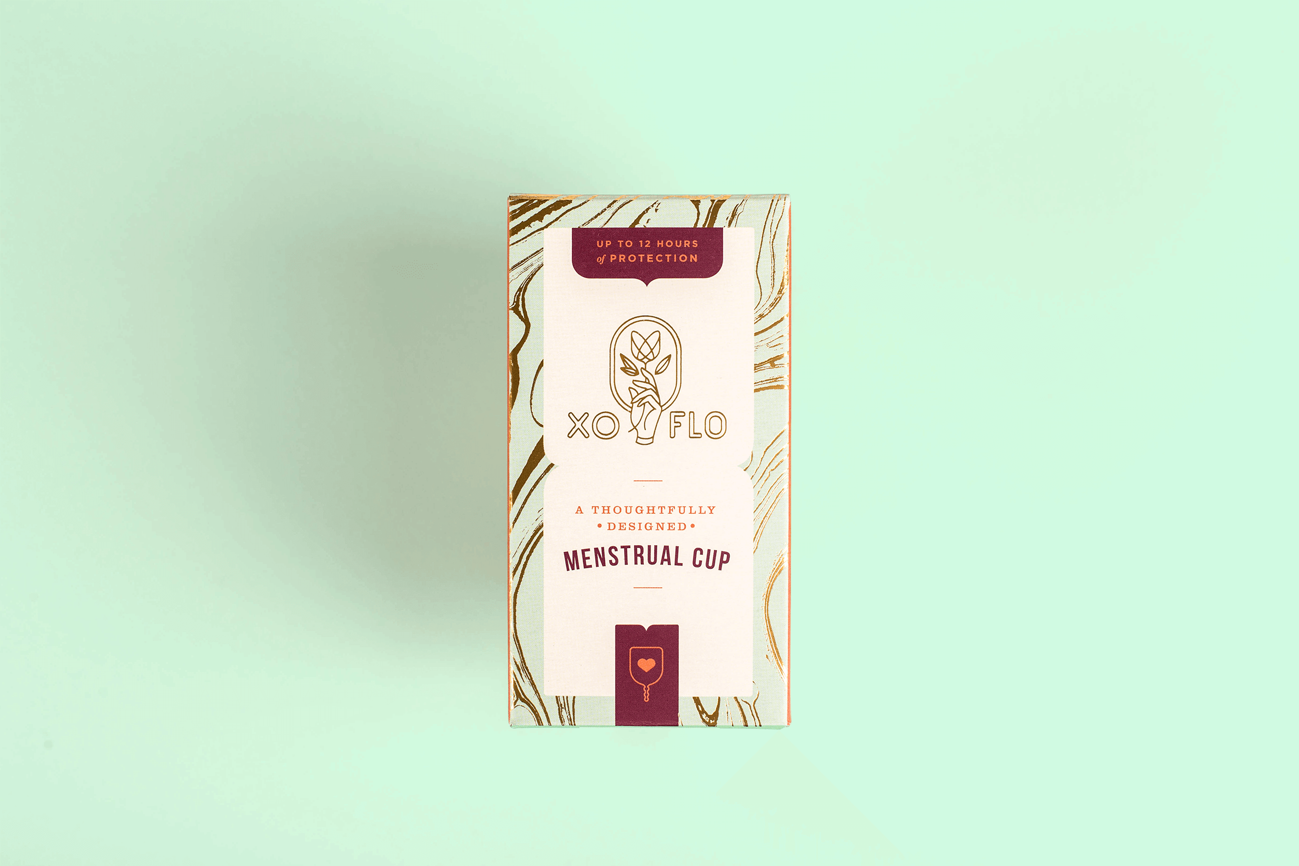
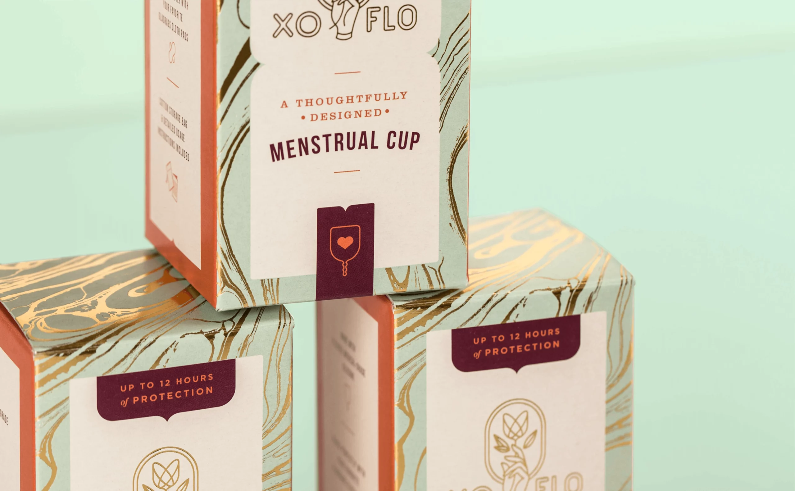
“We wanted to steer clear of the pharmaceutical aesthetic of feminine hygiene packaging on the whole. The stigma surrounding menstrual cups is that they're difficult and messy to use, and sometimes the natural conclusion is to compensate for that fact by designing packaging that's overtly minimal, girly, or just plain sterile. We wanted this packaging to feel thoughtful, upbeat, and unique by comparison.”
Renee Dimalla
Senior Art Director
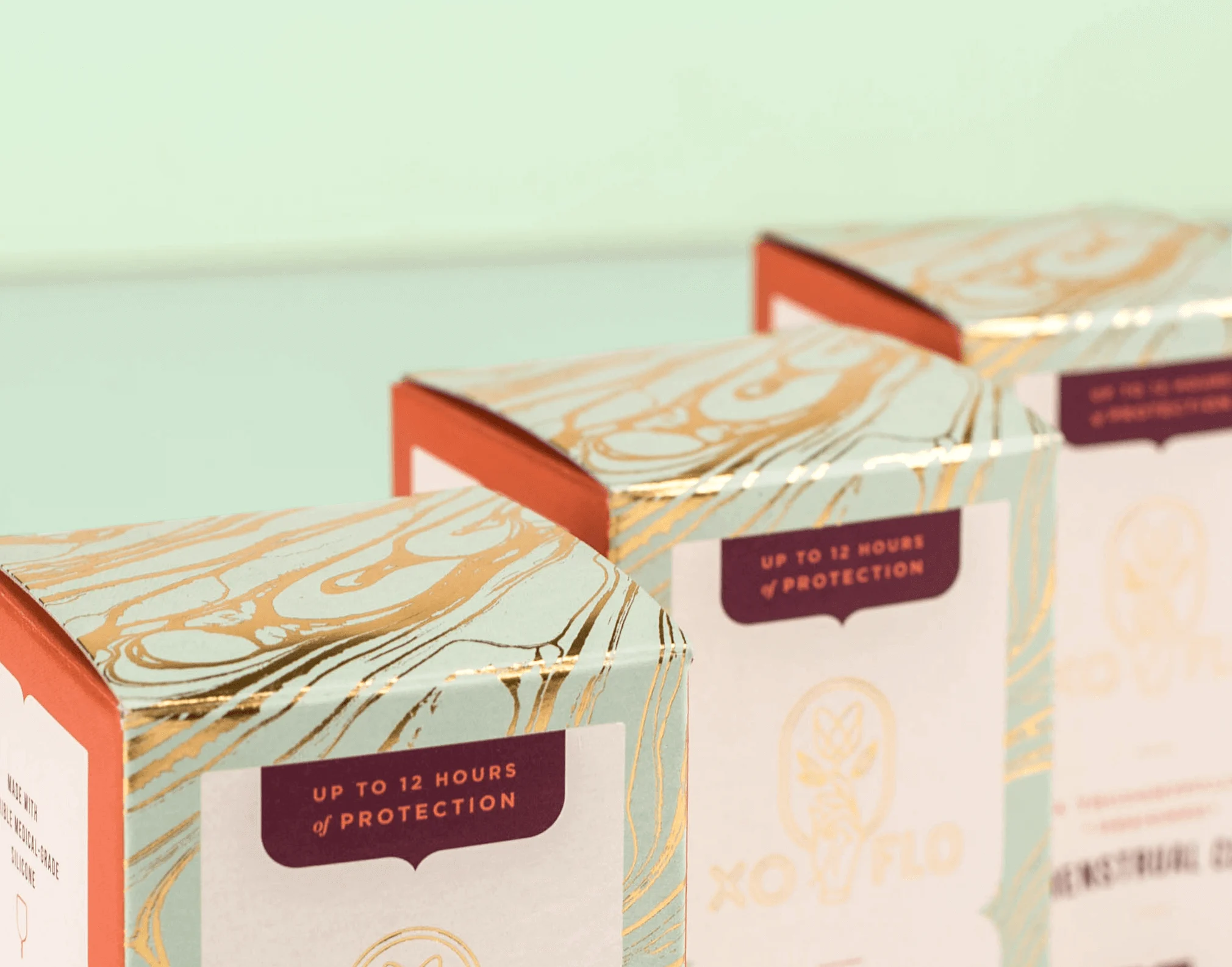
“When I heard @gladragspads had launched their own cup, XO Flo, I was like, MAMA NEEDS! It’s so comfortable to wear and the design and packaging are beyond dope! ”
@vegan
Instagram User
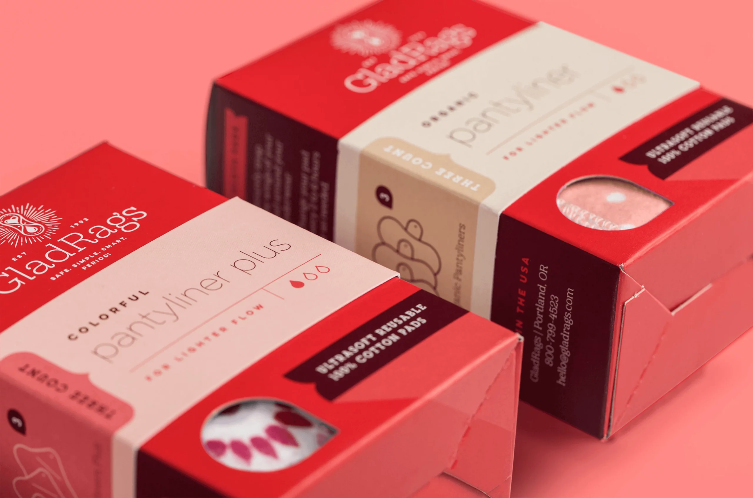
“I just received my new cup from @gladragspads!!! I’m really excited about trying it because I’ve only used one menstrual cup brand till now and it’s completely different from this one. The packaging is so f****** beautiful! Congrats @gladragspads, you’ve made a piece of art for our vagigis”
@anoncrafts
Instagram User
