- ... / Work / Jama Software
Jama Software
Goal
Jama Software was looking for bold branding and a powerful internal launch strategy. We knew just what to do.
Services
Visual Identity
Website
Jama is a software company that specializes in predictive product development. After the acquisition of a company, new software offerings, and a venture capital investment, Jama wanted to find new ways to communicate the growth of their product offerings and their overall philosophy to both customers and employees.
Brand Strategy
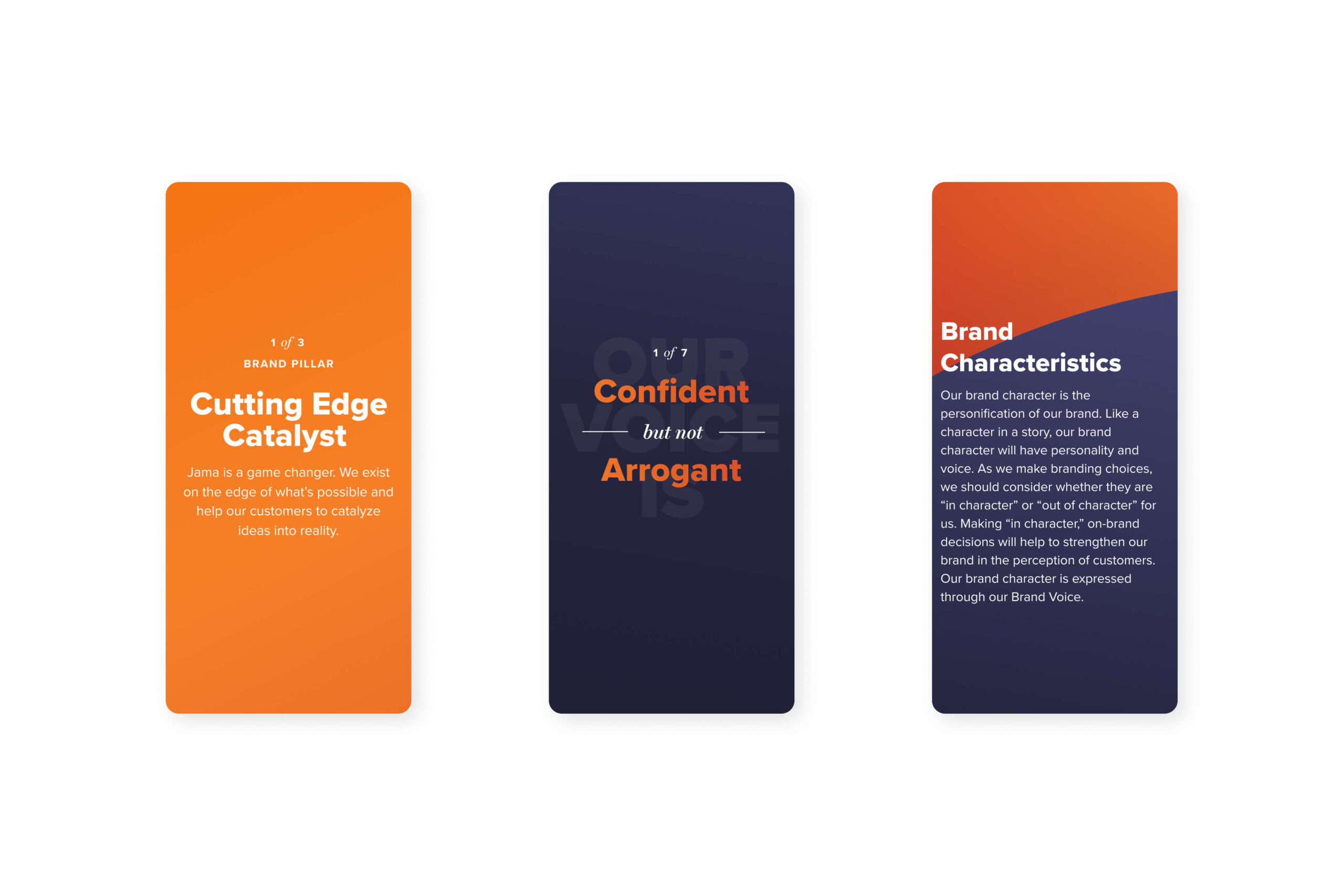
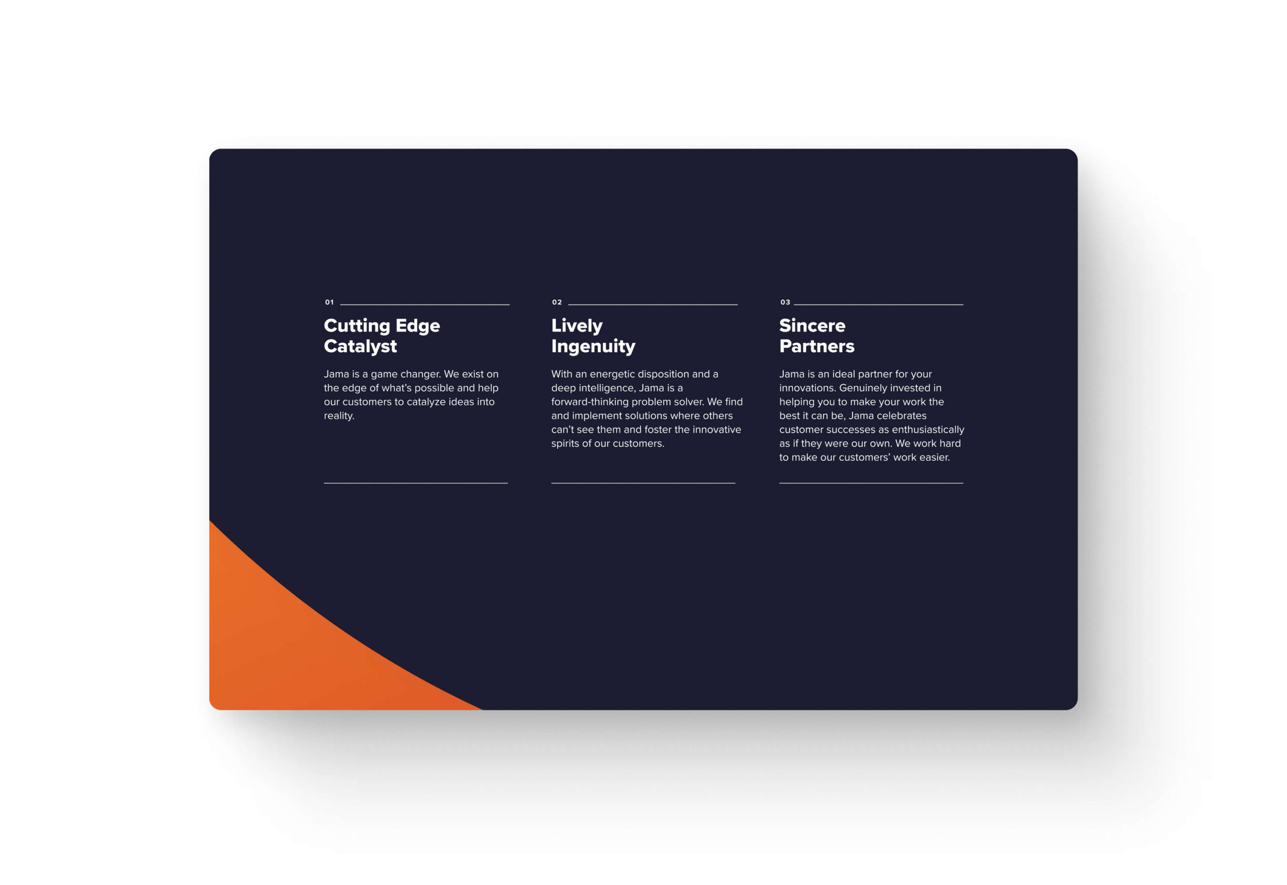
We began with a series of in-depth brand strategy workshops to discover what Jama meant for stakeholders, how they’d thought of themselves before, and what direction they wanted to move in. Through these workshops, it became clear that, in order to embody their predictive product development, Jama needed to get bold. We created a brand strategy guide that placed Jama at the cutting edge with powerful language and strong brand characteristics.

“Jama wanted a guide to help them to be more bold in their copy while also maintaining the trusted, knowledgeable elements of their brand. We led them through a workshop and wrote clear guidelines to help them balance these two aspects of their voice.”
Angela Larisch
Strategy Director
Logo Design
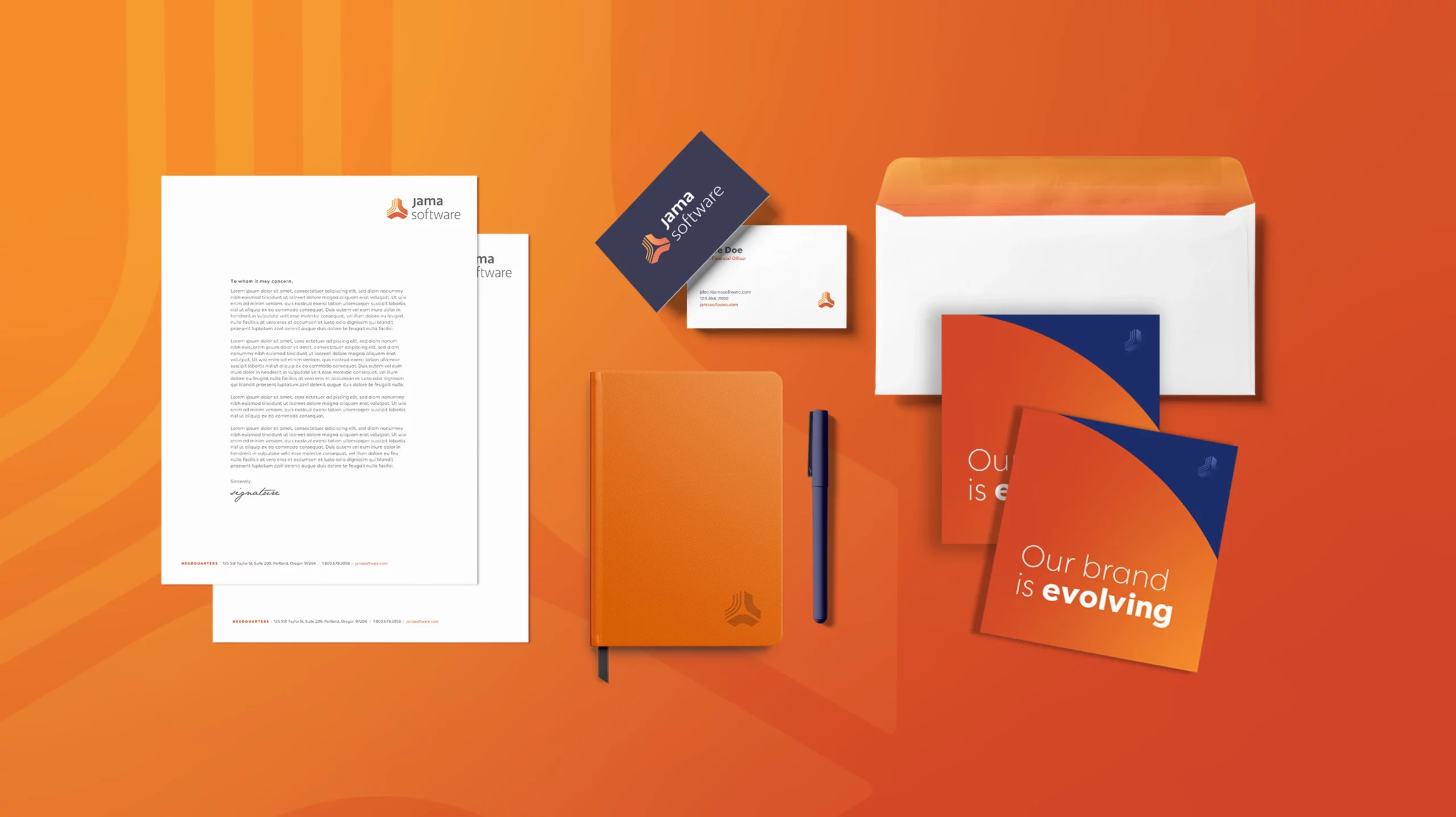
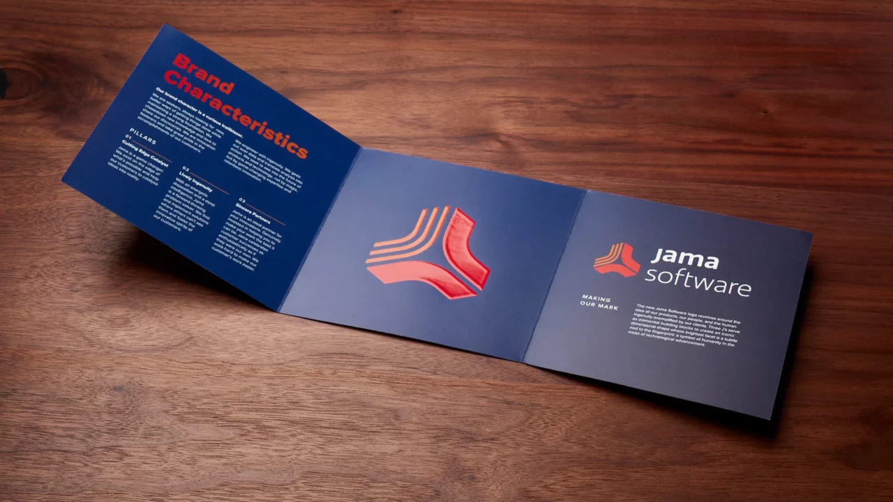
Our designers took Jama’s new strategy and ran with it, creating a series of beautiful logos: three for the sub-brands and one overarching parent mark. The main logo creates an abstract shape from the Jama J, each point coming together to catalyze the final mark. Representing the way that Jama helps clients to bring together the many components of complex processes, the logo signifies the innovation and collaboration that lead to new discovery. The fingerprint inspired pattern symbolizes the human touch Jama brings to each project and the relationship they build with customers.
Sub-Brand Logo System
Each sub-brand logo features Jama’s signature orange and builds an abstract shape that represents the key features of each product. For Jama Connect, we focused on bringing collaborators together in order to create. Gaining insight from an overarching view is one of the main components of Jama Analyze, which we represented as the peak of a graph-like shape. The intertwining Jama Services logo mimics the braided workflow of smooth collaboration and trust. Together, this family of logos creates a sense of warmth and innovation.

Voice & Tone
Jama already had a series of guidelines for copywriting, but they needed these to be tied into their overarching strategy. Through workshops, we pinpointed key areas of voice and tone that helped to hone Jama’s brand character. From this, we created a series of guidelines to help Jama’s copywriters maintain a strong and consistent brand voice across all communication platforms.

“It was exciting working with such an influential tech brand. It was very important to create an iconic and versatile brand system that would grow with the company.”
Andrew Bolton
Owner & Exec. Creative Director
Internal Launch
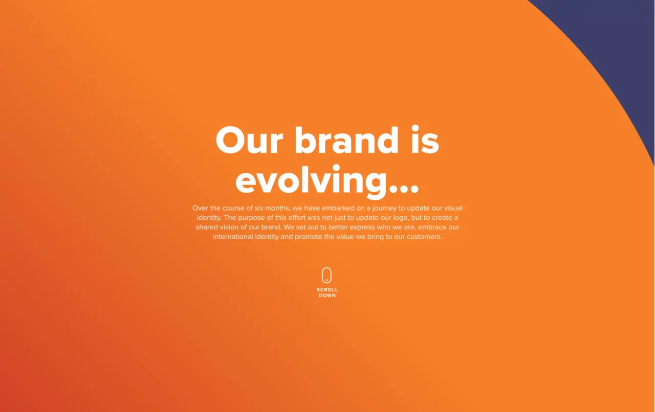
New branding is exciting, and Jama needed a fun way to reveal the new logos and strategy to employees. As a company with offices in both the U.S. and Amsterdam, Jama wanted to be sure that their branding was seen by their global audience. In order to introduce the new branding company-wide, we created an internal launch strategy that included an internal website that would reveal brand elements over the course of several days before revealing the new logos. This allowed anticipation to grow as each new element of the brand was revealed and also created a convenient way to share the branding with a large number of people. Employees also received a trifold brochure with all the brand elements and a beautiful branded tumbler.

“Up to this point, Jama Software had always made it a point to focus and celebrate their clients in their communications, instead of talking about themselves. Our brand strategy process helped them to solidify who they were as a company, and how to most effectively communicate that to a global audience. We were impressed with Jama's culture of collaboration, and how they value input from all of their stakeholders.”
Mary Breslin
Exec. Director of Client Services