Kurisu International
Goal
Kurisu was looking for a minimalist website to feature their beautiful gardens and embody their philosophy of nature.
Services
Website Design
Website Strategy

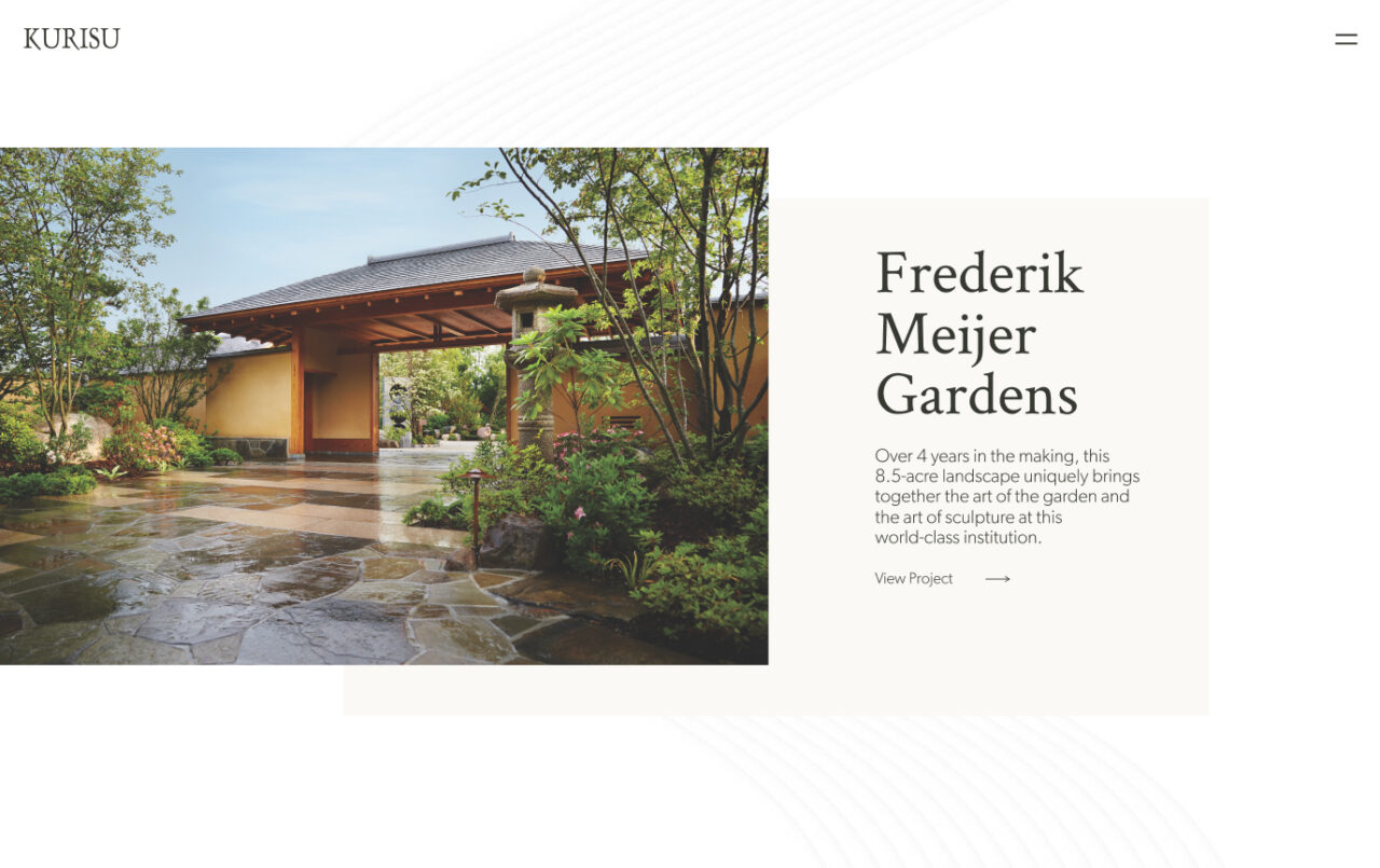
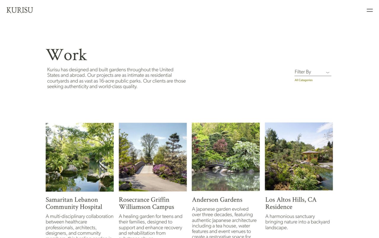
Project Pages
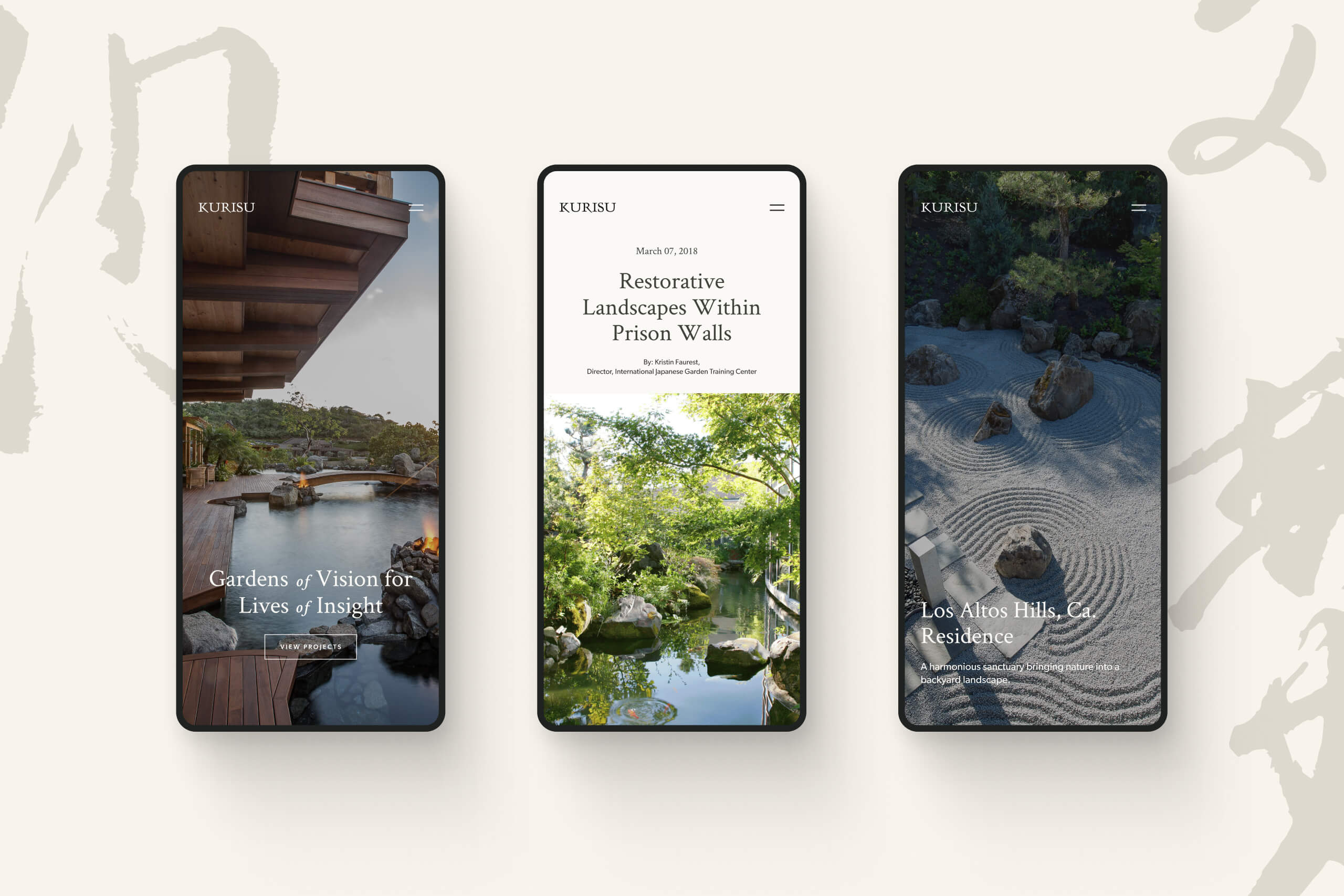
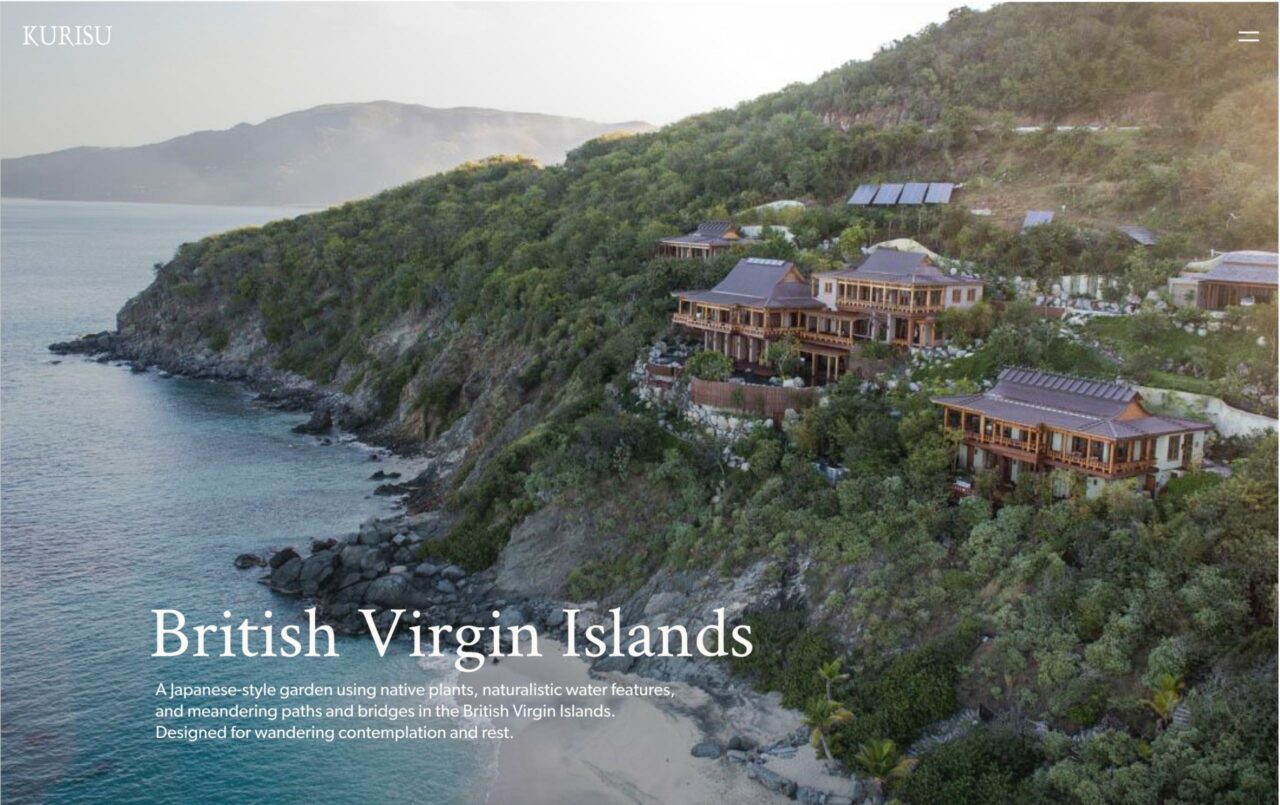
Kurisu wanted to create an immersive experience for users so a visit to the site could feel like a digital wander through their gardens. We designed a flexible page layout for their projects so that each could feature images, text, and videos that meandered down the page, encouraging a sense of flow and calm.
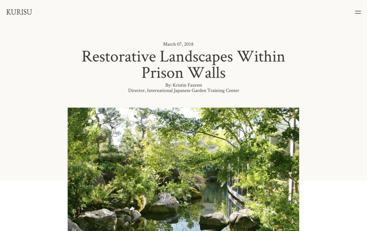
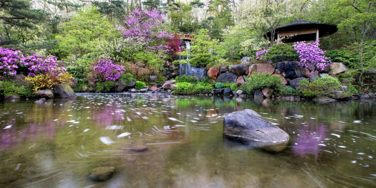
Dedicated to building restorative spaces, Kurisu believes in the essential qualities of nature to individual and societal wellbeing. Their gardens have served as unique landscapes for health facilities, public parks, private residences, and more.
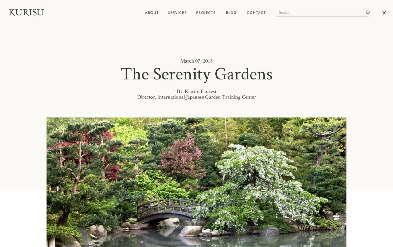
In order to heavily feature Kurisu’s beautiful gardens and their stunning photographs, we designed a minimalist website that fostered an immersive experience. From the homepage video to the custom design flourishes, each element of the site is meant to convey a sense of flow and create a reflective user experience.
Hidden Navigation Bar
Most pages feature a gorgeous header image or video at the top that draws viewers into the experience of nature. We needed to allow these images to capture the viewer’s full attention without immediately making them think about where to click next.
In order to do this, we created a subtle navigation bar that could be opened and closed by the user themselves. This is something we usually discourage on websites that are sales focused or dedicated to navigating users through the site to specific information. But because Kurisu’s site prioritizes experience, hiding the navigation bar so that users could open it when they were ready to move on was the perfect solution.

“It was very exciting working with a company that values art and design so highly. Our strategy sessions involved in-depth conversations about concept, content, and their brand.”
Andrew Bolton
Owner & Exec. Creative Director
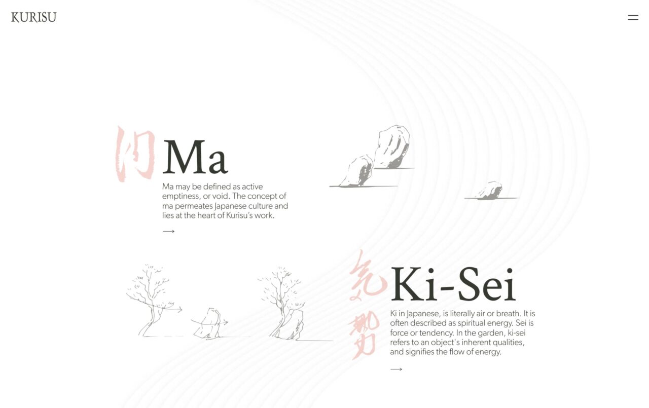
Design Flourishes
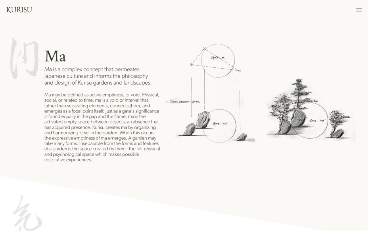
Inspired by Kurisu’s zen gardens, lines curve through pages, creating a meandering tone that leads users through the site. Pages end in a surprising, hand drawn blue flower that draws attention to the Healing Gardens page, espousing Kurisu’s restorative nature philosophy. Hand drawn images from Hoichi Kurisu’s notebooks appear on a variety of pages to illustrate Kurisu’s garden philosophy and add a personal touch.