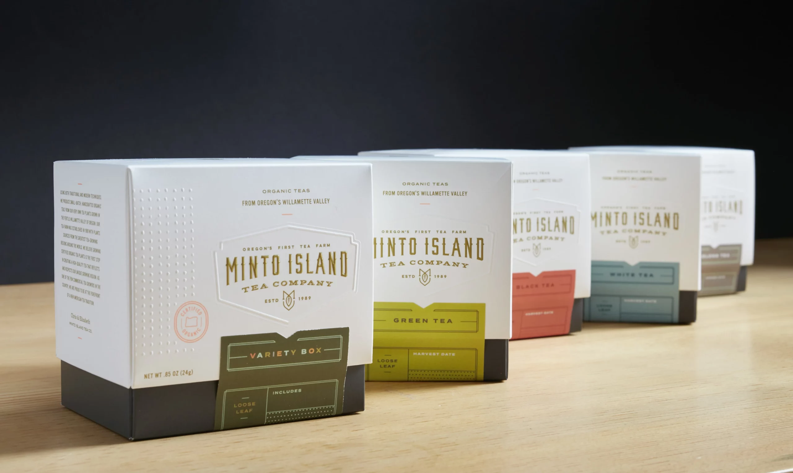
Minto Island Tea Company
Goal
Minto needed a new visual identity and packaging that showcased their artisanal Oregon-grown tea.
Services
Visual Identity
Packaging Design
Photography
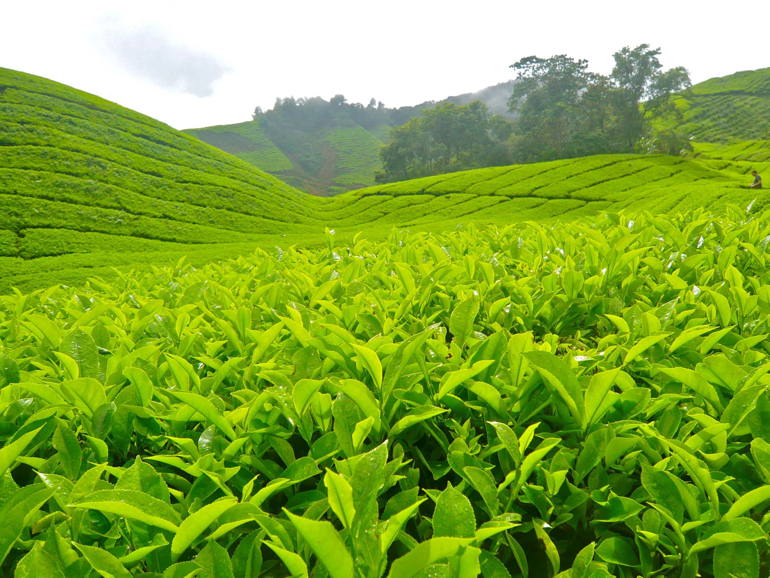
Oregon's First
Minto Island is on the forefront of the budding U.S. tea industry and is Oregon’s first tea grower. A premium tea grown with great care in small batches, Minto has operated in the Willamette Valley since the 1980s.

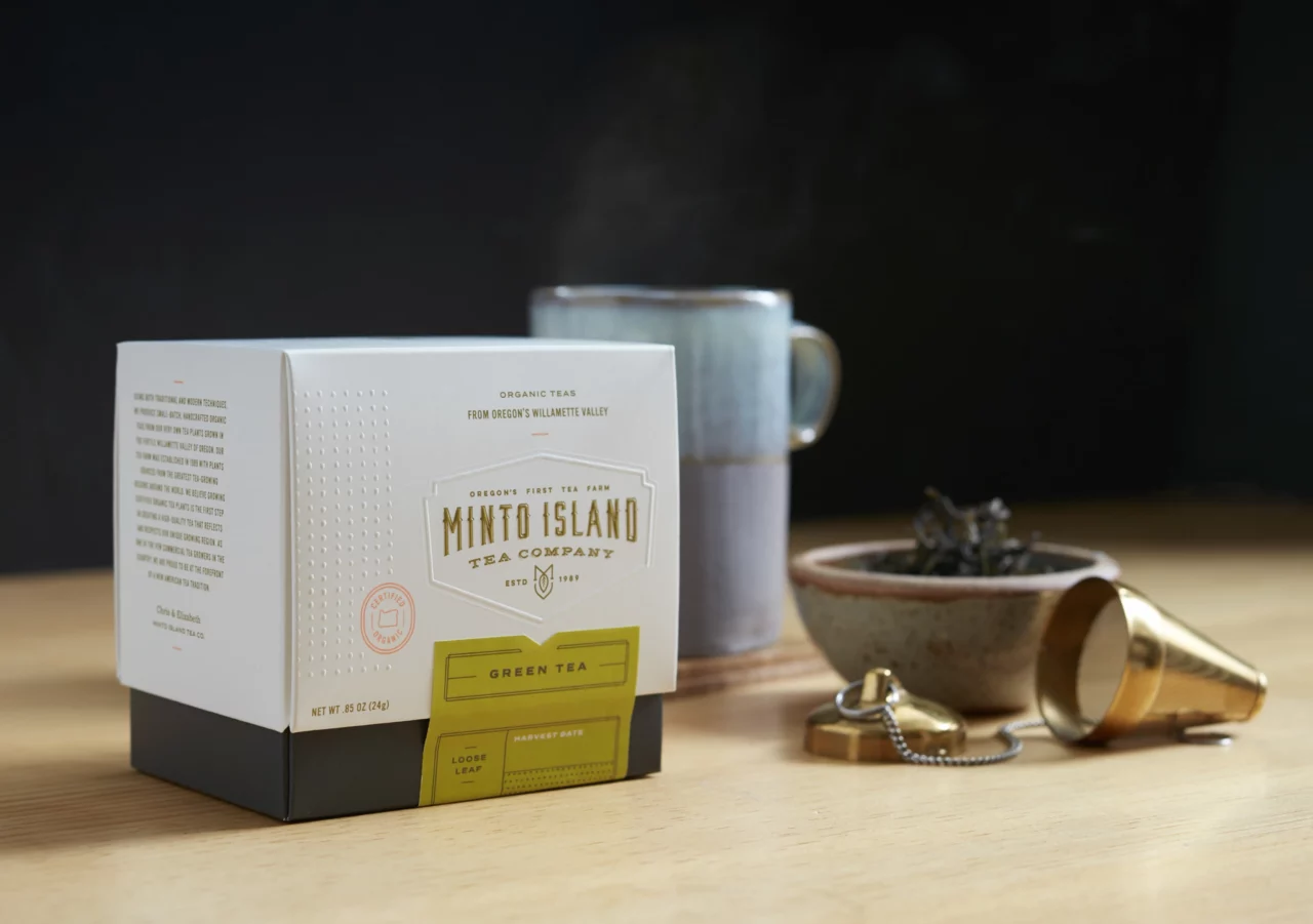
“We created a logo that captured the rustic feeling of Oregon in a classic design. The mark incorporates the shape of a tea leaf and an M in a badge shape. The modern color palette contrasts with the classic mark to create a sophisticated brand.”
Andrew Bolton
Owner & Exec. Creative Director
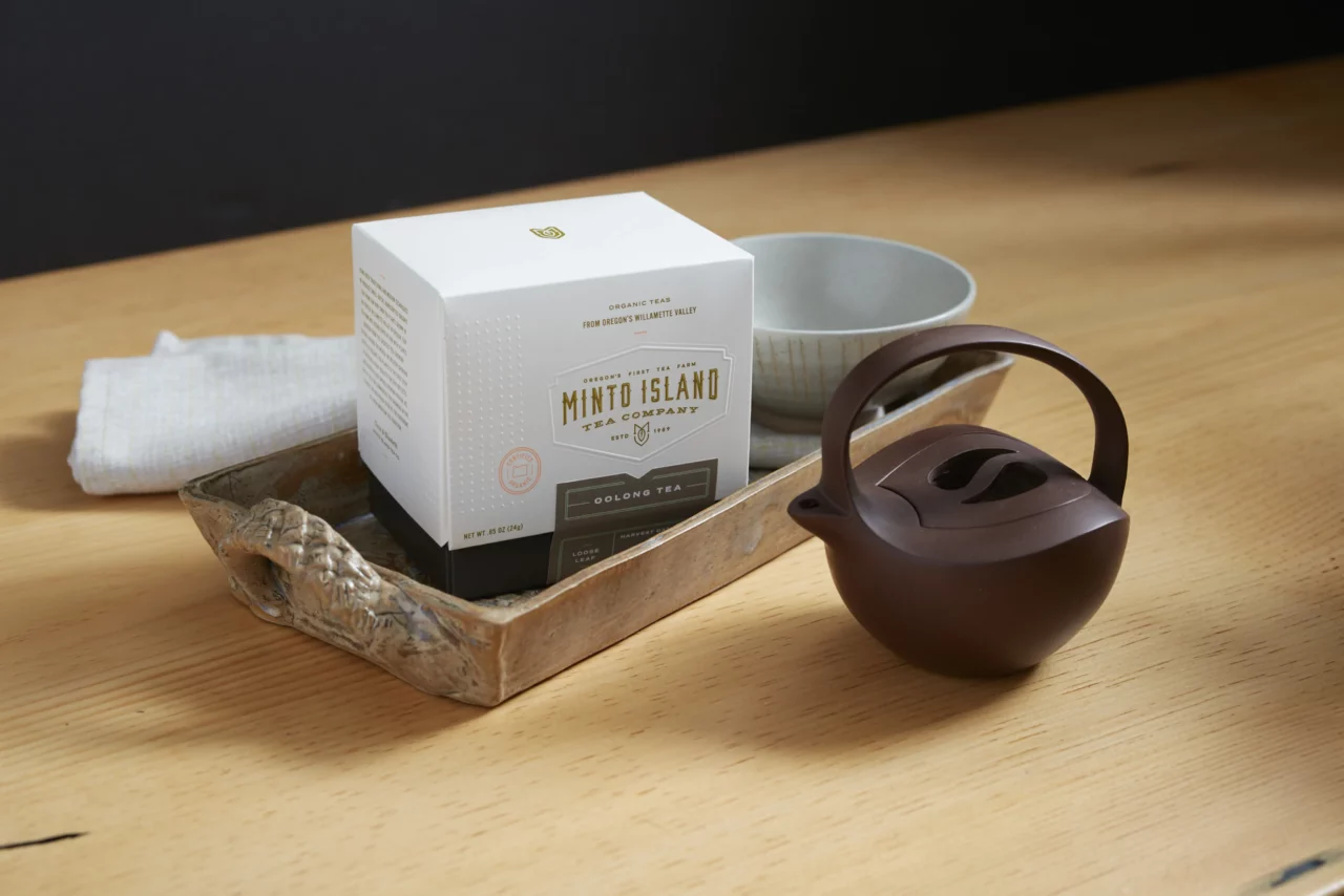
The Box
In designing packaging for Minto, we wanted to create a container that had the high-end feeling of a stand up box but that had less environmental impact and was more cost effective. The double width folded box achieves the structure and weight of a more expensive box and supports Minto’s premium branding. The custom labels functionally seal the box while also providing color differentiation for each tea variety.

“Minto is one of only a handful of tea growers in the United States, let alone Oregon. This is a truly small-batch, seasonal product with a rarity that demands a high price point. One of our main goals for the packaging was that it supports the premium nature of the product while also remaining true to its Oregon roots.”
Renee Dimalla
Senior Art Director