- ... / Work / Pecking Order
Pecking Order
Goal
Pecking Order's new brand identity started with a simple truth: flockkeepers don't just want chicken products, they want a brand that speaks chicken. We built them a system that does exactly that, with the shelf impact to match.
Services
Brand Strategy
Visual Identity
Packaging Design
Website Design
Photography


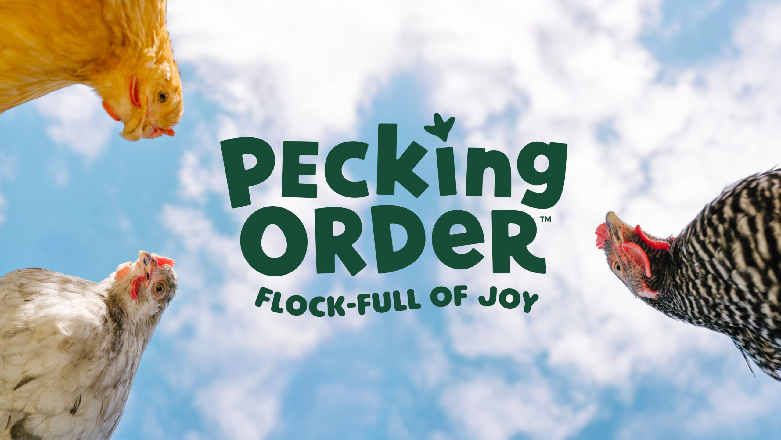
Most flockkeepers discover new brands in the aisle, so we started with two days of qualitative research to understand what really connects with them. To our surprise, they kept describing the exact same moment: their flock running across the yard for a favorite treat. That shared image of joyful, characterful chickens shaped a bold visual identity built to win on shelf. It is anchored by expressive portraits that capture the personalities of chickens, saturated flat colors, and a distinct hand-lettered wordmark with footprint in the “i”.


The Voice of the Flock
Pecking Order’s “Chicken POV” is a distinctive brand voice written in the first person that brings each bird’s personality to life in an engaging, informative way. It resonates with flock keepers by reflecting the quirks of real chickens and appears across packaging, marketing materials, and the website, turning product details into character-driven stories that strengthen the brand’s emotional connection.


A Flock-Savvy Wordmark
The Pecking Order wordmark blends cohesion with playful character through irregular letterforms, subtle baseline shifts, and a mix of upper and lowercase, capturing the charm and personality of flock life while remaining clear and readable. Its most distinctive feature, the “i” dotted with a stylized chicken footprint, extends beyond typography to become a versatile brand asset that appears across packaging, merchandise, and environmental design, turning a small detail into a recognizable and meaningful symbol.

Peckish Portraits
The design centers on bold, expressive chicken portraits that highlight the individuality of real birds, created through a mix of studio and outdoor shoots that built a diverse visual library. Each product features a distinct character within a clean, modern layout of large-scale imagery, saturated color, and a confident wordmark, using simplicity to cut through shelf clutter while delivering the emotional connection flock keepers value.

From Shelf to Show
At SuperZoo, the new identity scaled into a full physical experience. Ten-foot chicken portraits, light-up footprints running across the booth, and a custom chicken-foot-shaped ingredient table turned the booth into a charismatic destination.


A Chicken Takeover
The custom-built website expands Pecking Order’s brand world into the digital space, featuring oversized chickens, chicken POV voice on every page, and engaging animations throughout. The “Meet the Ladies” feature gives each chicken breed from the packaging an engaging yet educational page, turning the website into something rewarding for flockkeepers to explore.


