Goal
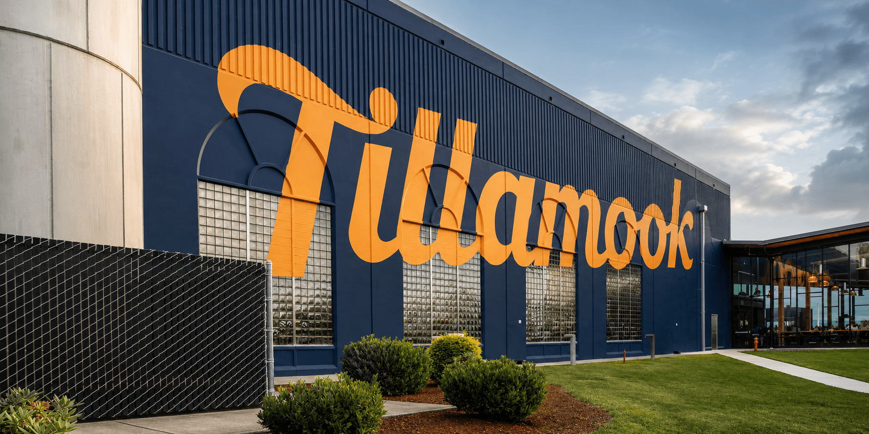
We've partnered with this iconic Oregon dairy company for a decade, evolving alongside the brand as it grew from regional favorite to national presence.
Services
Brand Guidelines
Photography
Illustration
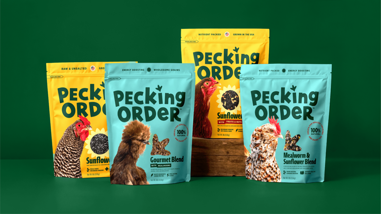
Packaging Design
Evergreen Photography
While the aggressive nature of this evergreen photography helped Tillamook stand out in a veritable ocean of dairy brands, it no longer represented Tillamook’s confident and vibrant future. The brand assets and guidelines of that era felt flat and tired compared to the new brand and shelf presence.
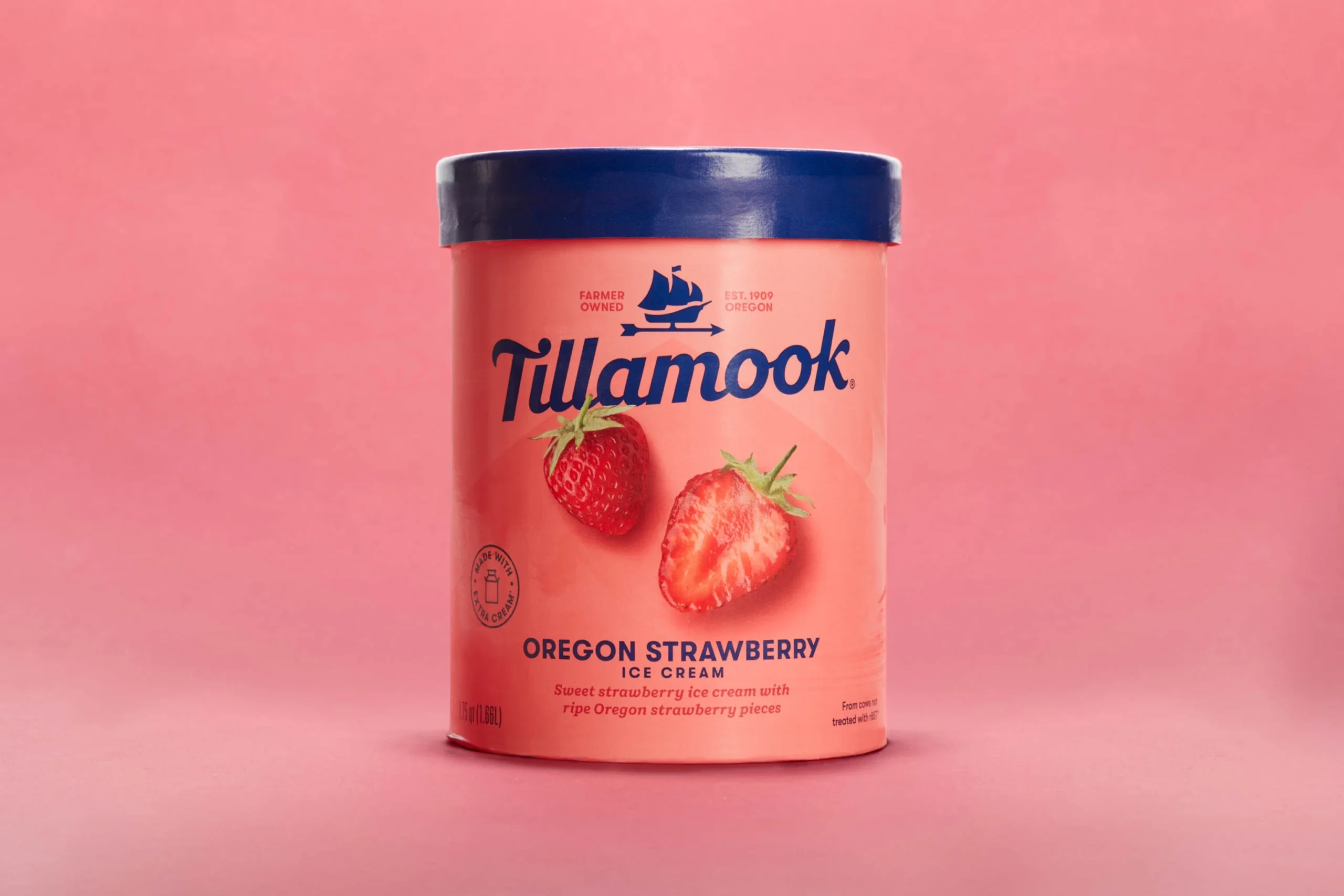
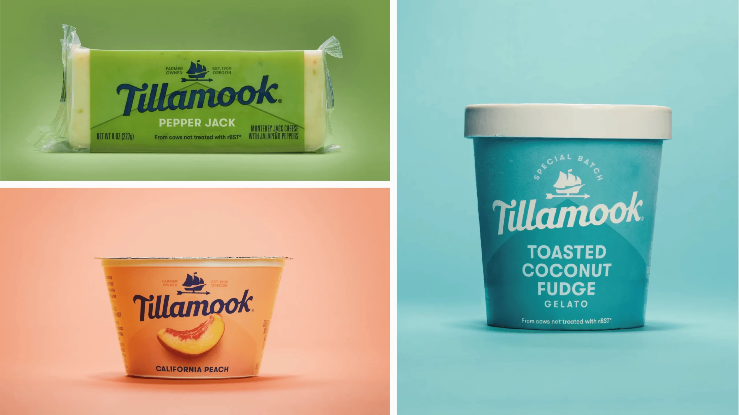
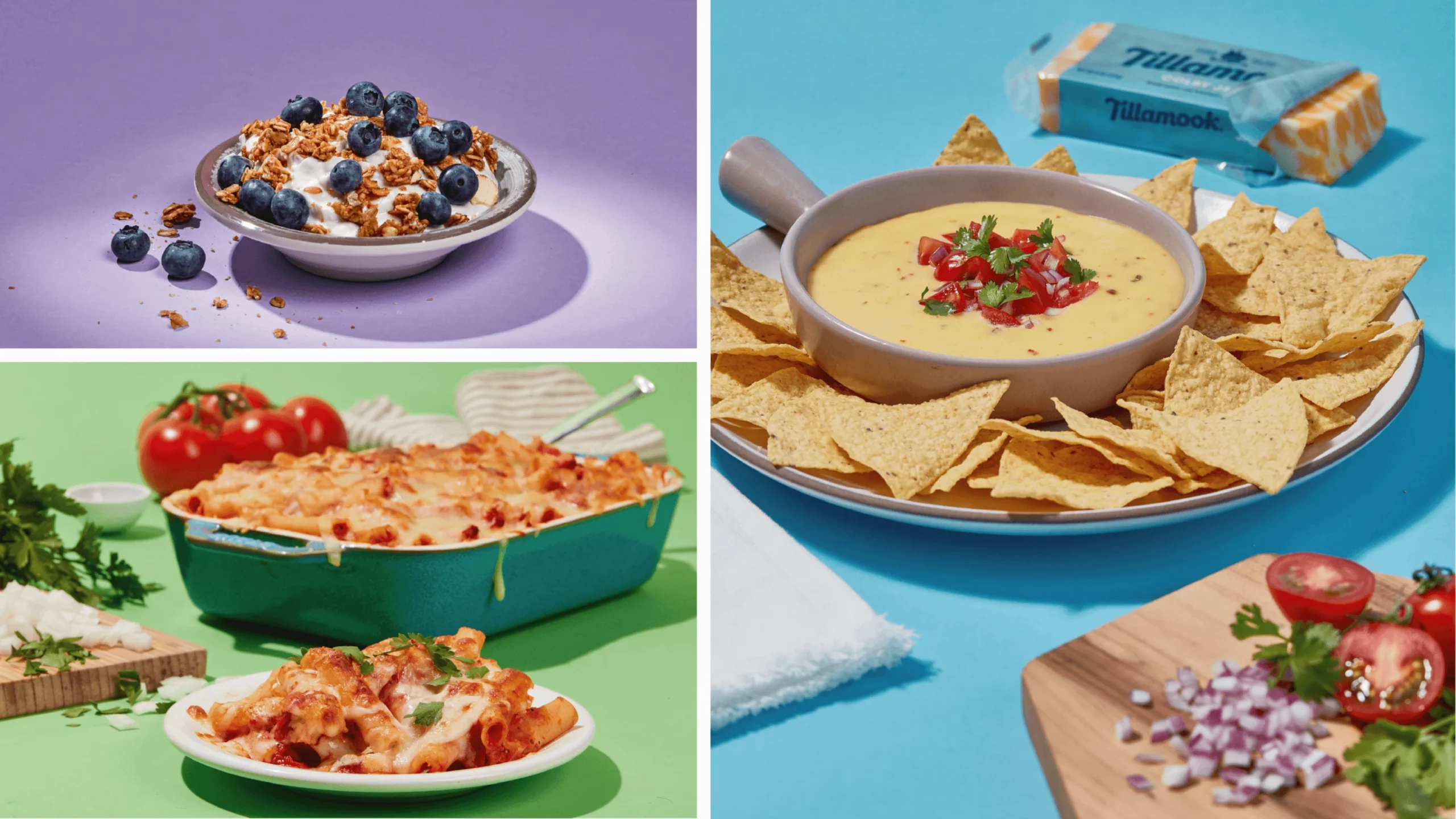
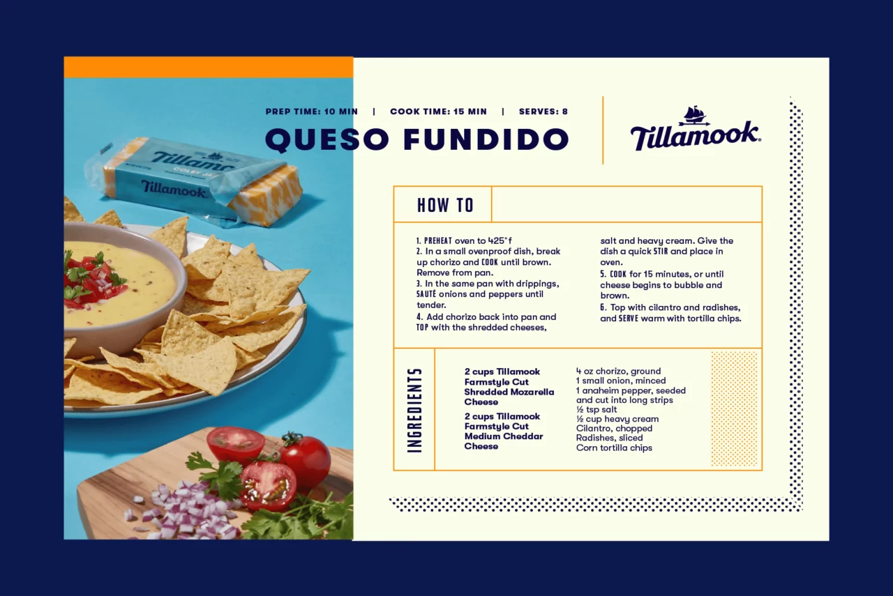
Murmur stepped in to help Tillamook create new brand extensions reflective and supportive of the new branding and to establish an evergreen photography style centered around heroic product shots.

“We are huge fans of the Tillamook rebrand and were super excited for the opportunity to develop photographic styles that compliment the new branding and packaging design.”
Andrew Bolton
Owner & Exec. Creative Director
From the Client
“Murmur Creative has become an indispensable partner across a wide range of Tillamook projects, bringing not only creative excellence but also a clear strategic perspective. They are collaborative, responsive, and intentional in everything they do. What truly sets them apart is their deep understanding of the Tillamook brand, they listen closely, take the time to ask the right questions, and consistently deliver work that is on brand.”
Audrey Crespo
Creative Director
Brand Extensions
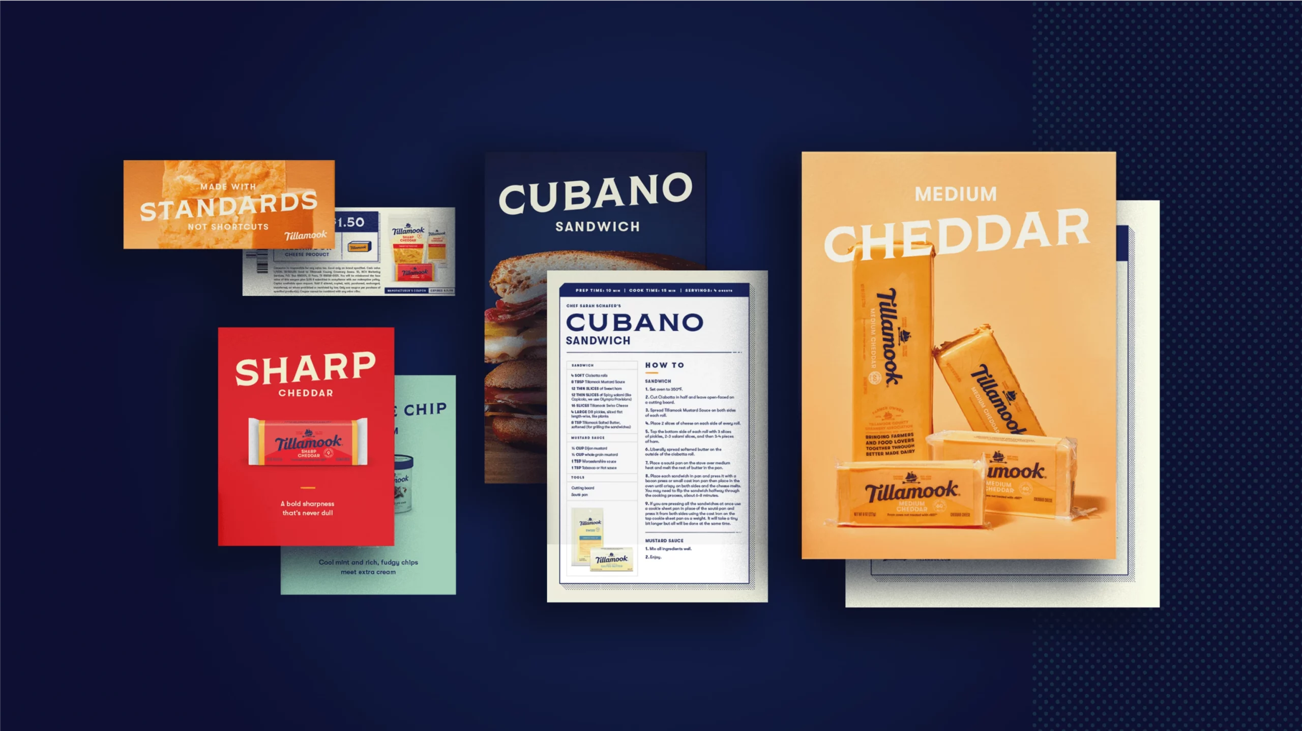
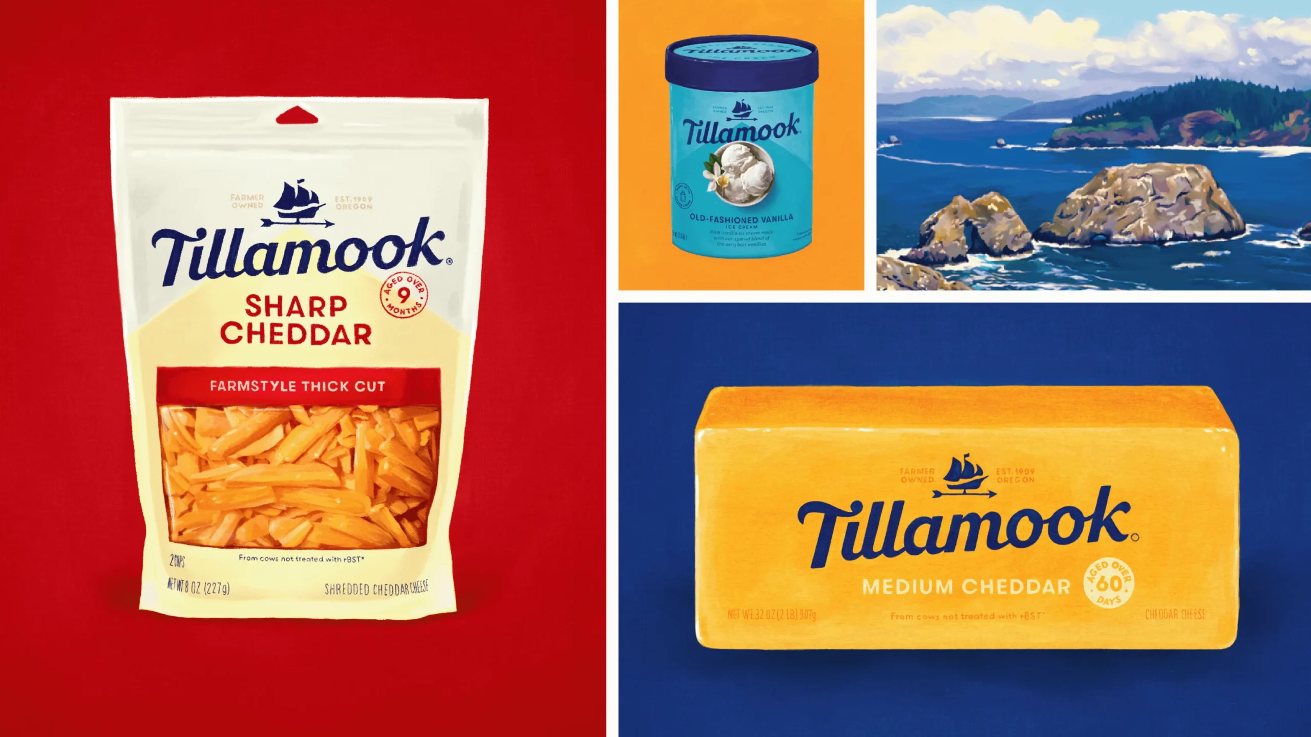
We helped streamline the brand through an extensive product focused color audit and established a new family of typeface guidelines to brighten collateral. We evolved print, digital, and environmental applications to usher in a new era for their brand.


“Introducing a new display typeface to a brand with such a strong, recognizable wordmark is a challenging task, but Shakleton proved to be a perfect contrast to the utilitarian nature of Walsheim while adding a subtle artisanal touch. Our system also encourages angling Shakleton in a way that further reinforces the new brand.”
Renee Dimalla
Senior Art Director
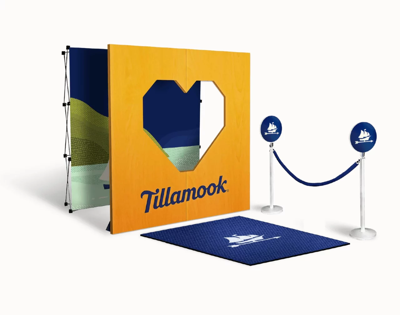
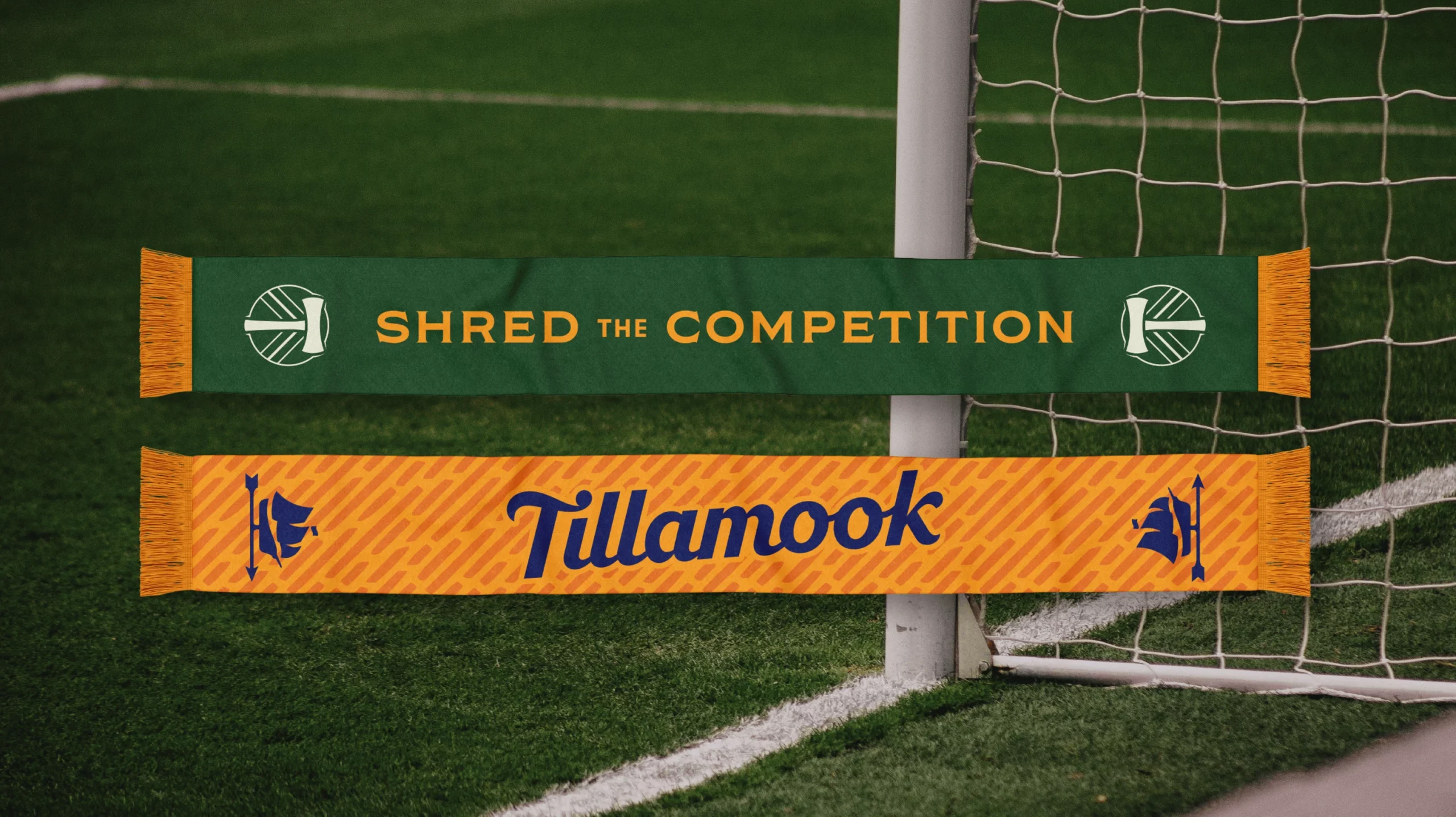
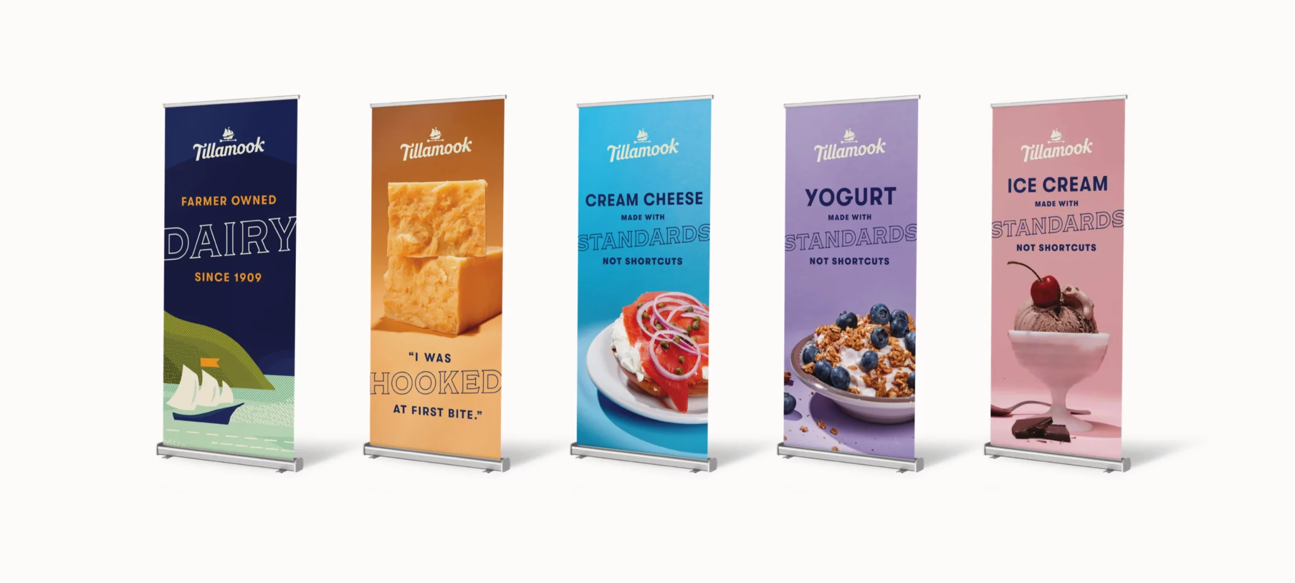
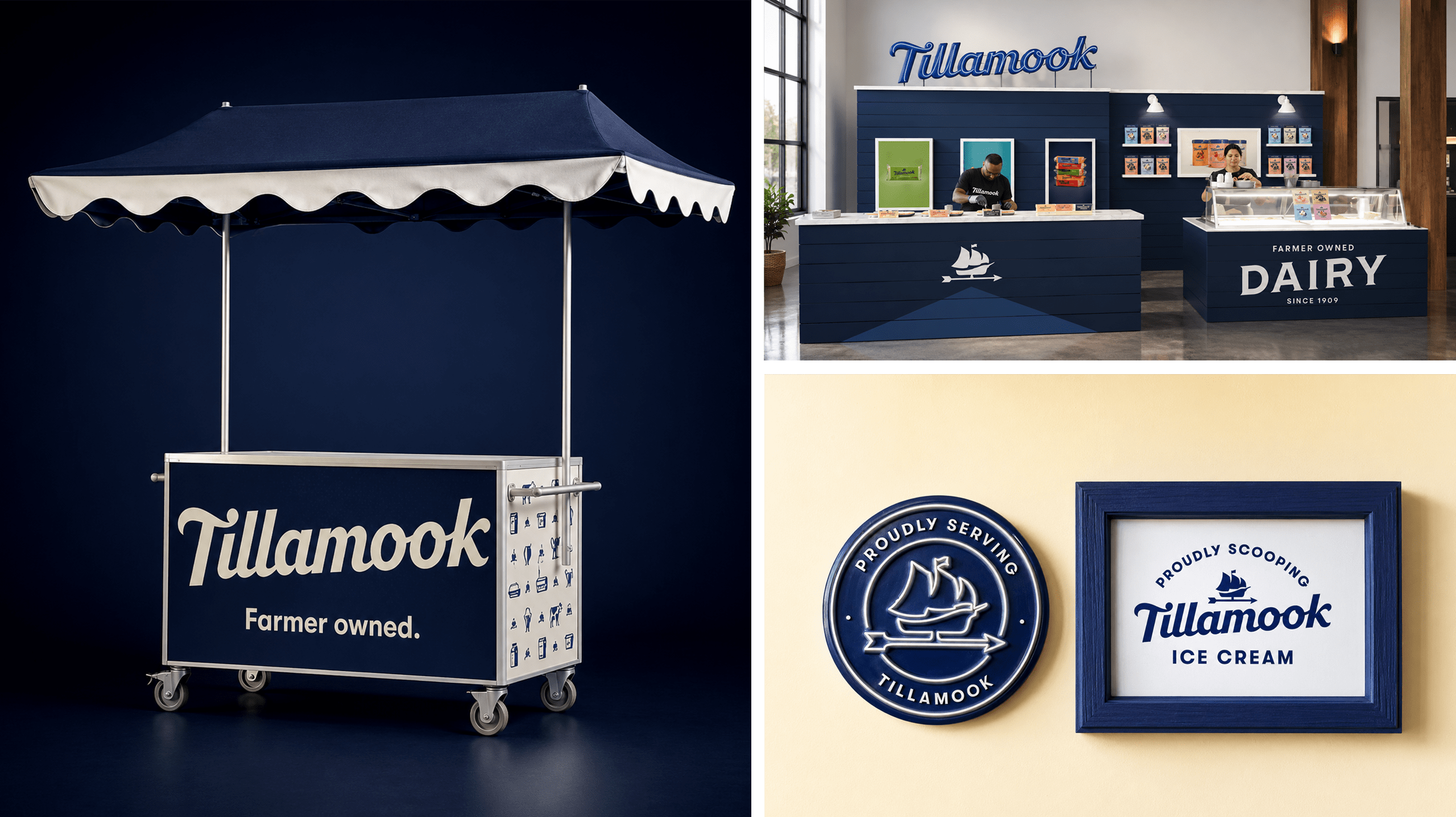
Environment
Tillamook’s physical presence at trade shows and food events has previously been guided by traditional farm elements like rustic weathered wood and metal. To follow in the footsteps of the new branding, we encouraged the use of crisp, saturated color, neon signage, and modern oversized usage of the Tillamook wordmark. Updates to event uniforms, trade show booths, environmental signage, and restaurant take-over collateral help to unify the Tillamook brand under one umbrella.

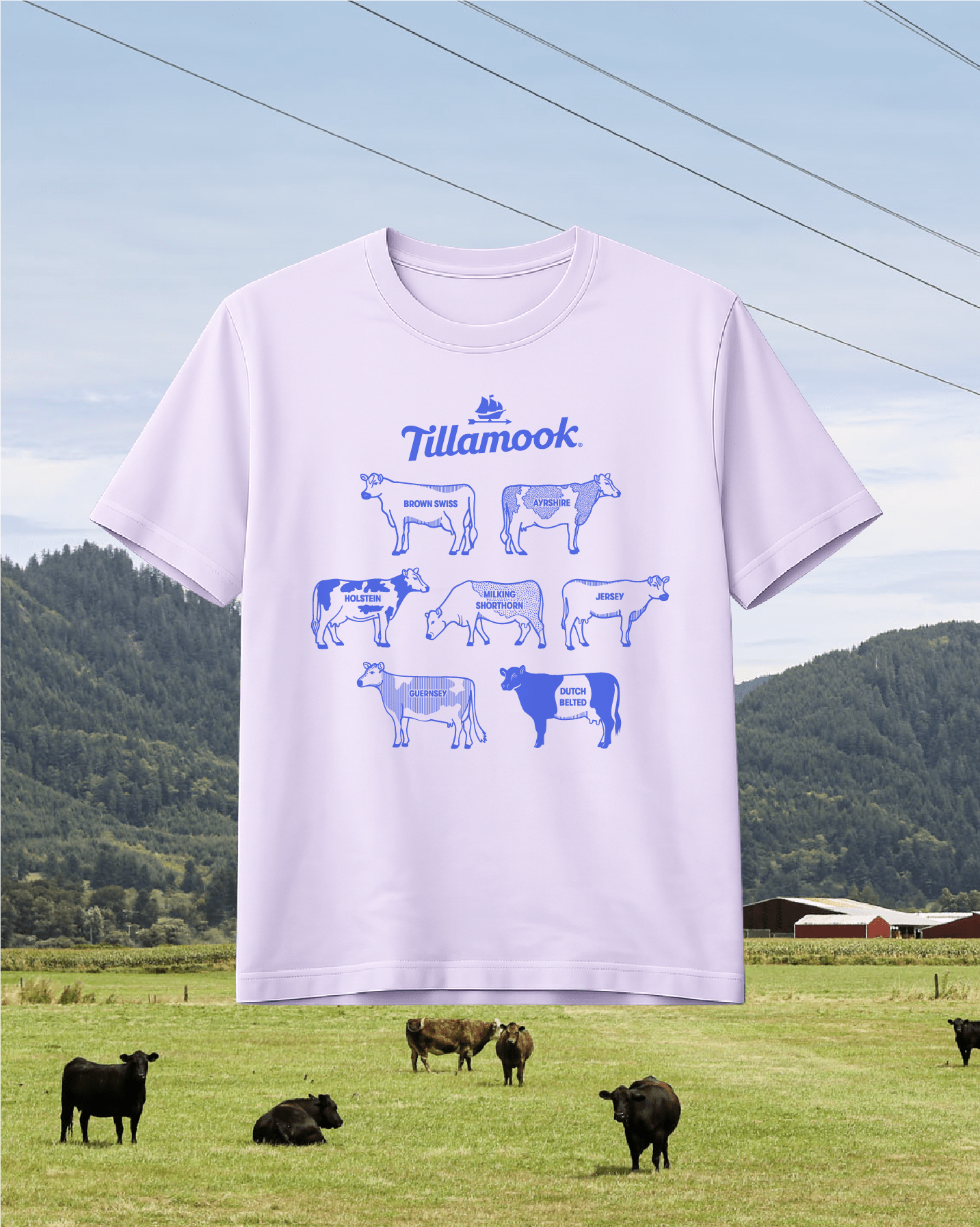
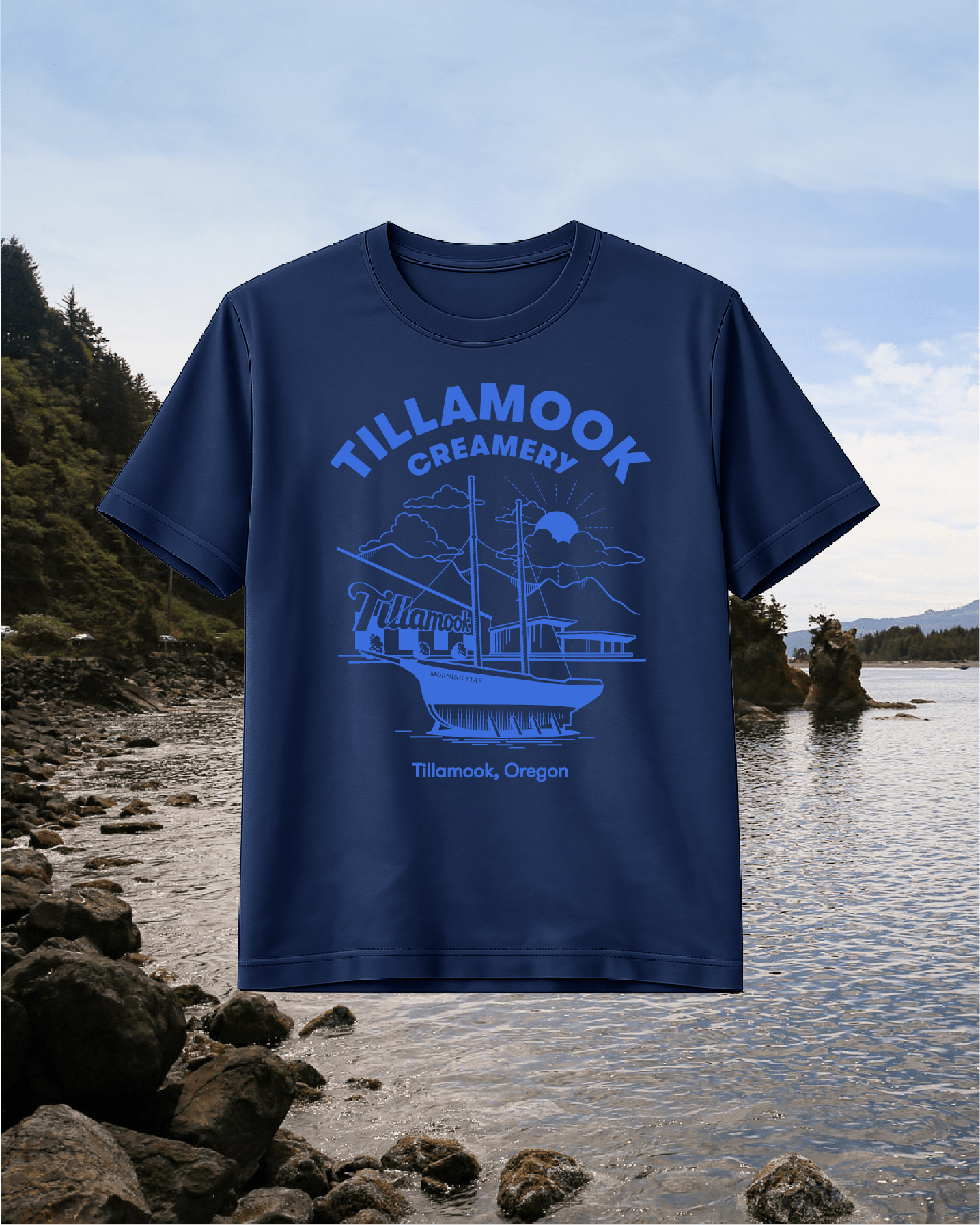
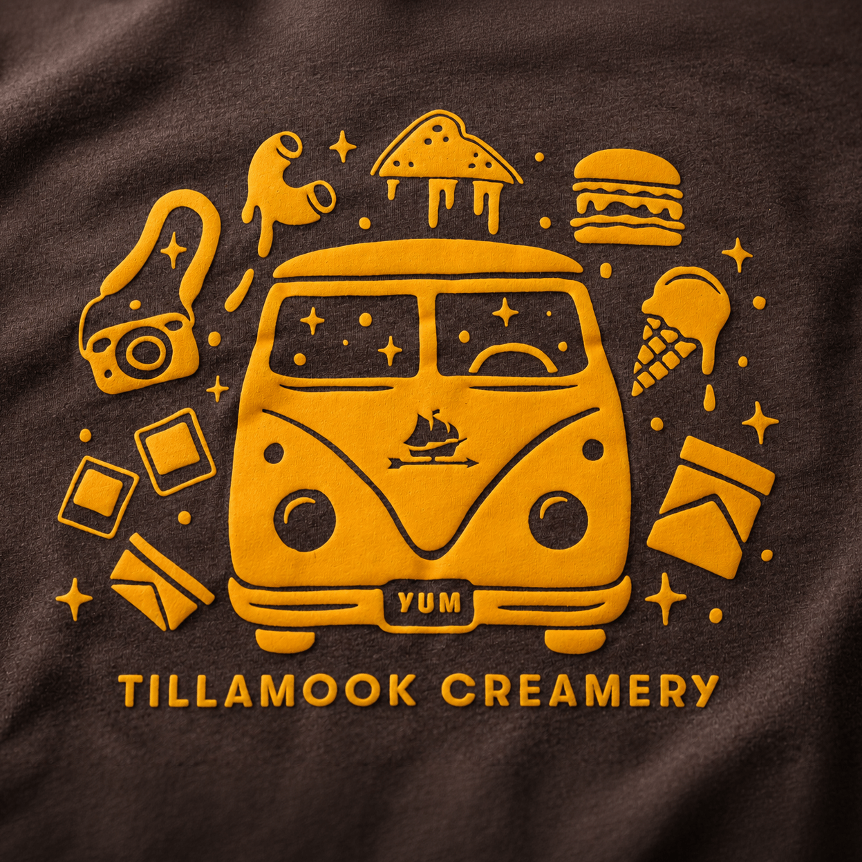
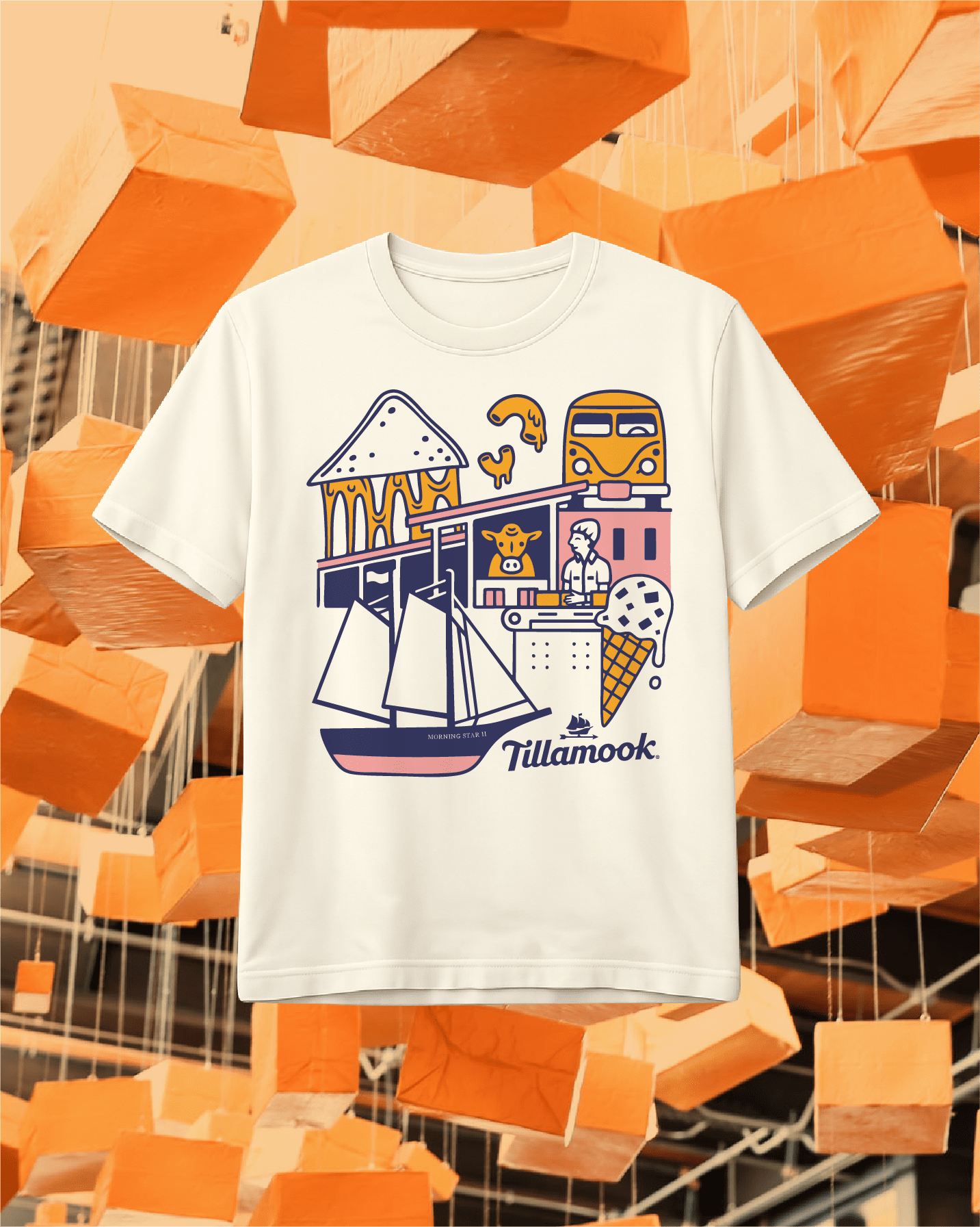
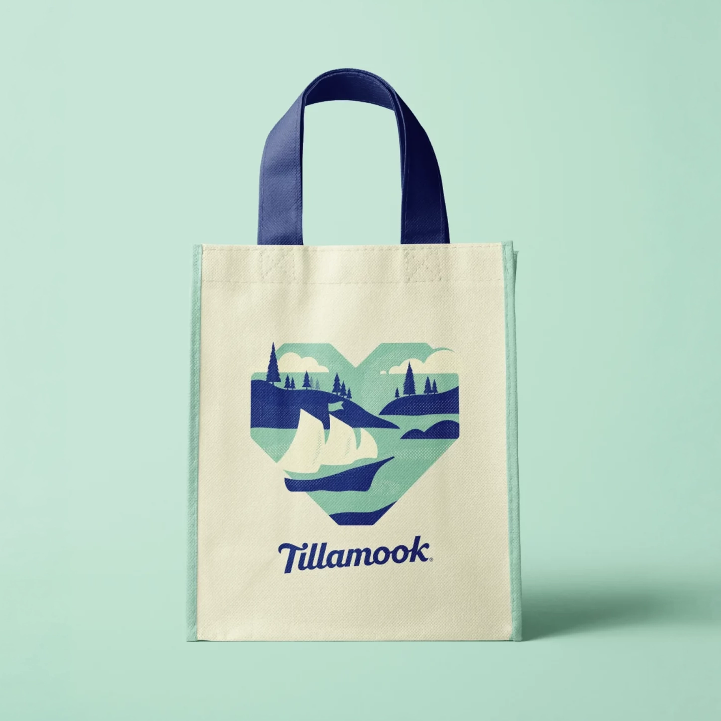
Illustration
To evolve Tillamook’s sanctioned illustration style, we sought out both in-house illustrators and local Oregon artists to inspire a regionally flavored but nationally recognized mid-century modern graphic style. Our process included a broad and varied exploration of graphic styles ranging from warm, painterly product illustrations to modern and textural landscapes.
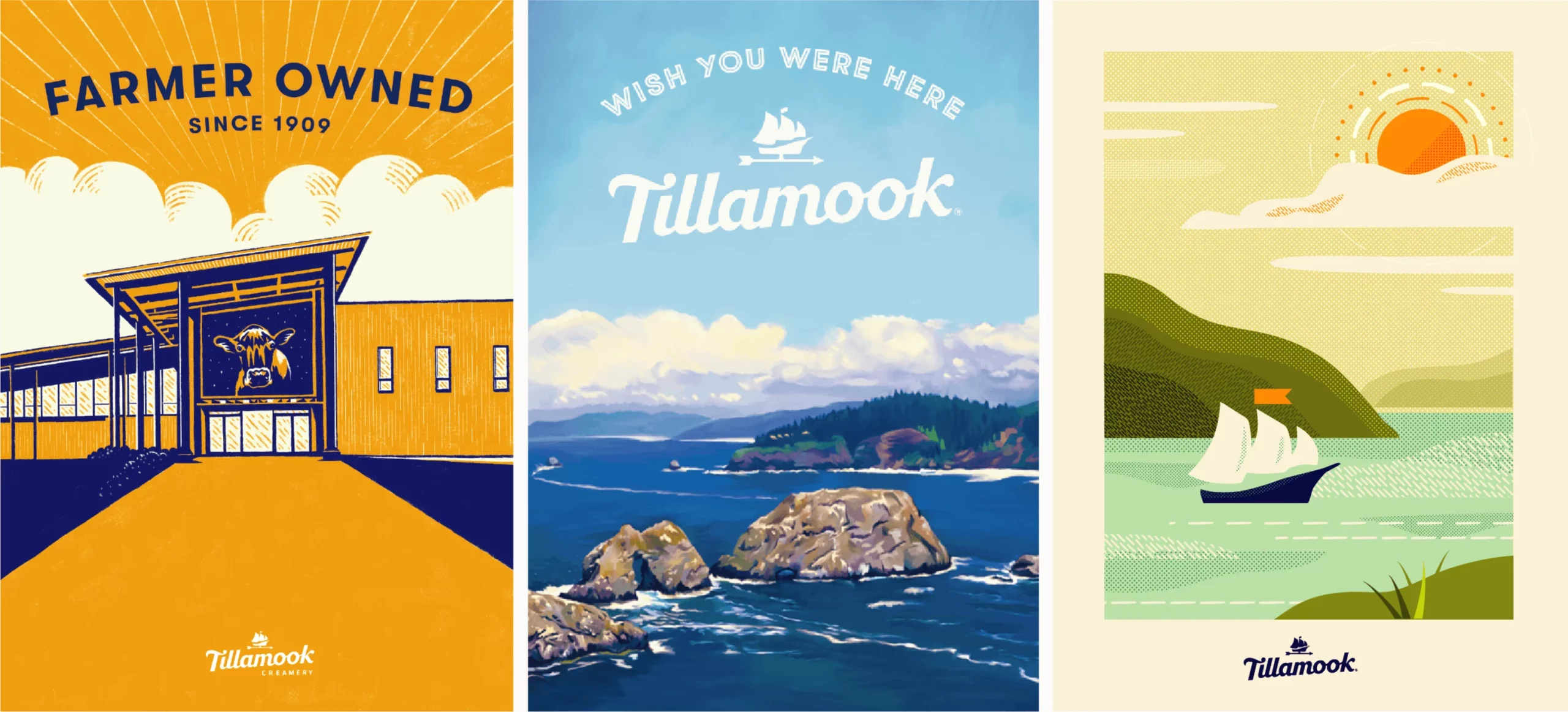

“Having the opportunity for a lot of illustration exploration is rare, so I jumped at the chance to flex multiple aesthetic styles. One of the most fun directions was a series that illustrated the Tillamook coast and Tillamook's products in a painterly style reminiscent of vintage travel posters or roadside antique store finds.”
Marc Girouard
Art Director
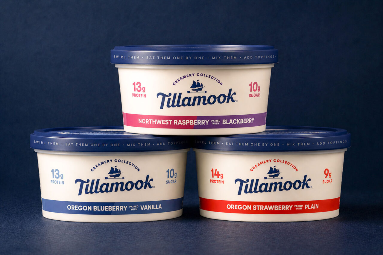
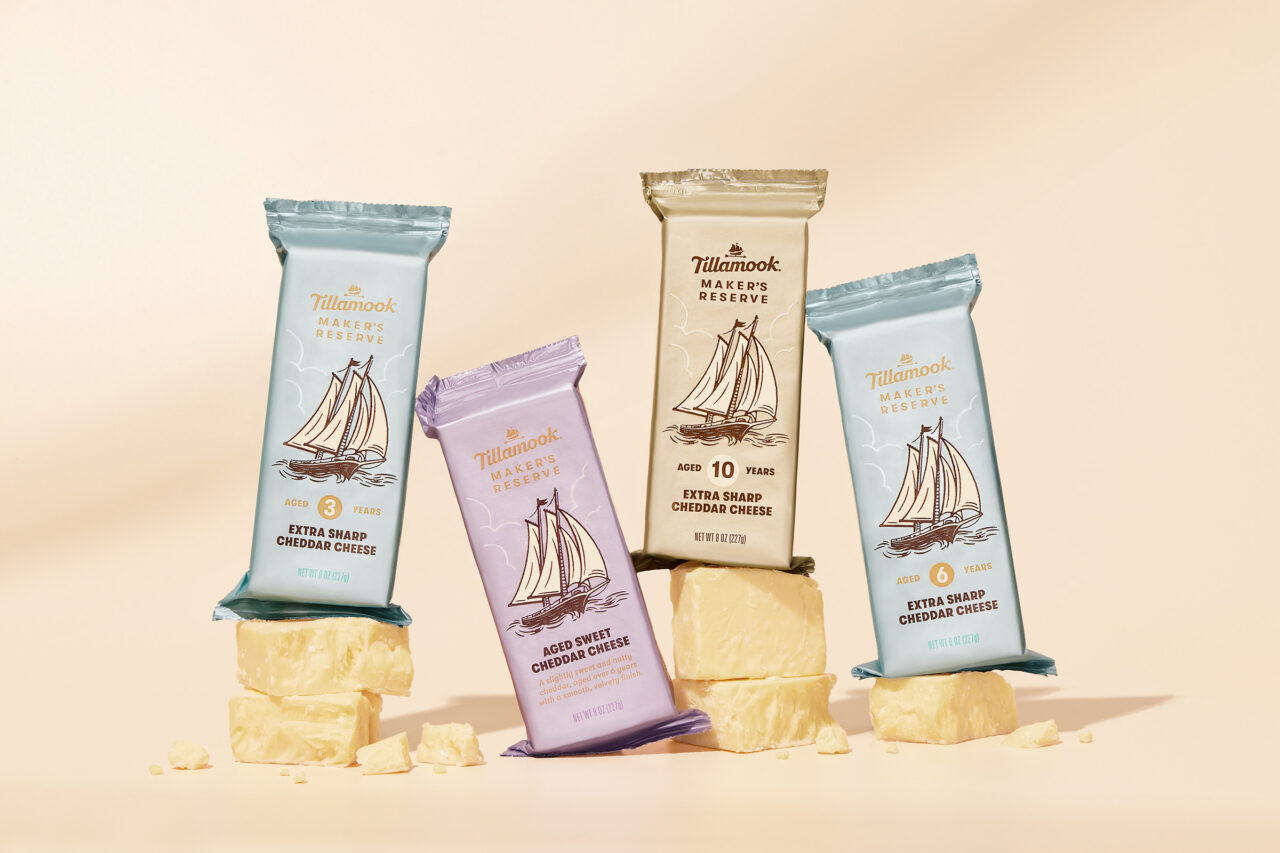
Packaging Design
For Tillamook’s new collection of yogurt pairings, we leveraged the brand’s classic navy as a foundation to help the flavors shine through. We highlighted each duo using rich reds, pinks, and purples, celebrating a new spin on the classic Tillamook yogurts.