Goal
Som is a unique mixer created by Pok Pok founder, Andy Ricker. They needed branding that communicated their category-bending taste and sense of adventure.
Services
Logo Design
Packaging Design
Photography
Som began at Pok Pok with the famous Som & Soda, a nonalcoholic beverage inspired by Thai drinking vinegars.
Som needed a rebrand that would take it from local favorite to national name. This meant delving into market research, competitor analysis, interviews, and using our discoveries to inspire unforgettable design.

From the Client
“The design strategy for our product needed to be spot on. We were introducing a new category to a saturated market. Som is a mixer that can be used in both spirited and spirit-free cocktails. It was incredibly important to balance these elements and appeal to both bartenders and their patrons. The bottle needed to stand out as something unique on the crowded backbar. Murmur did research in the field, interviewed renowned mixologists, and produced packaging design and messaging that hit all the right marks.”
Andy Ricker
Founder/Owner Pok Pok, Som
Brand Strategy
We began with research. As we interviewed bartenders and tastemakers, we also researched the competitor market to try to determine what category Som would most likely compete in. We soon discovered that, though they are a mixer, their taste profile and flexibility is particularly unique and, though they are a drinking vinegar, there weren’t many other drinking vinegars competing in the same national markets. Som is also particularly well-suited to zero proof cocktail menus and the growing market for non alcoholic drinks. Their branding needed to show them as something different, an adventuresome option with a sophisticated flavor profile.

“James Beard Award-winning Chef Andy Ricker has been on a mission to make Thai food more accessible to people, elevate the Som brand, and increase its availability in bars and restaurants across the country. Working closely on brand strategy with Andy and watching his vision come to life through Murmur's meticulous design was incredibly fulfilling to me.”
Mary Breslin
Exec. Director of Client Services
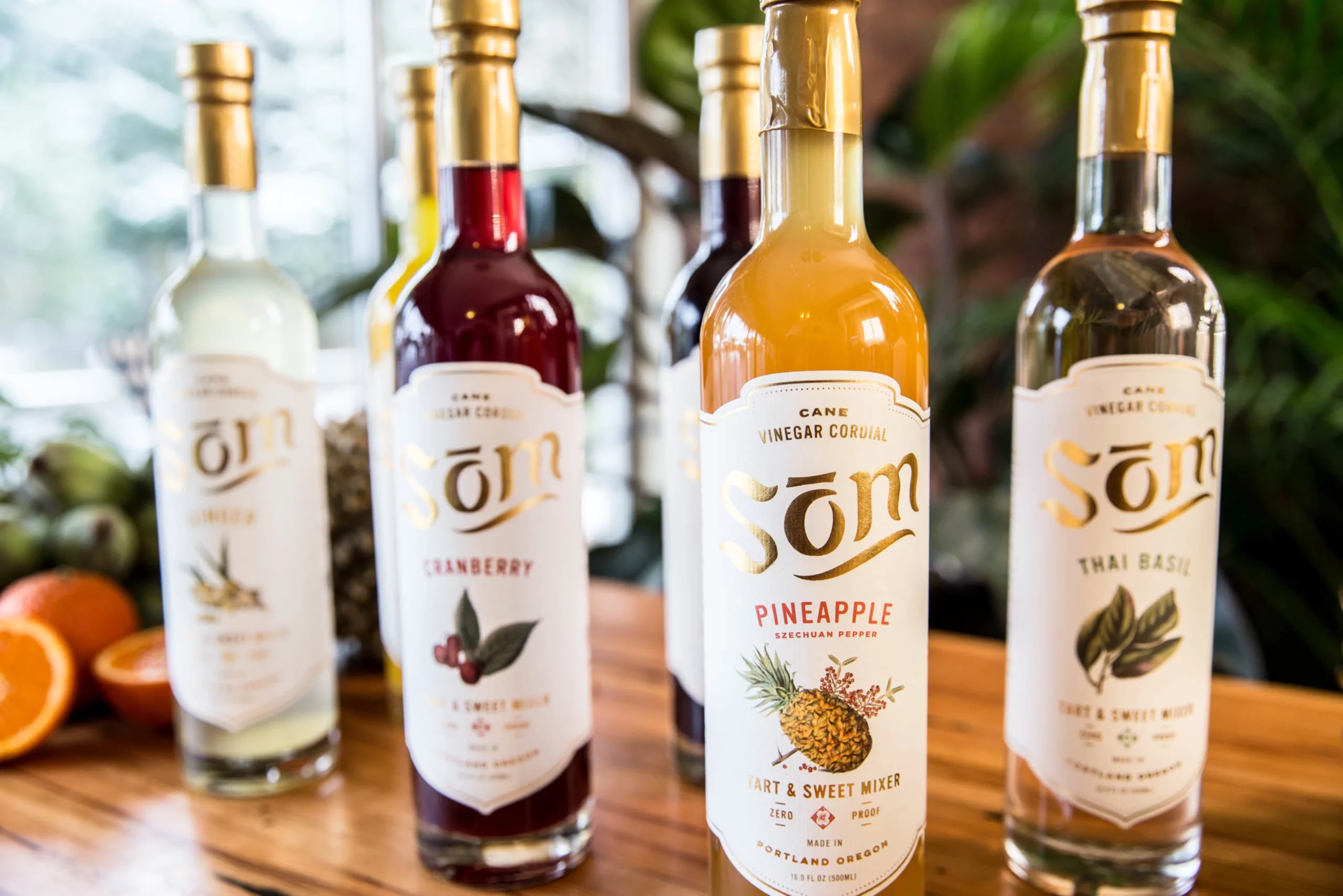
Logo Refresh
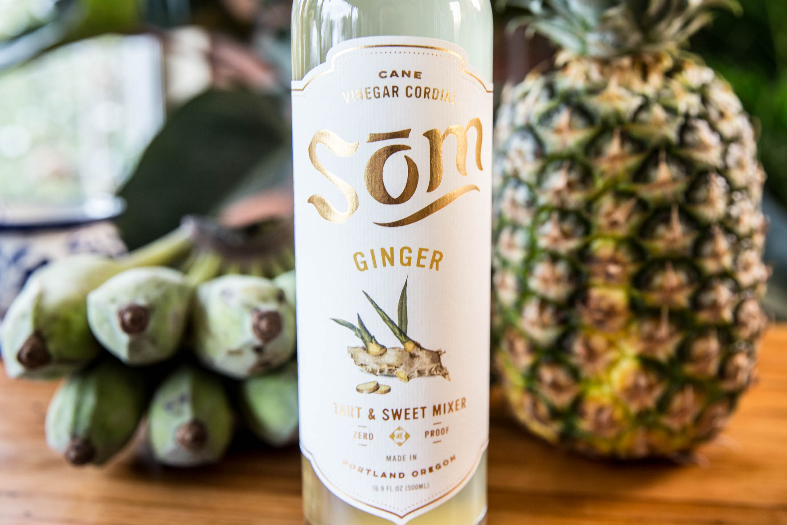
Som’s original logo was inspired by Thai advertising, and we wanted to keep this inspiration while creating a more intricate and sophisticated mark. We refreshed the Som logo with a clearer upward curve that evokes a found ink aesthetic. We accentuated the peaks of the letters to highlight their calligraphic qualities. The refreshed mark has the polish of an upscale product and preserves the unique character of the original.
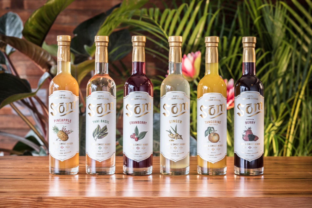
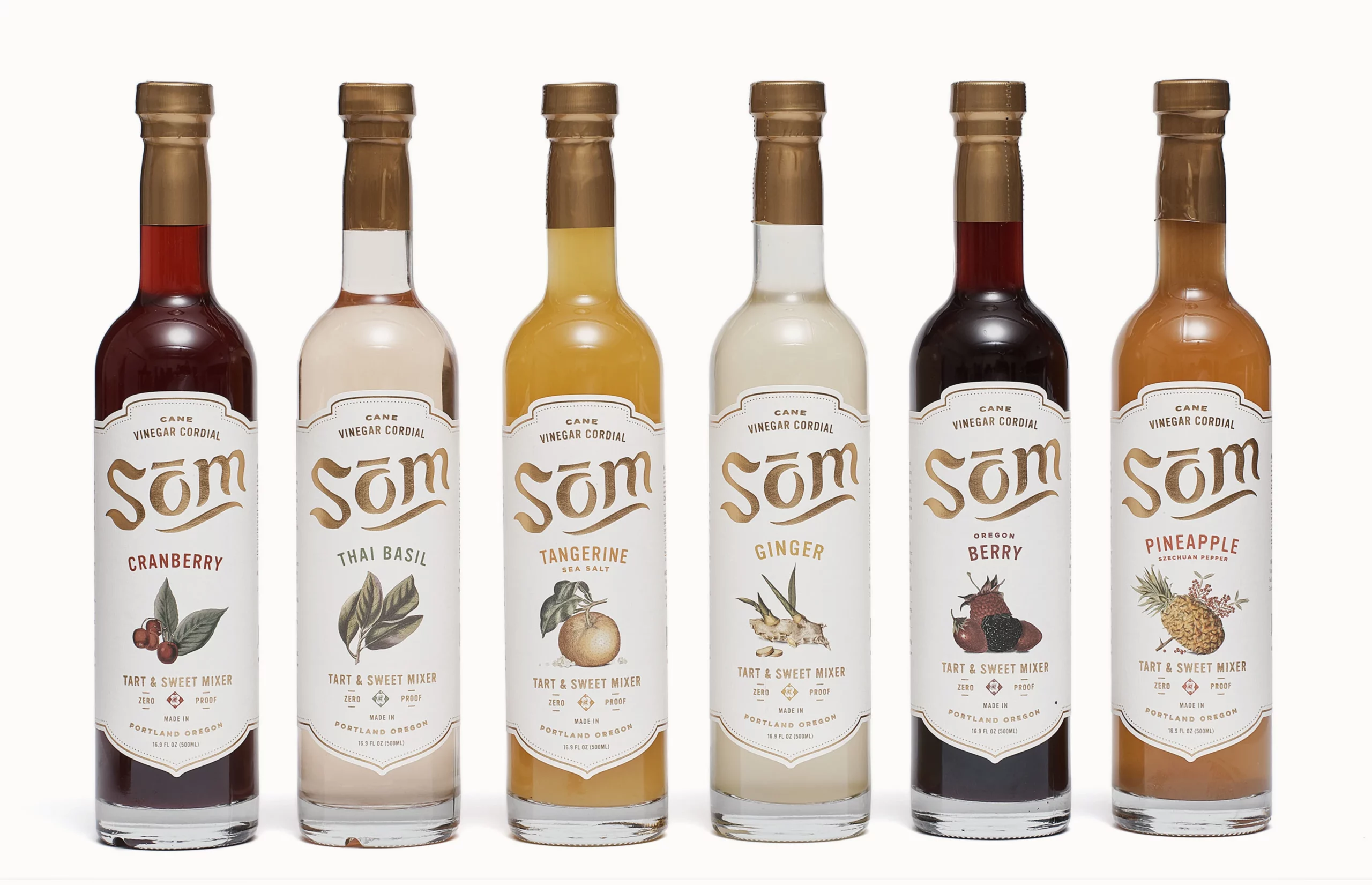
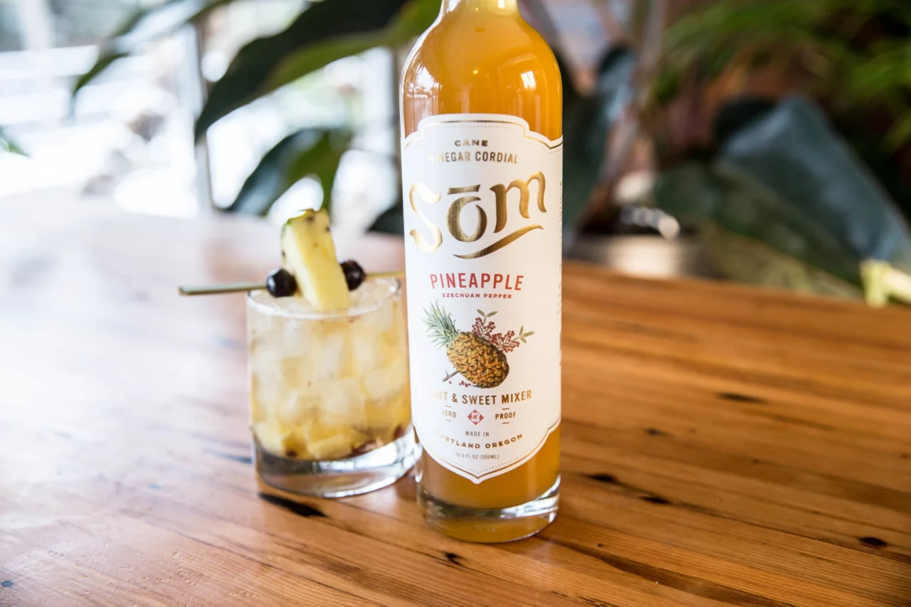
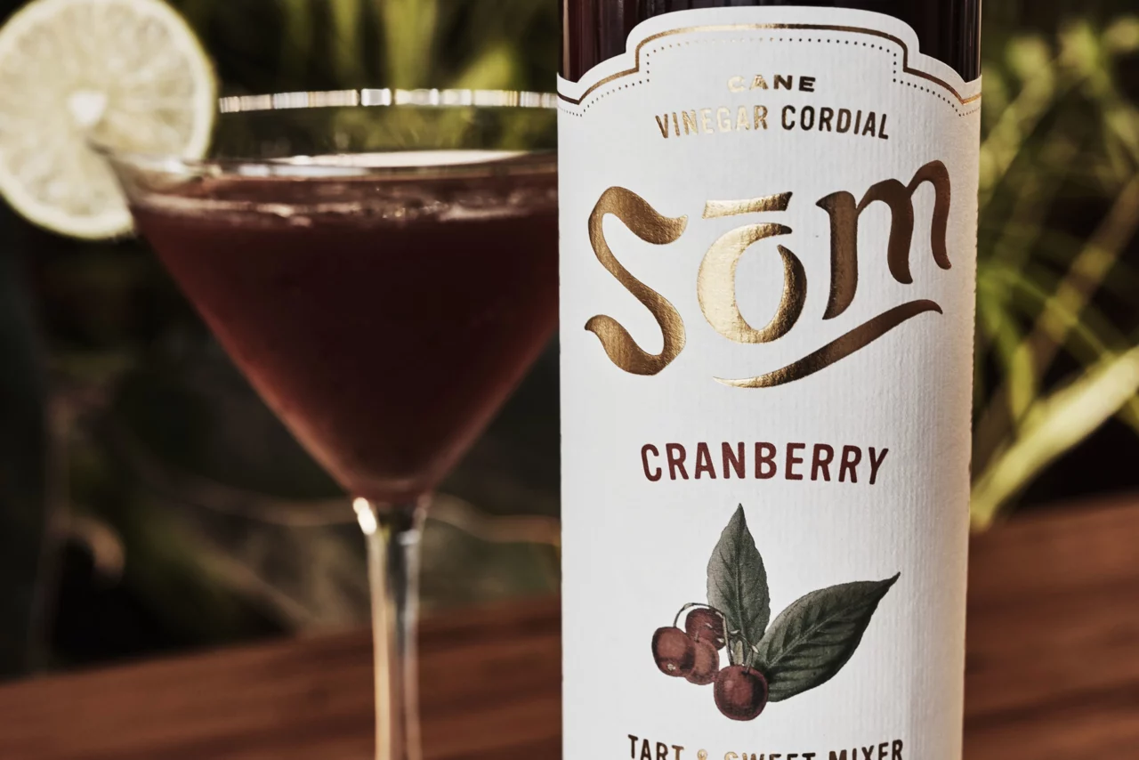
Packaging
Som needed seriously memorable packaging with beautiful work that would spark curiosity and encourage display. With Som, we wanted to elevate drinking vinegar to the aperitif category, educating consumers about its uses and quality. Inspired by Thai medicinal packaging, we created illustrations that blended Eastern and Western aesthetics. We worked with our printers to create an embossed effect for a more tactile experience. Our interviews also led us to understand that specific bottle shapes and sizes were preferred by bartenders. We made sure that the bottle fit these criteria while allowing the standout colors of the Som itself to shine through. The labels compliment these colors by featuring flavor illustrations and design elements that evoke a sense of luxurious adventure.
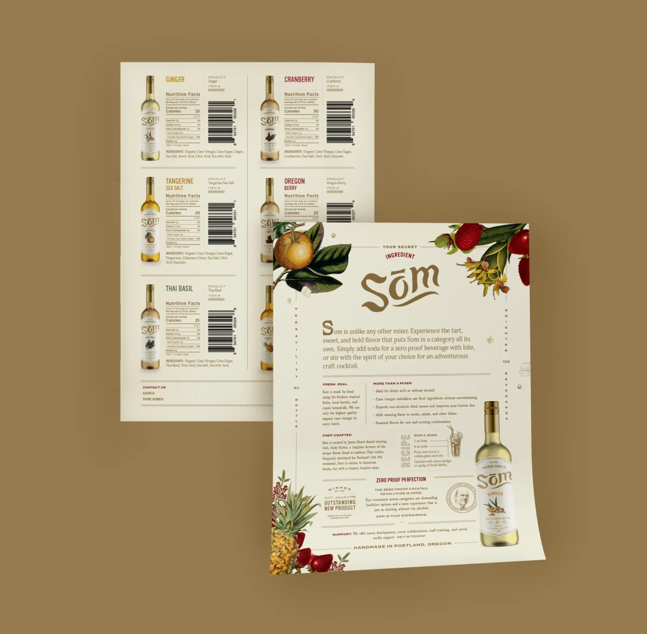
Sell Sheets
In order to present Som to buyers, Som needed two sell sheets: one for bars and one for grocery stores. We distilled the differentiators we’d discovered during the brand strategy phase of our project down to a few key points and designed memorable, custom sell sheets to stand out among competitors.