Ultima Replenisher
Goal
Ultima Replenisher wanted to refresh their brand Identity and design packaging that would standout in the crowded electrolyte market.
Services
Logo Refresh
Packaging
Illustration
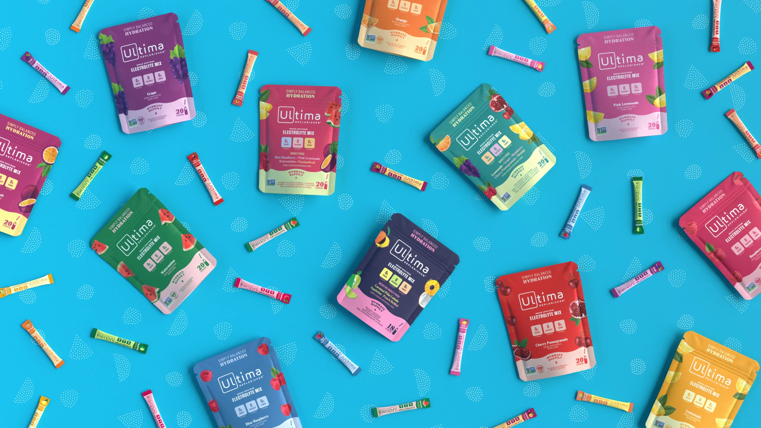
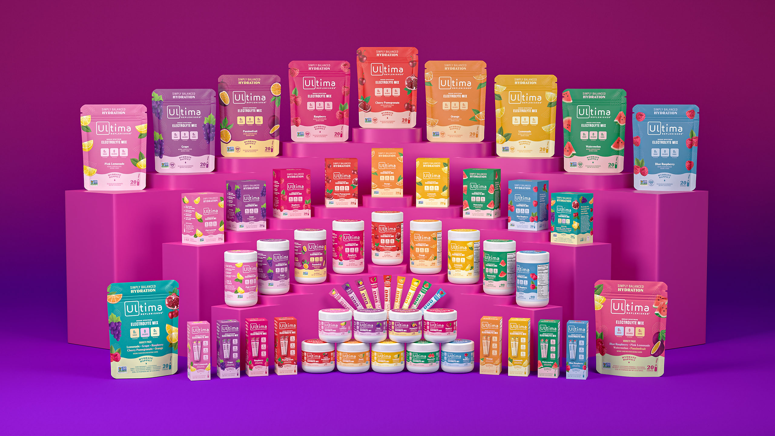
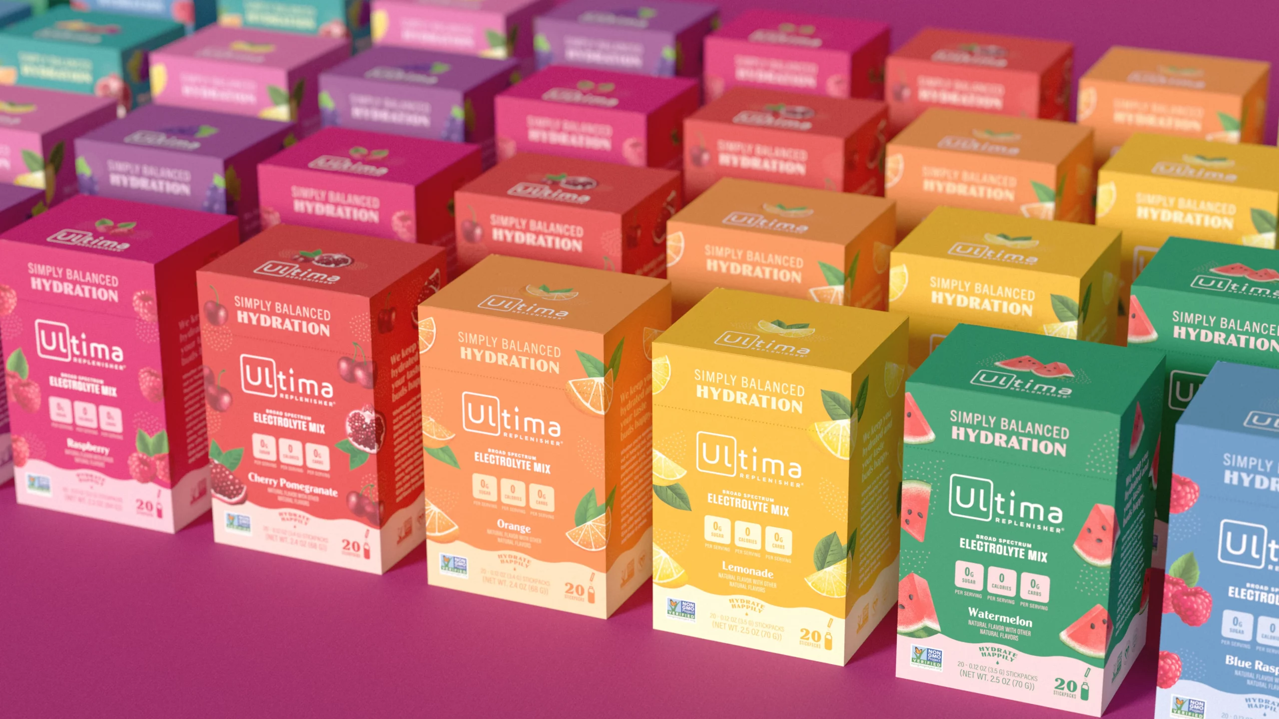
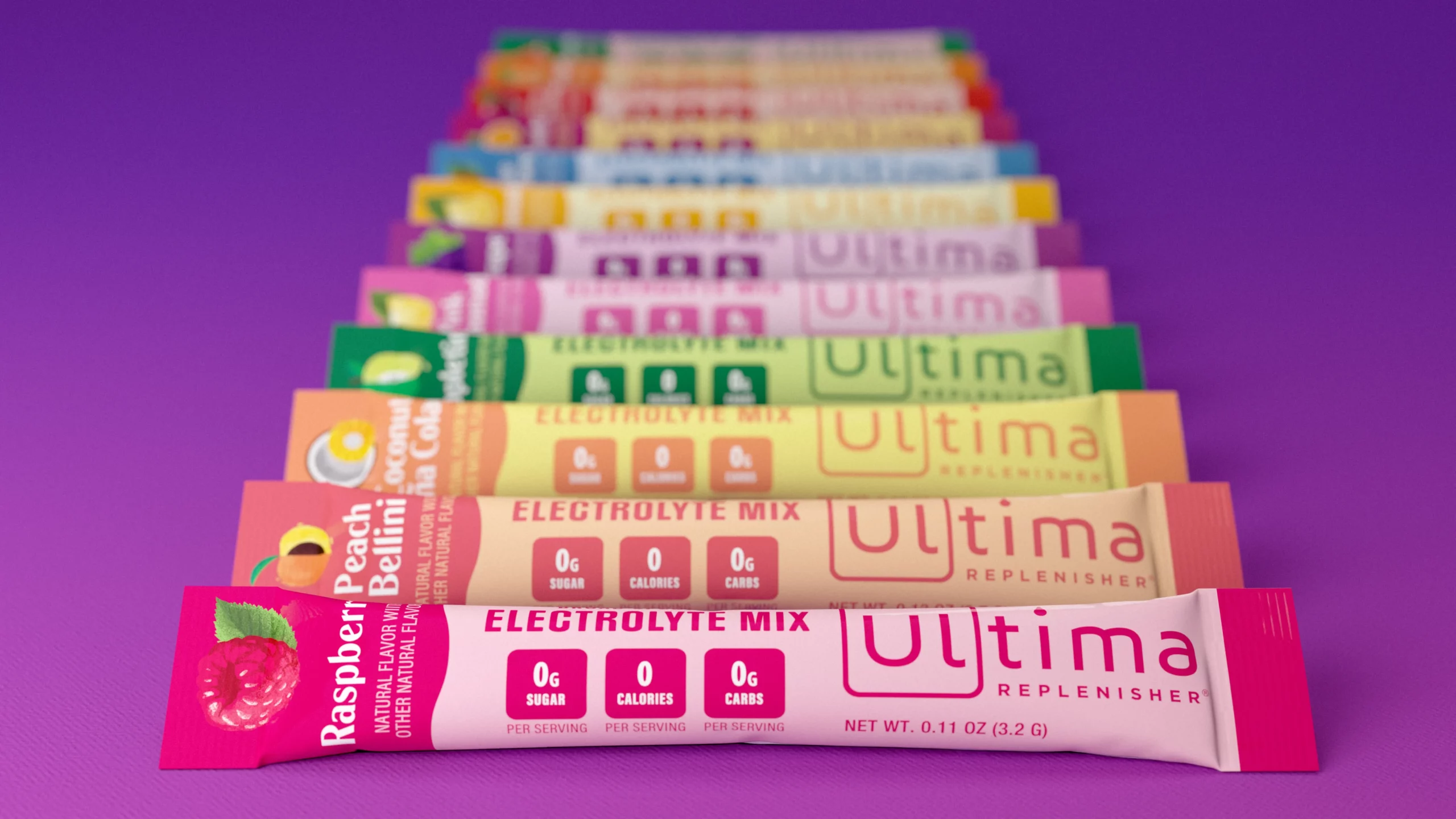
Ultima was looking to take their look to a delicious new level. We embraced a suite of popping colors to help the line stand out on the shelf and highlight the company’s diversity of flavors.
History
Ultima is all about effective hydration. As one of the first big nationwide electrolyte brands their sole mission is helping people live their ultimate lives by replenishing and rejuvenating their bodies. They’ve spent years perfecting their full-spectrum hydration formulas, delivering them in convenient powder form and in an array of appealing flavors. They use high-quality stevia to sweeten, keeping their product free of sugar, calories, and carbs.

Logo Refresh
Ultima wanted to preserve the impact and equity of their logo while upgrading the design. We kept the box around the first two letters of “Ultima” feeling the reference to the periodic table remained relevant with their scientific approach to wellness. We rounded out the corners of the square and removed the dotted eye droplet for a more elevated look and feel.
Packaging Redesign
Within the powdered electrolyte market a pharmaceutical aesthetic is common. Stark white backgrounds with minimalistic type gives many brands in this space a very clinical feel. Ultima, having previously followed suit, sought to stand out from their competition. Using their vibrant flavor offerings as an opportunity to differentiate, we chose to use a bold and expansive color palette.
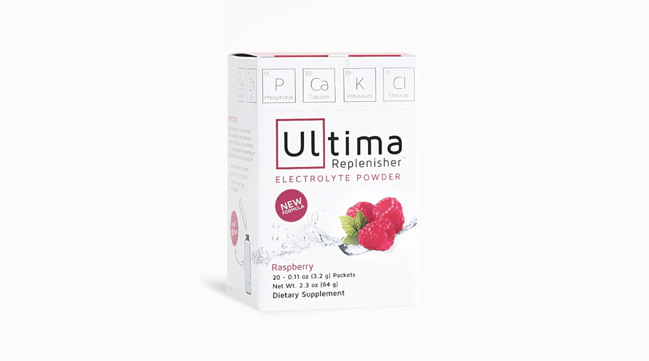
“Ultima was one of the first dedicated makers of electrolyte drinks. In recent years, growth of the health and wellness market meant they needed to work harder to stand out. We made it our mission to convey flavor as a competitive advantage through design.”
Renee Dimalla
Senior Art Director
From the Client
“Working with the Murmur crew has been a total pleasure. They are an incredibly kind, talented, creative, organized, and flexible team and sales increased so much that we are having difficulty keeping up with demand. We’re thrilled with the rebrand!”
Loretta Reilly
Vice President of Marketing
Illustration
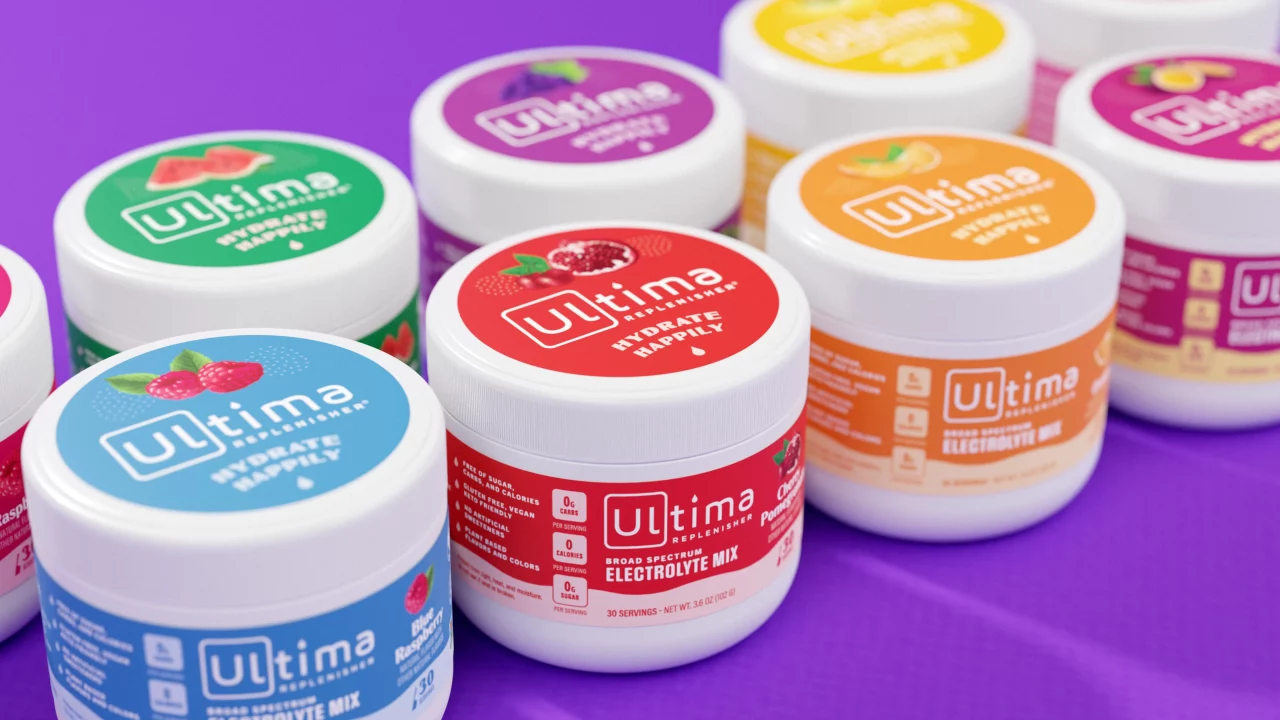
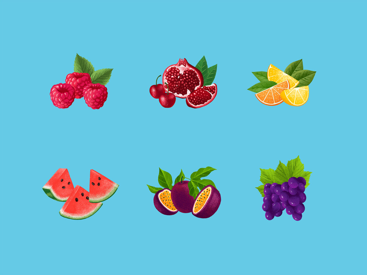
Our custom fruit illustrations were done in a realistic but ownable textural style. They serve as an additional pop of color and help convey each flavor at a glance. The dotted patterns add a similar stylistic flair, acting as either drop shadows to the fruit or additional imagery. Wave patterns across the bottom of each packaging style reference the liquid hydration.
Brand Flexibility
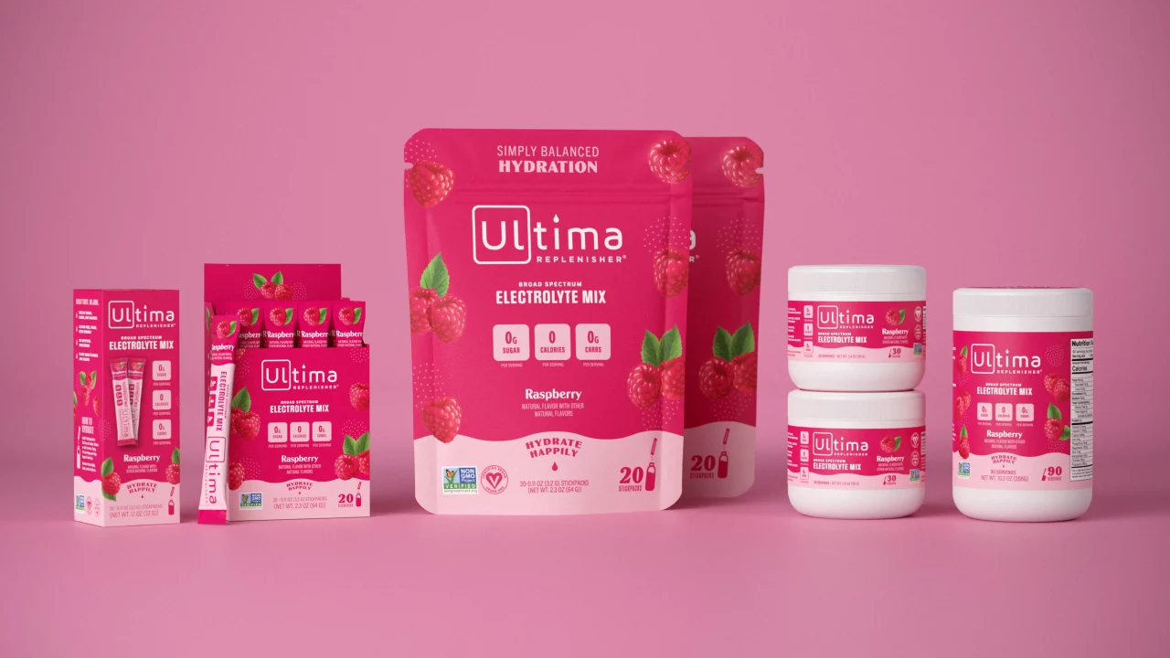
Our biggest challenge was creating a packaging system that worked across multiple formats, from pouches to canisters to single serving packets. The final designs ensured a successful transition across packaging types.
