- ... / Work / Wasa Crispbread
Wasa Crispbread
Goal
Wasa was looking to reinvigorate crispbread in the American market. They needed new packaging that would be appetizing and inspire new ways of snacking.
Services
Packaging Design
Photography Direction
Copywriting
Outcome
of shoppers viewed rebrand as an improvement.
increase in buy rate.
of consumers planned to buy it more often.
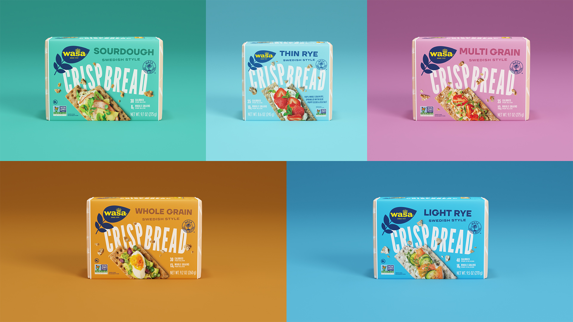
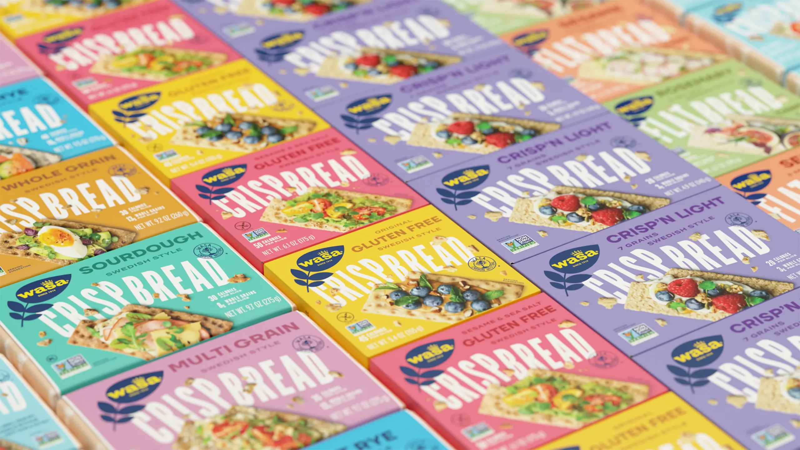
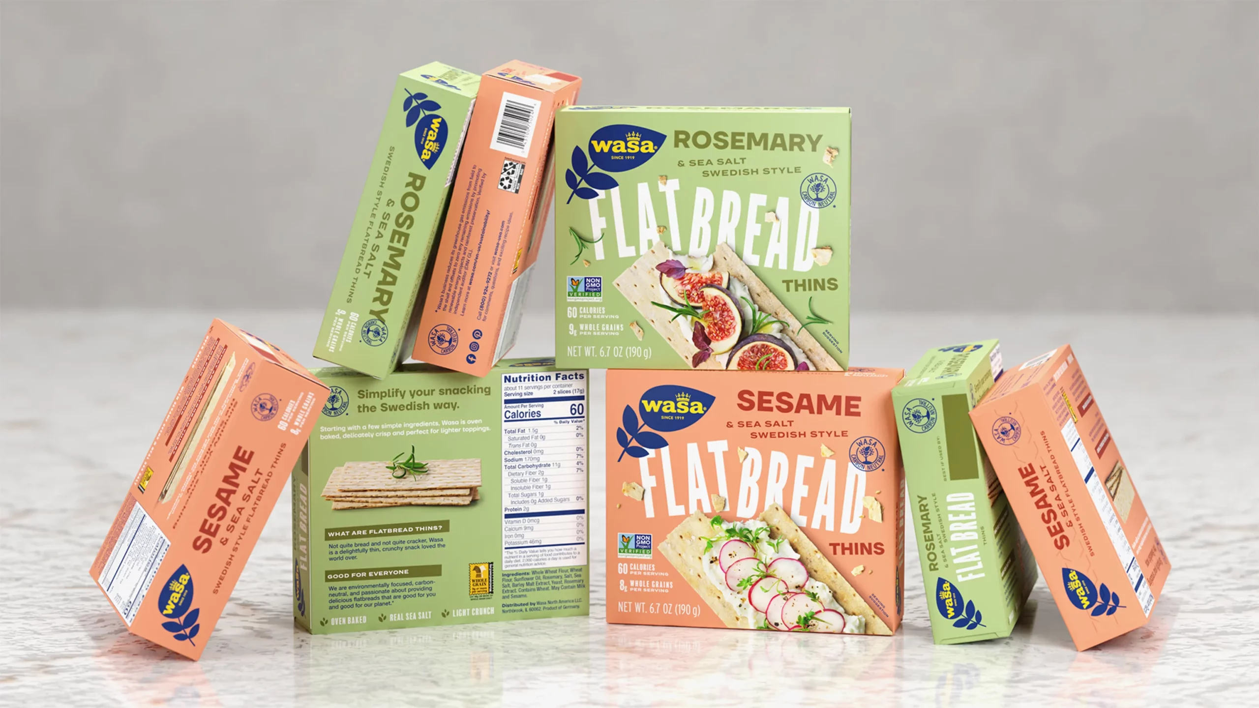
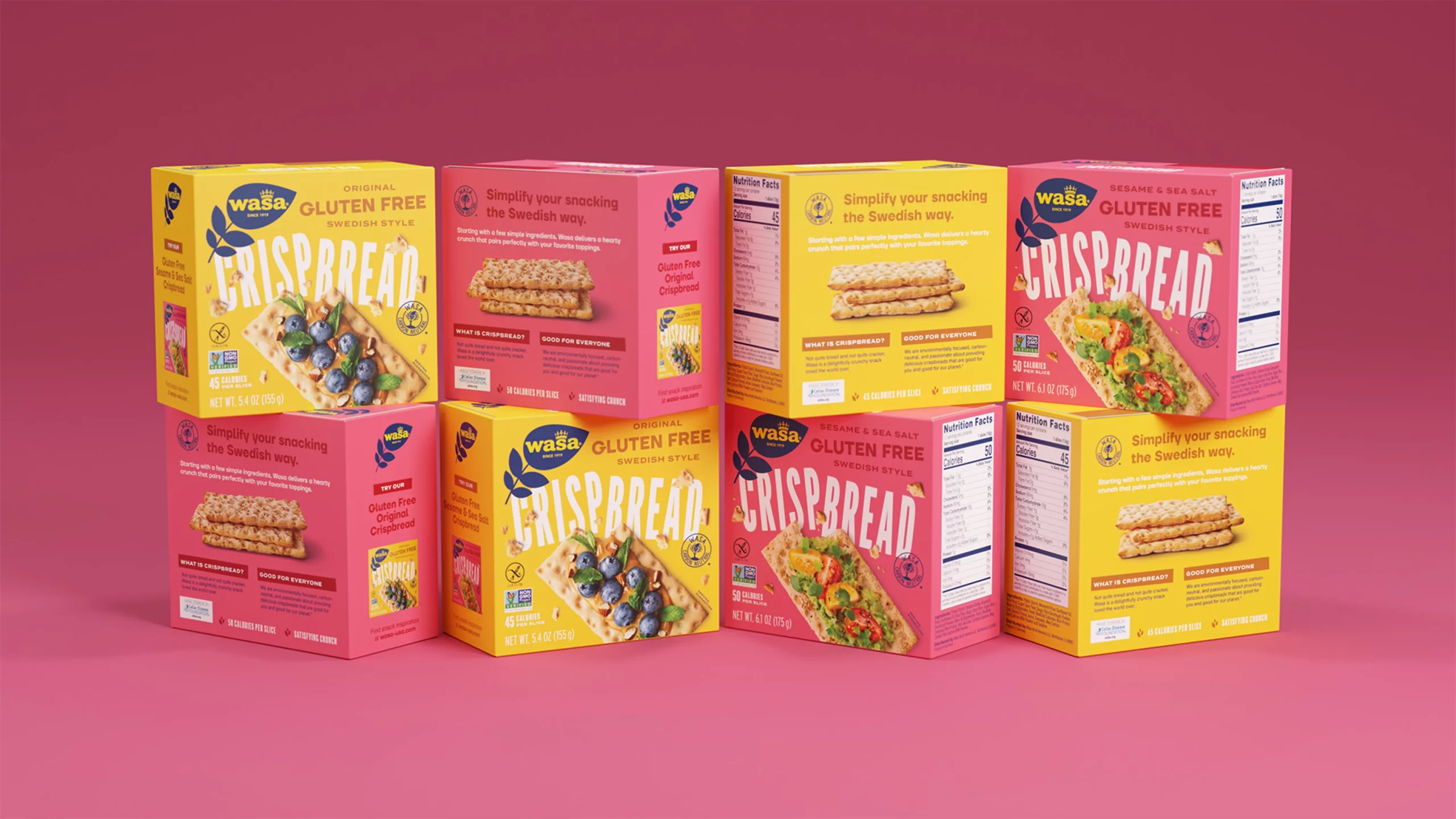
A Packaging Revolution
To bring crispbread to the next generation, Wasa wanted to revamp its packaging with modern design, updated photography, and compelling copywriting.
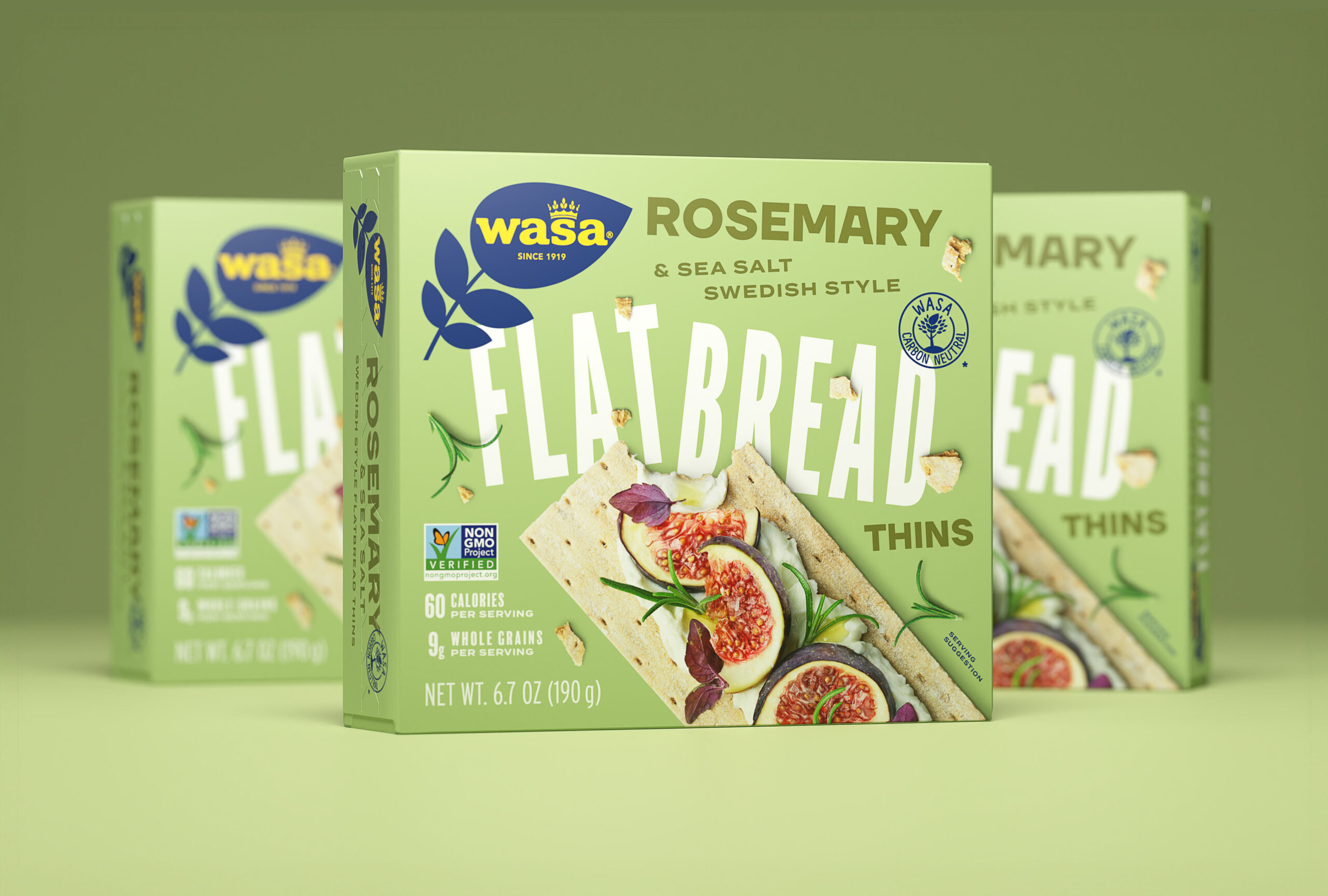
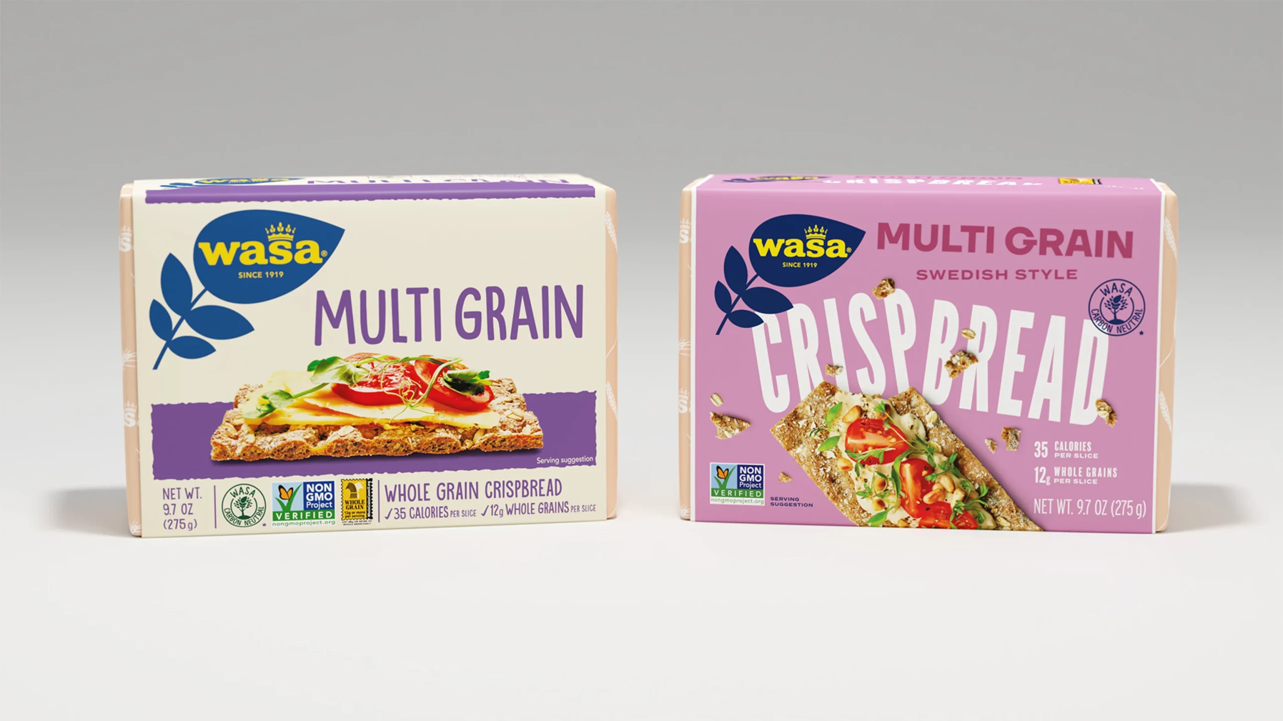
We endeavored to develop a modern and energetic packaging identity for Wasa while staying authentic to their Scandinavian roots. We employed a bold color pallet and irreverently skewed typography. We used naturalistic photography to capture the unique texture of the crispbread. The result was impactful and eye-catching. We’ve since seen dozens of examples of grocery stores using Wasa’s new packaging on endcaps and in displays.
Packaging Copywriting
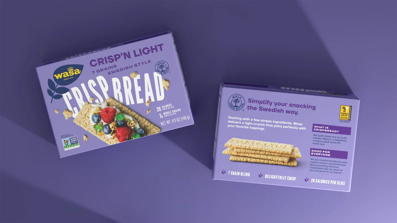
The packaging copy needed to effectively communicate the distinct flavor and textures of each unique crispbread product. We included some short informational tidbits on what the product is but also how Wasa’s environmental efforts set them apart from the competition.

“The packaging copy needed to effectively communicate the distinct flavor and textures of each unique crispbread product. We included some short informational tidbits on what the product is but also how Wasa’s environmental efforts set them apart from the competition.”
Angela Larisch
Strategy Director
Photography Direction
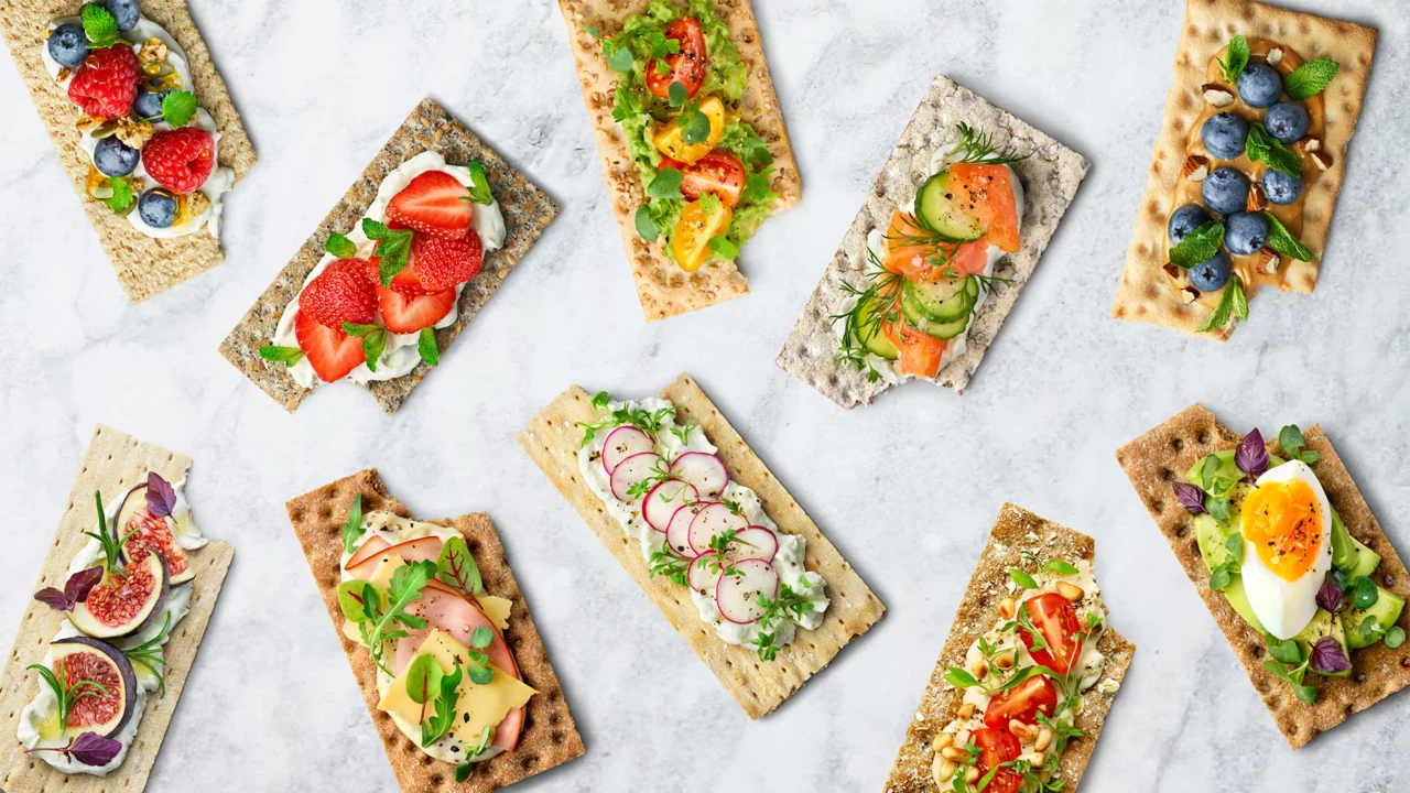
Photography was strategically shot to look incredibly crisp, with delicious approachable food pairings that showcase the versatility of the product. One key component is the use of crumbs and jagged edges that immerse the consumer in the realness and authenticity of the product.

“Photography was strategically shot to look incredibly crisp, with delicious approachable food pairings that showcase the versatility of the product. One key component is the use of crumbs and jagged edges that immerse the consumer in the realness and authenticity of the product.”
Andrew Bolton
Owner & Exec. Creative Director
“”