Frequently Asked Questions
What is the design process for creating a logo?
The design process for creating a logo involves several key steps: understanding the client's vision, conducting research, brainstorming ideas, creating initial sketches, refining designs, and finalizing the logo to ensure it effectively represents the brand identity.
How does Murmur Creative ensure a memorable logo design?
Murmur Creative ensures a memorable logo design by blending creativity with a collaborative process, focusing on understanding each client's unique brand identity to craft visually striking and meaningful logos that resonate with their target audience.
What types of logo design services does Murmur Creative offer?
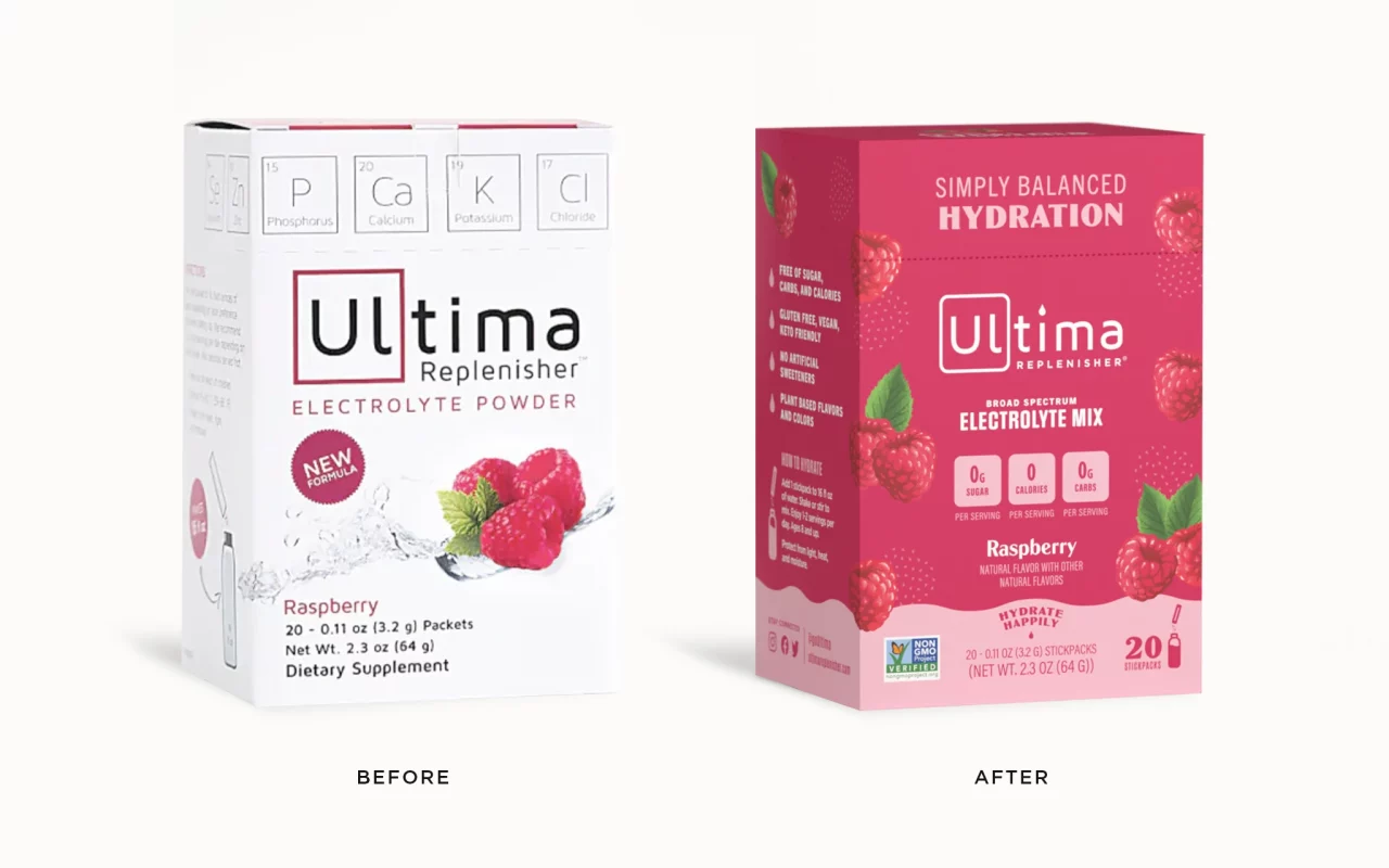
Murmur Creative offers a variety of logo design services, including custom logo creation, brand identity development, and logo redesign, all tailored to meet the unique needs of each client and enhance their brand presence.
What steps are involved in logo design?
The steps involved in logo design include research and brainstorming, concept development, design iteration, client feedback, and finalization, ensuring a collaborative process that results in a unique and memorable brand identity.
How does collaboration enhance logo creation?
Collaboration enhances logo creation by combining diverse perspectives and ideas, fostering creativity and innovation. This teamwork ensures that the final design resonates with the brand's identity while meeting client expectations effectively.
What makes a logo memorable and effective?
The qualities that make a logo memorable and effective include simplicity, distinctiveness, and relevance to the brand. A well-designed logo should be easily recognizable, convey the brand's essence, and leave a lasting impression on its audience.
How does Murmur Creative approach client projects?
Murmur Creative approaches client projects through a collaborative process, focusing on understanding the client’s vision and goals. This ensures that each logo design is tailored to effectively represent and enhance the brand identity.
What design styles does Murmur Creative specialize in?
Murmur Creative specializes in a variety of design styles, including modern, minimalist, vintage, and illustrative. Our approach is tailored to each client, ensuring that every logo reflects their unique brand identity.
How long does the logo design process take?
The duration of the logo design process varies, typically ranging from two to four weeks, depending on the complexity of the project and client feedback.
What is the importance of brand identity in logos?
The importance of brand identity in logos lies in its ability to convey a company's values and personality. A strong logo reinforces brand recognition, fosters customer loyalty, and differentiates a business in a competitive market.
How does feedback influence the design process?
Feedback significantly influences the design process by guiding revisions and ensuring the final logo aligns with client vision and brand identity. It fosters collaboration, enhances creativity, and ultimately leads to a more effective and memorable design outcome.
What tools does Murmur Creative use for design?
Murmur Creative utilizes a variety of industry-standard design tools, including Adobe Creative Suite (Photoshop, Illustrator, and InDesign) and Sketch, to create innovative and impactful logos tailored to each client's brand identity.
How are client preferences incorporated into designs?
Client preferences are incorporated into designs through a collaborative process, where we actively engage with clients to understand their vision, feedback, and specific requirements, ensuring that the final logo truly reflects their brand identity.
What are common mistakes in logo design?
Common mistakes in logo design include overcomplicating the design, using too many colors or fonts, failing to ensure scalability, and neglecting target audience preferences. A successful logo should be simple, memorable, and versatile across various applications.
How does color choice impact logo effectiveness?
The impact of color choice on logo effectiveness is significant. Colors evoke emotions and convey brand values, influencing how consumers perceive and connect with a brand. A well-chosen color palette can enhance recognition and memorability.
What trends are currently influencing logo design?
Current trends influencing logo design include minimalism, vibrant color palettes, and custom typography, all aimed at creating memorable and adaptable brand identities that resonate with modern audiences.
How does typography affect logo perception?
Typography significantly influences logo perception by conveying emotions and brand personality. The choice of font style, size, and spacing can impact how a logo is interpreted, making it essential for creating a memorable and effective brand identity.
What is the role of research in logo design?
The role of research in logo design is crucial as it helps designers understand the target audience, industry trends, and competitors, ensuring that the final logo is not only visually appealing but also strategically aligned with the brand's identity and goals.
How can logos adapt to different media?
Logos can adapt to different media by being designed in versatile formats, ensuring clarity and recognition across various platforms, such as print, digital, and merchandise. This adaptability enhances brand visibility and consistency in diverse applications.
What are the phases of the design process?
The phases of the design process include research and discovery, concept development, design refinement, and final delivery. Each phase emphasizes collaboration and creativity to ensure a memorable logo that effectively represents your brand identity.
How does Murmur Creative differentiate its services?
Murmur Creative differentiates its services through a collaborative design process that prioritizes client input, ensuring each logo is uniquely tailored to capture and enhance brand identities while fostering creativity and innovation.
What is the significance of scalability in logos?
The significance of scalability in logos is that it ensures the logo maintains its clarity and visual impact across various sizes and applications, from business cards to billboards, thereby enhancing brand recognition and versatility.
How does the agency ensure client satisfaction?
The agency ensures client satisfaction through a collaborative design process, regular communication, and by incorporating client feedback at every stage. This approach guarantees that the final logo aligns with the client's vision and brand identity.
What are the benefits of custom logo design?
The benefits of custom logo design are significant, as it creates a unique and memorable brand identity, enhances professionalism, and effectively communicates your brand's values and vision to your target audience.
How does storytelling play a role in logos?
Storytelling plays a crucial role in logos by conveying a brand's values and mission visually. A well-crafted logo encapsulates the narrative of a brand, making it memorable and emotionally resonant with the audience.
What industries does Murmur Creative serve?
Murmur Creative serves a diverse range of industries, including technology, retail, hospitality, and healthcare, providing tailored logo design solutions that resonate with each sector's unique branding needs.
How can logos convey brand values effectively?
Logos can effectively convey brand values by visually representing the essence of the brand through color, shape, and typography. A well-designed logo encapsulates the brand’s personality, mission, and core values, creating an immediate connection with the audience.
What is the process for revising logo designs?
The process for revising logo designs involves a collaborative approach where clients provide feedback on initial concepts. We then refine the designs based on this input, ensuring the final logo aligns with the client's vision and brand identity.
How does Murmur Creative showcase its portfolio?
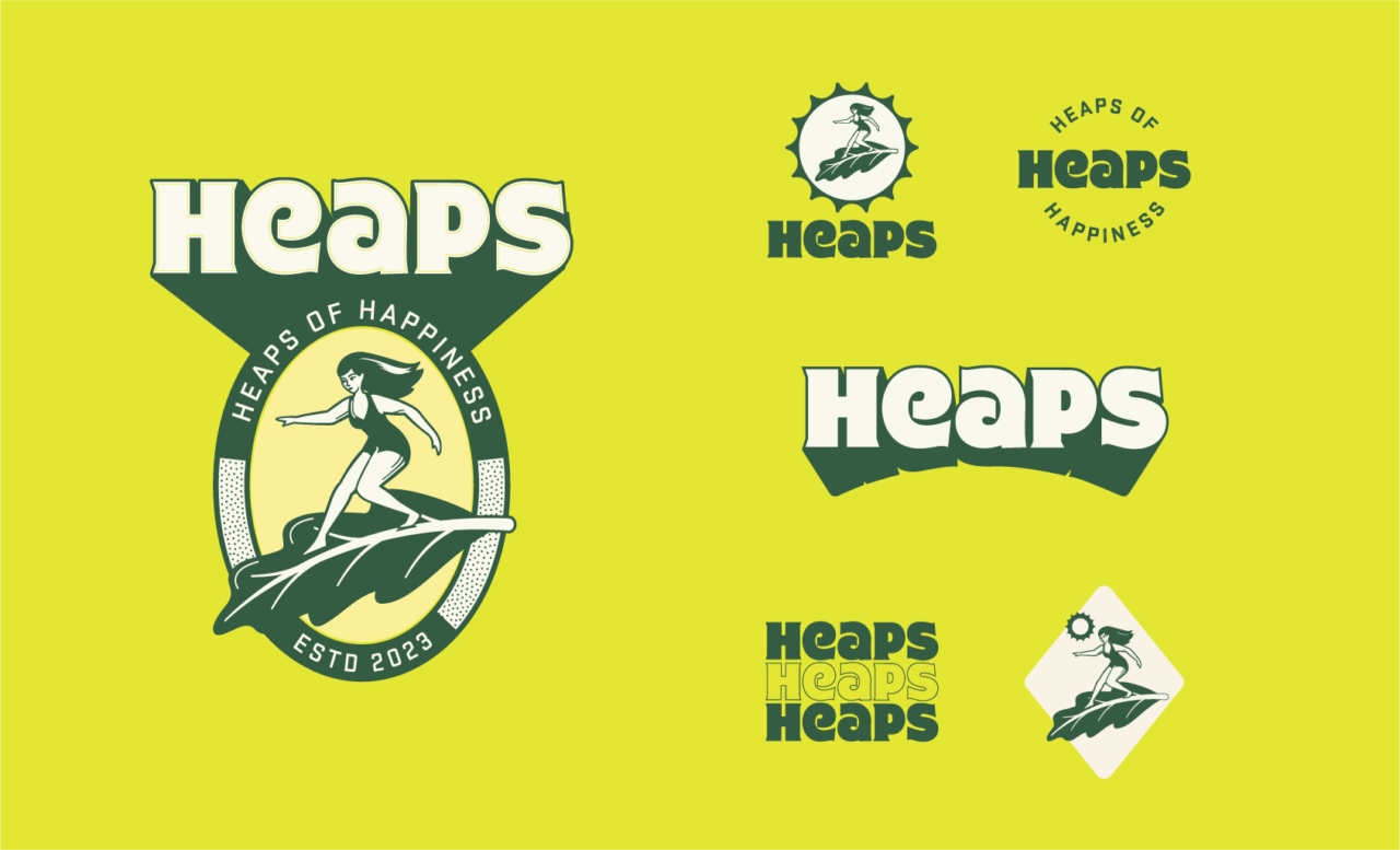
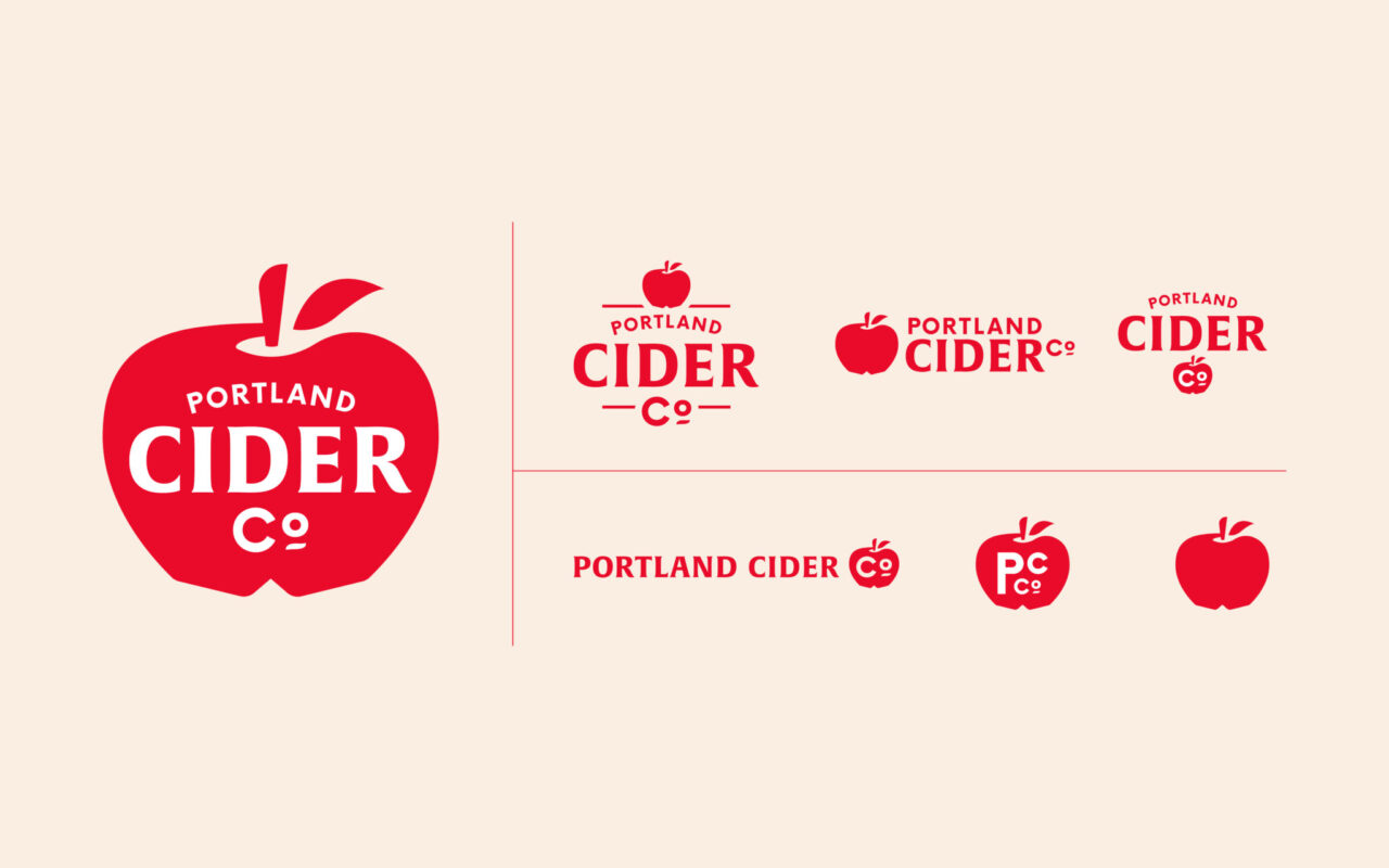
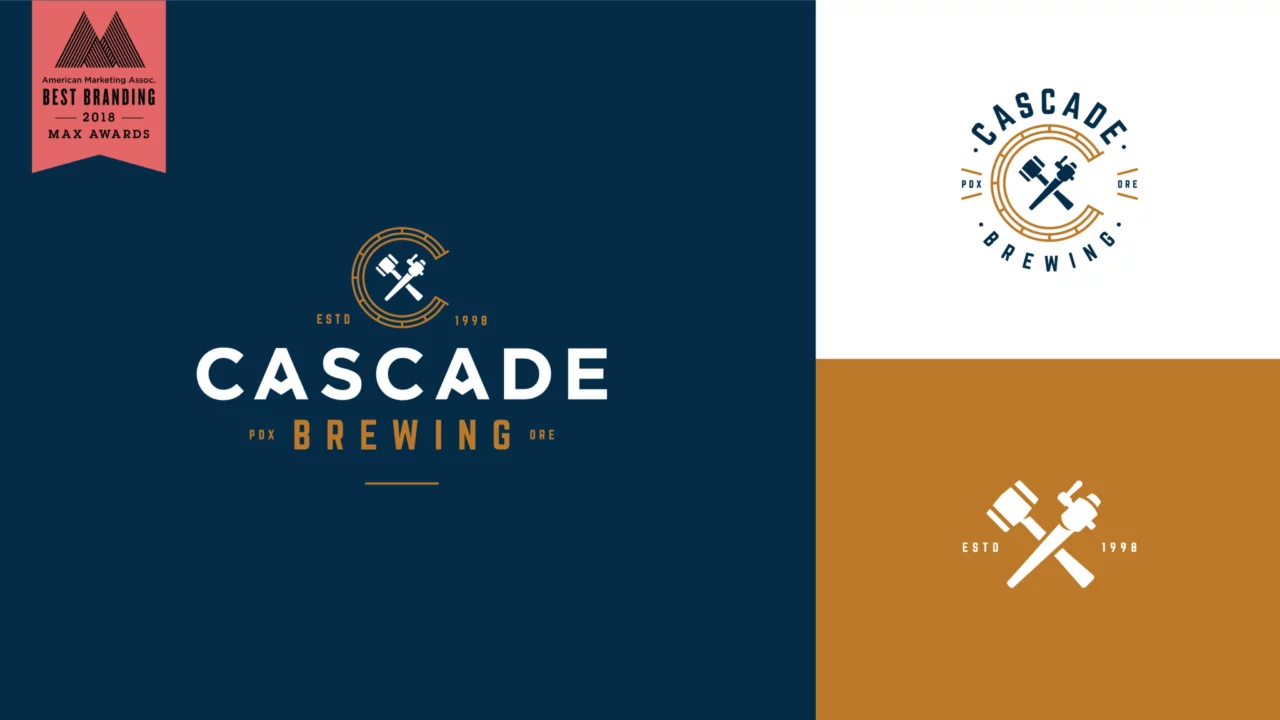
Murmur Creative showcases its portfolio through a curated collection of client projects displayed on its website, highlighting the unique logo designs and creative processes that define their approach to brand identity.
What are the key elements of effective logo design?
The key elements of effective logo design include simplicity, memorability, versatility, relevance, and uniqueness. A well-designed logo should clearly communicate the brand's identity while being easily recognizable across various applications.