- ... / Work / Mule Extracts
Mule Extracts
Goal
Mule needed branding that would highlight the quality of their product and help them stand out in the crowded cannabis industry. We were excited to help grow their wings.
Services
Visual Identity
Brand Strategy
Packaging Design
Photography
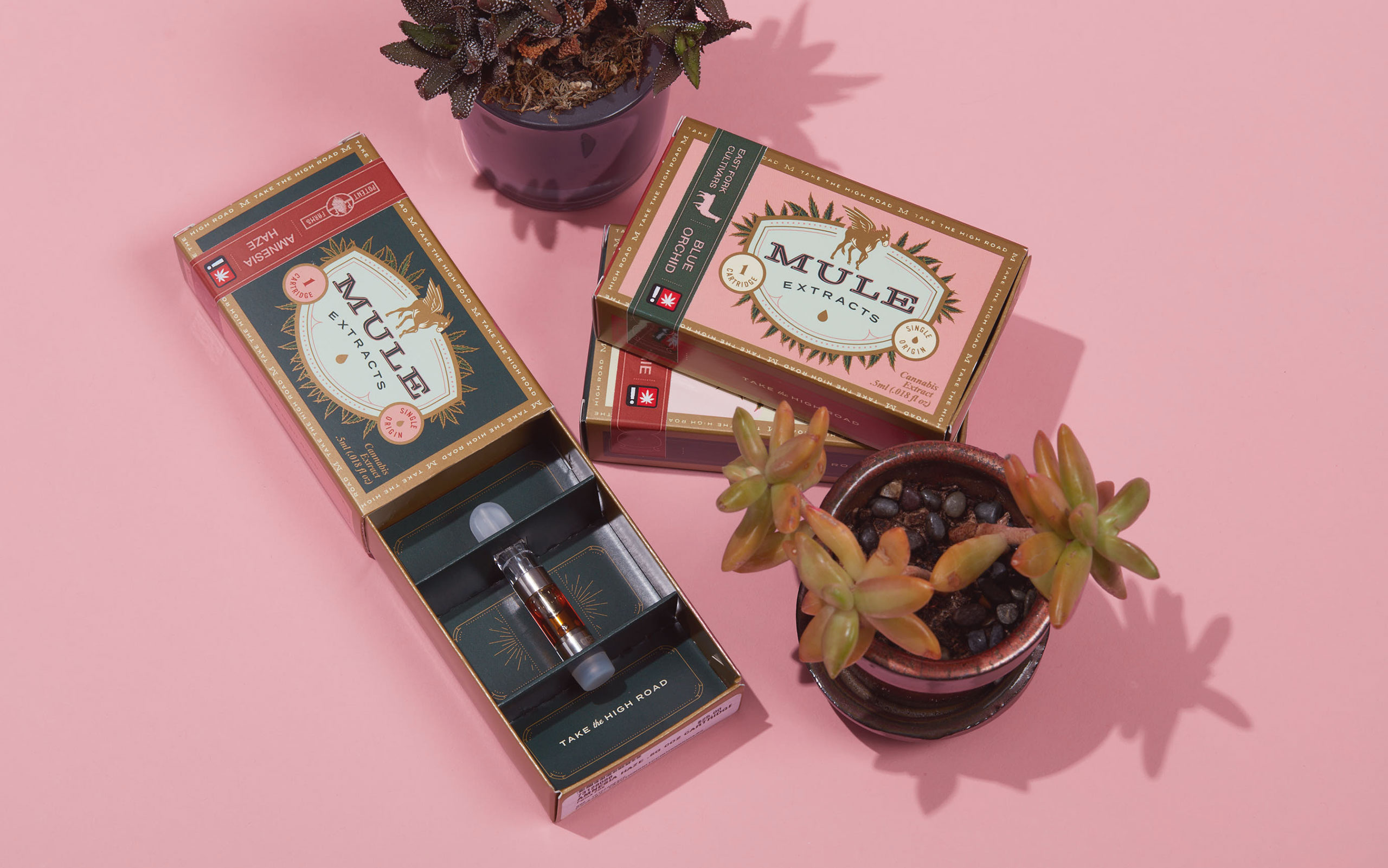
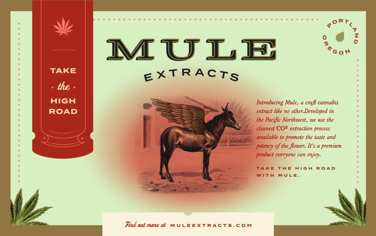
Mule is a craft cannabis company dedicated to created the best quality concentrates for an affordable price. They needed a logo, packaging, and a tagline for their new product.
We began our process with workshops designed to help us understand what set this product apart from similar concentrates. We soon discovered that Mule’s concentrates were of an unusually high quality for their price point. The name, Mule, pointed to the brand’s everyperson quality, their dedication to keeping their product accessible and unassuming. In creating their branding, we wanted to indicate the high quality of the product, evoking a playful sense of luxury.
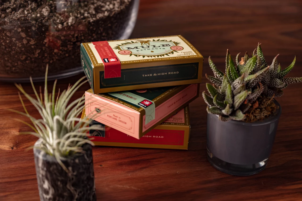
Packaging
The Mule packaging was inspired by vintage cigar boxes. As an affordable luxury, cigars are given a unique reverence that we wanted to bring into cannabis branding. We created typography around the edge of the box to evoke vintage advertising and an antique looking band to indicate the varietal of each cartridge. Functional and legal requirements are incorporated seamlessly into the design and the box is engineered to fit each cartridge securely. We used a gold metallic pantone and a soft baby pink to help Mule stand out as a high quality and subtly playful option among cannabis competitors.
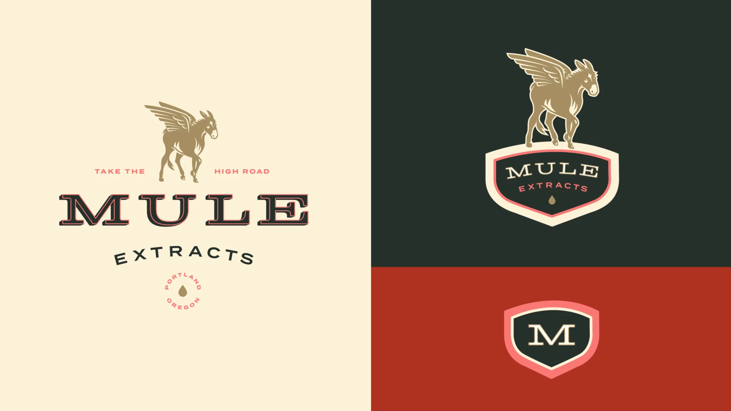
Logo & Tagline
We created the logo and tagline in tandem so they would better be able to reinforce each other. Our design and strategy teams worked closely together brainstorming ideas. When we arrived at the mule with wings, we knew we had our concept. The final mule is a charming figure with a bit of everyday sophistication. The tagline “Take the High Road,” is an uplifting call to action that circle around a pun.