Visual Identity
Craft a Cohesive Visual Identity that Stands Out
In a world full of endless distractions, we craft visual identities that not only grab attention but hold onto it. Turn glances and scrolls into lasting impressions and purchases with striking, meaningful branding.
Our experienced designers and art directors will work closely with you to create a strategic and adaptable identity that you, your audience, and your employees will be proud of.
Identity Creation
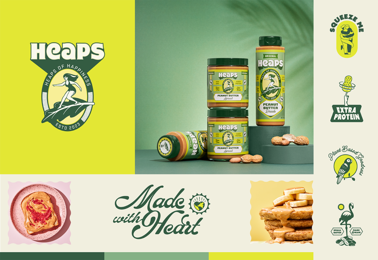
Heaps
Peanut butter is often a function-forward category, so our goal was to differentiate Heaps by merging indulgence, health, and high aesthetics to reach a young and discerning consumer.
Referencing the brand’s Miami origins, we zeroed in on the golden surf era of the 70s as a source of inspiration. We provided Heaps with a lively, flexible logo system, a unique color palette, and versatile brand graphics highlighting features of their peanut butter.
Identity Revolution
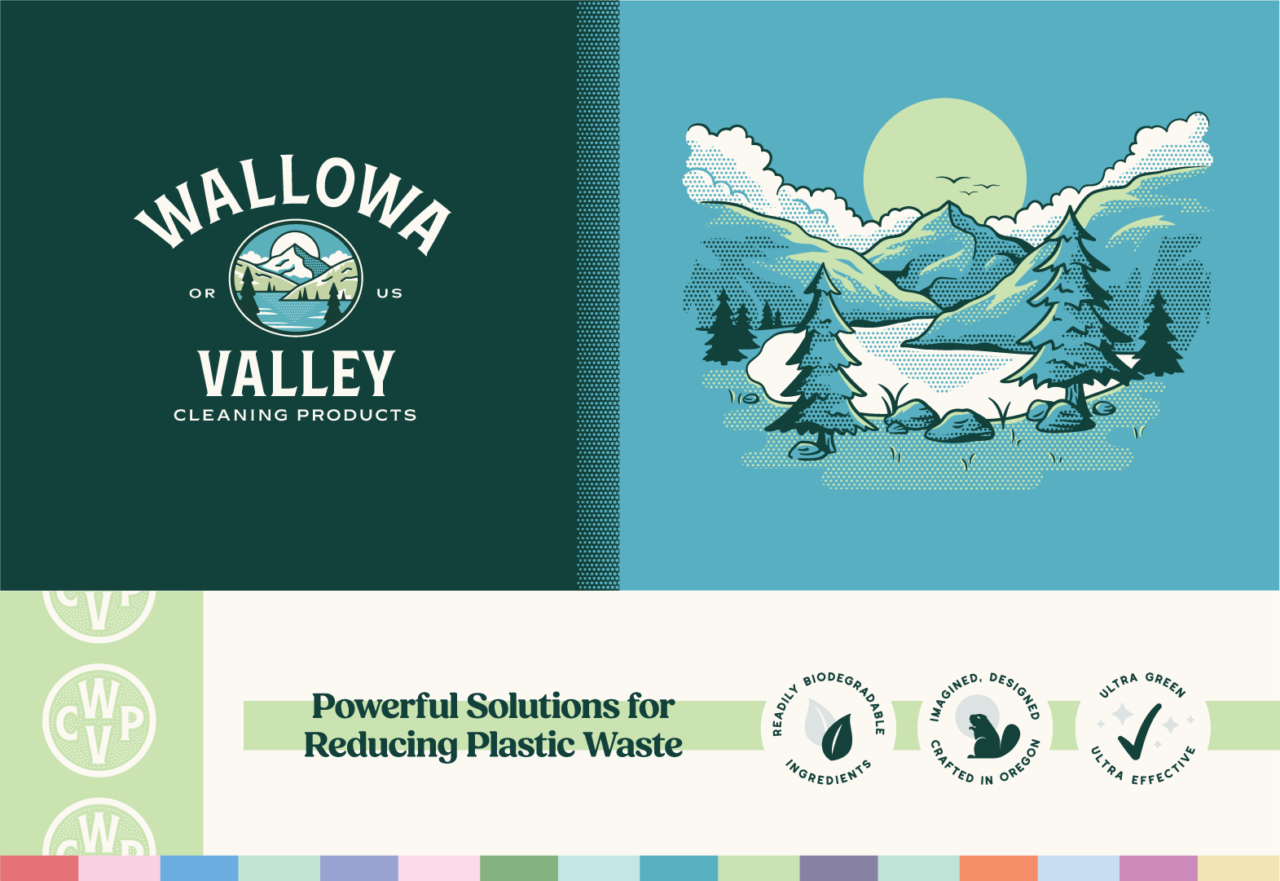
Wallowa Valley Cleaning Products
The WVCPteam is driven by their belief that green products can be more effective than harsh chemicals. The foundations of the WVCP brand are inspired by the pristine beauty of Eastern Oregon and the Wallowa Valley, providing lots of inspiration for our creatives.
When we began crafting their new identity, we knew the picturesque mountains and Oregon pine trees belonged in the logo. The idea behind the style of the packaging artwork was sparked from National Park signage aesthetics and the landscape ink illustrations of the Old West.
From the Client
“We spent a fortune with four other companies on branding, labeling, and building a website. The results were not good. Then, we found Murmur, and they surpassed my highest hopes. Murmur listened to our team and came up with multiple ideas to achieve our goals. They adjusted, fixed, corrected, cajoled, imagined, and pushed back. We are absolutely in love with the results.”
Mike Harvey
Owner of Wallowa Valley Cleaning Products
Identity Evolution
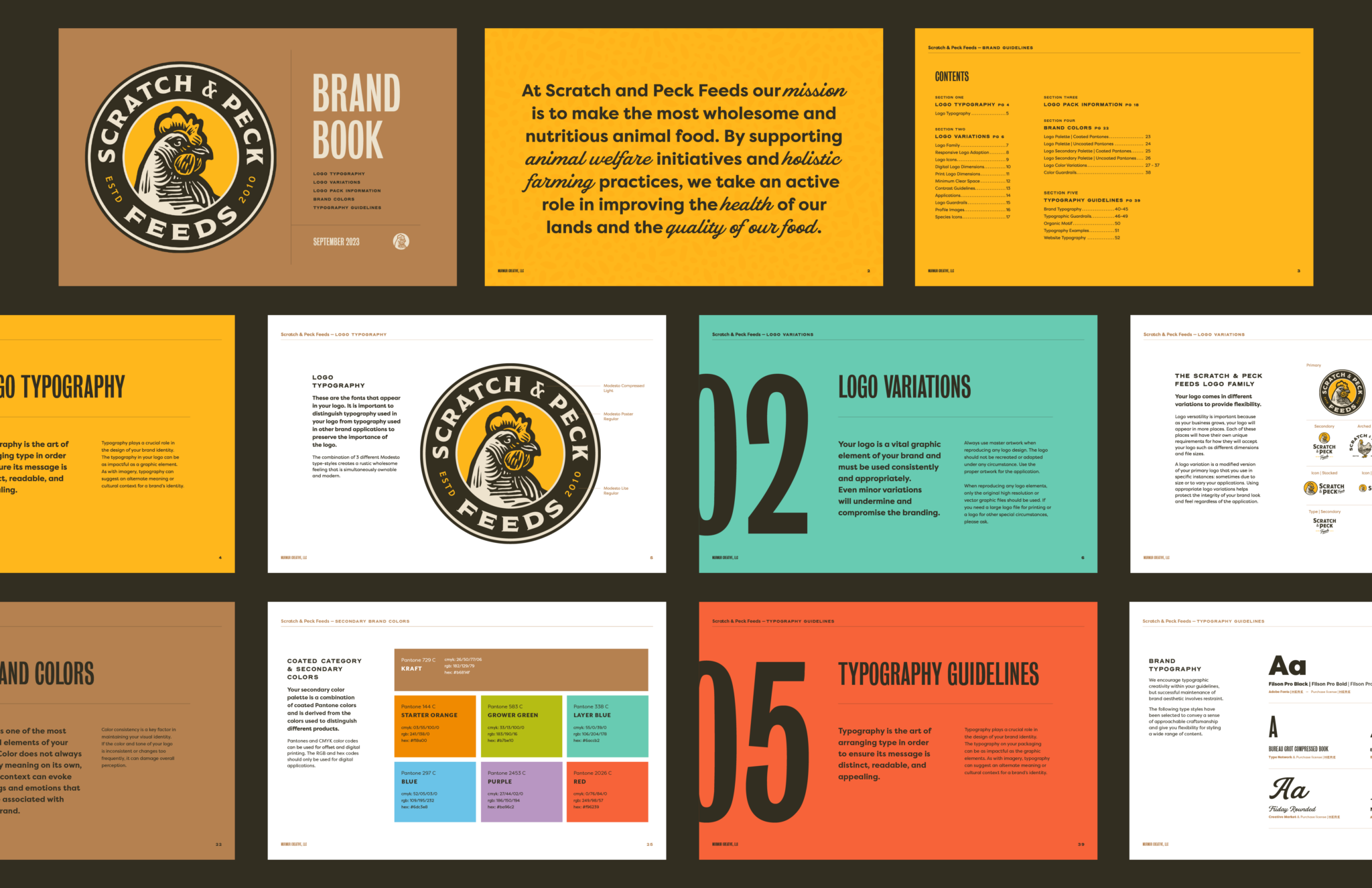
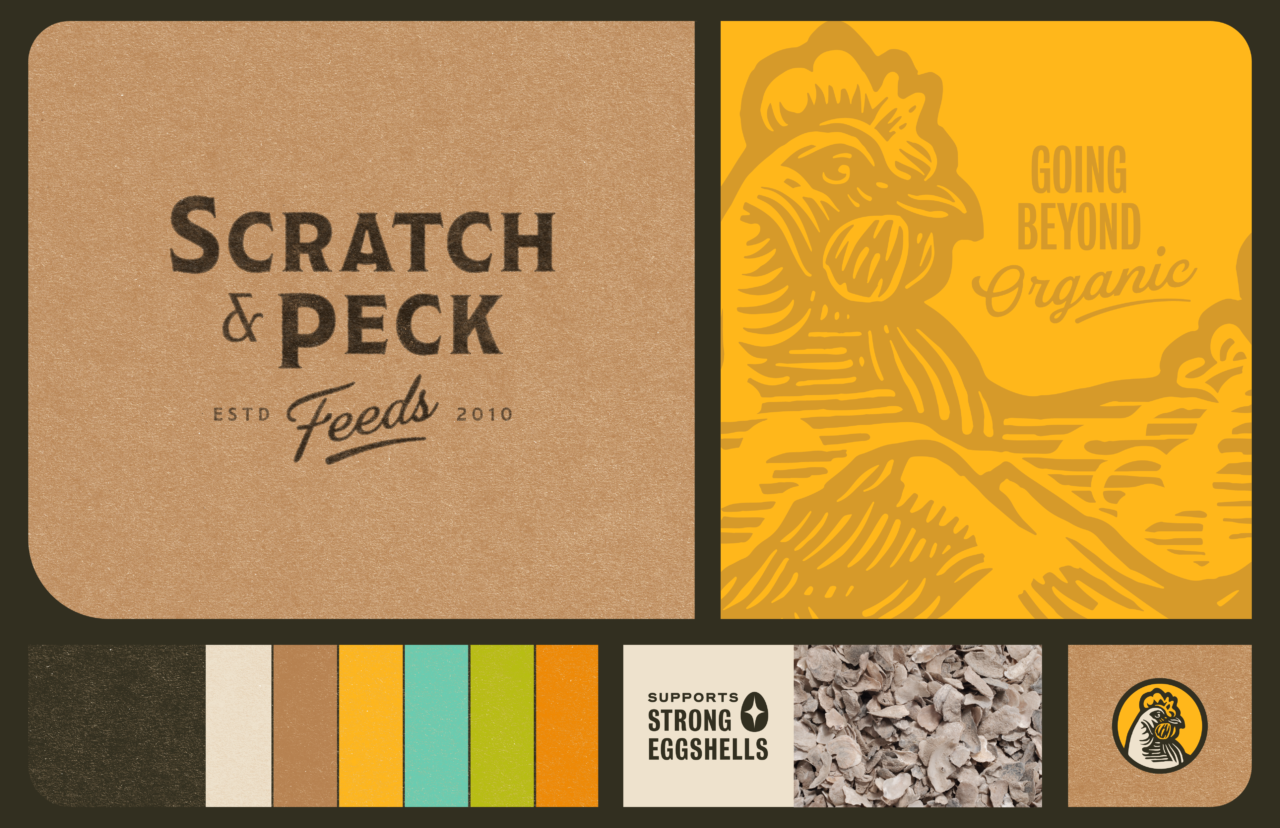
Scratch & Peck
Scratch & Peck came to us seeking a branding and packaging evolution with a new mascot to rally around. We wanted to maintain some of the features of their old branding, so we kept the circular badge style of their original logo with a chicken at the center.
We reimagined what that chicken looked like and illustrated “Mona,” the new S&P mascot. Part of the updating included adding a wood grain effect to the logo for a pastoral feel. We provided S&P with a bright and earthy palette to play in and a system of illustrated assets including icons, social media graphics, and packaging details.
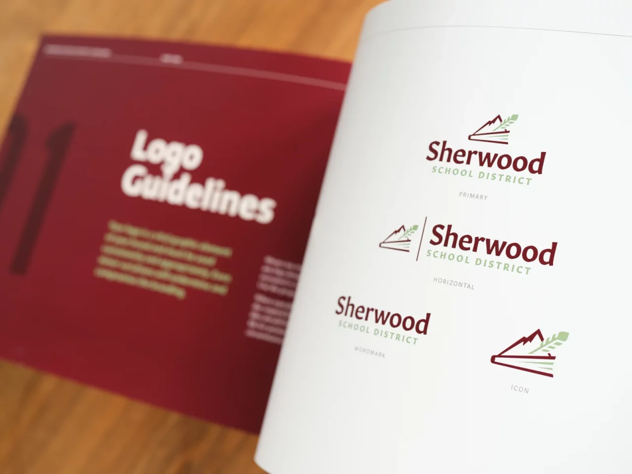
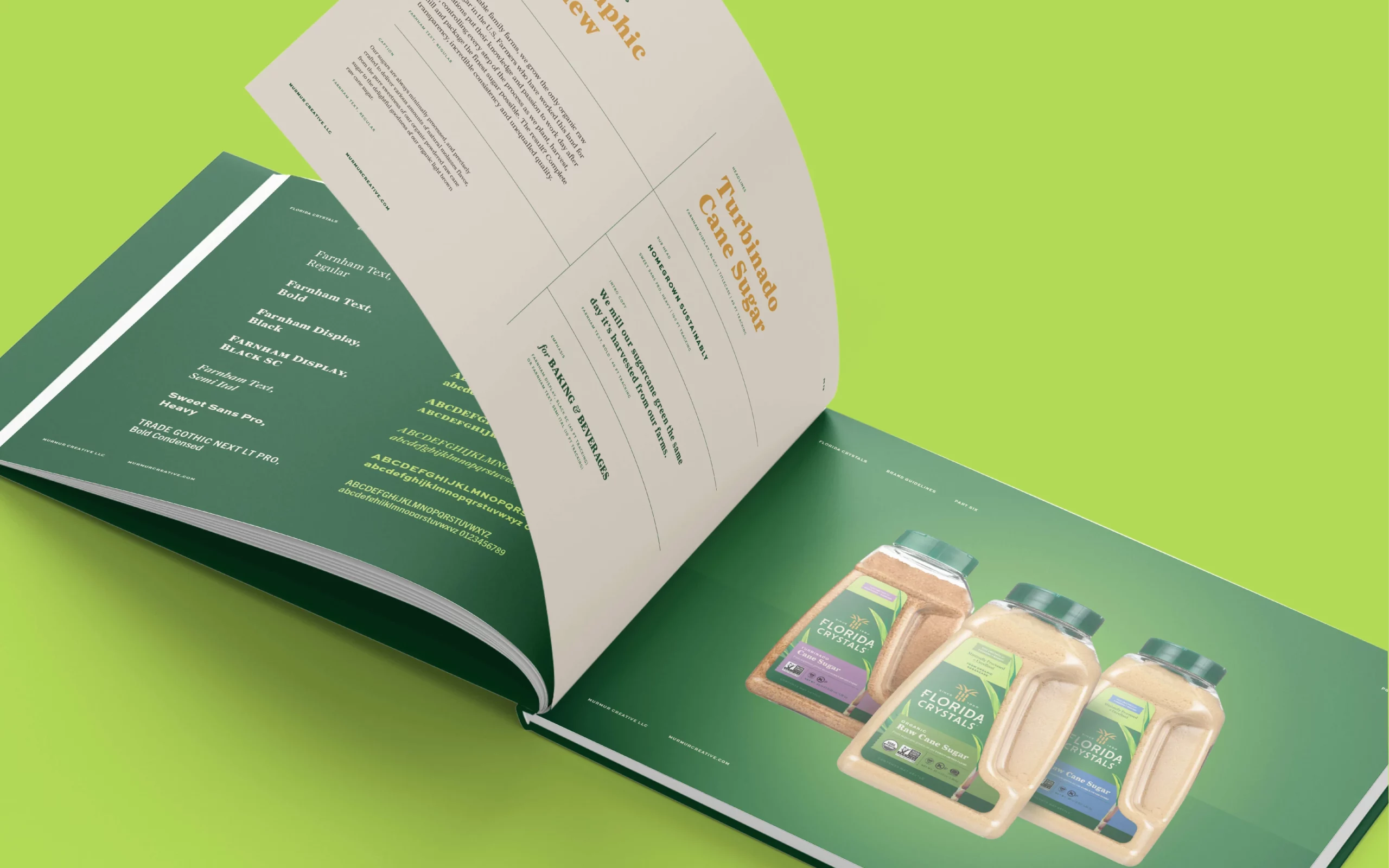
Brand Guidelines
A lot of time, creativity, and hard work goes into developing a logo and brand identity. At the end of our collaboration, we want it to be easy for you to take off running with your new look. To set your team up for success, we can develop a framework for expressing your brand.
Our brand books, whether hard cover or digital, contain guidelines that ensure your new identity is used correctly. This makes it easy for any designer or print shop to render your logo and artwork in the proper colors, format, and context.