- ... / Work / Compris Vineyard
Compris Vineyard
Goal
Compris wanted a brand identity and website that would resonate with their mission – promoting more inclusivity and diversity within the wine industry.
Services
Brand Strategy
Visual Identity
Packaging Design
eCommerce Website
Copywriting
Accessibility & SEO
Outcome
increase in wine club sign ups
in the first year
increase in return ecommerce customers
in the first year
increase in repeat ecommerce sales
in the first year
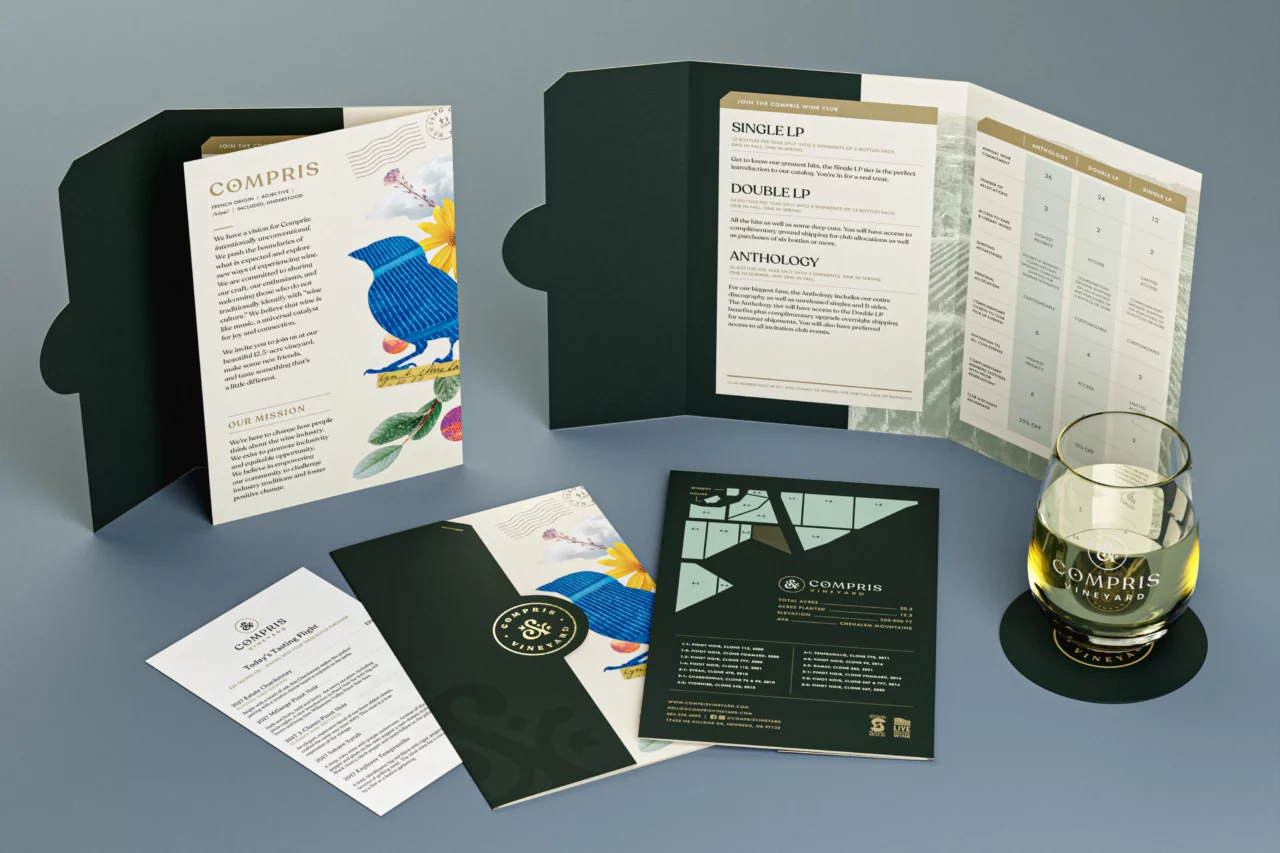
When owners Dru and Erin bought their vineyard, they knew they wanted to build a community. We worked with them to create a values-based foundation for their unique brand.
Brand Strategy
Compris is a French word that means inclusion, and it speaks to their desire to create a diverse community. This was evident when they hired the first black winery president to round out their team. As a brand new organization, it was important that the character of the brand was born from the values and dreams of the team. We dug into their values and beliefs and explored common threads. This foundational work was key in discovering how important music was to all of them and how this passion for music could be woven into the brand.

“When developing a brand from scratch, we like to start with the basics. Through a series of interactive workshops, we helped Compris establish a strategic foundation. We uncovered core values and crafted mission and vision statements that felt authentic to their higher purpose.”
Angela Larisch
Strategy Director
Wine Naming
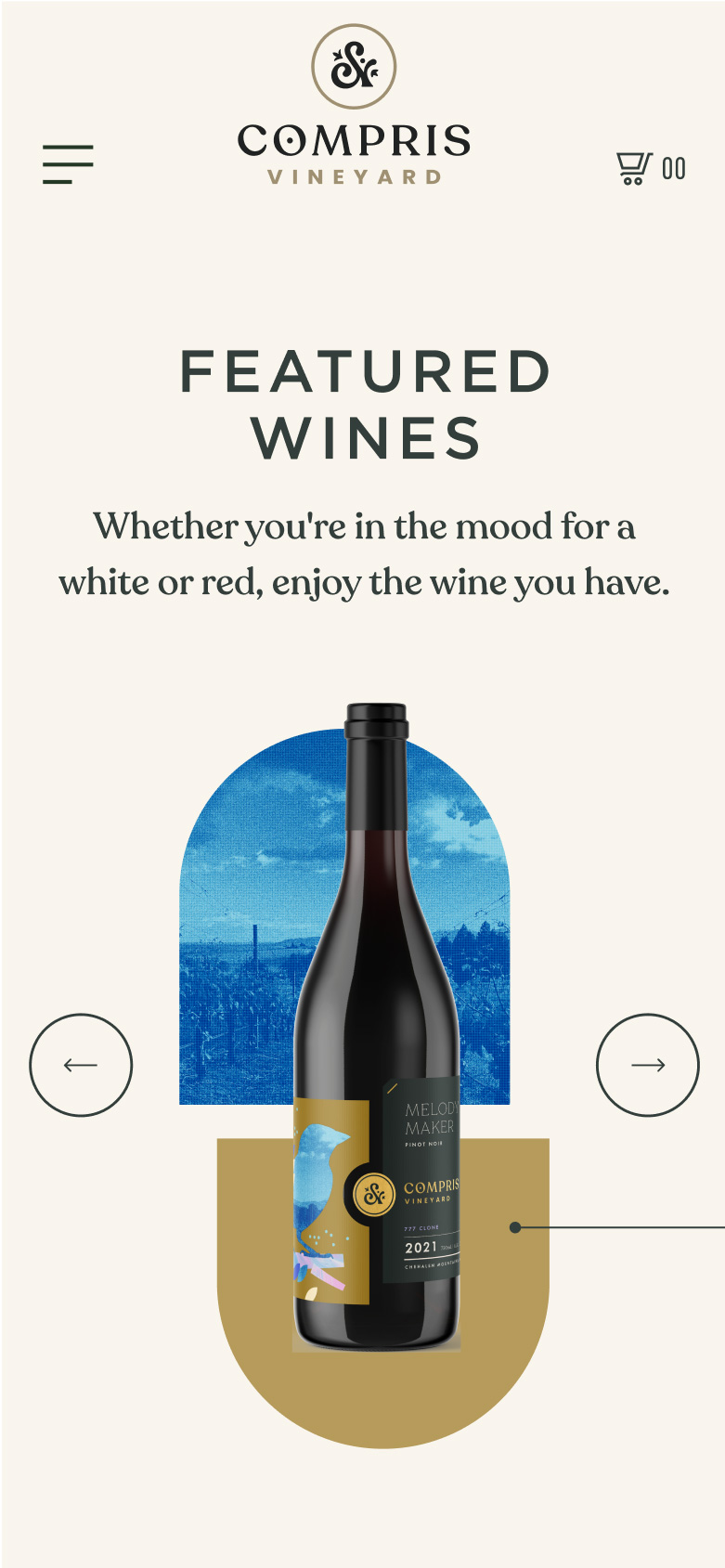
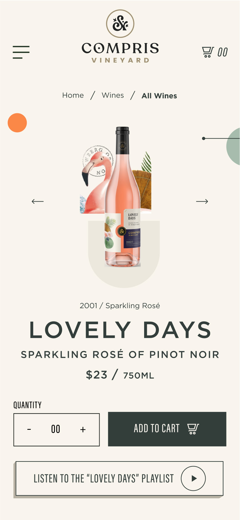
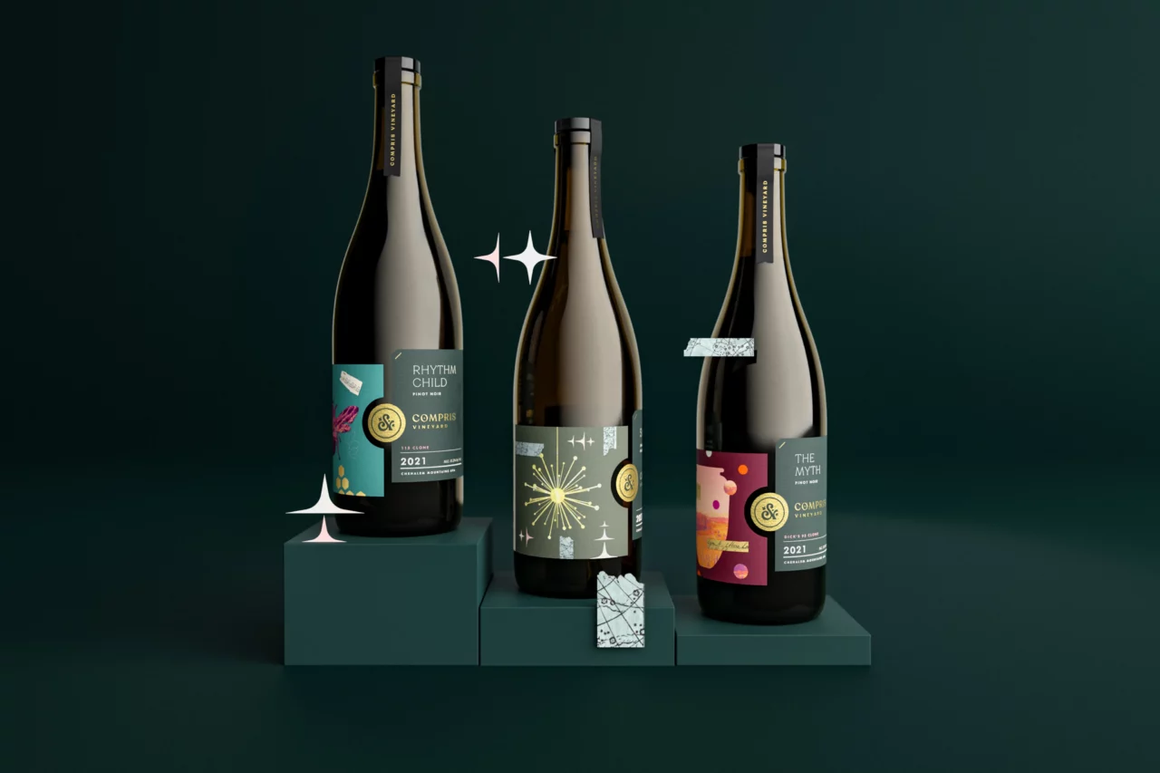
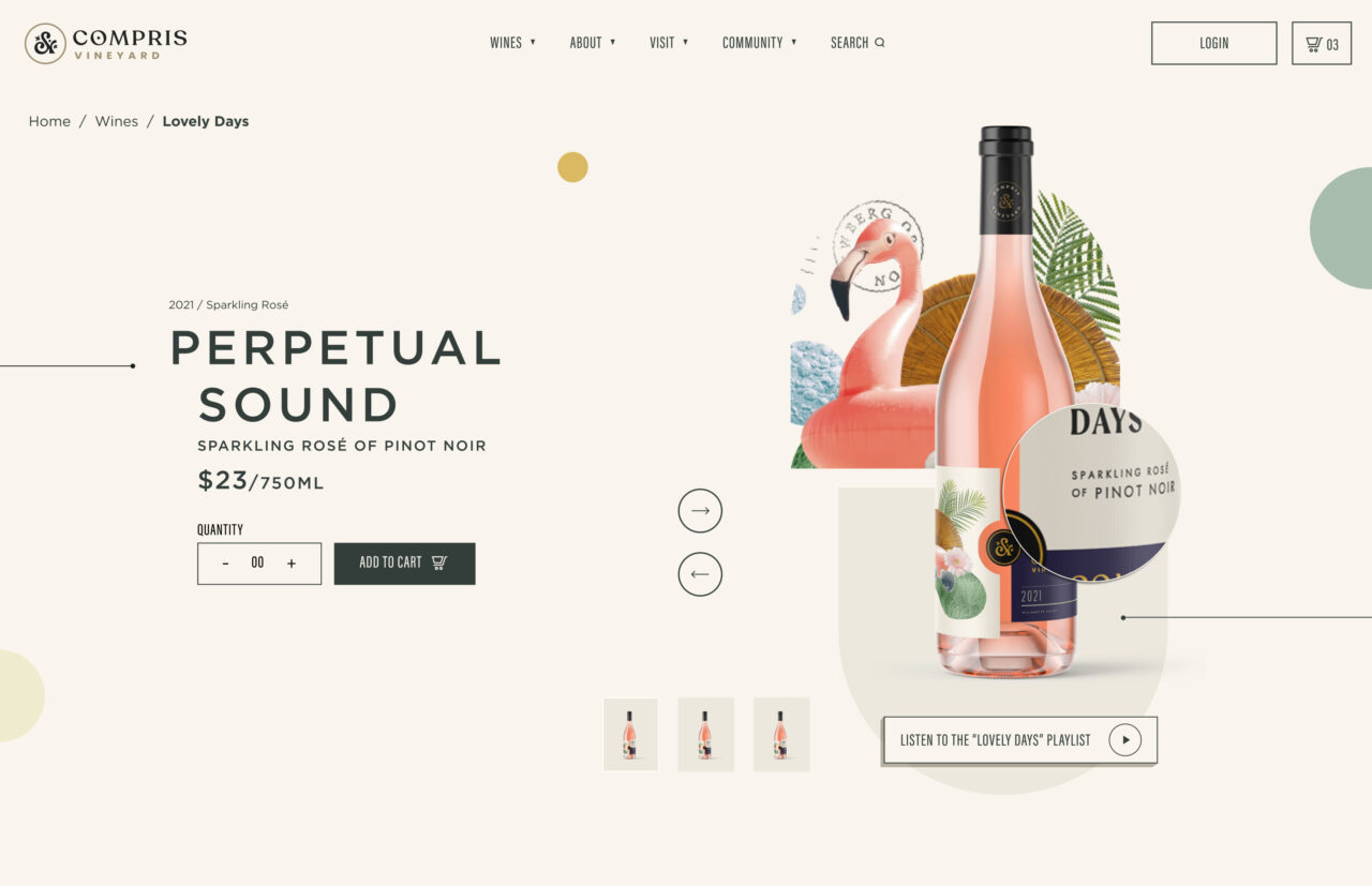
Part of Compris’ branding work included the naming of 15 different wines. From our workshops, we developed a naming convention that showcased the team’s love of music while telling the story of each unique wine.To ensure the names felt authentic, we scanned music and artists handpicked by the client. We pulled interesting descriptive lyrics and distilled them into two to three-word names that conveyed a feeling, emotion, aesthetic, or taste that tied to one of their wines. The final name choices were the perfect reflection of the winery: sophisticated but approachable – with a touch of whimsy.
From the Client
“We were unsure what our new brand would look like and knew we needed help. Murmur seemed an obvious choice for us as a mission/values-based organization with an amazing portfolio. Our intuition was proven correct. Throughout the entire process, the Murmur Team guided us toward success. They spent time getting to the core of who we are and translating it perfectly into something tangible. Murmur is not our business partner, they are an extension of our family.”
Dru Allen
Proprietor/COO of Compris Vineyard
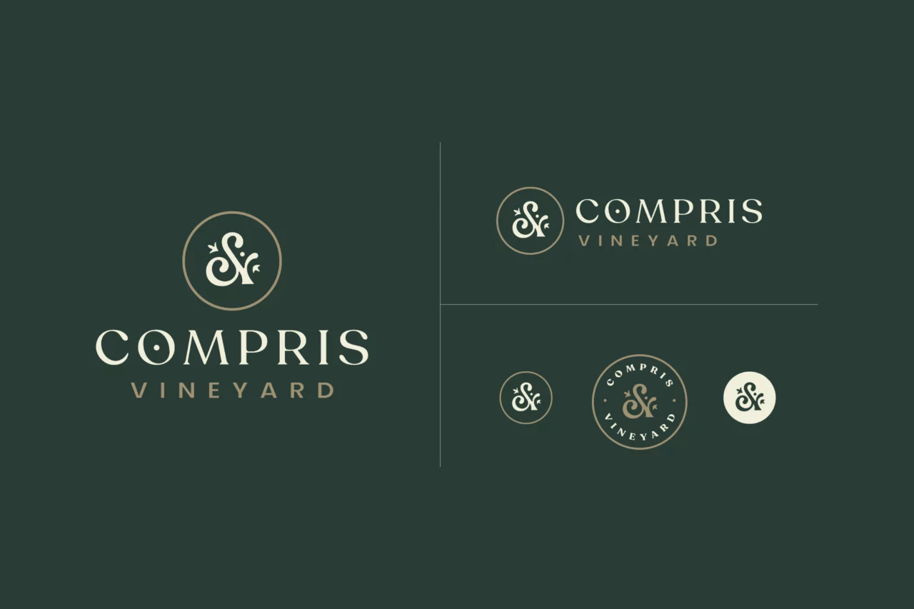
Logo System
We created a monogram of an ampersand, composed of a “C” and “V,” flanked by subtle botanical ornaments to perfectly render the meaning of the word Compris. The soft, rounded motifs of the logotype exude elegance without feeling exclusive. The new logo provides endless varieties of color and orientation to meet the creative demands of the wine industry.

“We're always looking for an elegant way to unite brand messaging with the logo mark, so we were very excited to discover that the combined forms of Compris Vineyard’s initials would create an ampersand that so perfectly represents their mission of inclusion.”
Marc Girouard
Art Director
Packaging Design
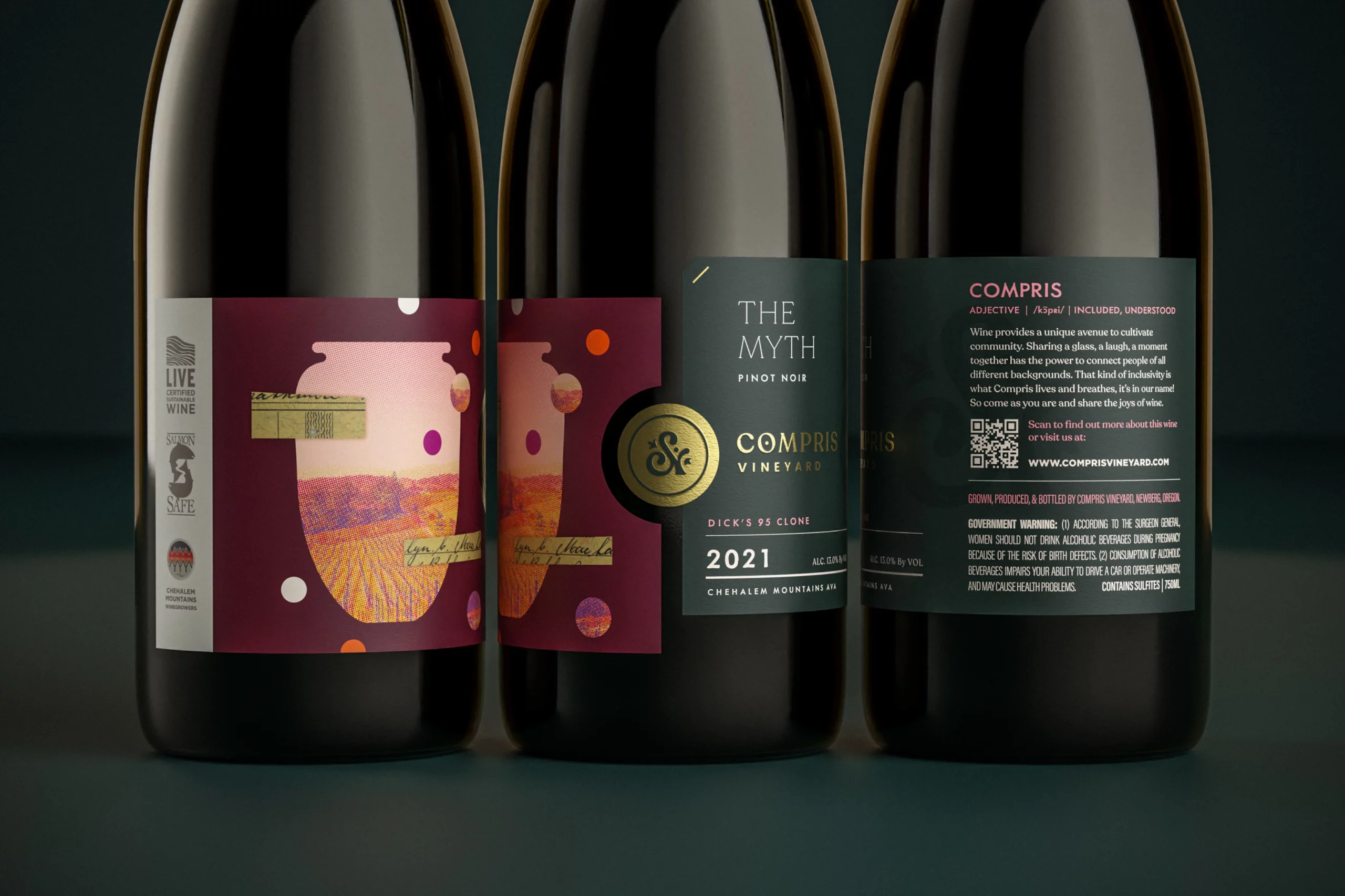
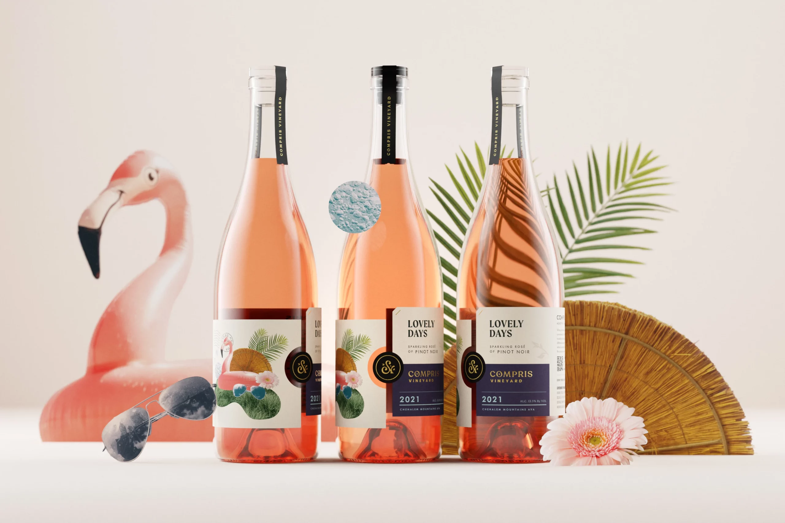
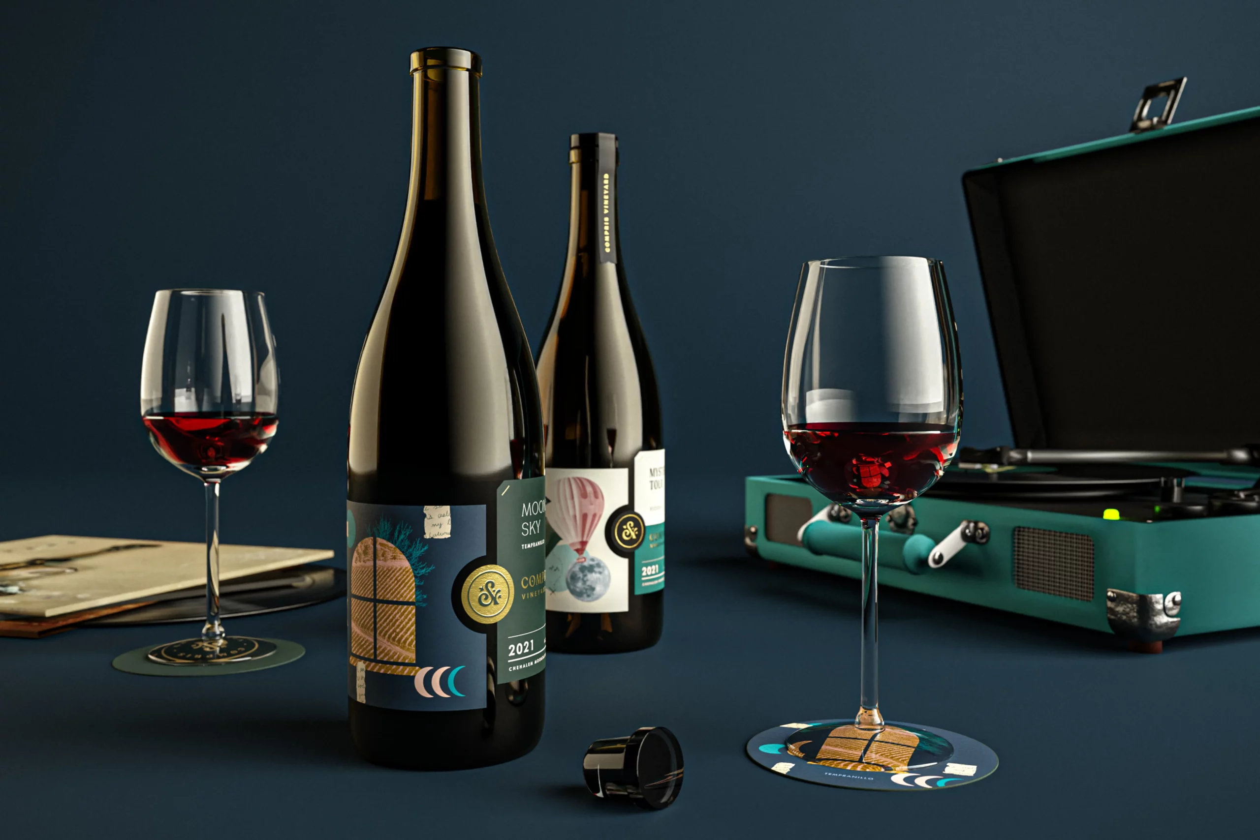
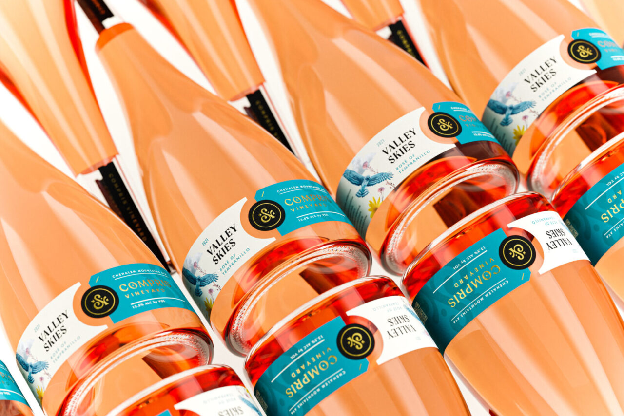
Tiering Compris’ wine offerings gave us the opportunity to develop two unique creative tracts for the labels. The gateway tier is designed to beckon wine newcomers and veterans alike with whimsical and playful photographic collages that capture the emotion of the wine names in an approachable way. Conversely, top-tier wines are sleeker and have an upscale color palette with jewel tones. Both gateway tier and top tier labels share a quintessential design feature: two labels coming together, and the Compris seal locking them in place.
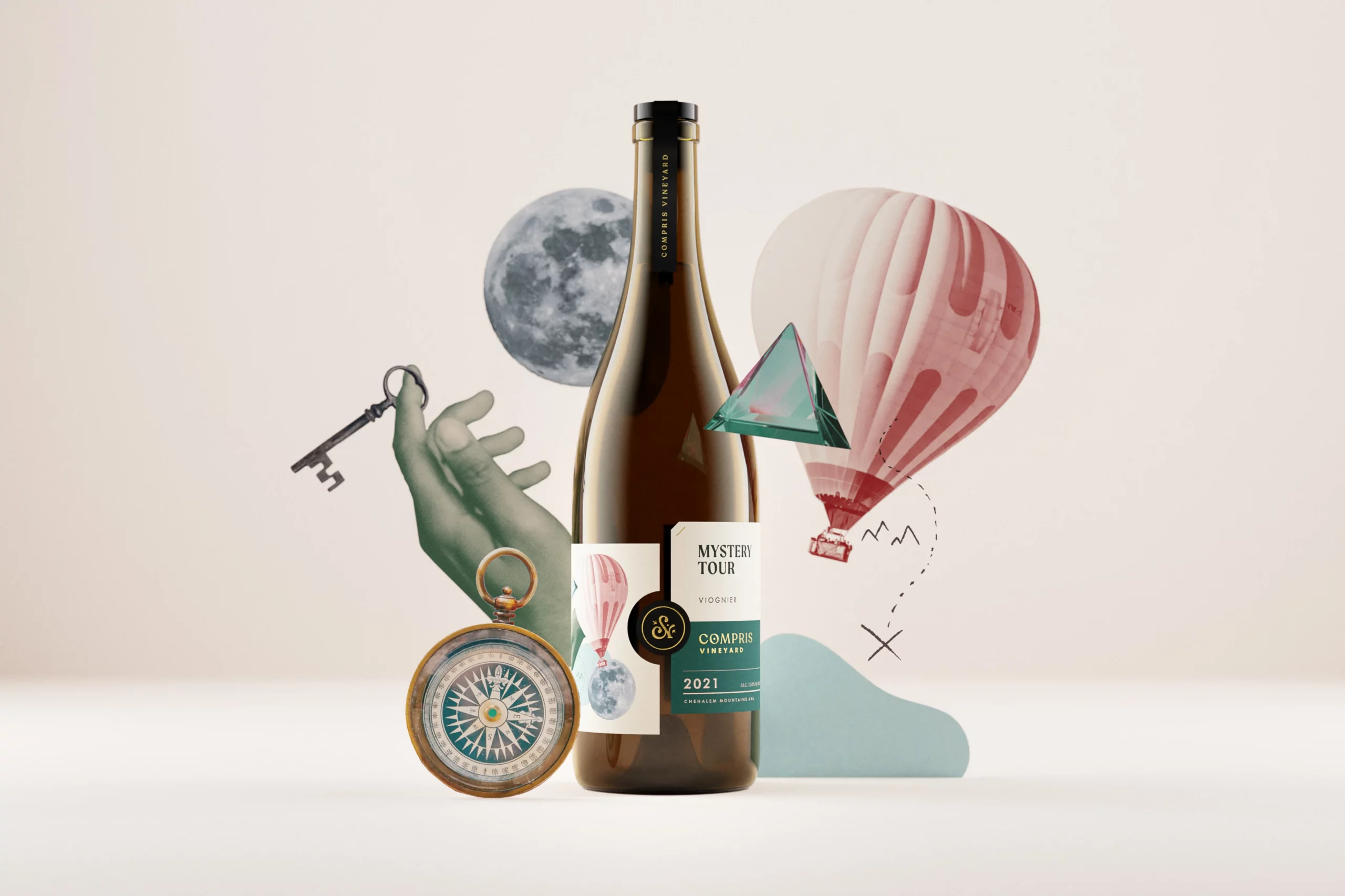
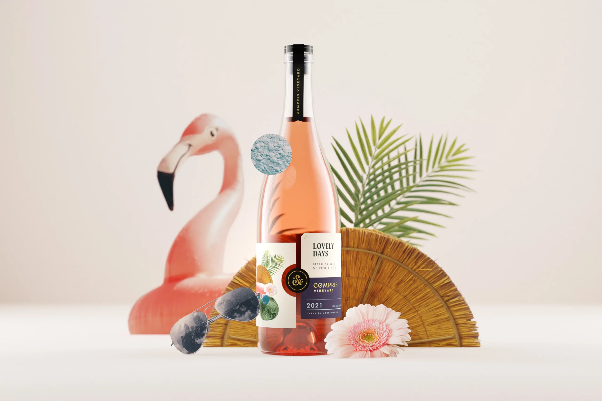
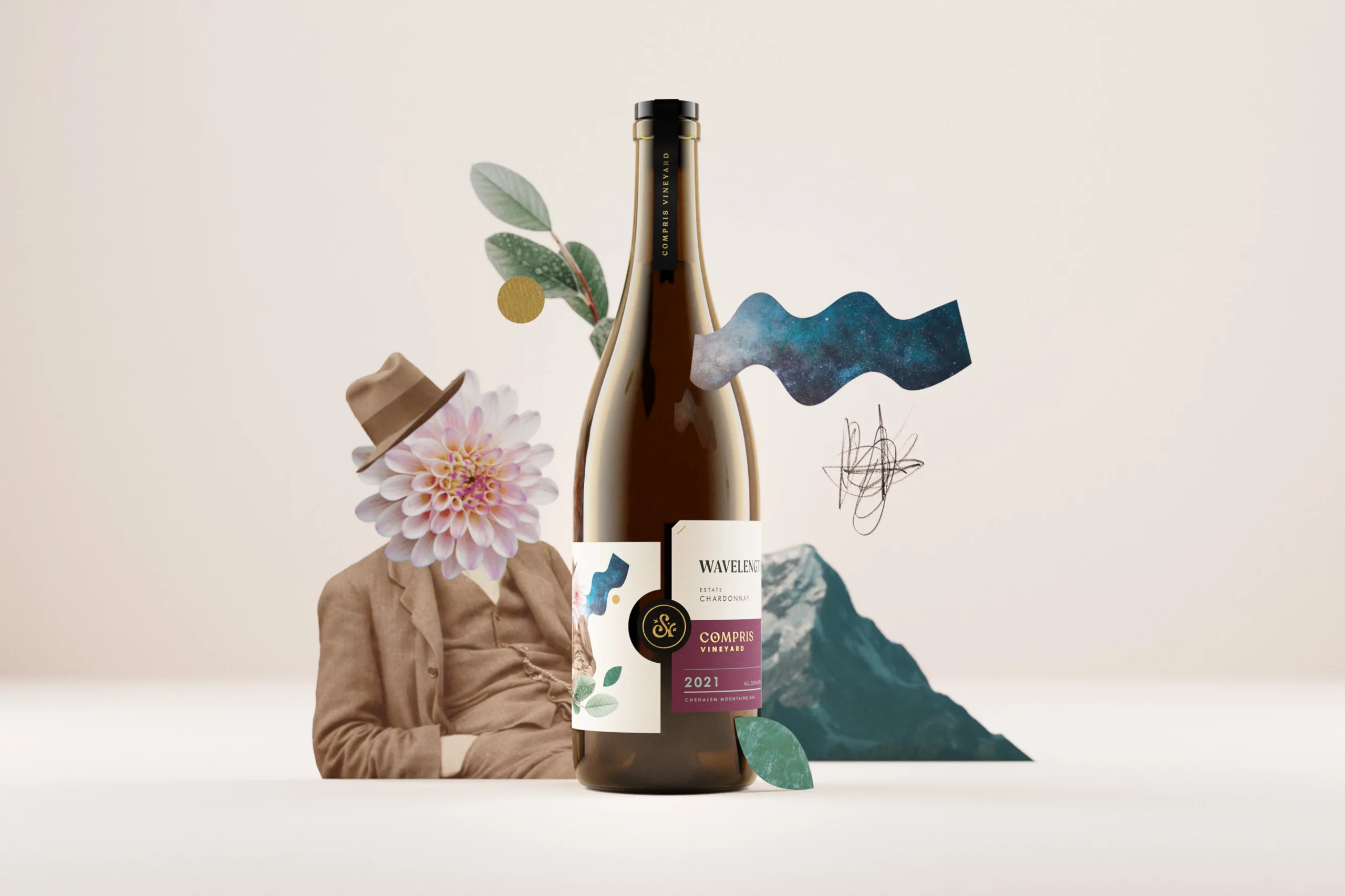
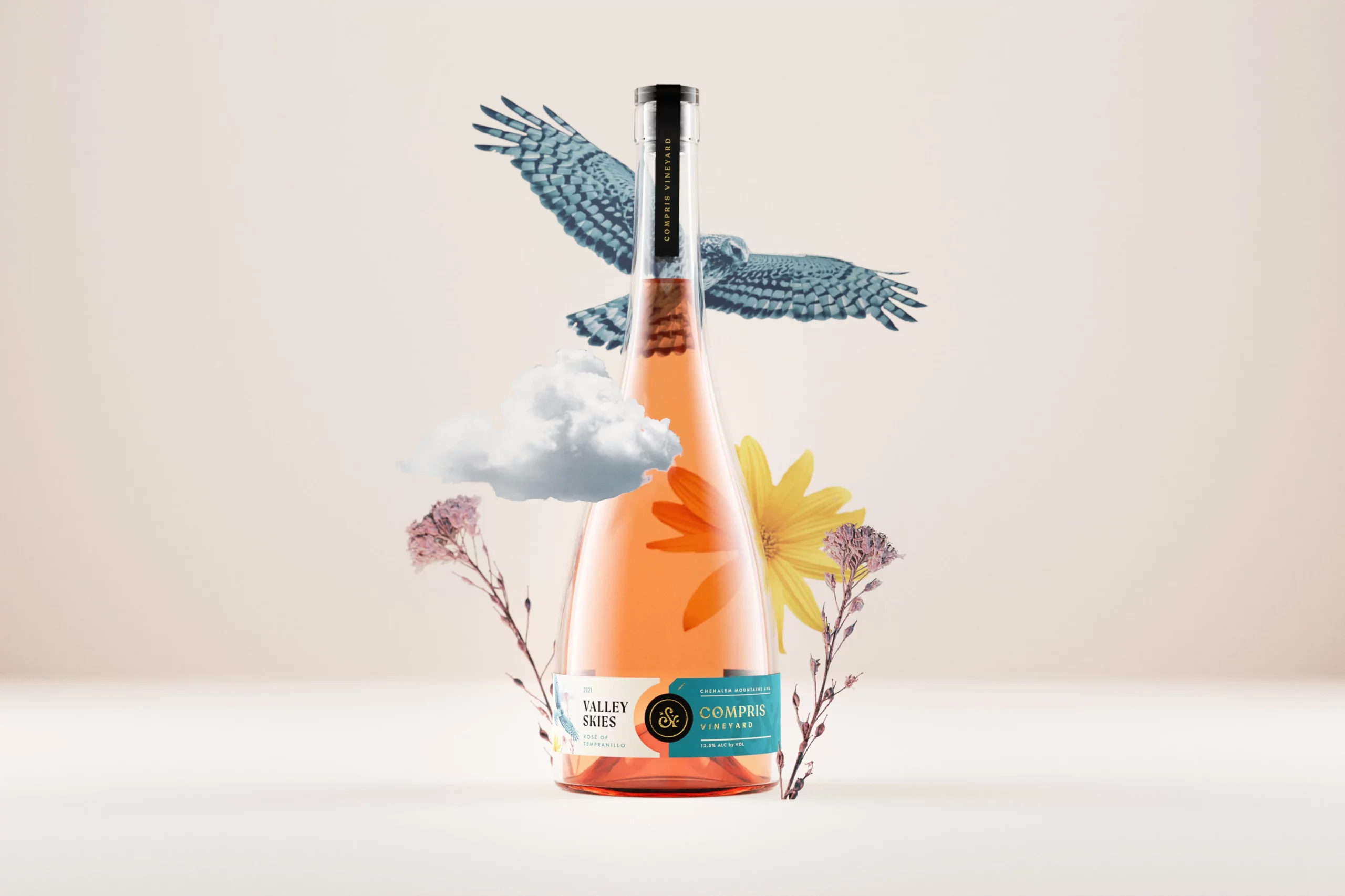

“Compris’ wine names are all inspired by music of all genres, so we wanted each label to have a little bit of an "album cover" quality, where each bottle is a unique piece of art. ”
Renee Dimalla
Senior Art Director
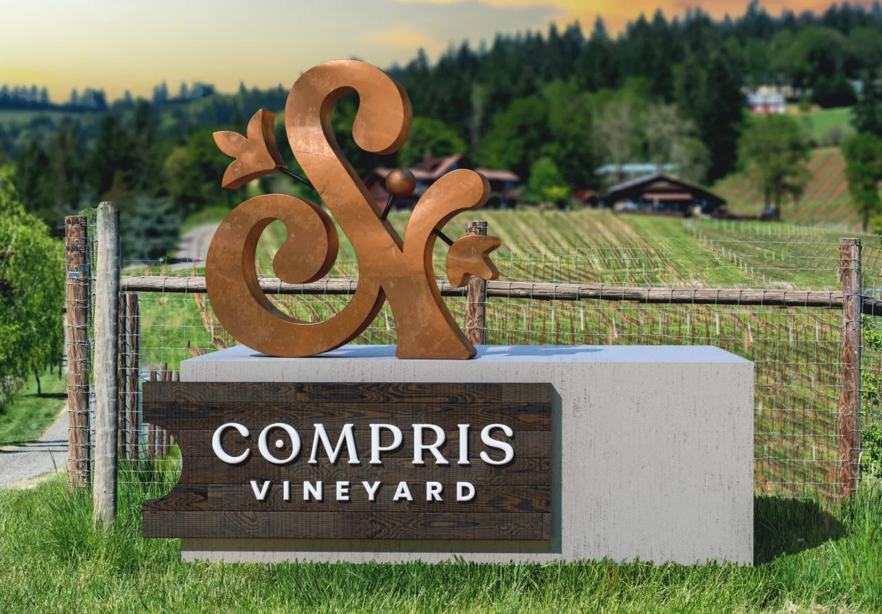
Signage
Exterior signage for Compris marries the owner’s mid-century modern sensibilities with the rustic, rural atmosphere of the Willamette Valley. An impactful concrete plinth forms the base, with the logotype set against a backdrop of walnut slats in a shape that references the Compris labels. A copper three-dimensional ampersand is intentionally rusted to feel “lived-in”, weathered by the ecology of the valley.
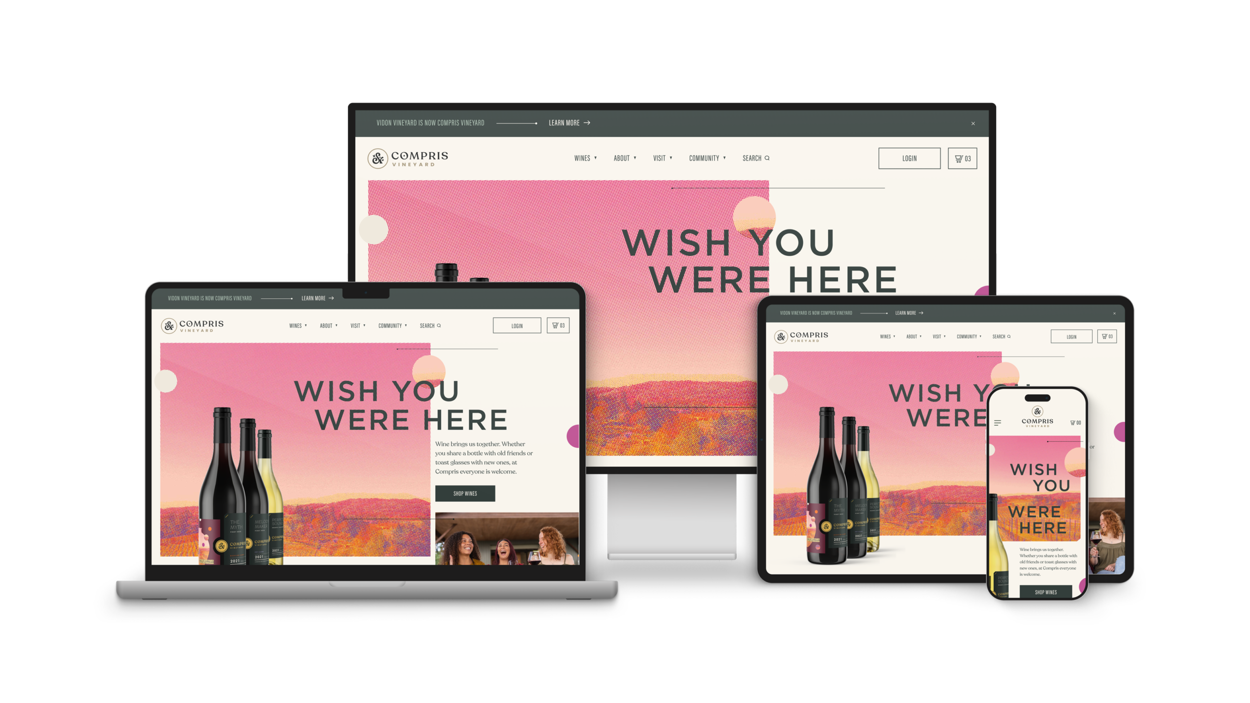
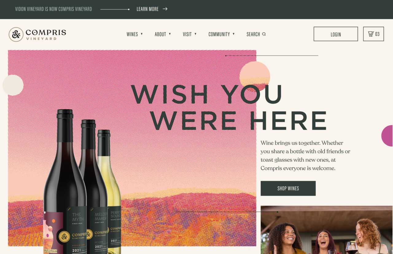
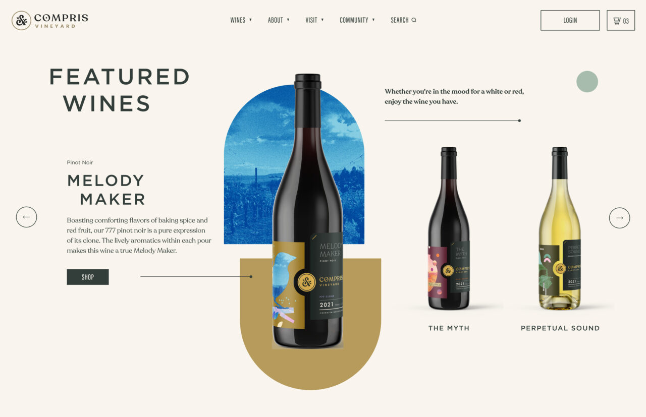
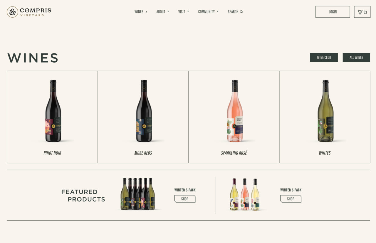
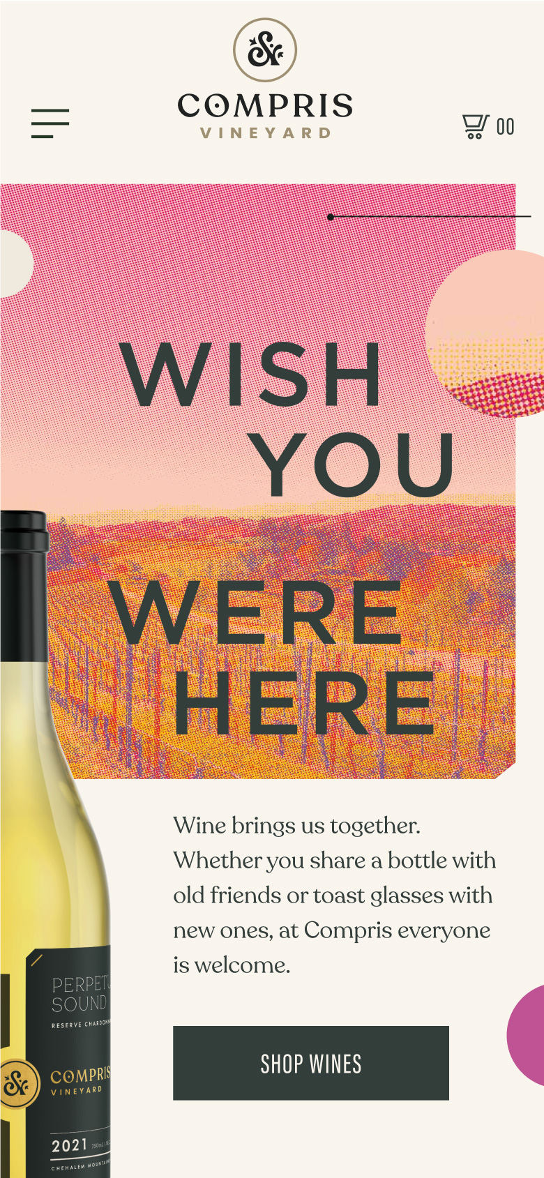
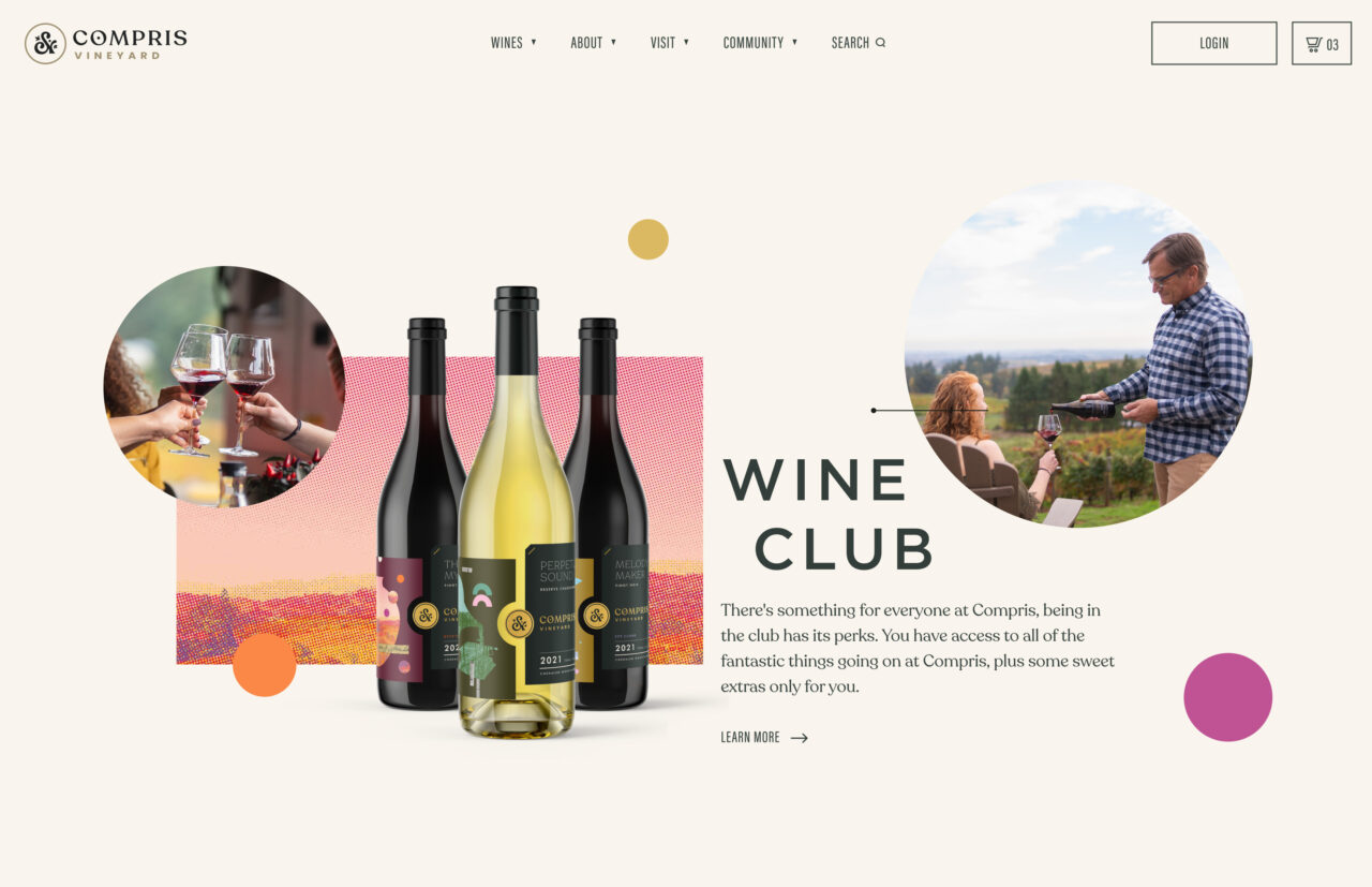
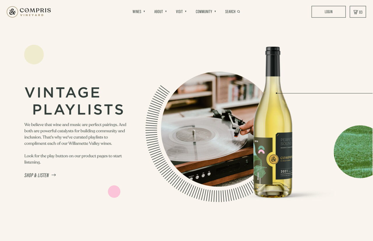
Website Design
This was evident in that they hired the first black winery president to round out their team. As a brand new organization, it was important that the character of the brand was born from the values and dreams of the team. Affected images, delicate line work, and cutouts take note from the bottle labels, creating a throughline on every page. Music is an excellent metaphor for the relationships forged through shared experiences and we couldn’t think of a better wine pairing.

“When developing a brand from scratch we like to start with the basics. Through a series of interactive workshops, we helped Compris establish a strategic foundation. We uncovered core values and crafted mission and vision statements that felt authentic to their higher purpose.”
Andrew Bolton
Owner & Exec. Creative Director