Goal
The Durant Vineyard and Olive Mill was looking for consistency across their ever expanding family of brands.
Services
Visual Identity
Packaging
The Durant Family Legacy
As Durant Vineyards has grown to include the Durant Olive Mill and Red Ridge Farms, the long-established brand sought to identify them all under a single cohesive label, Durant. Our task was to create an elevated look and feel that worked across the brand family. We pulled inspirational elements from the family’s land, their commitment to its stewardship, and their trailblazing spirit.
History
For fifty years, the Durant family has grown grapes in the Willamette Valley. But in 2004, they took on olives, establishing Oregon’s first commercial olive mill. Since then, the family has continued to expand their offerings. Durant Vineyards, Durant Olive Mill, and Durant at Red Ridge Farms have become beloved destinations for gardeners, tourists, families, and connoisseurs alike.
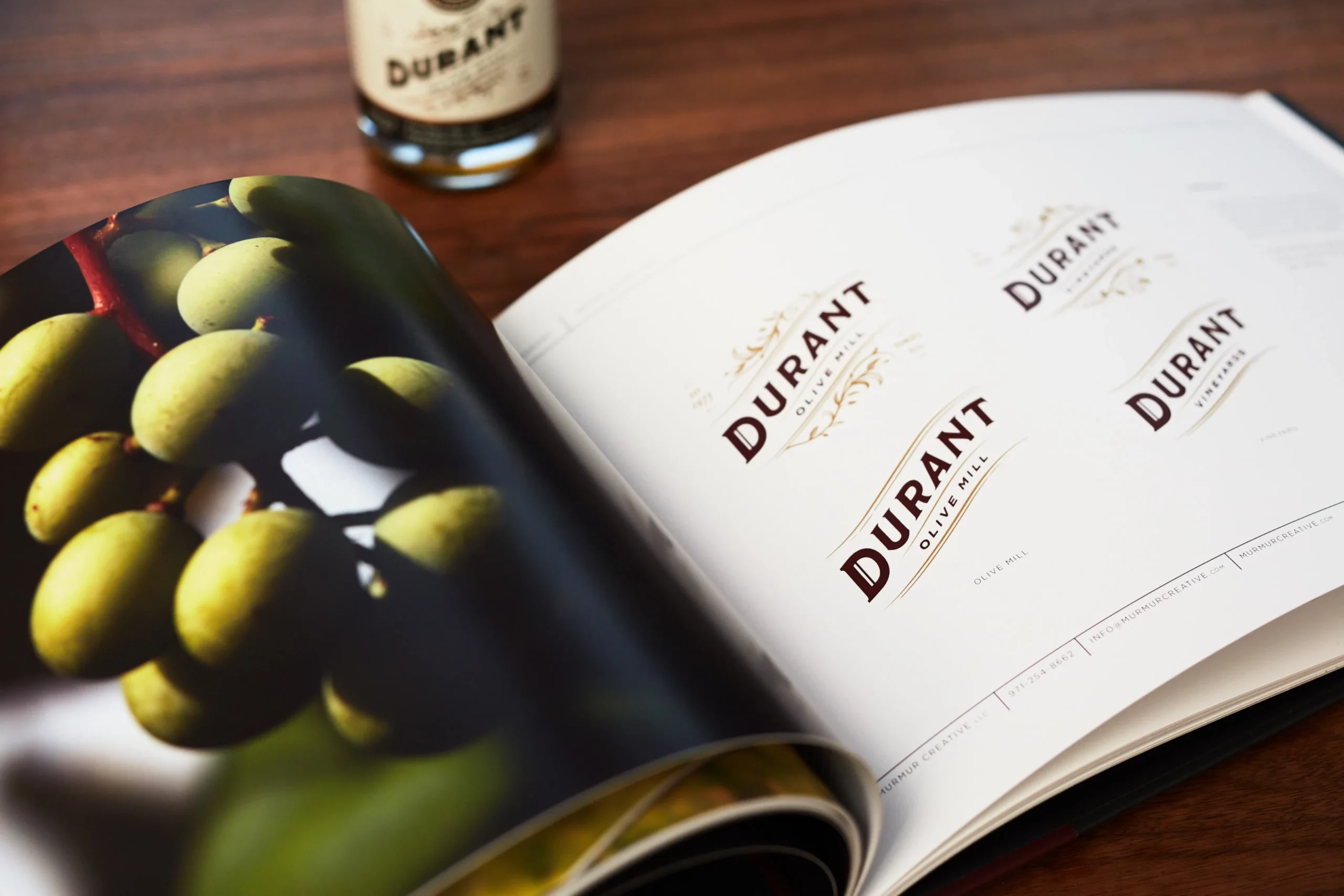
Logo
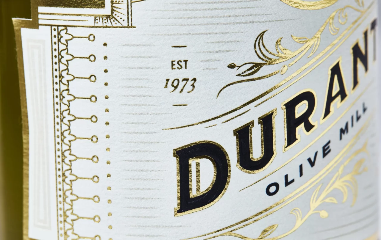
We created a collection of logos for Durant to evoke the pioneering spirit of the family business. The custom typeface is reflective of the old West, while the graceful arc and classic color palette create a sense of timeless elegance. Unique flourishes were created to give distinction to the oils and wines.

“From start to finish, this rebrand found us honoring the Durant family’s founding presence in the Dundee Hills wine region. We landed on a look that feels uniquely American in a crowded global wine industry, and one that sets Durant apart as a destination for epicureans looking for a genuine experience.”
Andrew Bolton
Owner & Exec. Creative Director
Strategy
Through a series of workshops Murmur’s strategists developed key tenants of the Durant brand. Pillars were established to guide and align creative work and core values, mission, vision, uniqueness, and personas were articulated as foundational elements. Our aim was to take a holistic approach to Durant’s branding strategy to support continued growth long into their future.
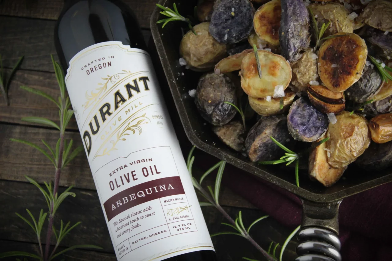
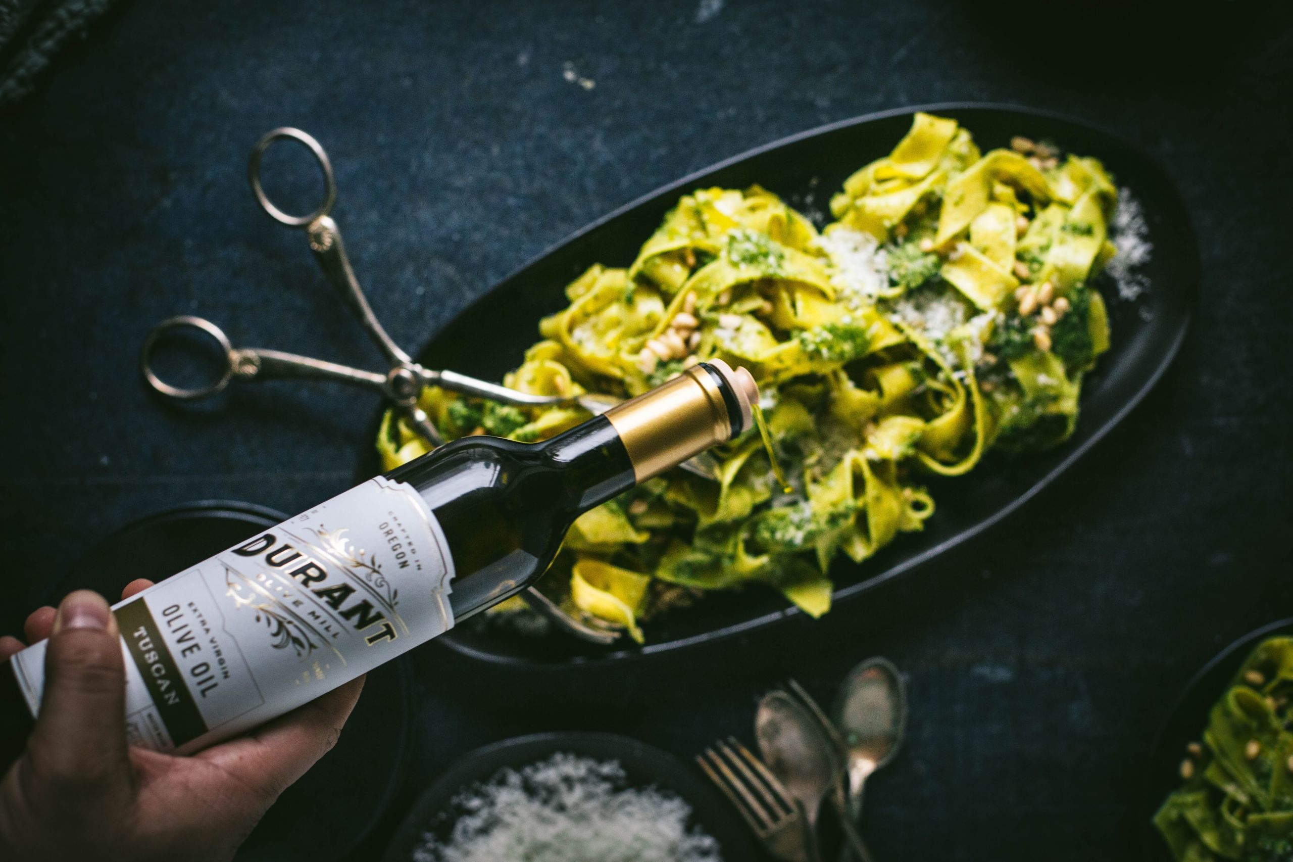
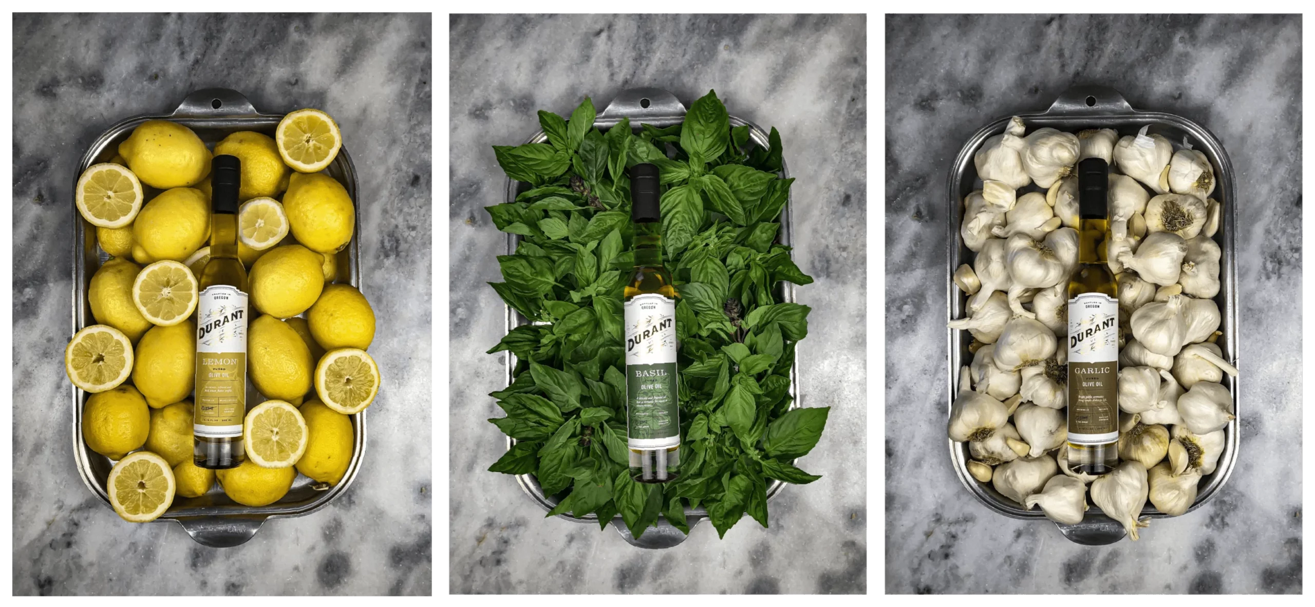
Packaging
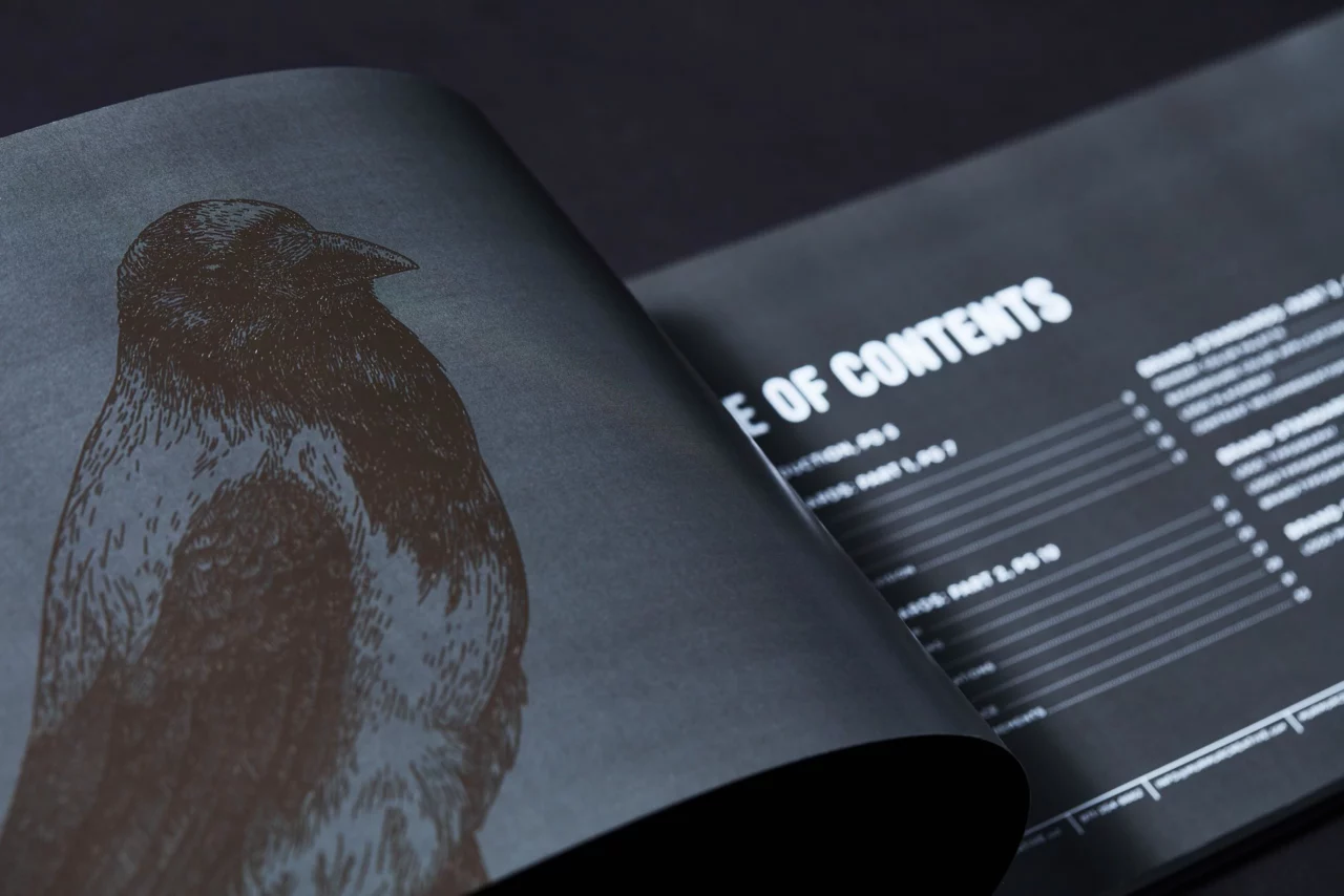
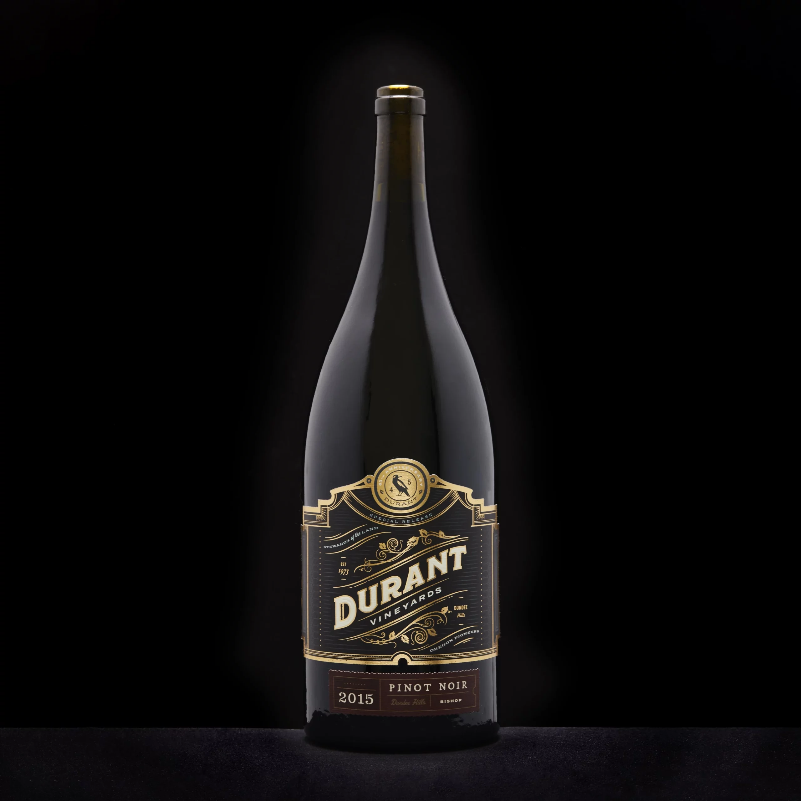
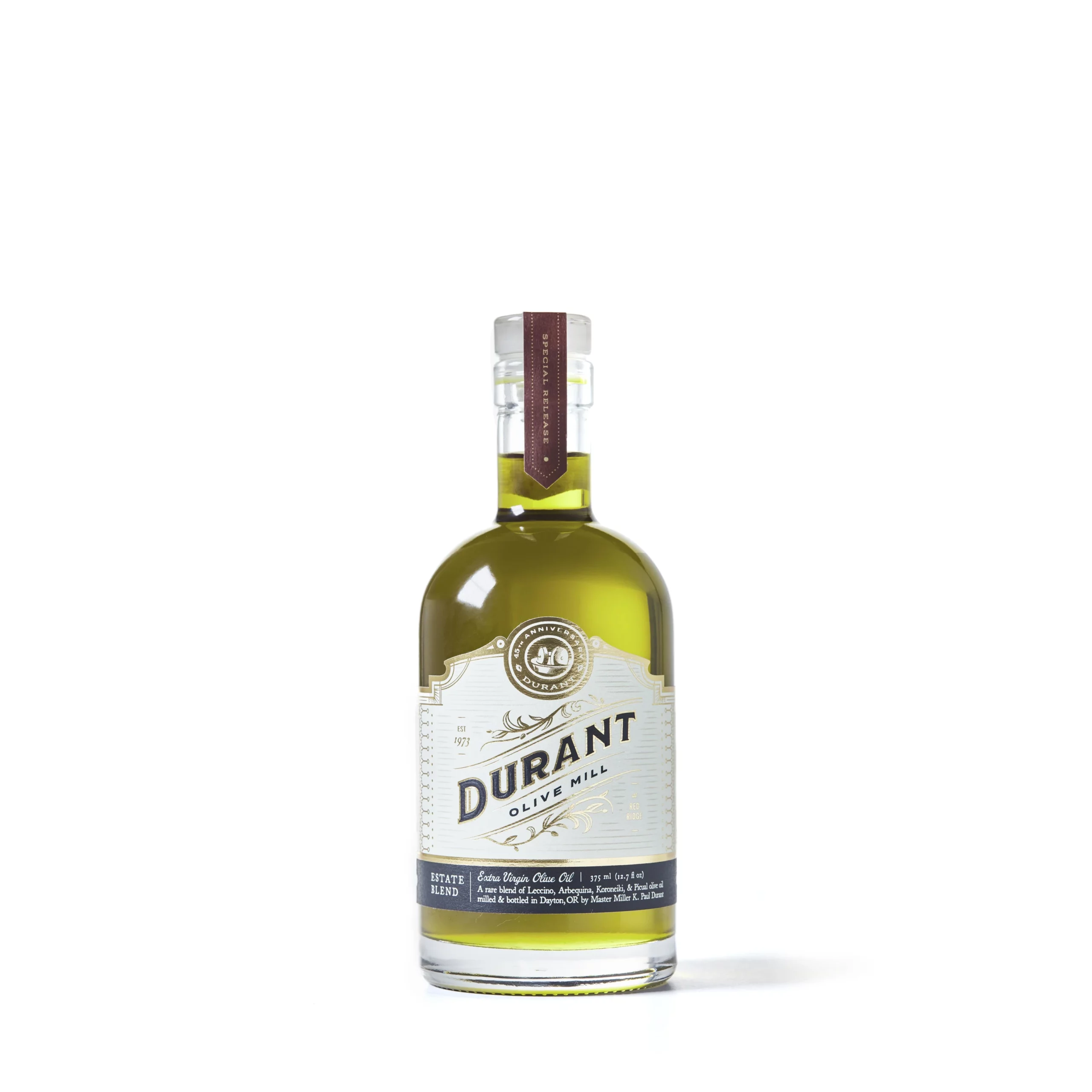
Packaging work began with Durant’s 45th anniversary series of Oregon Pinot Noir and Estate Olive Oil. For these special products, we created high-end, ornamental packaging with opulent embossing, foiling, and die-cutting. A woodcut raven illustration to the center emblem was added to honor founder Penny Durant’s love of birds, and the role they played in Durant’s history. For Durant’s regular olive oils, we used apothecary-style packaging that highlights each varietal.
Olive oil photography by Lee McCollins of Durant and Karlee Sisler Flores of Olive and Artisan.
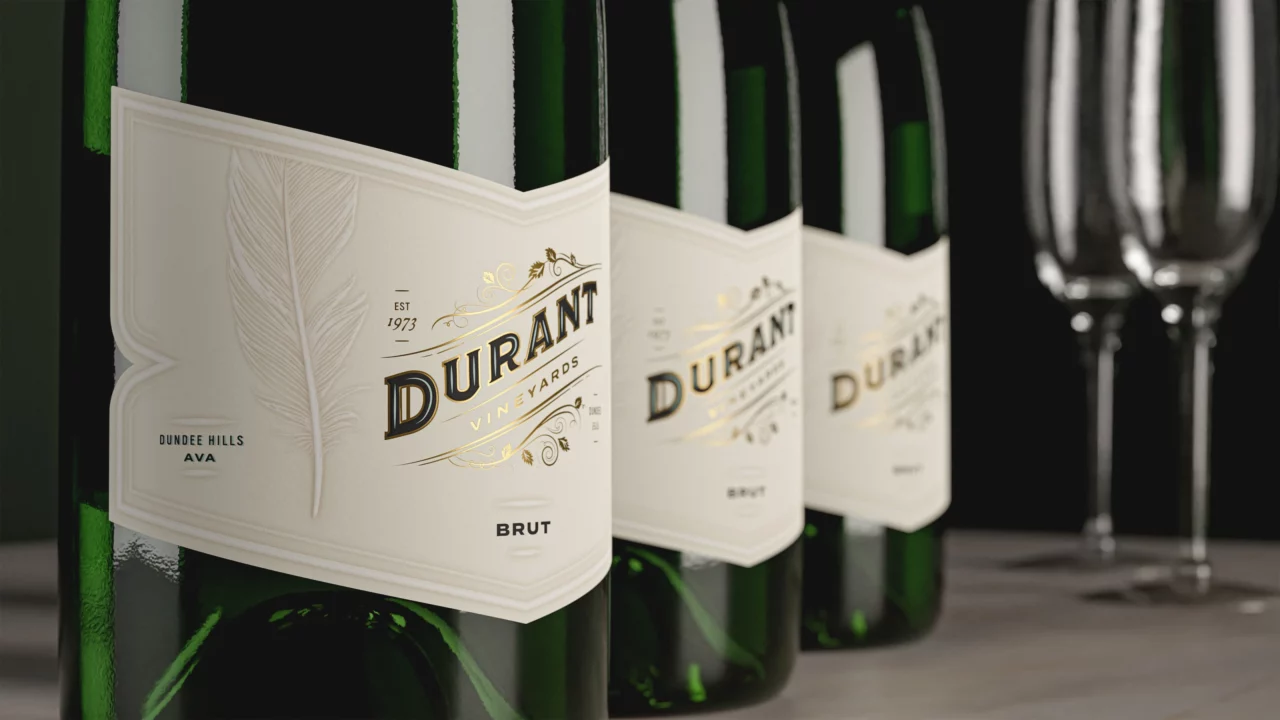
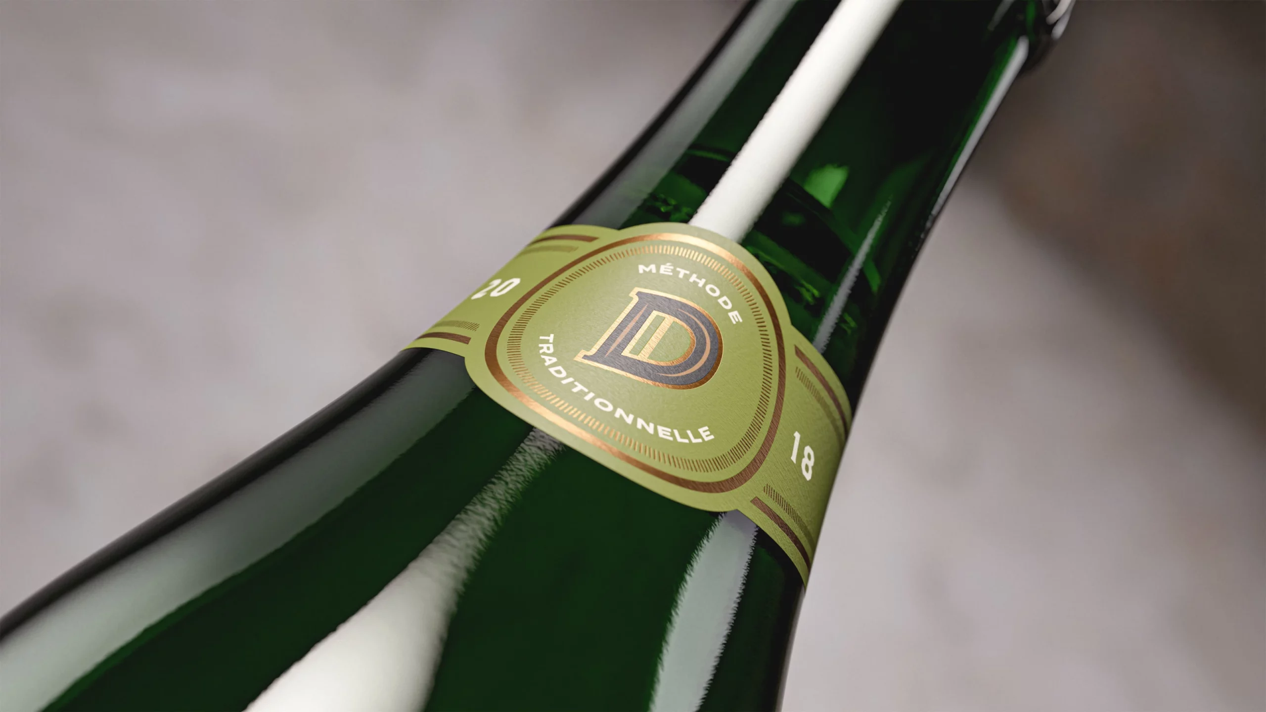
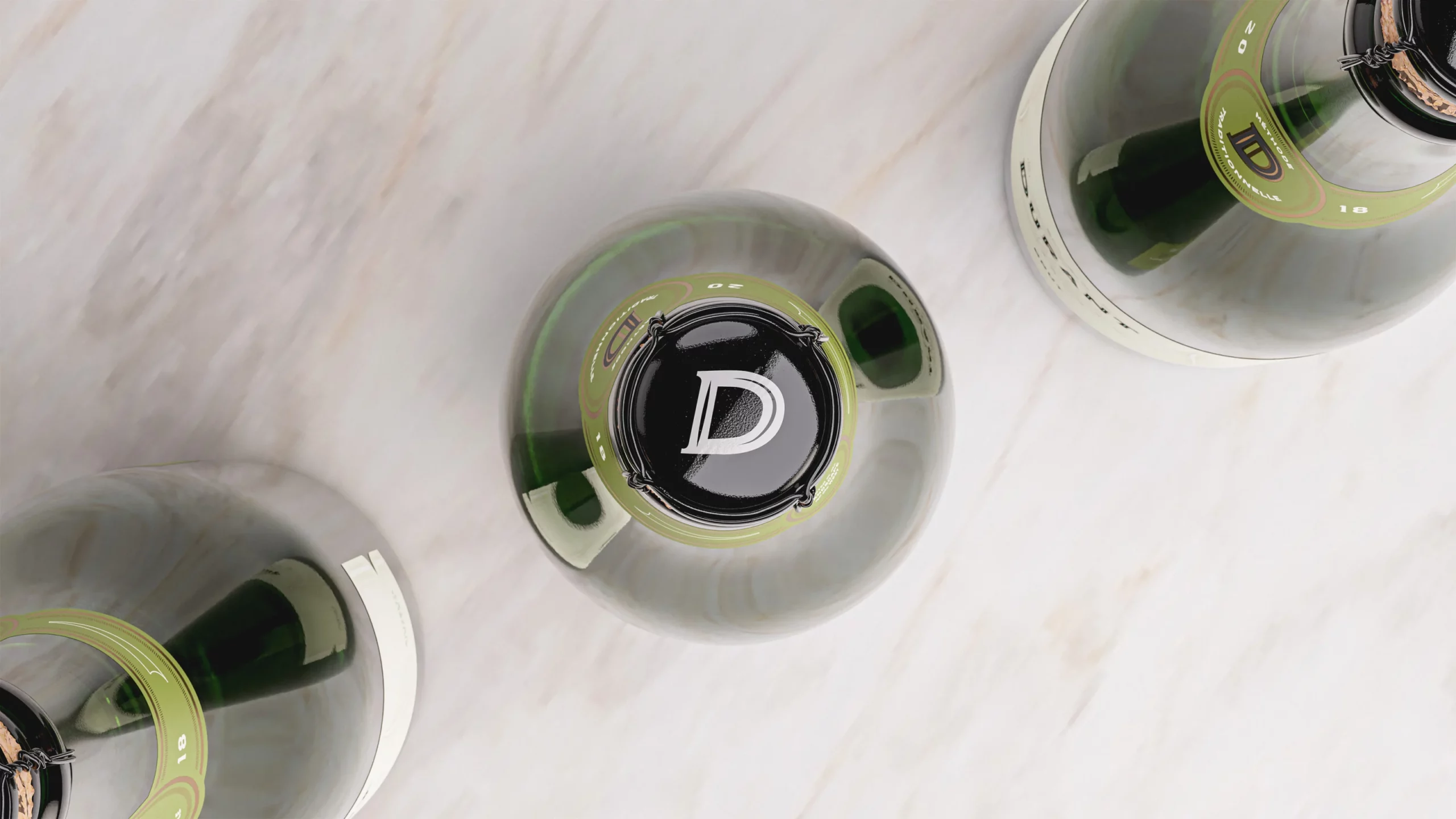
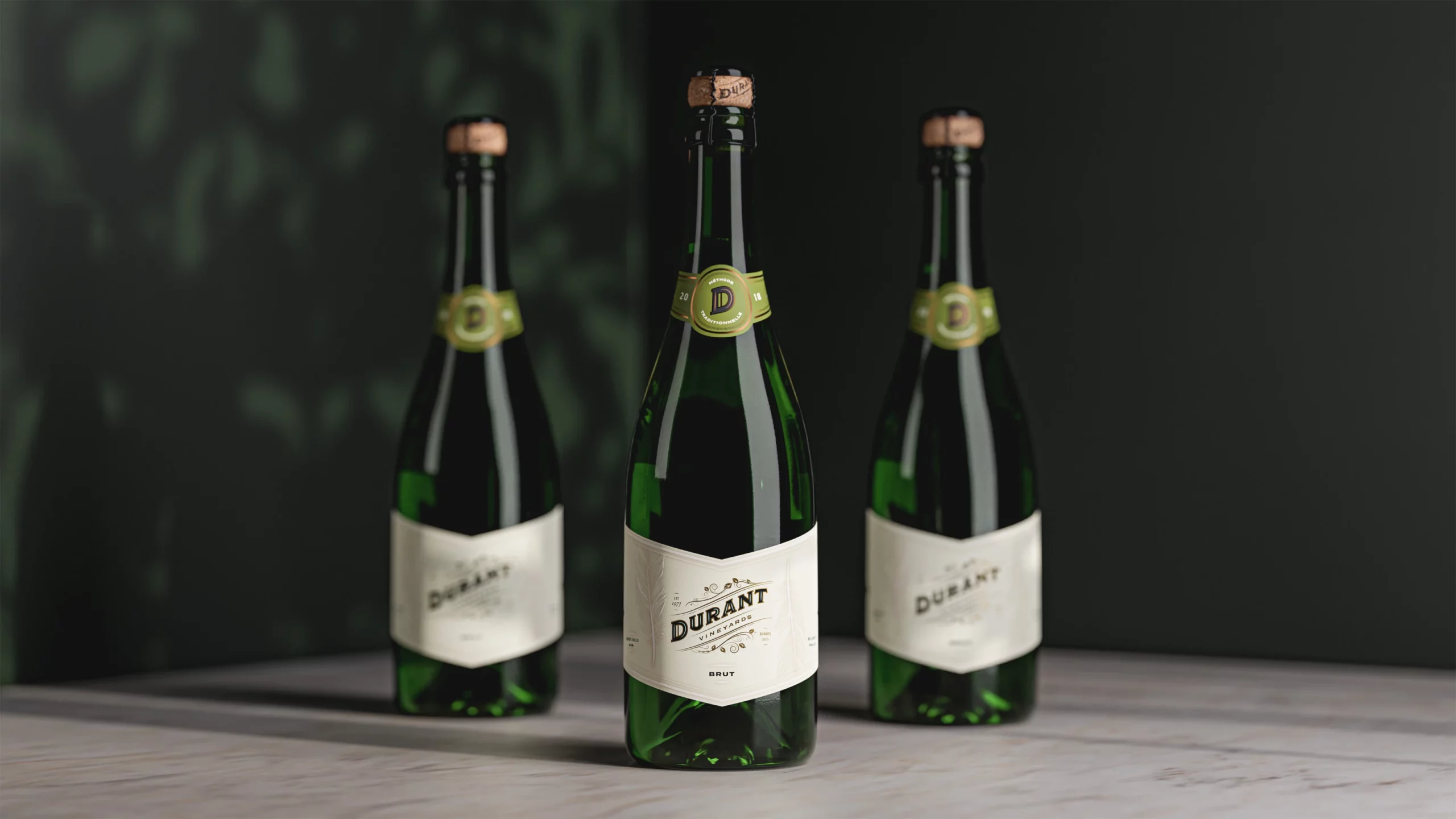
Brut Sparkling Wine
The release of Durant’s 2018 Brut Sparkling Wine – their first bubbly – was cause for celebration. The design needed to be referential to other bottles in their line, but stand out on its own. The delicate feminine flourish gave this label a refined quality while the sculptural embossing carried through the bird motif, symbolic of the Durant brand.