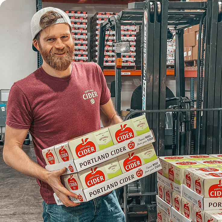
Portland Cider Company
Goal
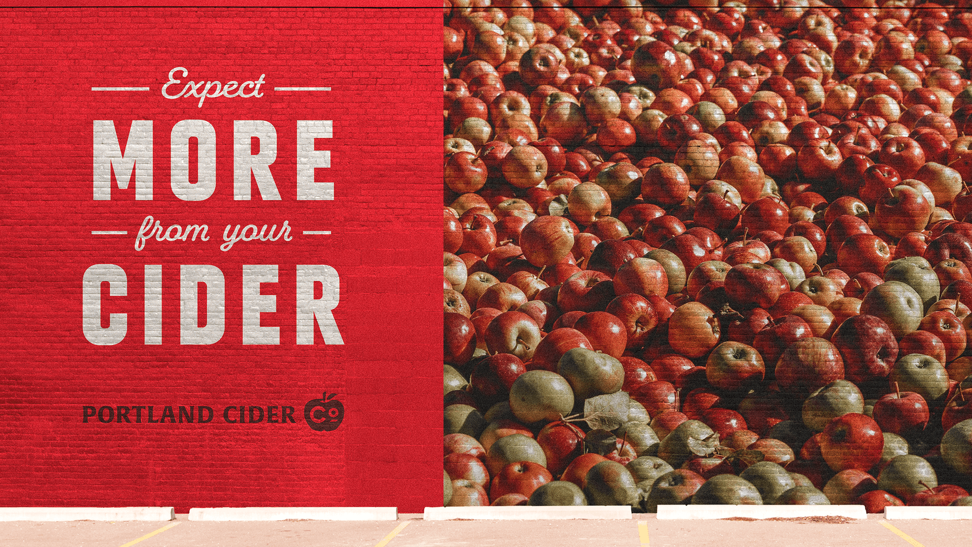
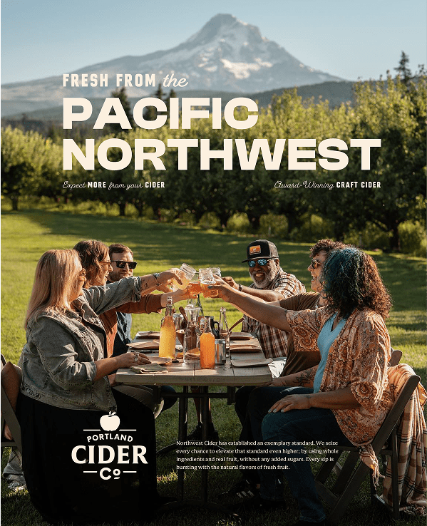
Portland Cider Company needed a sophisticated new look that would pop off the self to reflect the quality and flavor of their delicious award-winning ciders.
Services
Visual Identity
Naming
Packaging
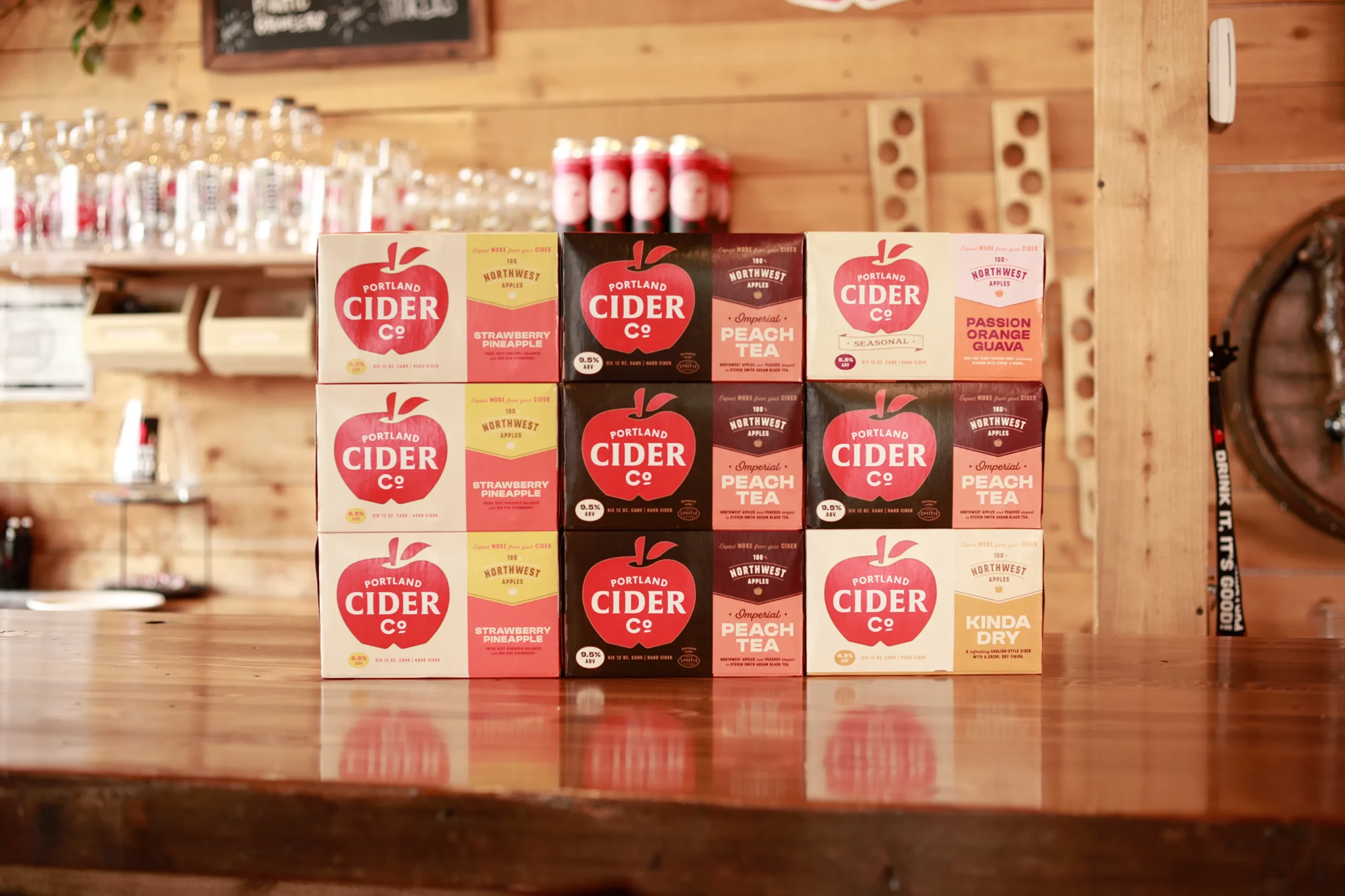
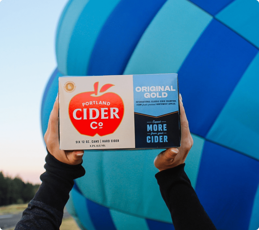
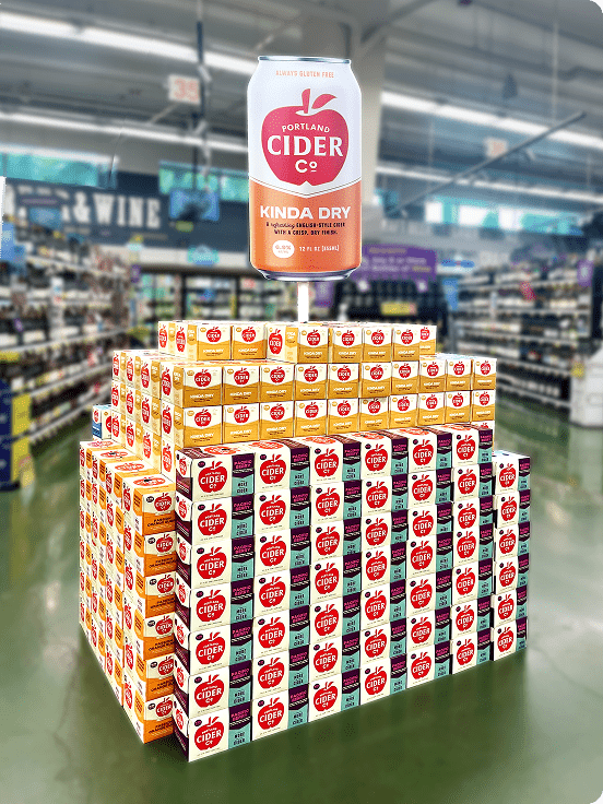
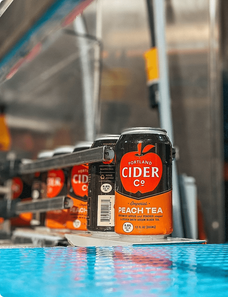
A new polished look and feel to reflect Portland Cider Company’s award-winning status. We developed a clean packaging system to work for their year-round, seasonal, and small batch ciders as well as a spiffy new logo to take center stage across the brand.
Logo
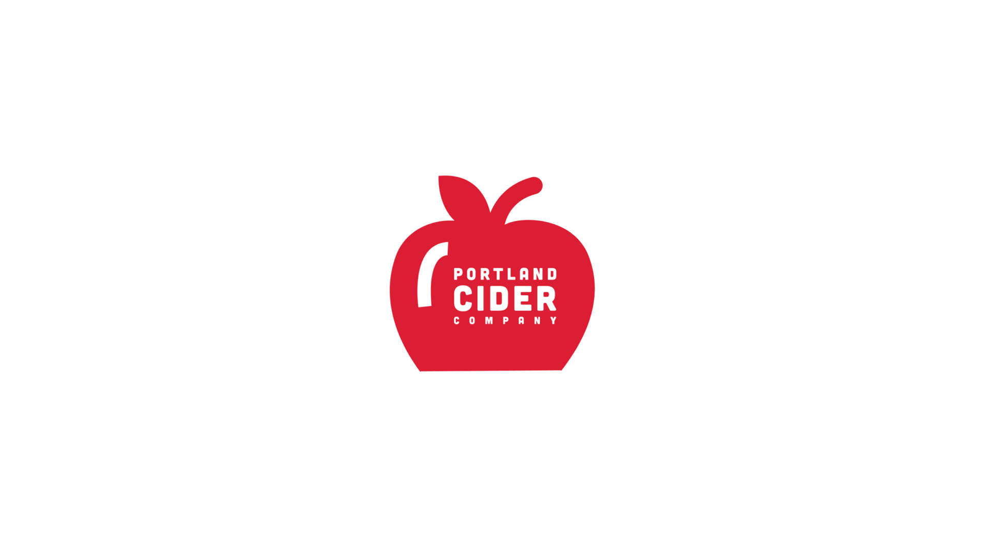
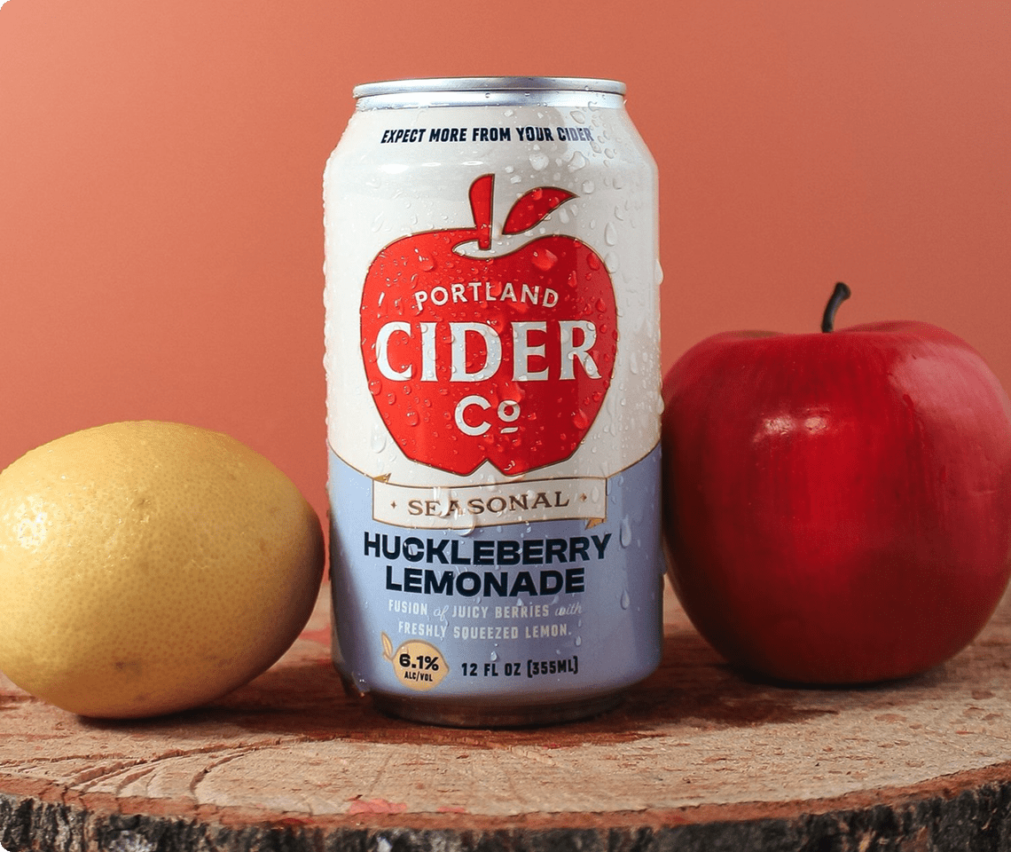
Portland Cider Company’s original logo was recognizable because of its color and shape. After exploring a number of alternate directions we ultimately landed on an upgraded version of Portland Cider’s original big red apple. We wanted to retain familiarity while adding a new level of elevation and clearly communicate their expertise, trust, and dedication to creating great cider.
We refined the apple shape to create more negative space and added gold metallic detailing and custom typography for elegance and sophistication. We chose to feature the logo largely on the cartons, allowing it to become a major part of the packaging design and aid in brand recognition.
From the Client
“We were beyond impressed with the Murmur team. They took the time to understand our brand, history, and the ciders we take pride in crafting... Not only did they show exceptional creativity every step of the way, but there was a consistent strategy and high level of customer service along the way.”
Jeff & Lynda Parrish
Founders & Owners of Portland Cider Company
Before & After
Portland Cider Company’s original logo was immediately recognizable in shape and color but needed an aesthetic shift to communicate trust and value to consumers. Elevating the logo with serifs and a more prominent namesake typographic structure allowed the new logo to showcase Portland Cider Co.’s dedication to creating great cider.
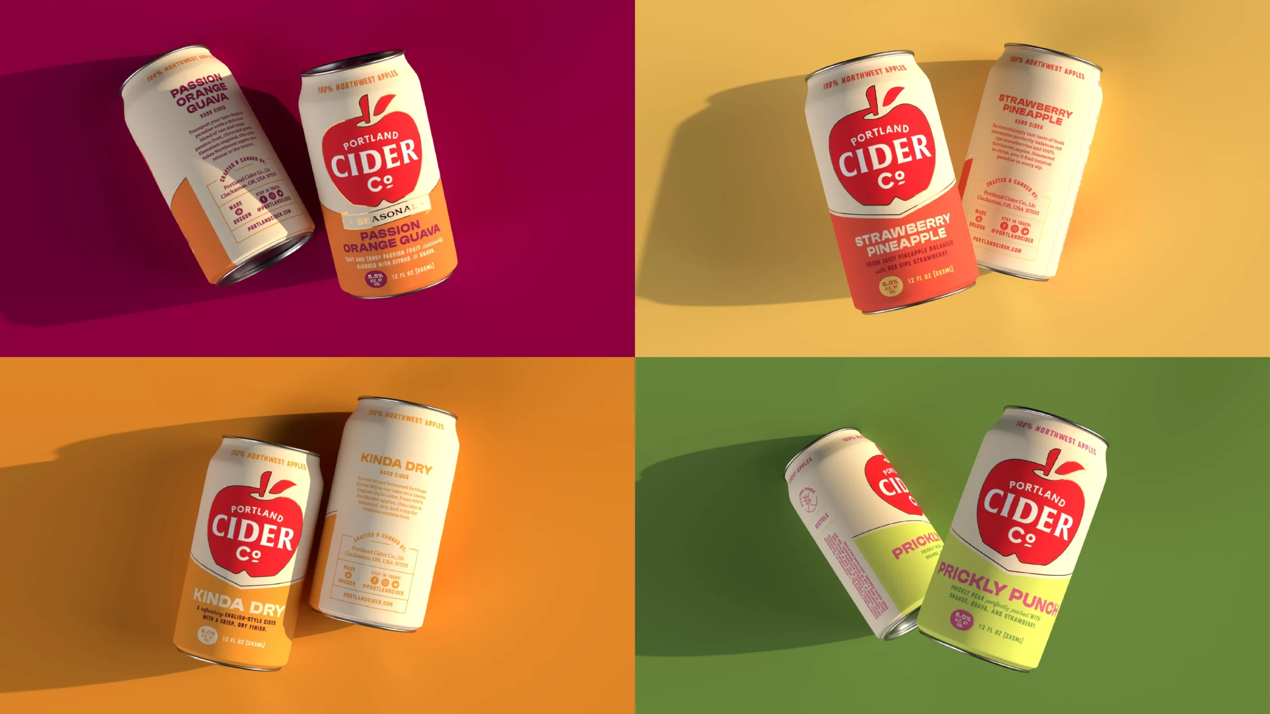
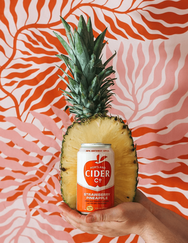
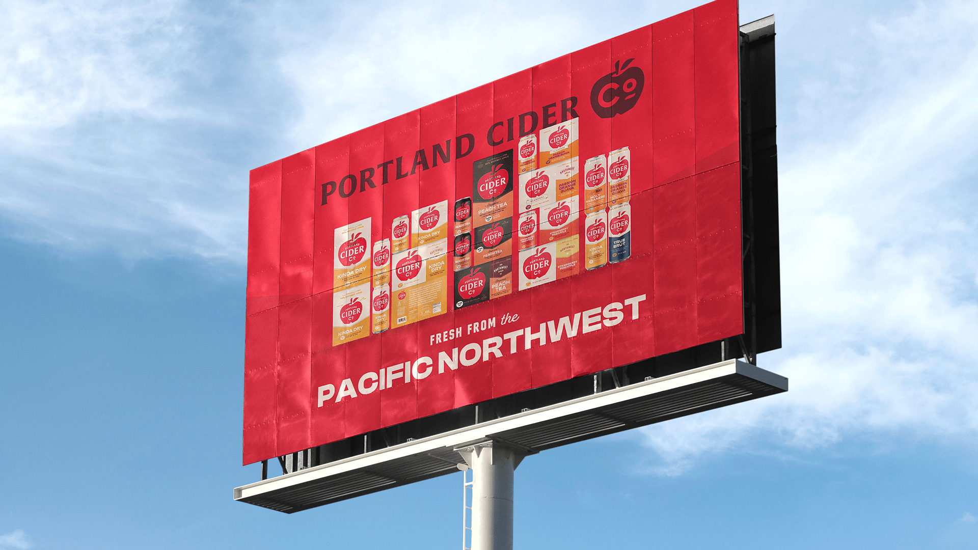
Packaging
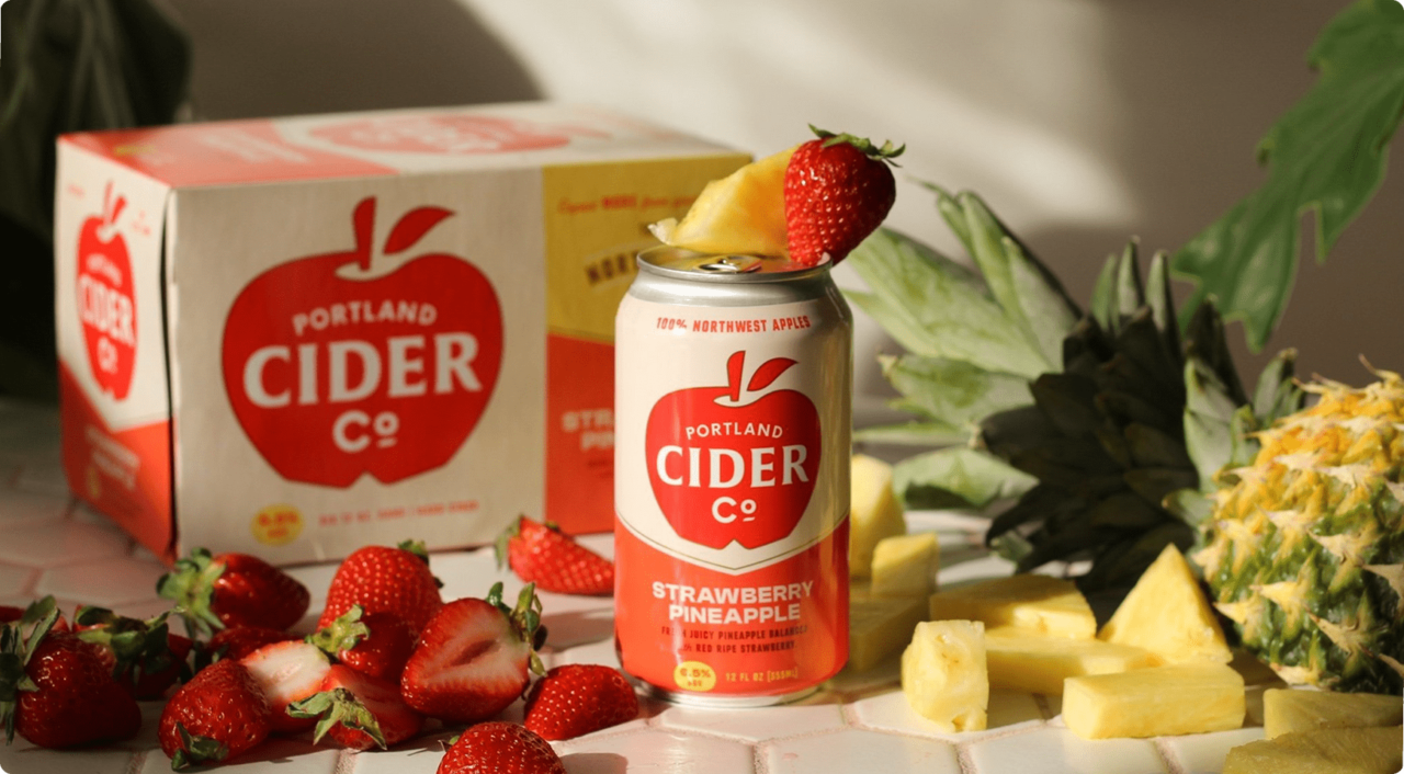
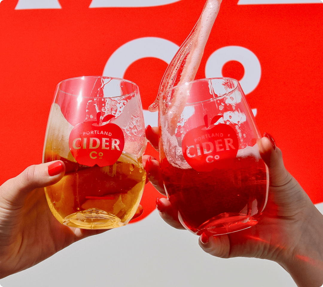
Our goal for Portland Cider was to elevate their overall branding to create cohesion across their cider lines. Inspired by the clean, sophisticated designs of classic English ciders, Portland Cider eagerly embraced a sophisticated minimalist design. We developed a system to highlight the quality and built out diverse colorways to differentiate the range of flavors.

“Helen and the team were so great to work with from start to finish. Being such an established Portland brand, it was so rewarding to see this team embrace the often scary change that comes with a rebrand. As the team fell in love with the new direction of their brand, we were tasked with a fun challenge of redesigning the company’s seasonal and small batch flavors. Differentiating these product lines and creating separate design systems was a joy to see develop with the Portland Cider team.”
Kaitlyn Becchina
Senior Brand Producer
Packaging Messaging
We had two primary objectives for Portland Cider’s packaging messaging. The first was to craft a punchy brand story. The second was to write detailed flavor descriptions for their cans. Our challenge for the brand story was to determine what the key pieces are and write it in a concise and compelling way. We wanted to bring their delicious ciders to life but remain aligned with their new sophisticated look.

“Getting to know a company and learning about their history and personality is one of the great joys of strategy work. Portland Cider had a unique charisma that was fun to capture on their cans.”
Angela Larisch
Strategy Director


“As a B Corporation, we love working with local companies with whom we share similar values. Portland Cider Company takes great care and pride in their products, as well as the experience in their cideries. It was a fun (and tasty!) project and is exciting to see their new branding and packaging in coolers and on store shelves!”
Mary Breslin
Exec. Director of Client Services