Endurance Products Company
Goal
Endurance needed a new look and web presence to showcase their proprietary technology in a crowded supplement market.
Services
Visual Identity
Packaging Design
Website Design
Website Strategy
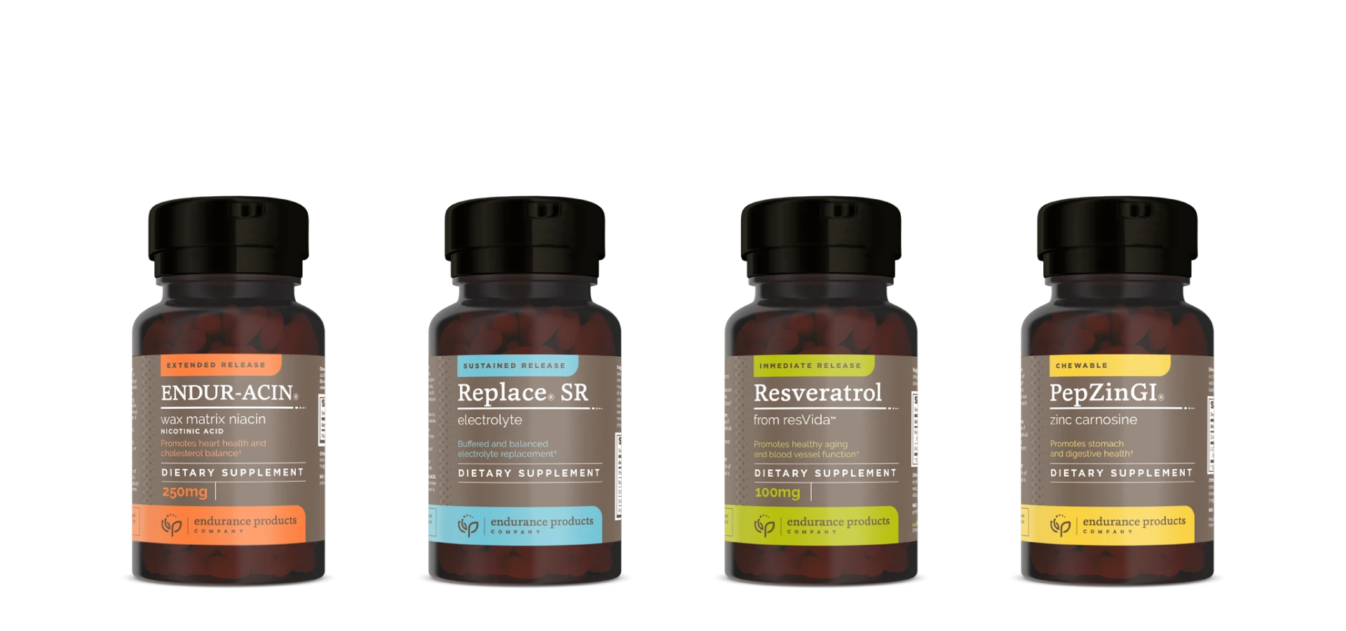
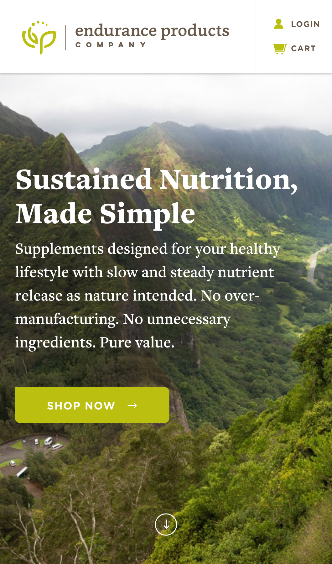
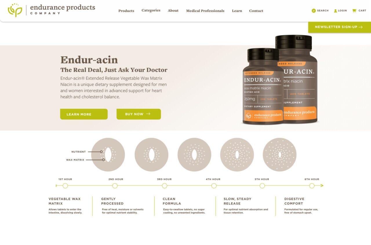
Endurance Product Company’s new branding visualizes their sustained release technology with a new logo that evokes nutrition and health. The icon hides a monogram in the leaves of a plant. The blossoming center illustrates the dissolving effect of Endurance’s slow release supplement.
The icon is complimented by a lowercase Cassia word mark that offers a sense of friendly professionalism in a market space that is often aesthetically clinical. Paired with natural tones of lemongrass and dark taupe, the logo serves to emphasize Endurance’s focus on wellbeing.
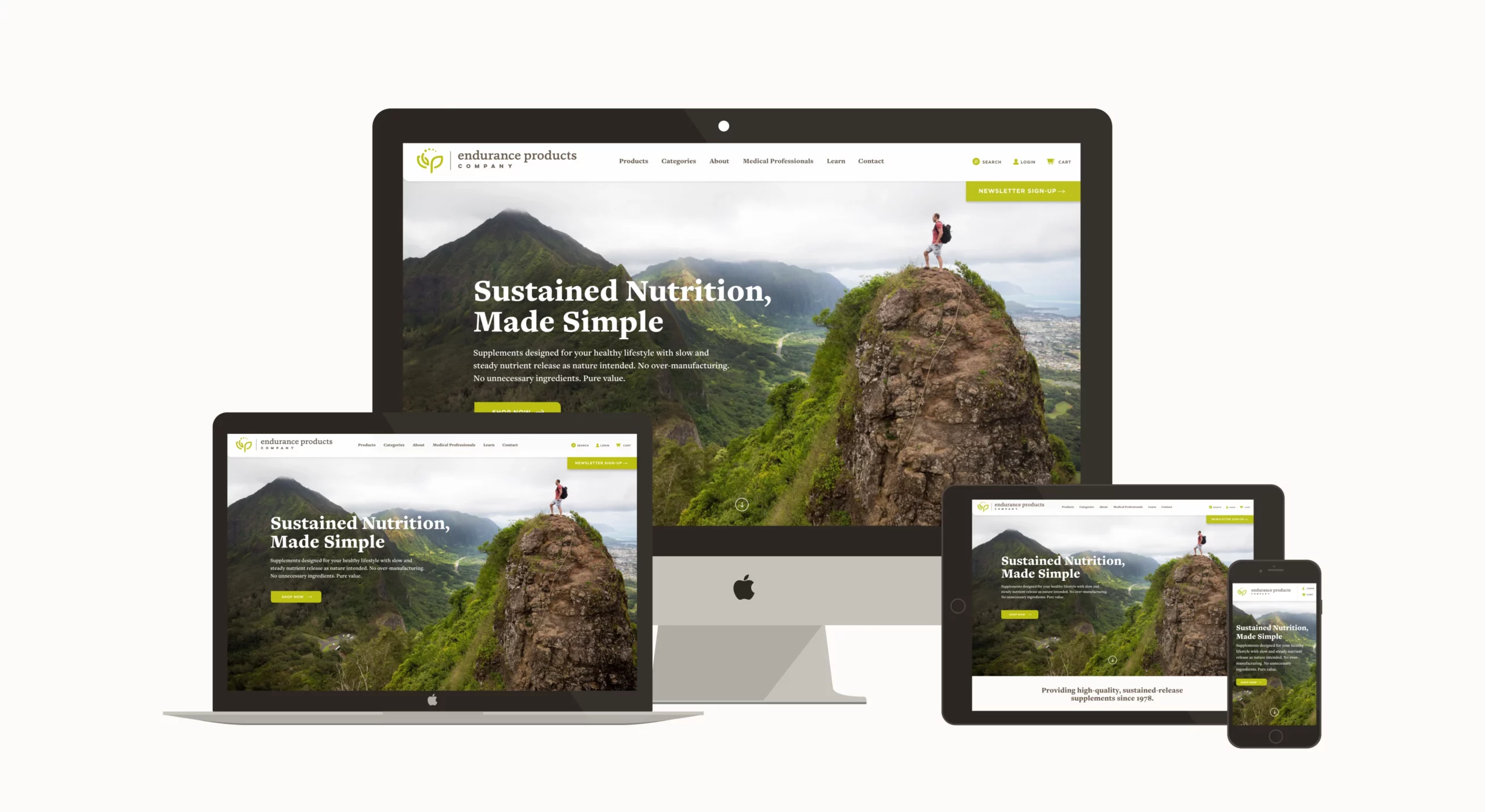
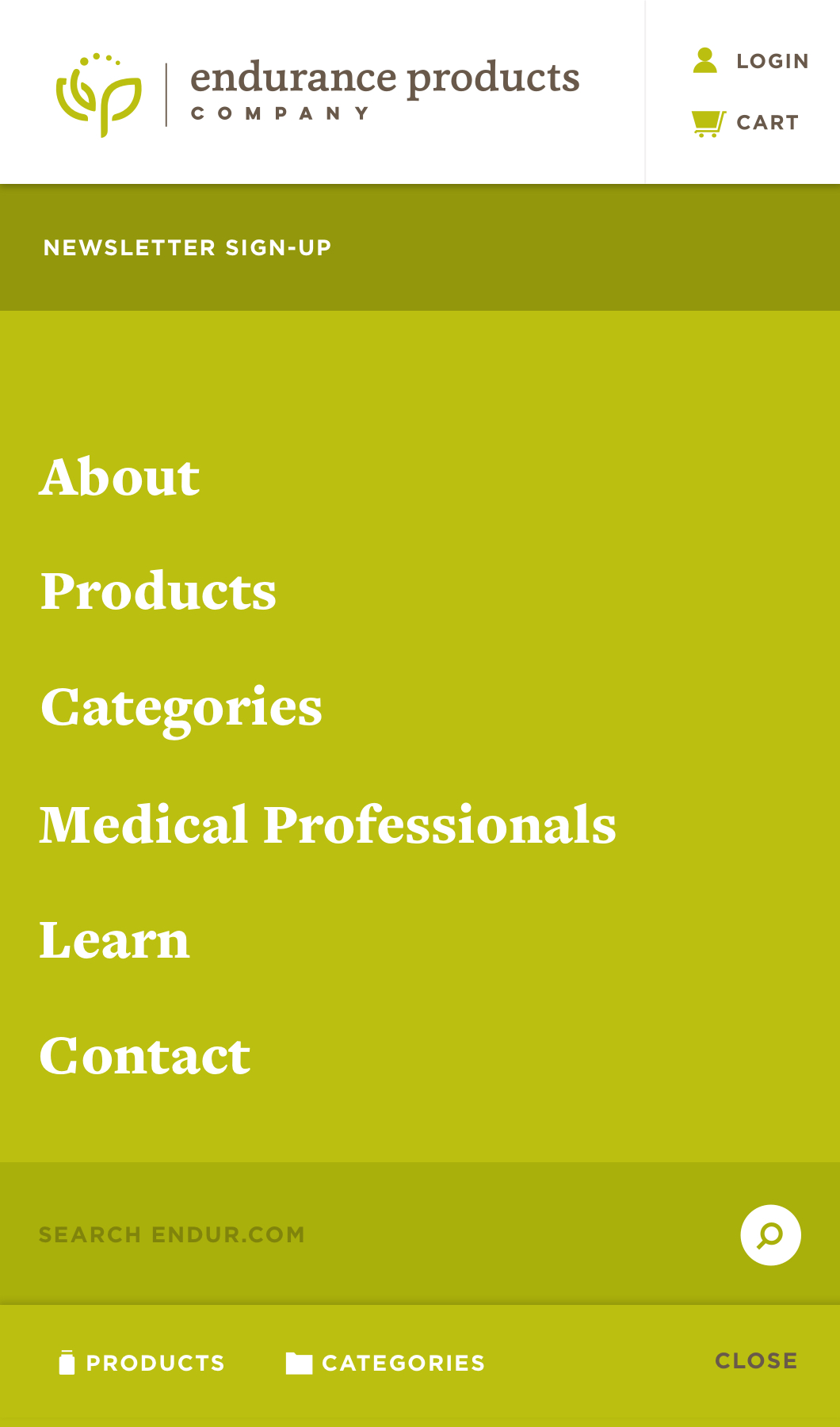
The marketing site is aimed directly at individual customers like athletes and health-conscious consumers. The research site is created for medical and nutritional specialists who want to better understand how the supplements work by delving into extensive studies. We treated each site differently, featuring products on the marketing site and in-depth science on the research site.
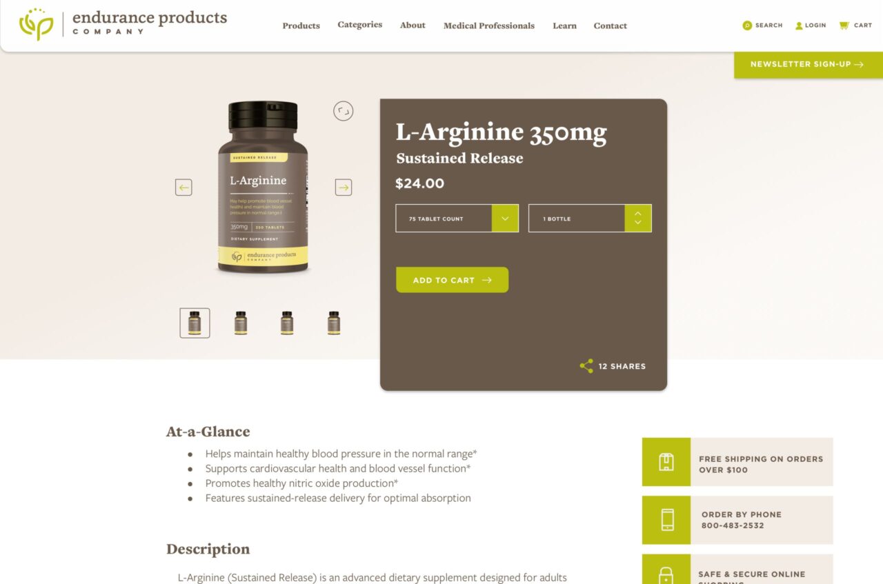

“We designed the site to function well for Endurance's older demographic. Easy-to-digest copy, intuitive UI/UX, fun and thoughtful content, and an earthy color palette came together to make this a beautiful site that differentiates itself from the sterile aesthetic of so many medication and supplement websites.”
Dani Ramsby
Lead UI/UX Designer