Goal
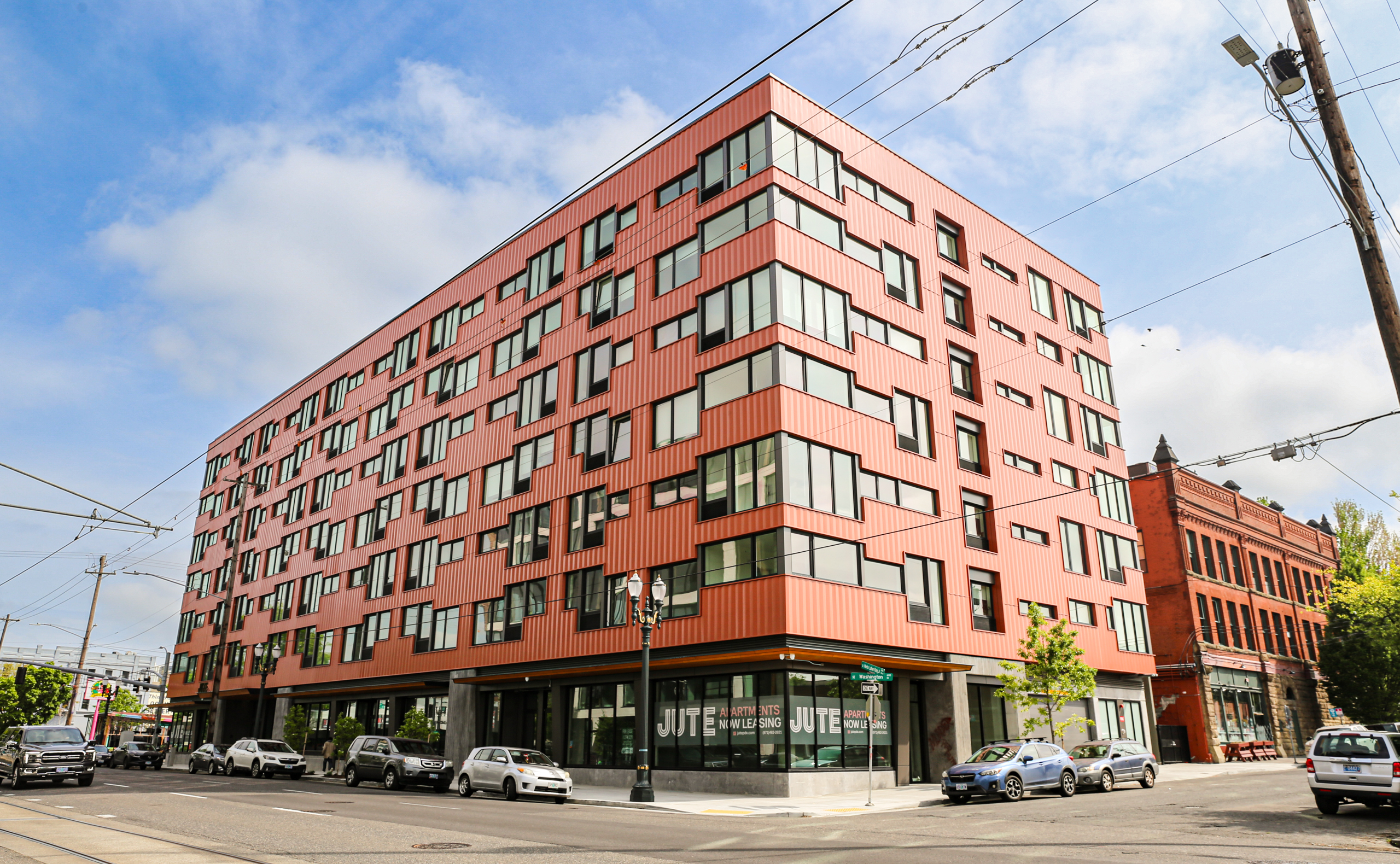
Urban Development Partners needed a name and brand identity for a new apartment building that would appeal to millennials and makers.
Services
Brand Strategy
Naming
Visual Identity
Brand Guidelines
Brand Strategy
In collaboration with the developers, we worked to find a unique positioning for this building amongst a sea of high rise apartments across the Portland area.
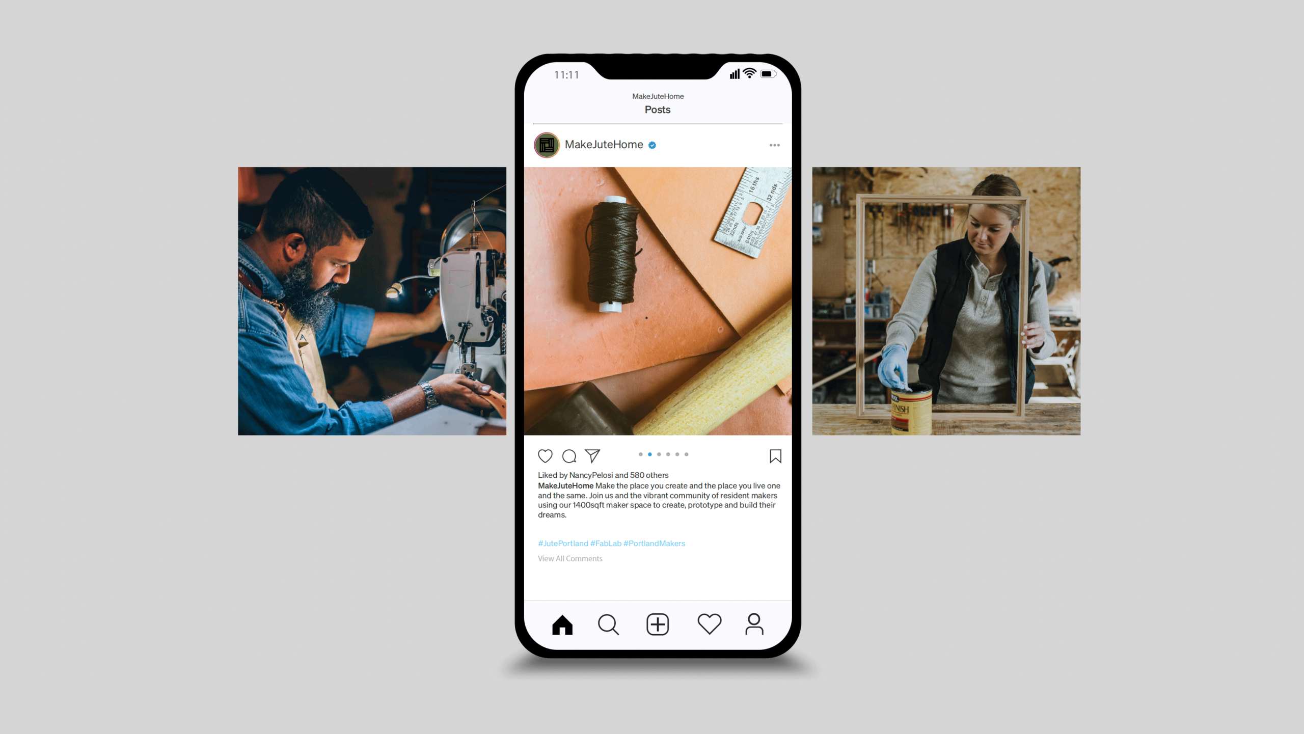
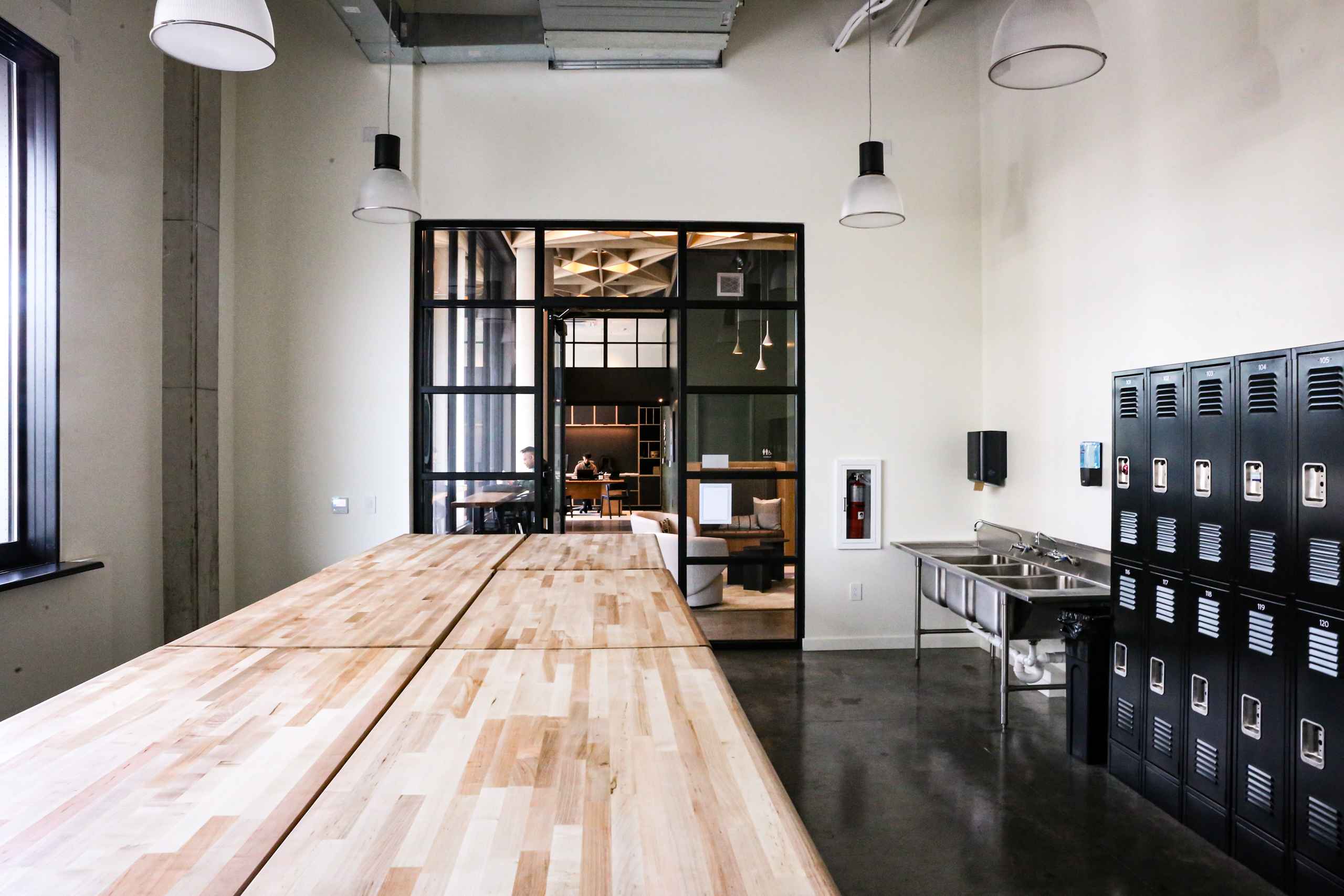
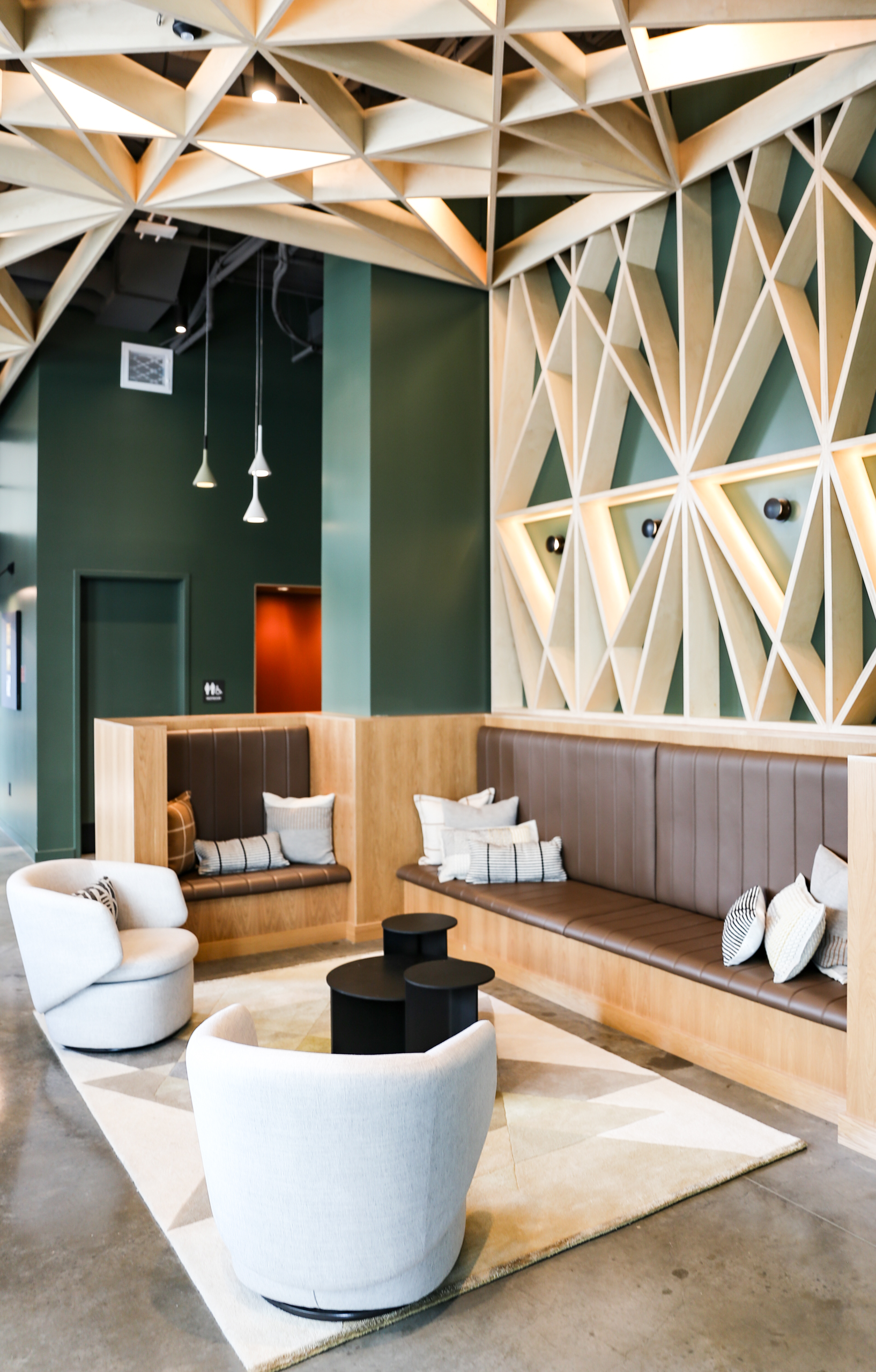
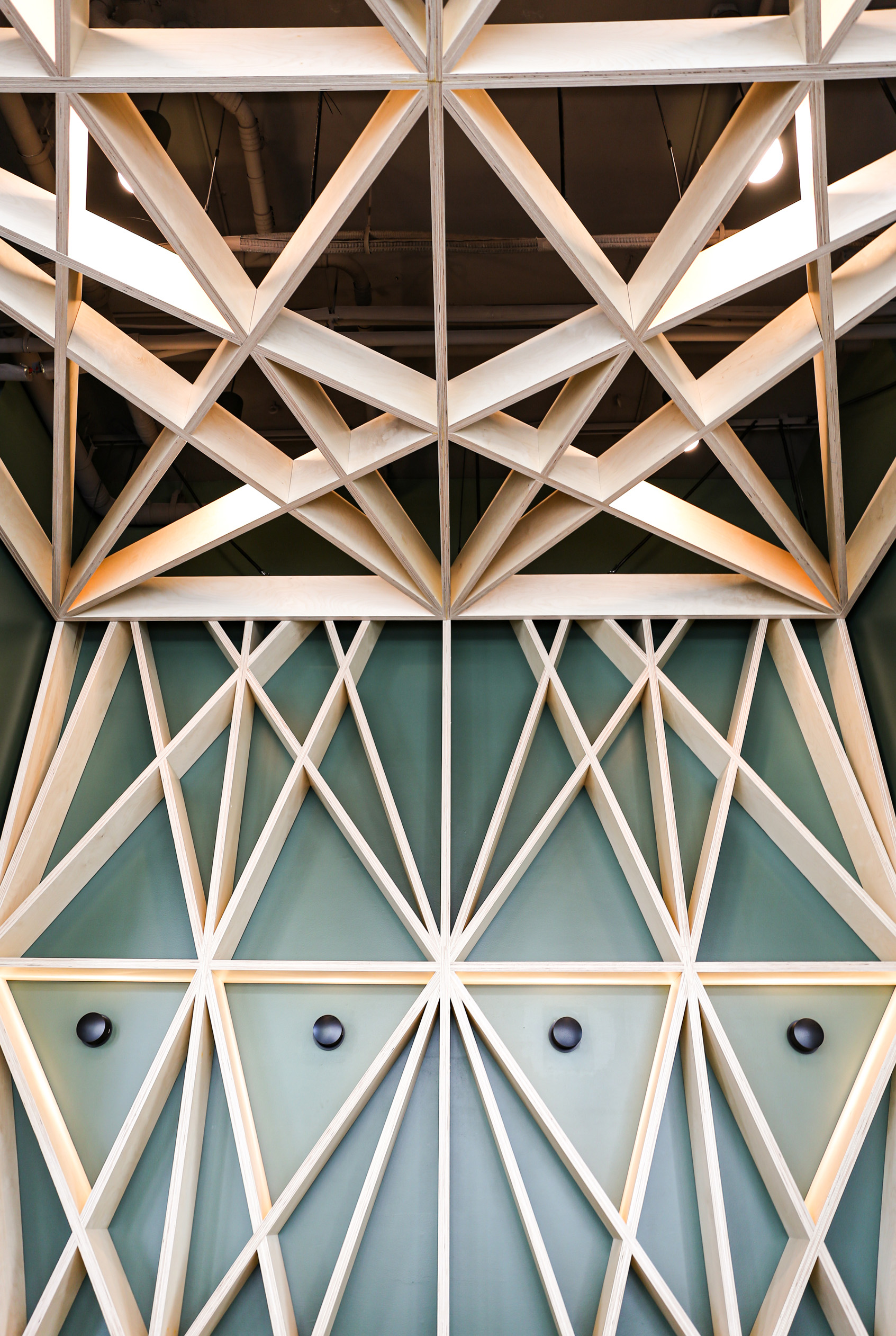
The centerpiece of our strategic positioning became the fabrication lab built within the complex, where residents could craft just about anything with tools and workspaces made for the modern DIYer. By highlighting this unique amenity alongside the simplicity of the building’s Nordic design, we promoted an enticingfusion of hands-on creativity and the functionality of contemporary urban life.
Naming
When it was time to name the building, we set out to satisfy some specific criteria. The name needed to be succinct and ownable with a soft feel to counter the industrial edge of the Central Eastside neighborhood. It also needed to emphasize the modern makerspace positioning in a single word or phrase.
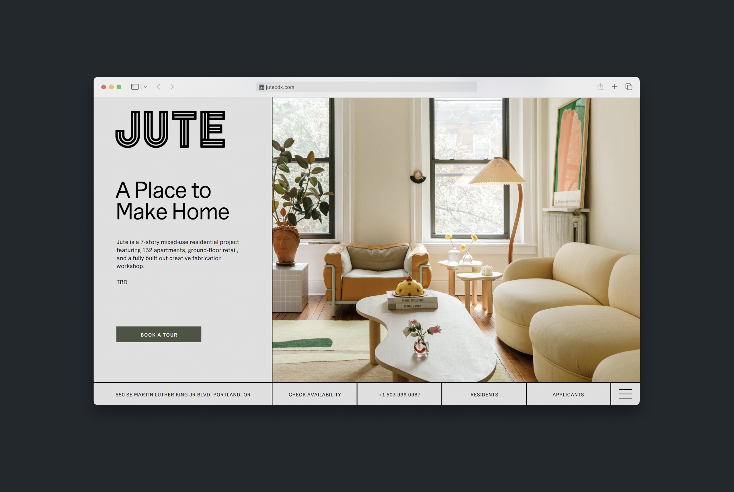
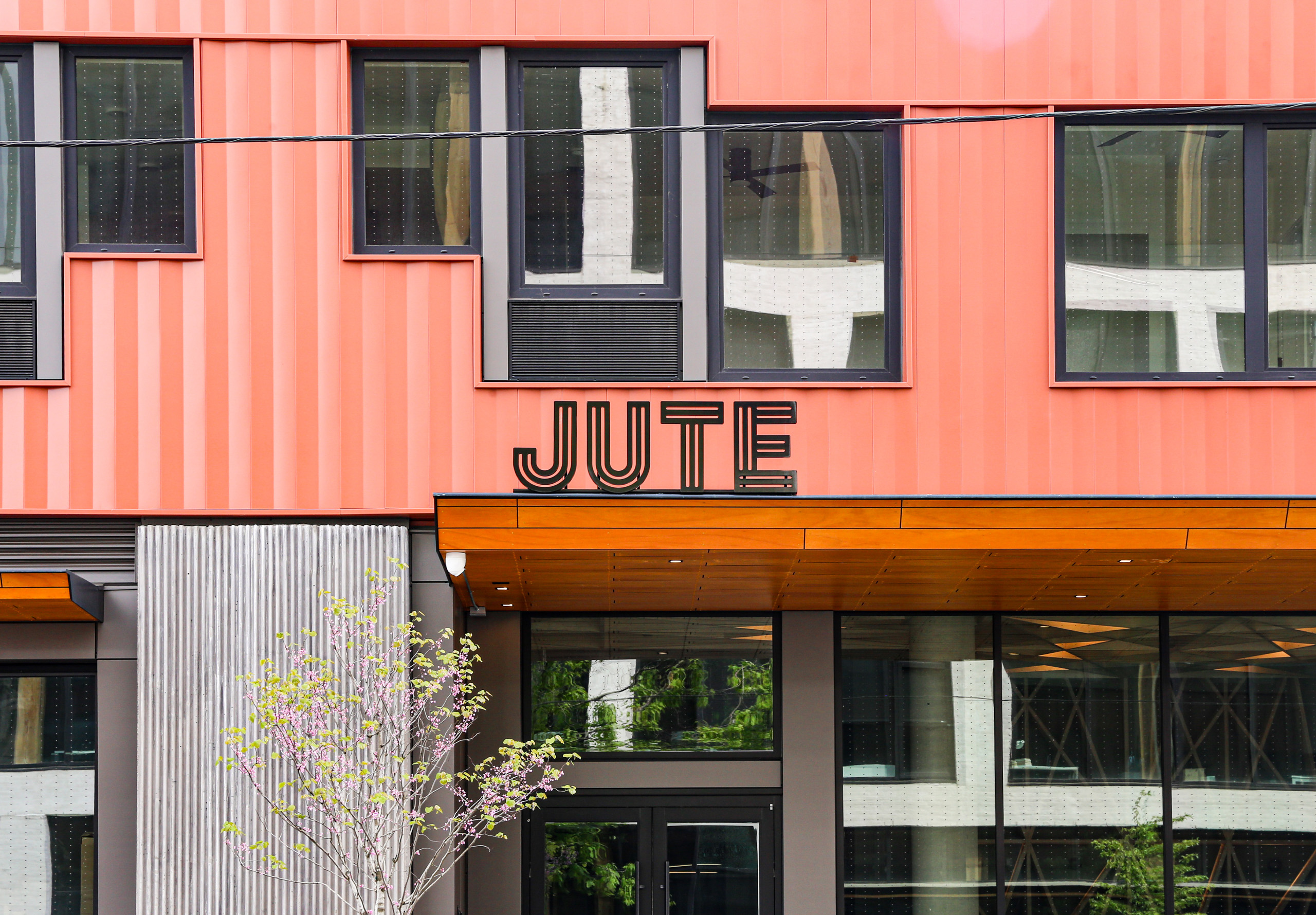
After completing our naming workshop process and lots of research, we landed on the name “Jute.” Jute is a natural fiber used to make twine, rope, and fabric. Jute twine is often used in crafting, and jute fabric is a popular material for summer bags and accessories as well as outdoor furniture. The name relates directly to the building’s unique fabrication lab, while also subtly evoking the ties that bind us, both through craft and community.
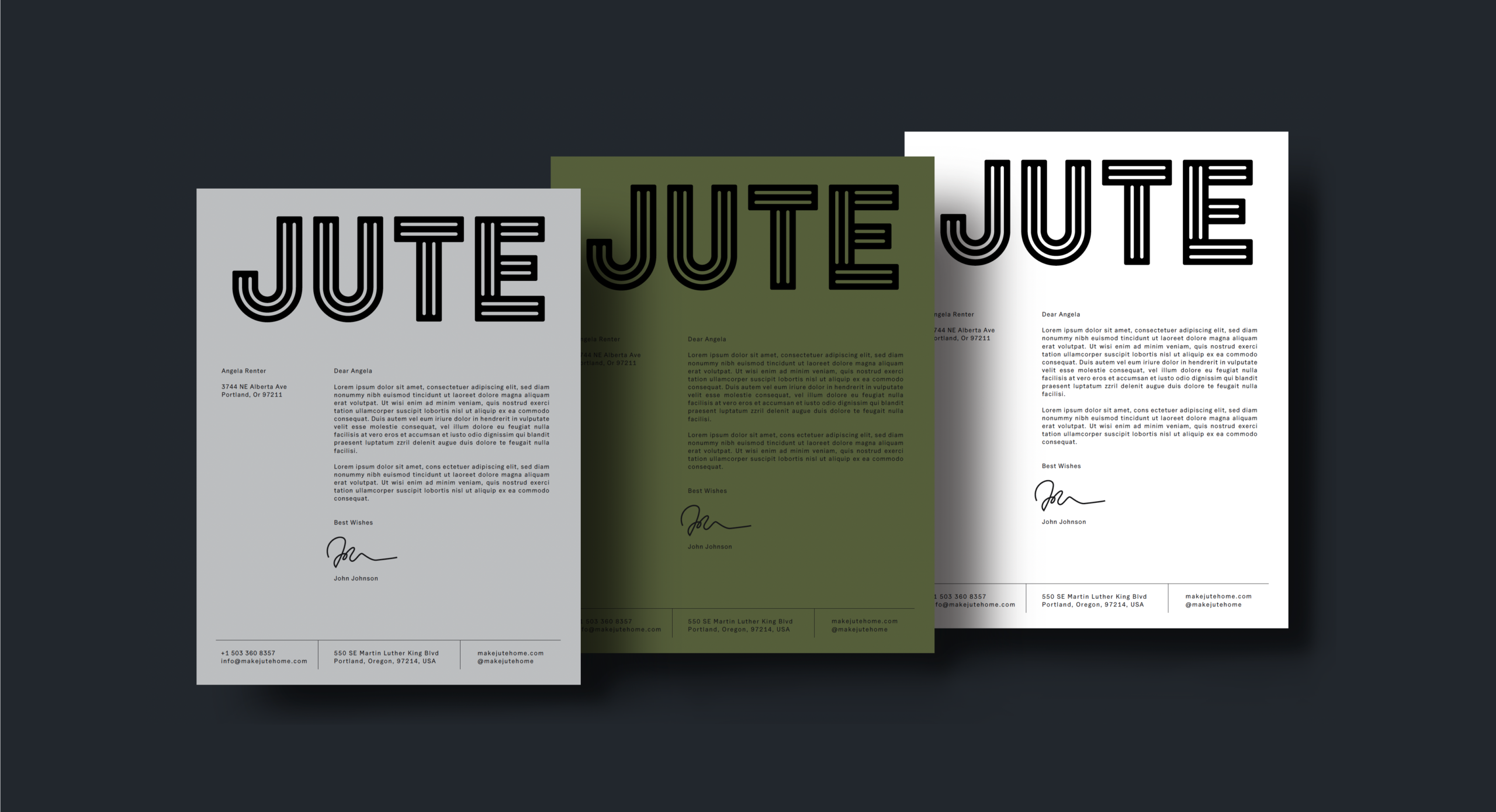
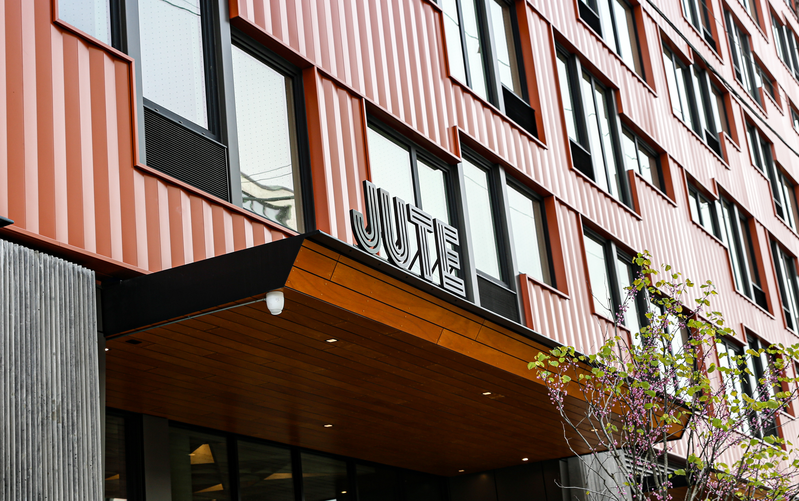
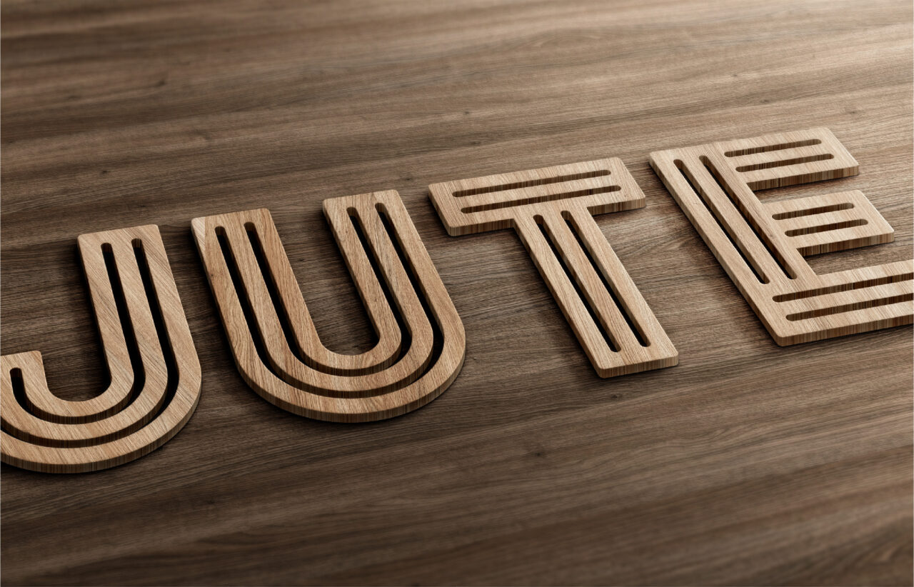
Logo Design
The Jute logo celebrates analog artistic techniques and the building’s construction with letterforms that reference jute rope and corrugated metal. Its strong presence balances hard lines and soft curves, while its bold weight lends a feeling of strength. The logo ultimately represents the spectrum of makers living and working in the complex.