Opal
Goal
This downtown Portland’s gem needed a multifaceted identity.
Services
Visual Identity
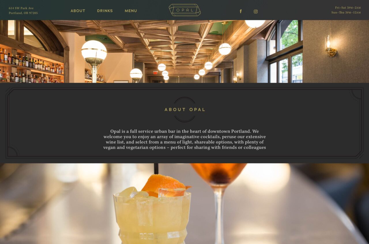
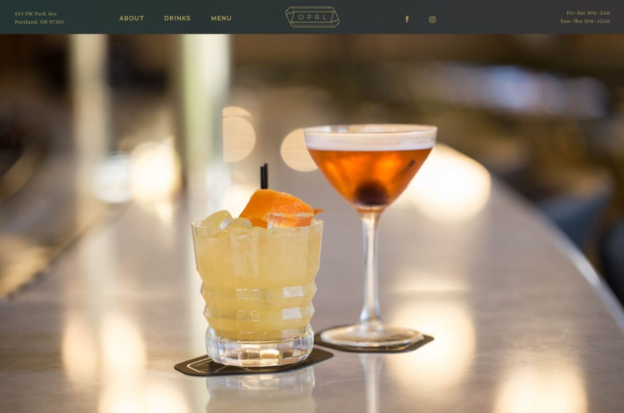
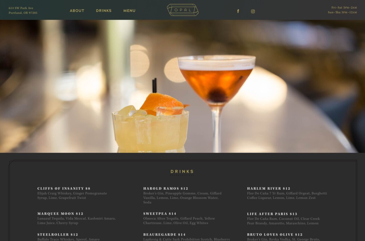
Website Design
Photography
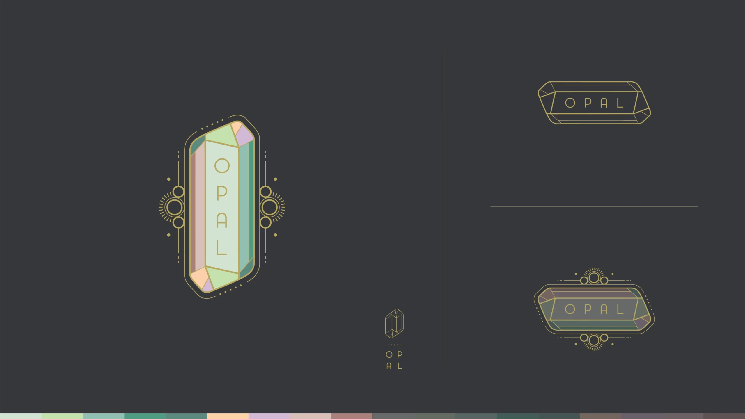
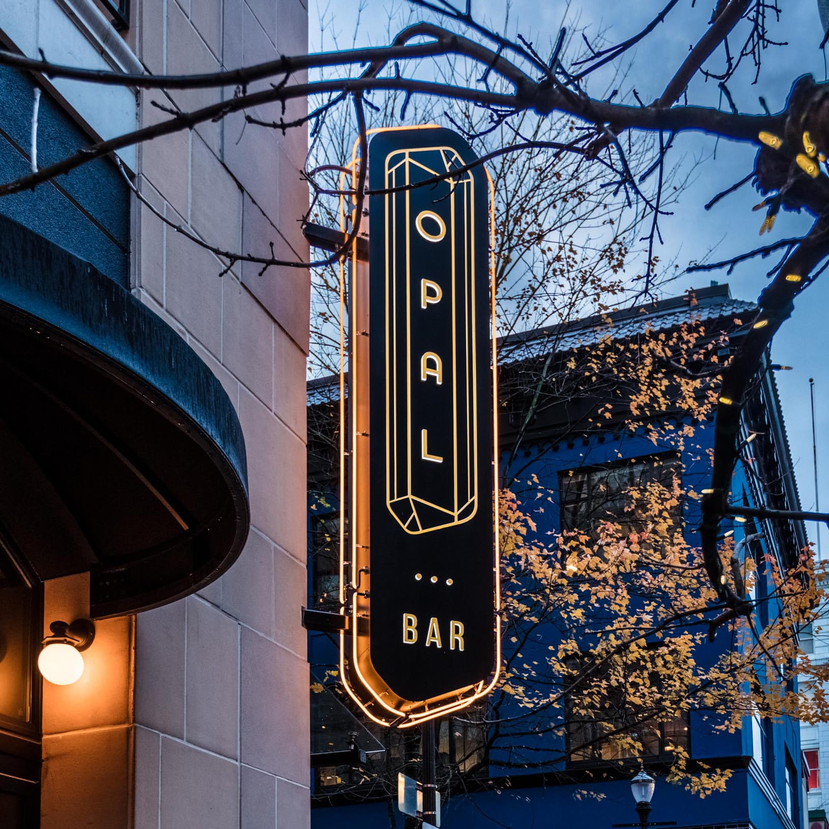
Opal is a cocktail bar with a vintage Art Deco atmosphere. It needed more overt branding that expressed a sense of playful high-end sophistication.
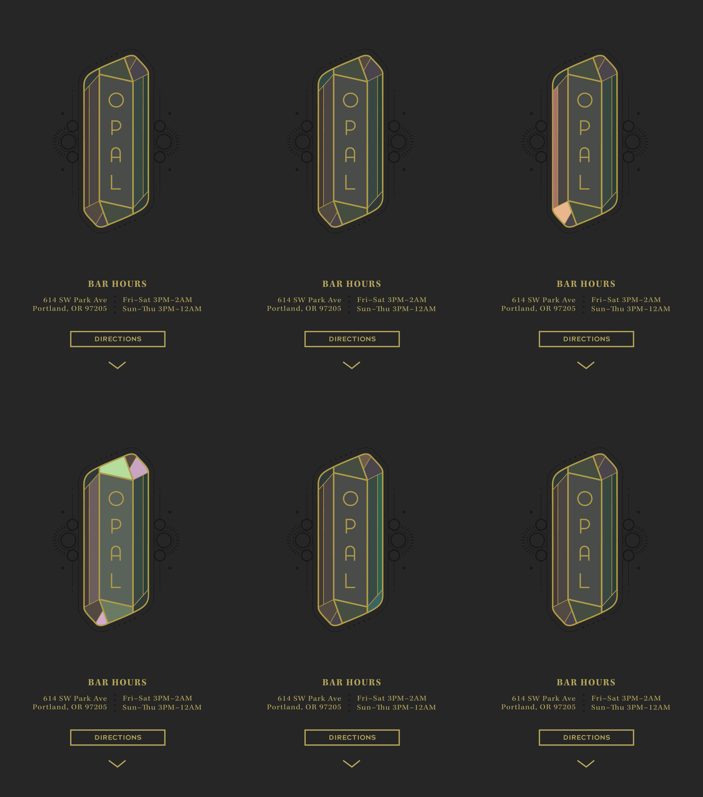
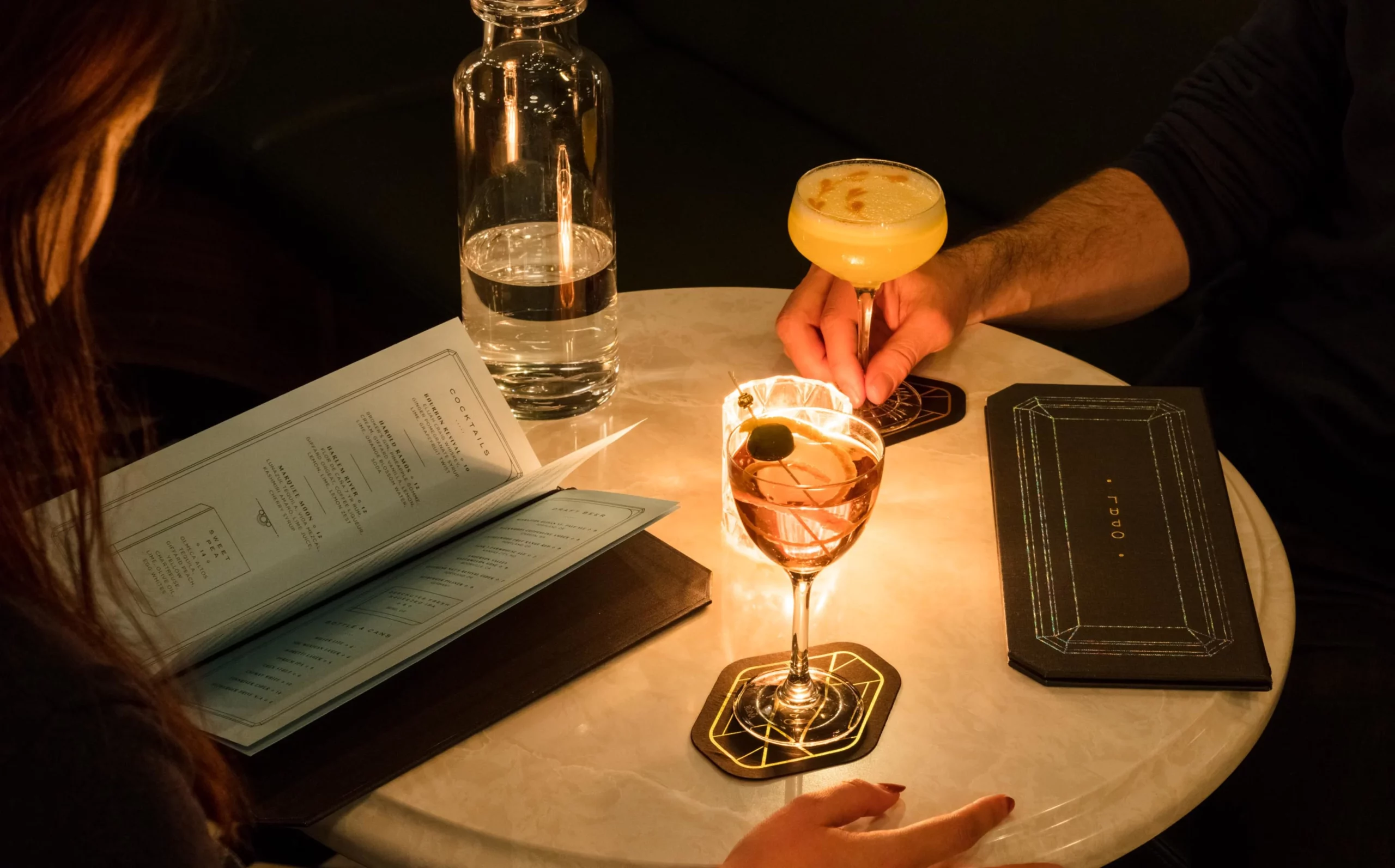
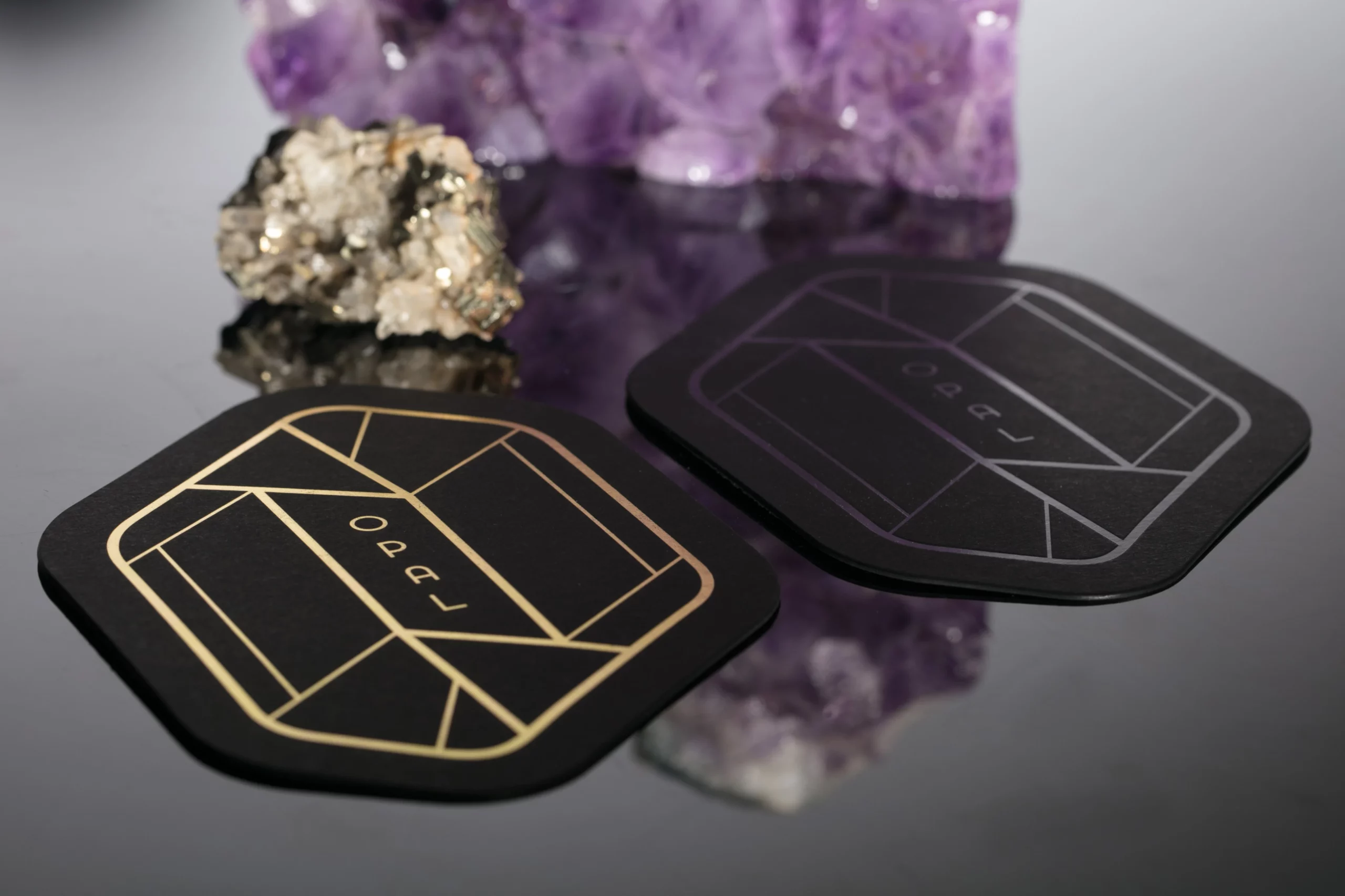
We took inspiration from the cocktail bar’s name. The jewel logo was created from a calligraphic “O” which we manipulated into the shape of cut opal. The colors for the logo were taken directly from photographs of real opals and placed against dark gray and black backgrounds to emphasize their precious quality. We adhered to an Art Deco tone and typography in our branding and adapted the logo shape to appear throughout the bar. From coasters to menus, which feature oil slick foil to mimic the glimmer of minerals, we wanted to fill the space with surprising gems.
Interior
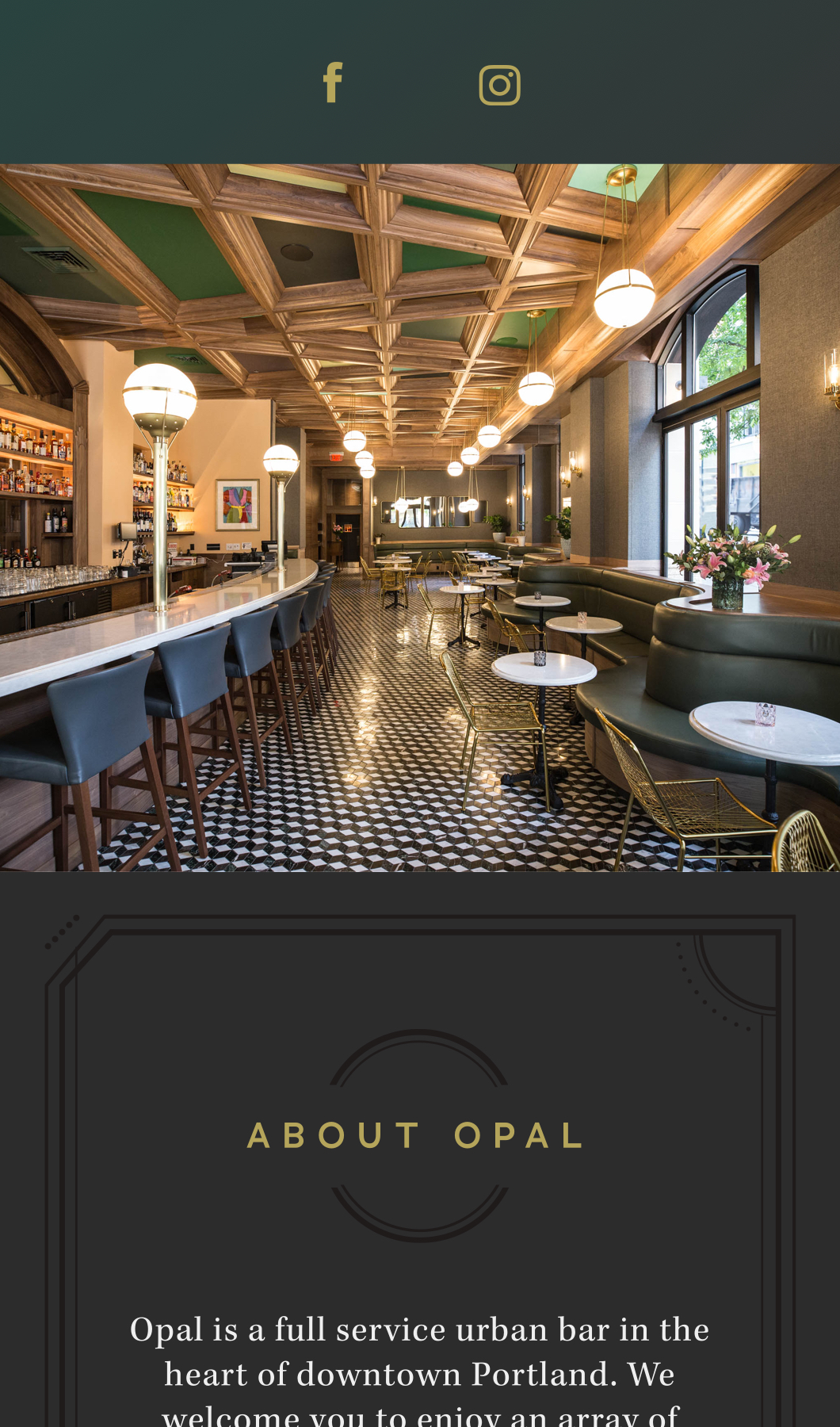
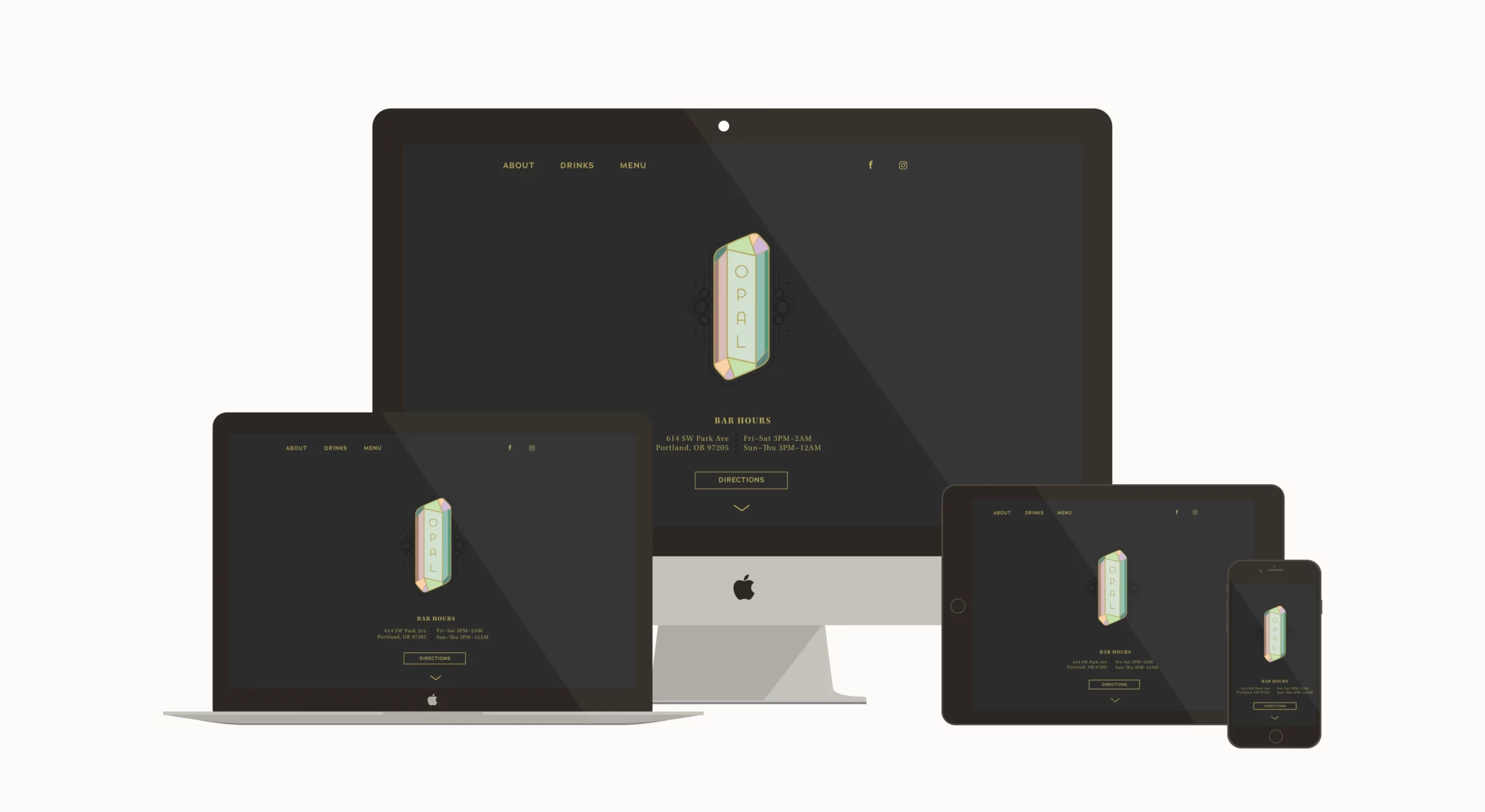
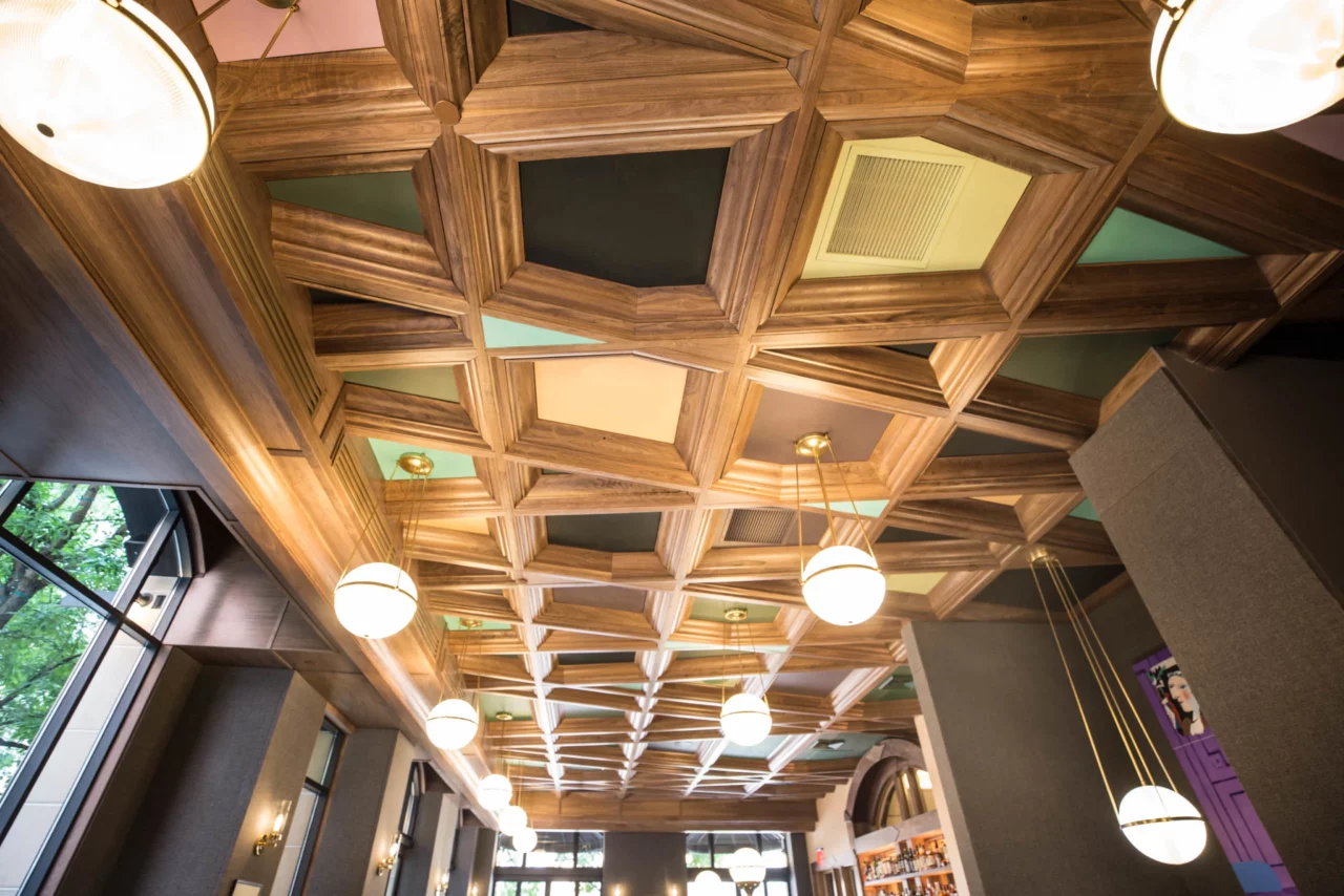
We also tied the logo to the bar’s decor by mocking up complimentary colors for the space’s unique ceiling, designing a brass framework for the wall, and providing consulting as the physical space was created. We animated the logo for Opal’s website to make it stand out against the dark, understated colors.
