Goal
Pipcorn was looking for new packaging and website design that captured their vibrant personality and showcased the value of their heirloom snacks.
Services
Visual Identity
Packaging Design
Illustration
Website Design
Photography
Outcome
Pipcorn Varieties Sampled
Corny Puns Attempted
Cheeseballs Consumed
Logo Design
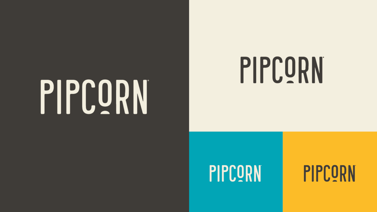
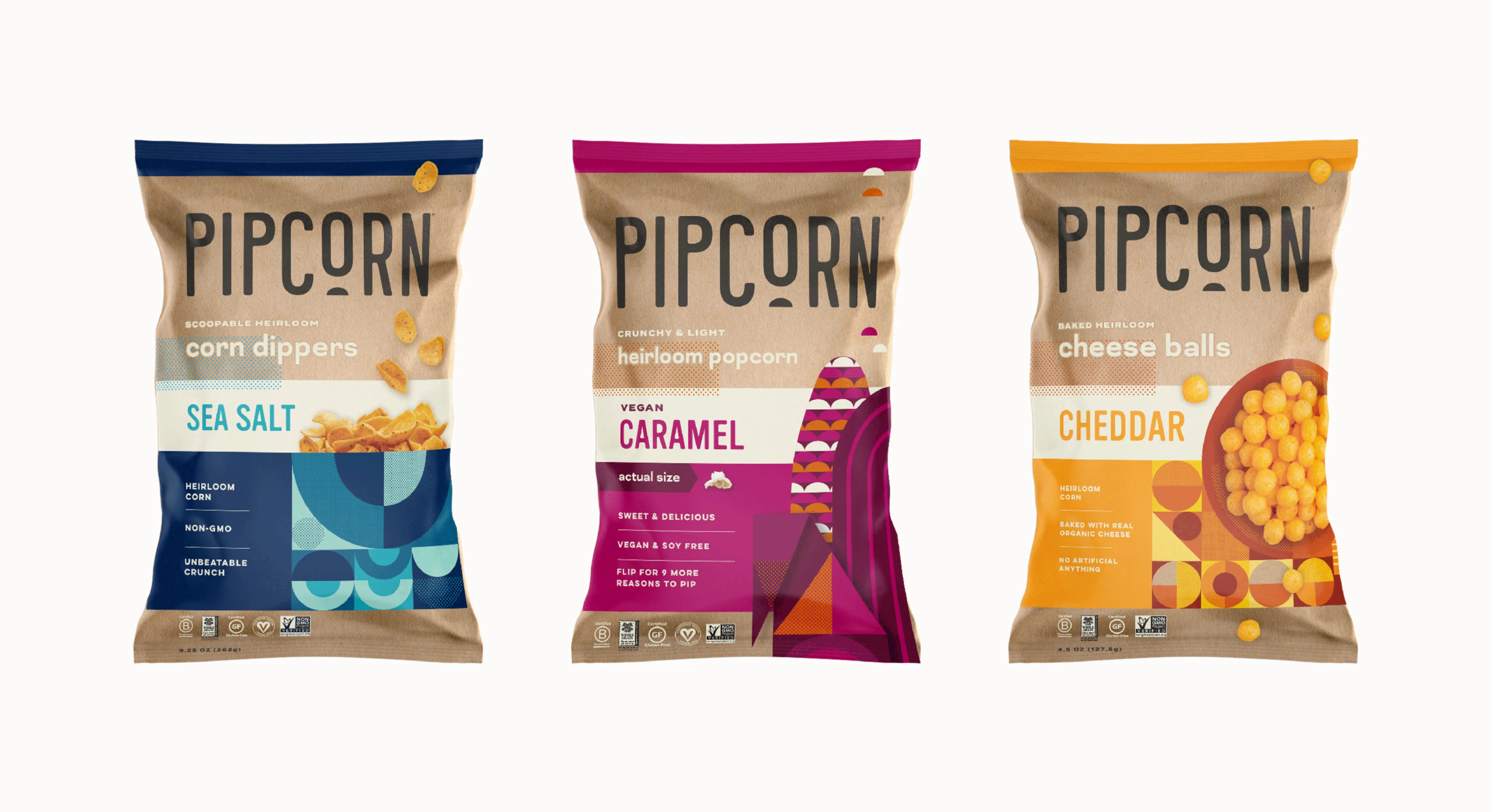
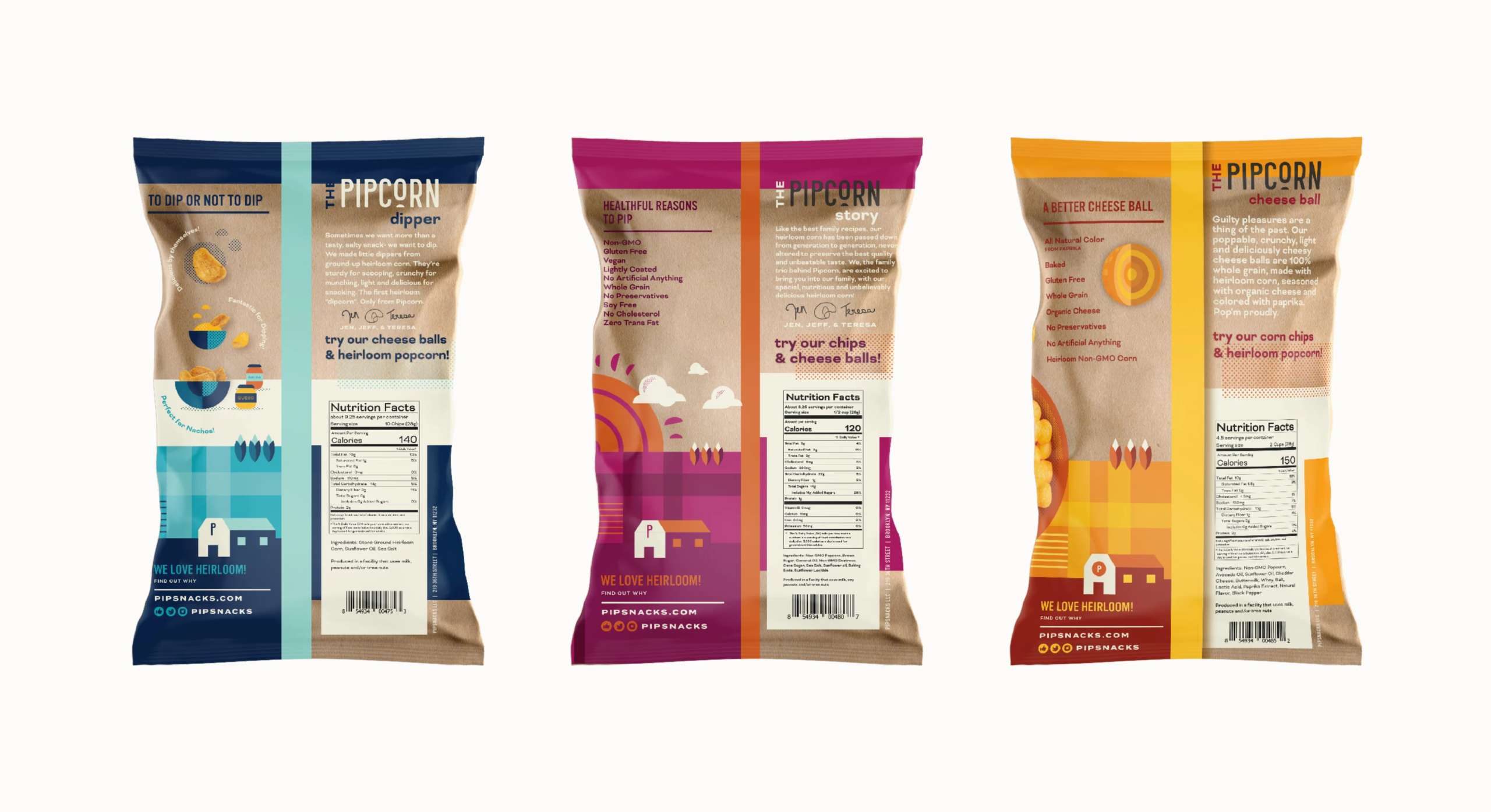
We refreshed the Pipcorn logo as we worked on their new packaging, turning the line under the “O” into a tiny kernel and using a more rounded and friendly typeface. The tiny kernels show up again in the X-height of the “P,” which, inspired by the diminutive product, is unusually small.
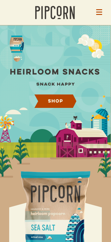
Featured on Oprah and Shark Tank, Pipcorn has been popping up everywhere and they needed their brand to grow with them. We created standout packaging, a refreshed logo, and a whimsical website that immerses users in the Pipcorn world through illustration, animation, and lifestyle photography.
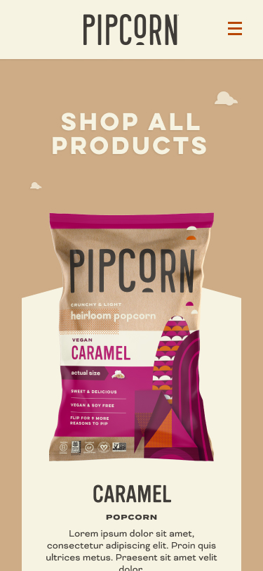
Packaging
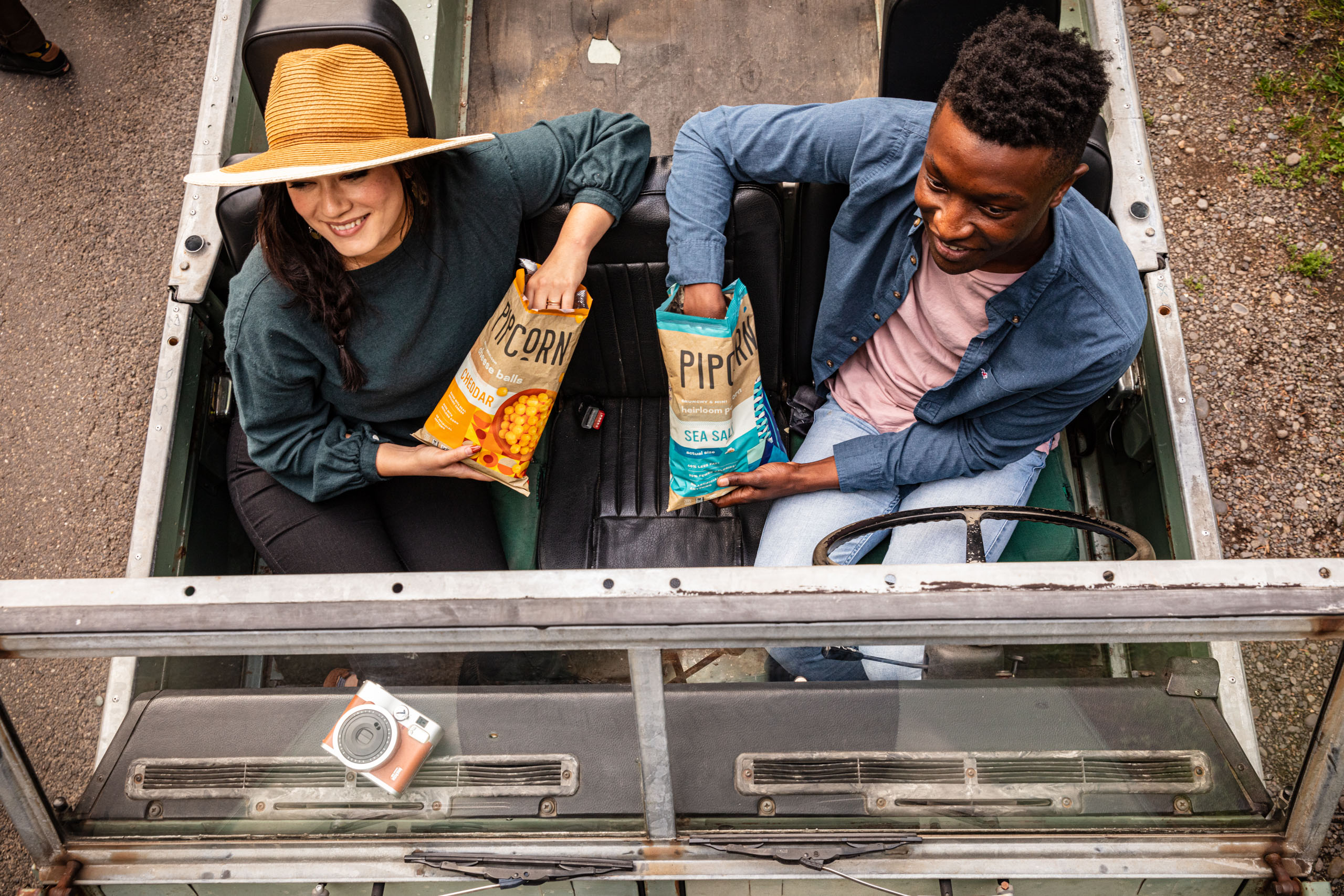
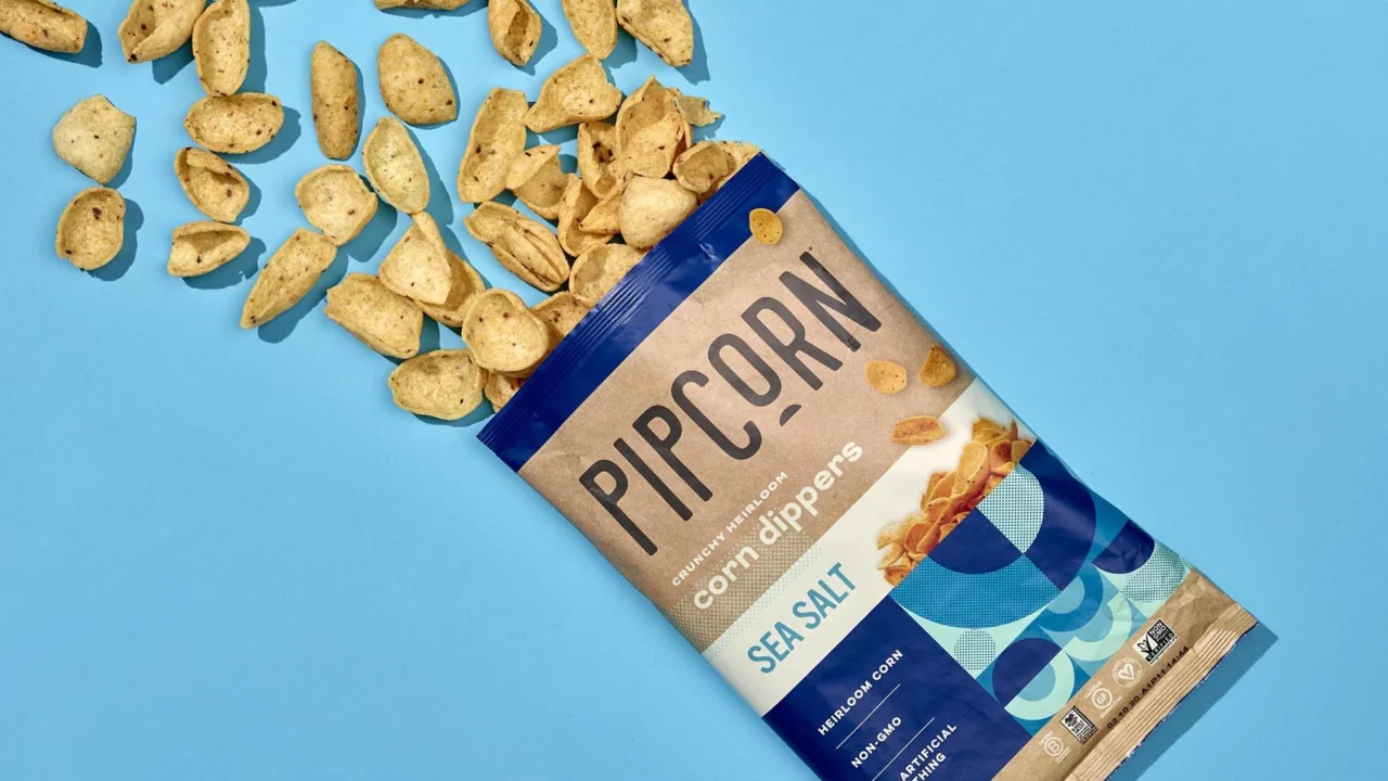
We added vibrant colors and illustrations to Pipcorn’s natural packaging style, preserving their connection to health and craft while adding some playful artisanal pep to the snack. Geometric patterns reference each product variety–rounded shapes for cheese balls, half circles for dippers, and a geometric ear of corn for the original Pipcorn. In order to introduce the new cheese balls and dippers, we featured product photography interspersed with the illustrations on the bag. Paying attention to all the small details, we incorporated every part of the bag, including a full color seam, into our design.
“What I love so much about this packaging is that each bag feels like a little work of art. Kraft texture provides the perfect canvas for hunger-inducing color palettes with the added benefit of livening up your coffee table or kitchen counter.”
Renee Dimalla
Senior Art Director
From the Client
“Murmur is a creative force! They did an amazing job capturing our brand personality and adapting it for a national audience. From logo and packaging to our amazingly delightful website, Murmur succeeded with flying colors.”
Jen Martin
Pipsnacks Founder
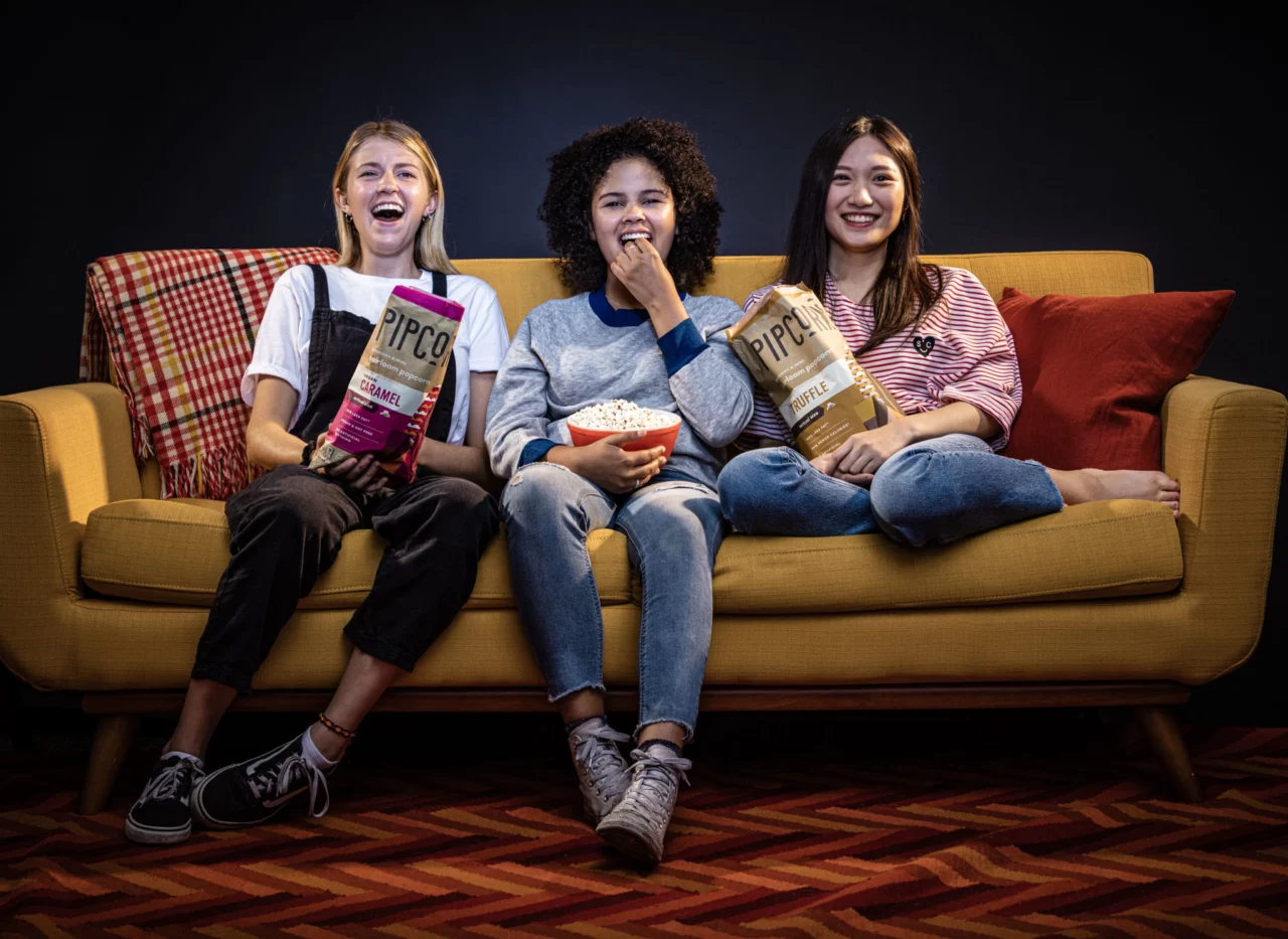
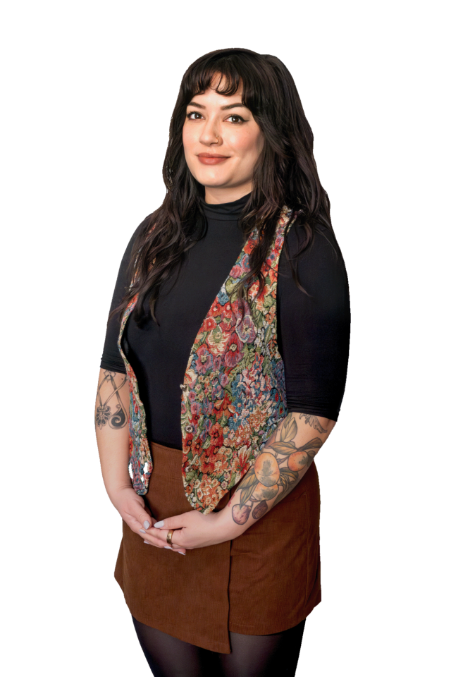
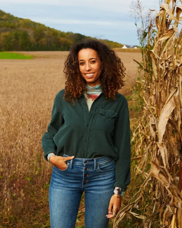
Photography
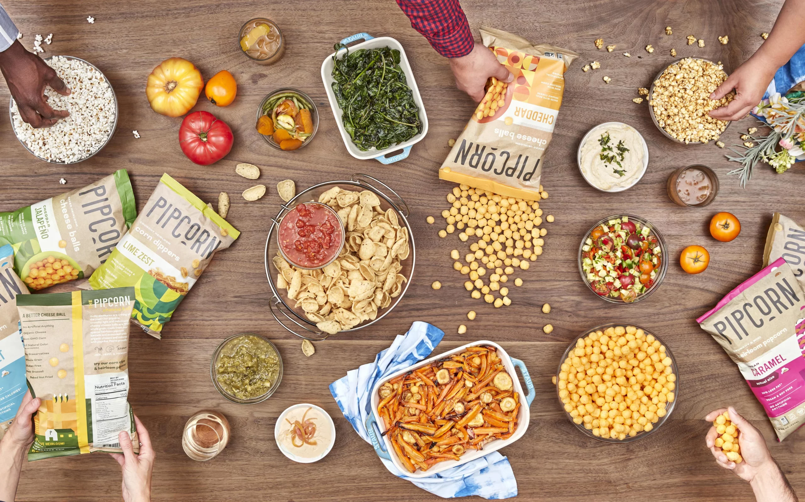
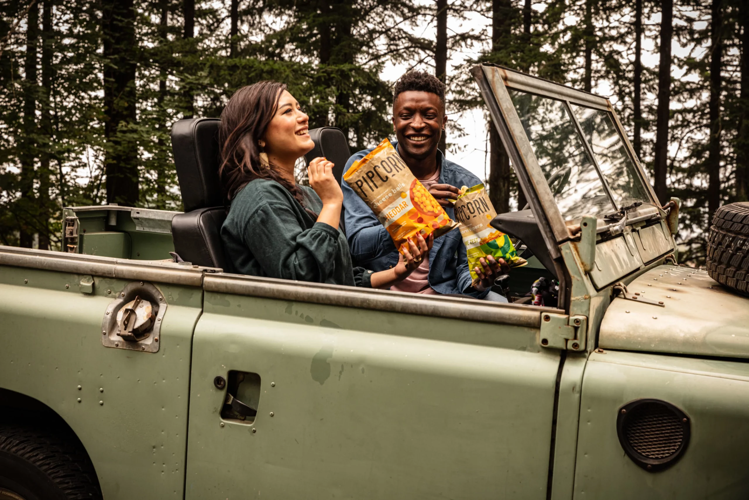
The concept for our photoshoots was “snack time is the best time.” We wanted to evoke nostalgic movie nights, road trips, and other joyful times with friends and family. We produced numerous indoor and outdoor shoots, including a shoot that involved staging a grocery store aisle in our own studio.
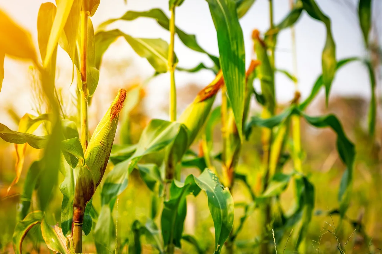
Branding Heirloom
Pipcorn is made from heirloom corn, vibrant and nutrient rich varieties that have been passed through generations. We highlighted this unique characteristic through messaging on the packaging and website and with visual cues, like cream tones and natural colors, that indicate the healthy, artisanal, and historic nature of the product.
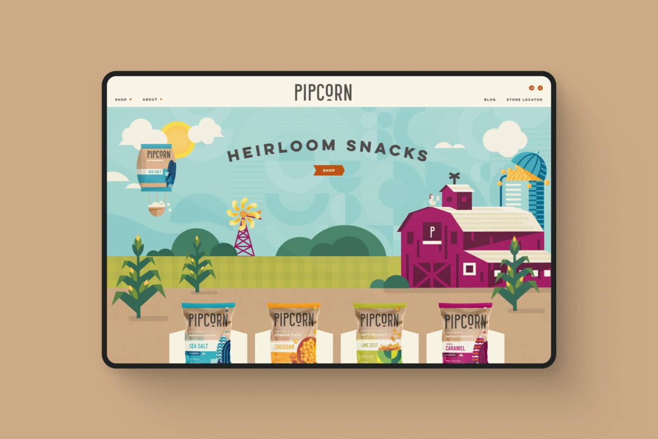
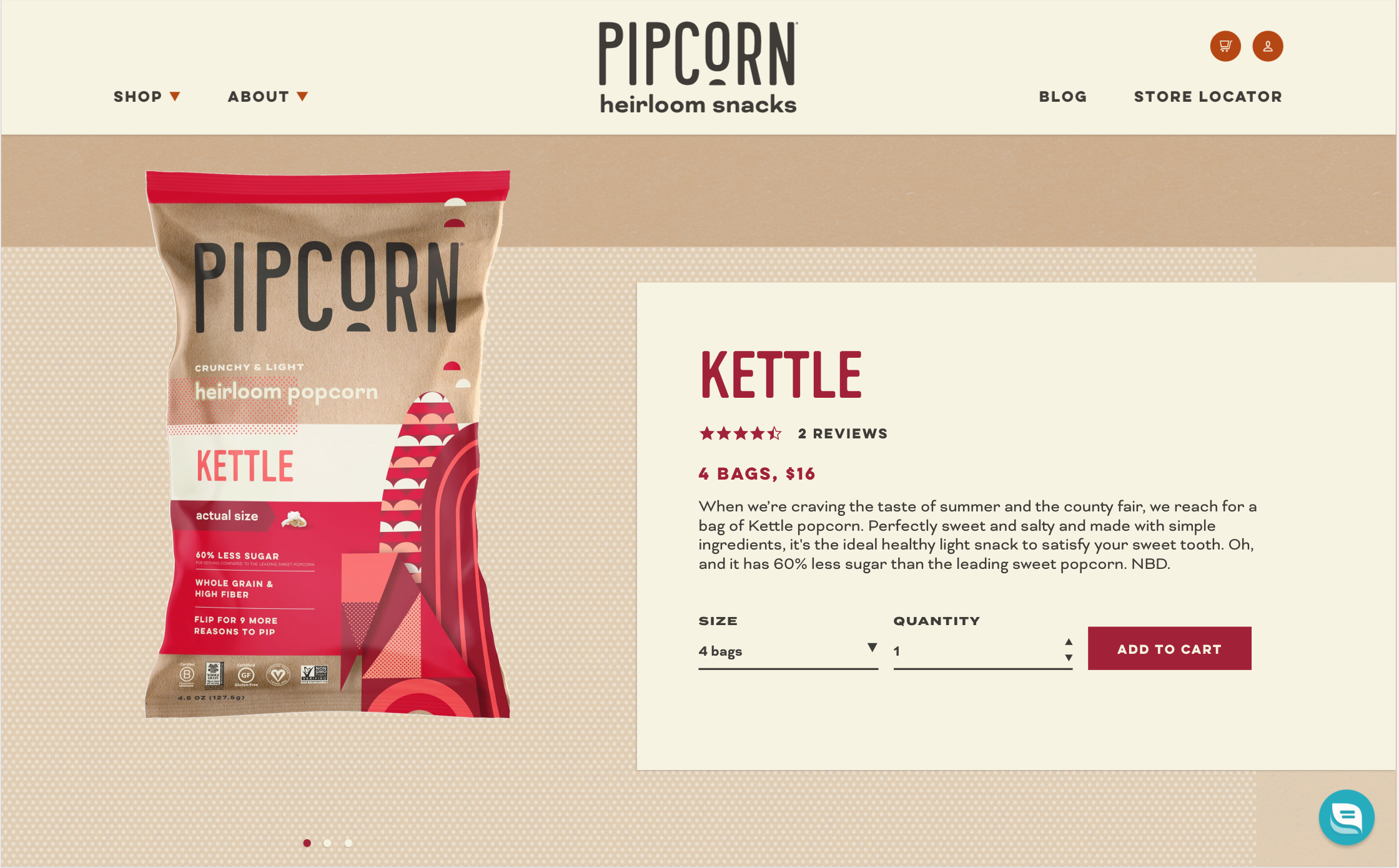
Website Design
Featured on dozens of blogs (ex: Hubspot) as one of the best websites designed on the Shopify platform, we developed Pipcorn’s website to enhance the playful brand and increase conversion. We took inspiration from the artisanal packaging, adding custom illustrations by designer Erin Nyffeler to create playful touches. Animations draw users into the Pipcorn world with unexpected twists and unique shapes. Icons draw attention to product features. And everything comes together to focus on the flavor of these delicious snacks.
“It was so fun working with a company that had landed a deal on Shark Tank! Pipcorn wanted us to help them take their business to the next level. Strategic branding and packaging are helping both their classic and new snacks garner more attention on shelves, while their fun website exudes brand personality and makes online ordering a breeze. Make sure to try the Truffle Corn Chips. They just might change your life!”
Mary Breslin
Exec. Director of Client Services