Packaging Design
Award-Winning Packaging Design with a Purpose
You have the consumer’s attention for mere seconds. Our packaging design approach maximizes creativity and resonates with consumers, so you’re not only remembered but chosen.
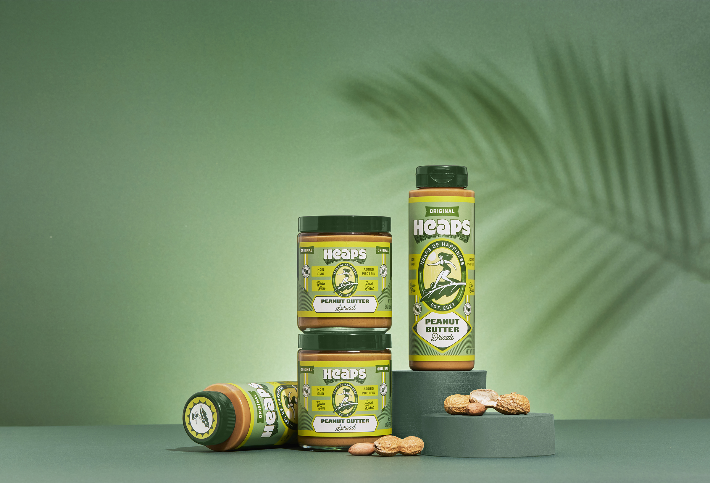
Whether you’re launching a new product or refreshing your brand, we help you find the right words to inform, inspire, and influence at first glance. We balance aesthetics and purpose to ensure your brand values and personality shine through. We can also assist in navigating industry regulations, sourcing sustainable and sturdy materials, and crafting bespoke, one-of-a-kind containers.
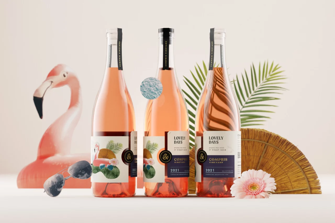
Wine Label Design
Compris Vineyards
Compris means inclusion in French and serves as an apt name for a vineyard run by a team driven to empower inclusivity in the wine industry. Their packaging needed to reflect their open arms attitude. After naming 15 different wines after the Compris team’s favorite tunes, we were excited to have such melodic references to play with for our designs.
We established a tiering system for their wine offerings: a gateway tier with whimsical collage-style labels, and an upscale tier with a sleeker design in a jewel tone palette. Both tiers share a quintessential design feature, with two labels coming together, and the Compris seal locking them in place.
From the Client
“When we bought our vineyard, we were unsure what our new brand would look like and knew we needed help. Murmur seemed like an obvious choice for us as a mission/values-based organization with an amazing portfolio. Our intuition was proven correct. Throughout the entire process, the Murmur team guided us toward success. They spent time getting to the core of who we are and translating it perfectly into something tangible. Murmur is not our business partner, they are an extension of our family.”
Dru Allen
Proprietor and COO of Compris Vineyard
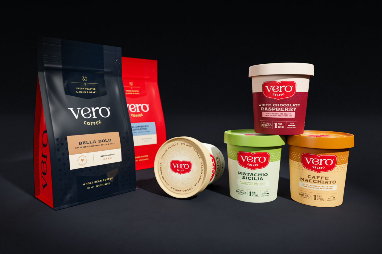
Packaged Goods Design
Vero Coffee & Gelato
When CPG brands update their packaging, they face a challenge of balancing modern tastes with their heritage and brand equity. Vero needed to give equal representation to their Italian ancestry and Chicagoland roots while bringing a modern elegance to their look.
We landed on a flavor-forward color palette for the gelatos and a classic navy for the coffee. Both schemes work beautifully with Vero’s original bright red brand color, carried through in the updated logo. The addition of the Chicago star not only showcased their hometown pride but also tied the product lines together.
Canned Cocktail Design
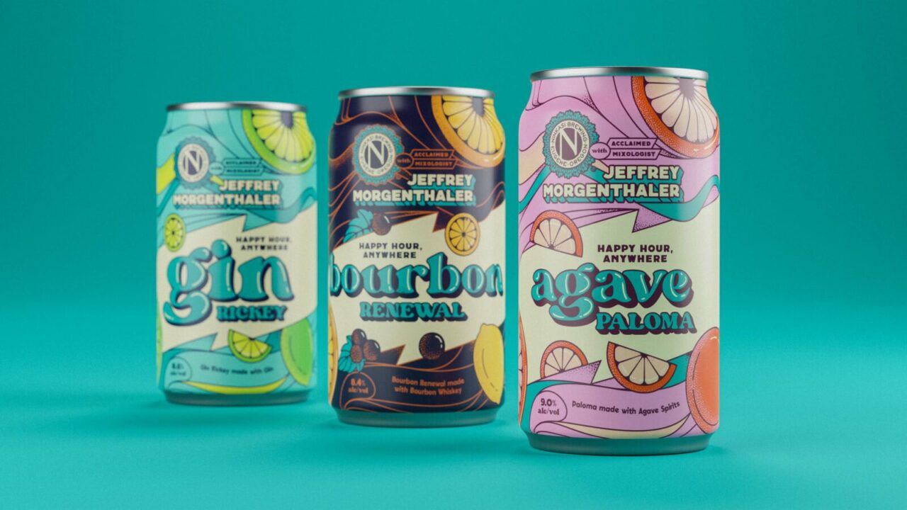
Ninkasi Brewing & Jeffrey Morganthaler
When two icons team up on a product, the packaging needs to be just as exceptional as they are. The award-winning Ninkasi Brewing and renowned mixologist Jeffrey Morganthaler came to us looking for a design for their canned cocktails that practically popped off the shelf into customers’ hands. We delivered a psychedelic explosion of fruits and hues to communicate the flavor of summer happy hours in each can.
From the Client
“The Murmur Team meshed seamlessly into our creative process and brought expertise that helped them design these absolutely fabulous branding elements and packages. Murmur captured the playful, Happy Hour Anywhere vibe we wanted specifically for the cocktails. Consumers have repeatedly said how these cans stand out compared to others and how much they radiate Ninkasi!”
Jamie Floyd
Founding Brewer of Ninkasi Brewing
Our Approach to Packaging
- Unique packaging designs
- Format changes
- Packaging materials sourcing
- Brand strategy workshops
- Messaging development and hierarchy
- Competitor and consumer research
- Compliance implementation
- Packaging prototyping
- Trademark risk analysis
- Retail displays and experiences