Scratch & Peck Feeds
Goal
Scratch & Peck Feeds sought a new brand identity that would reflect their rapid growth from a backyard feed shop to a leader in the industry.
Services
Brand Strategy
Visual Identity
Packaging Design
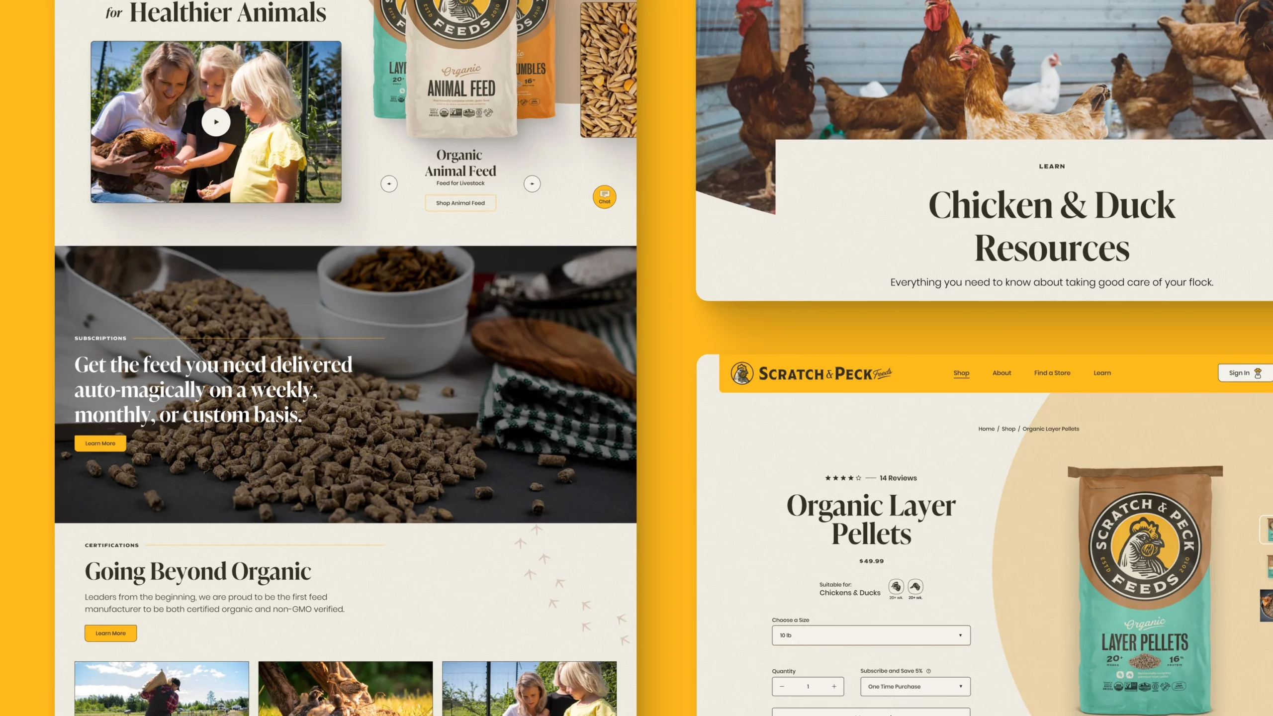
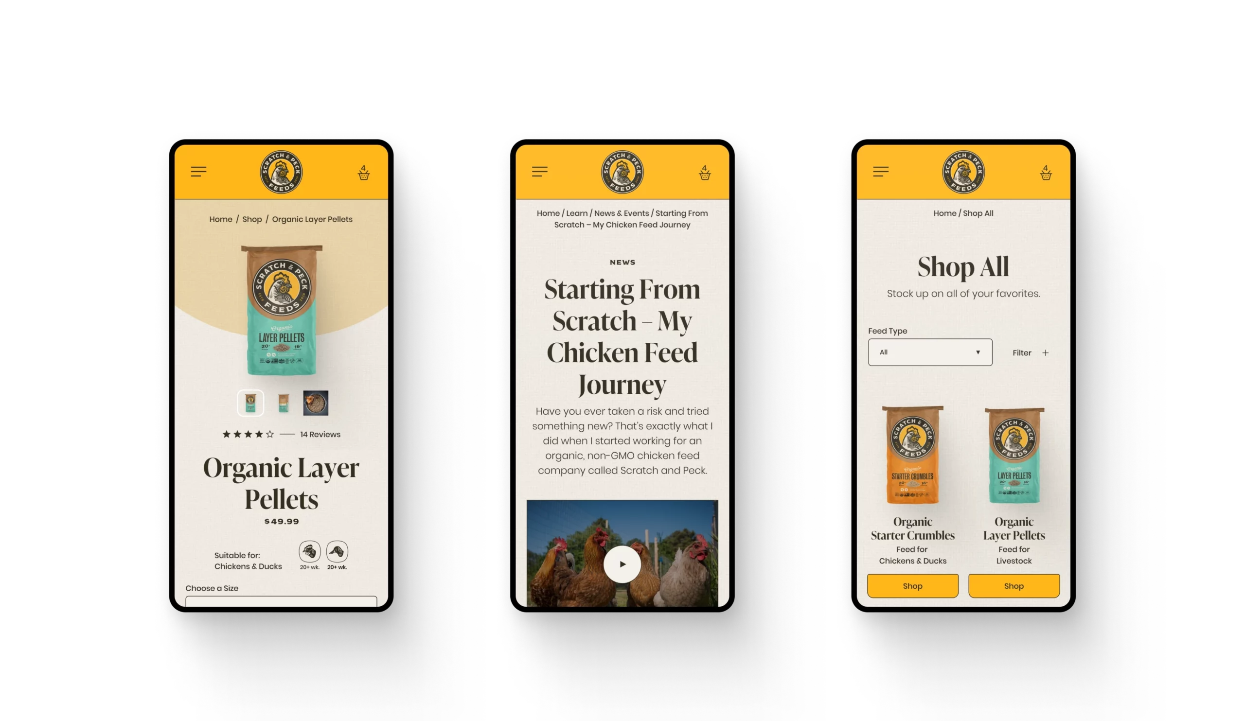
Website Design
Website Strategy
Brand Strategy
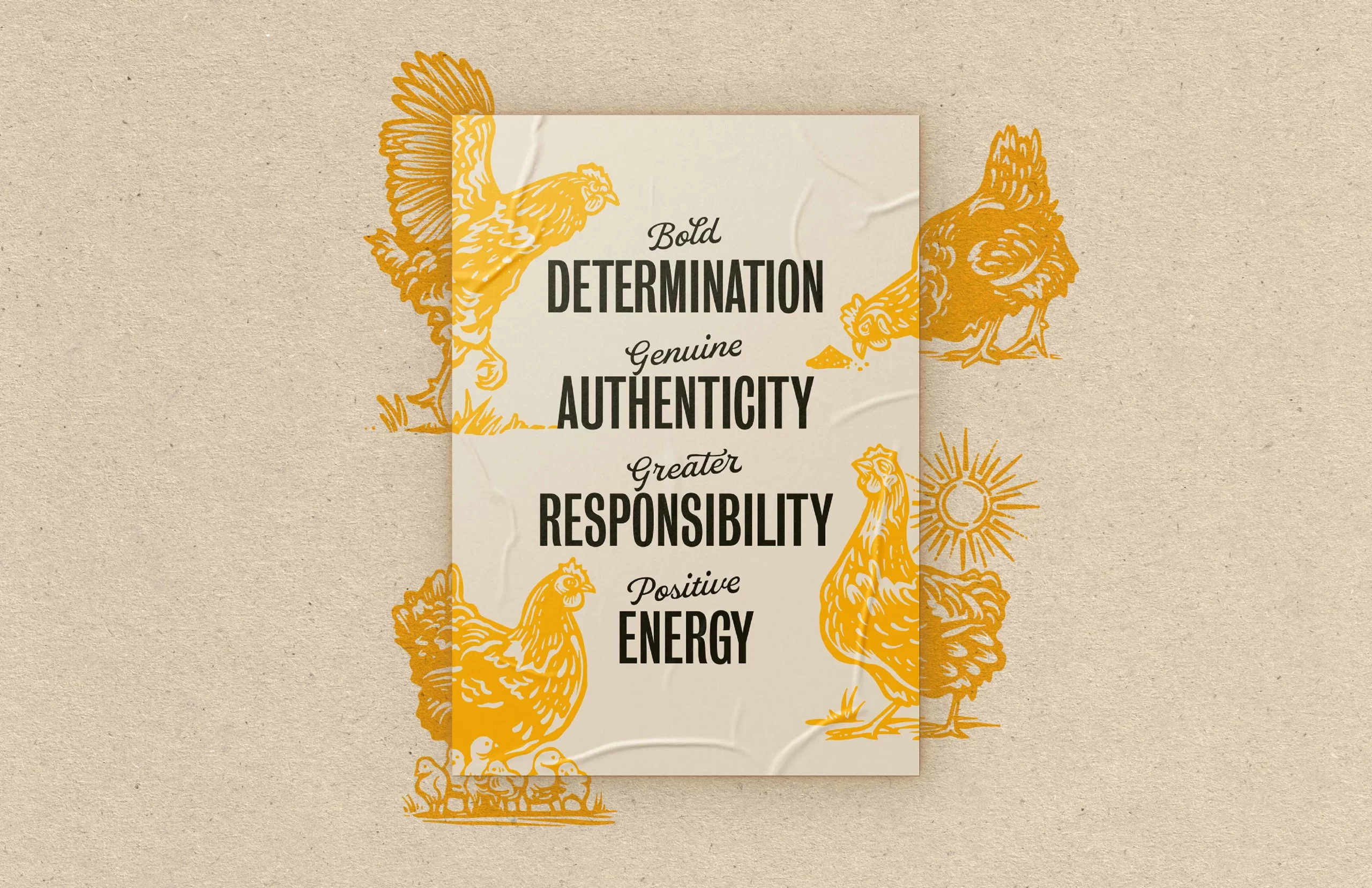
From their values we created pillars that could be used to inform their design and communication strategies. With their new branding in tow, Scratch & Peck wanted to ensure they could effectively leverage each brand touchpoint with a consistent voice. As part of the Voice & Tone process, we narrowed in on parameters for everything from B2B communication to pun use.
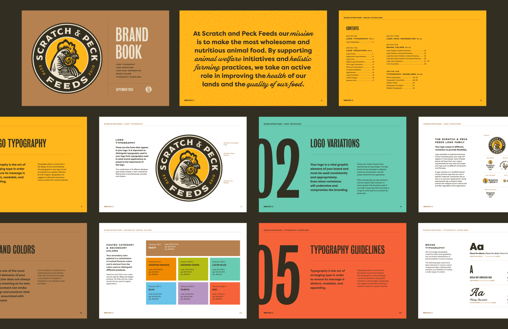
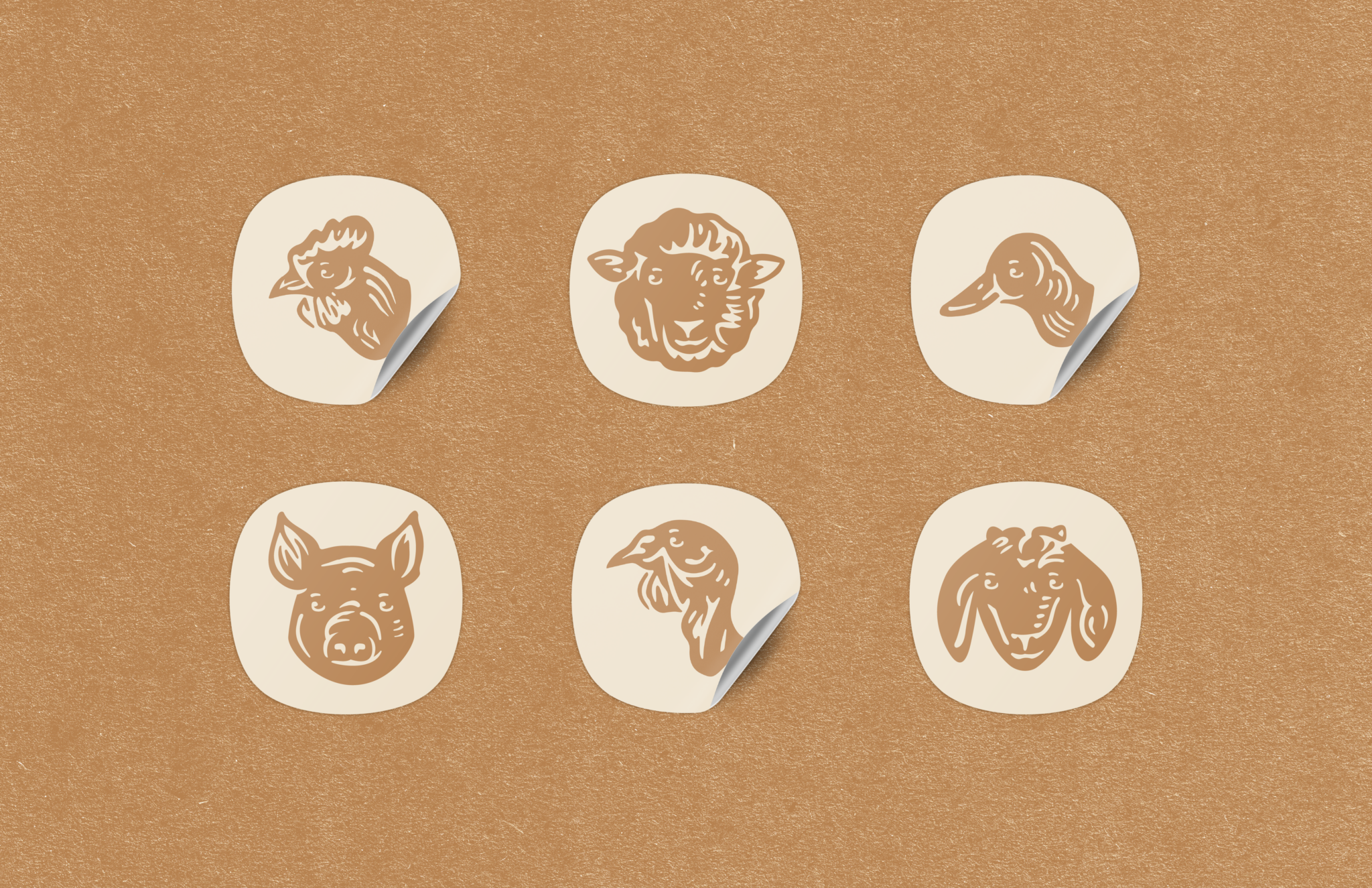
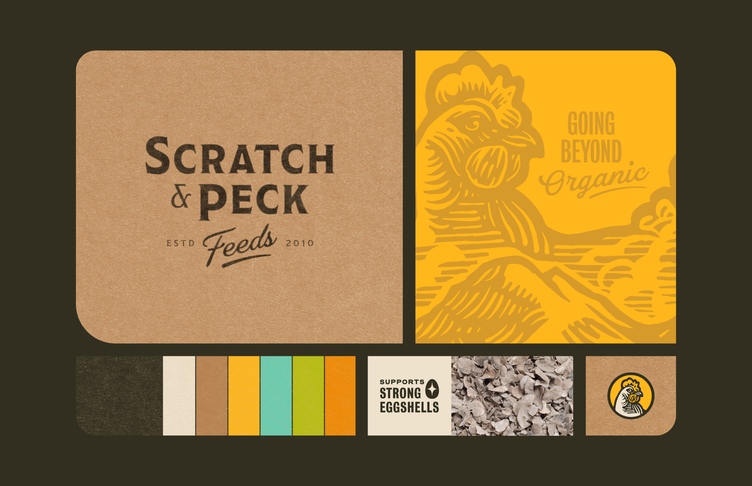
Logo System
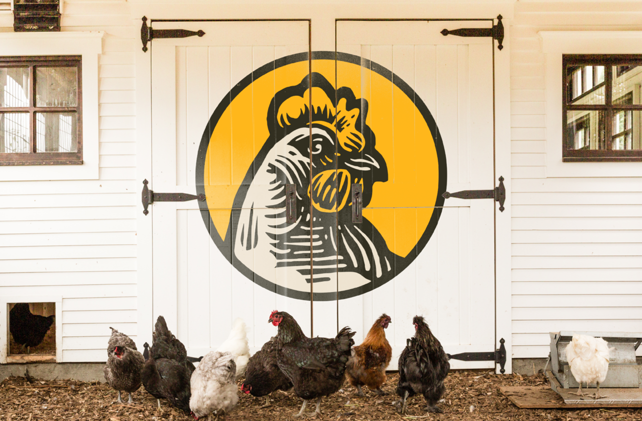
We designed “Mona,” name given to the chicken, to reference the former logo and the way she was displayed on packaging. We retained the seal and visual elements, while updating the style to give it a woodcut, agrarian feel. The full-scale Mona incorporates Mt. Baker, the view from the Scratch & Peck headquarters.
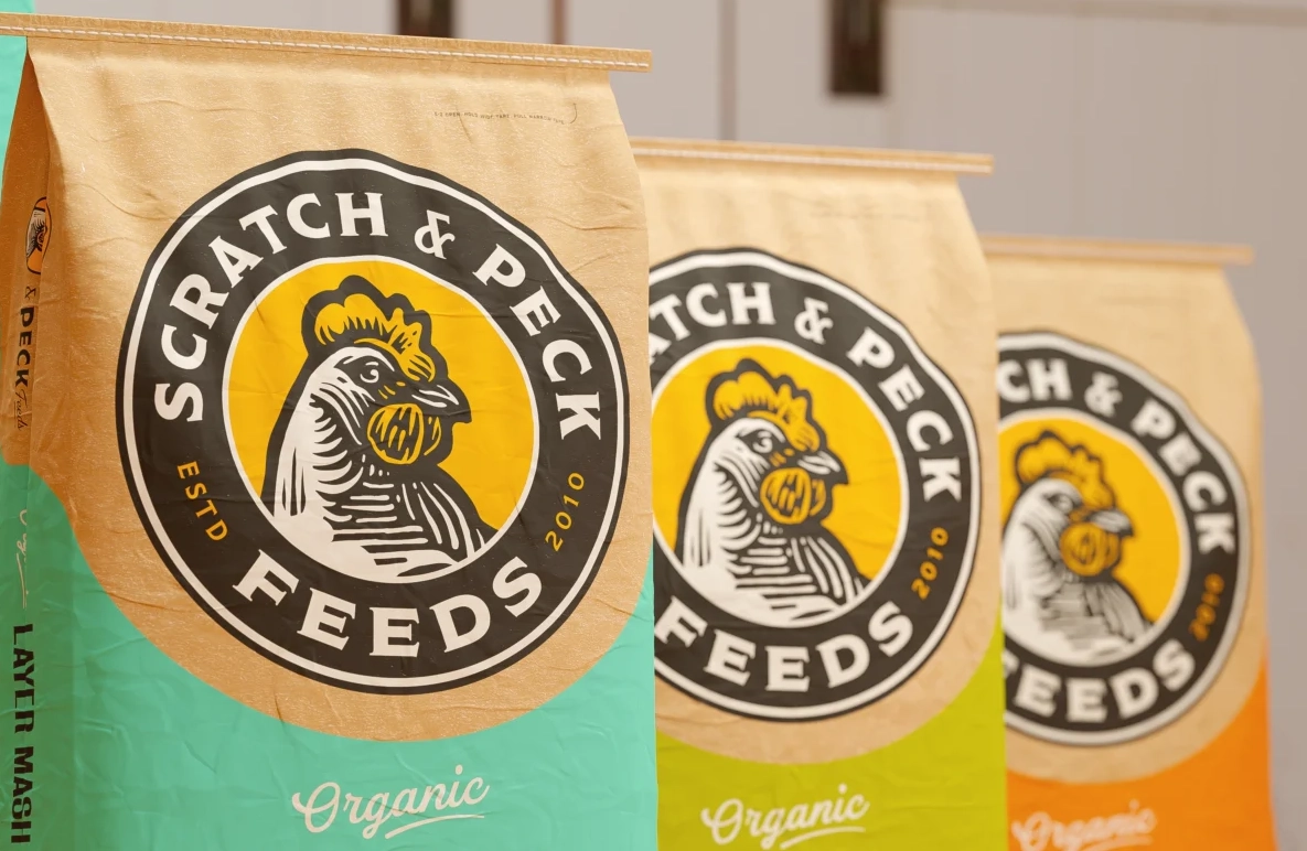
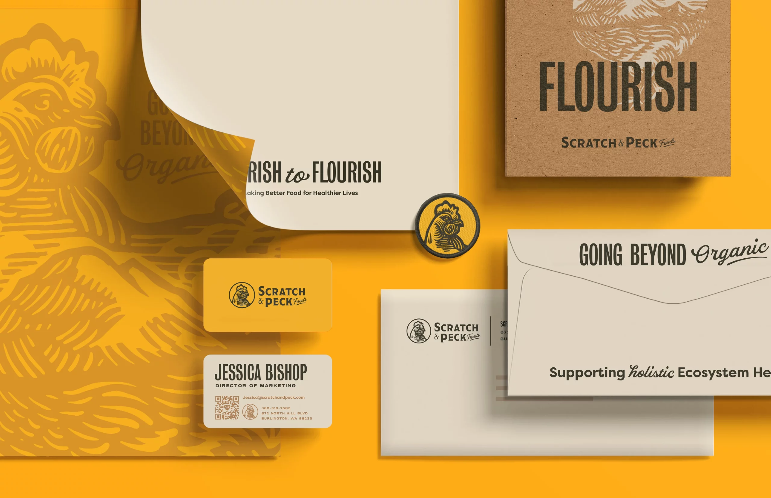
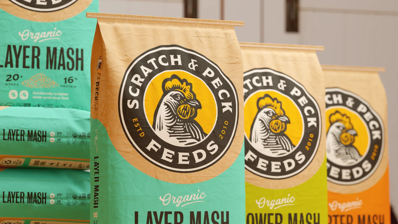
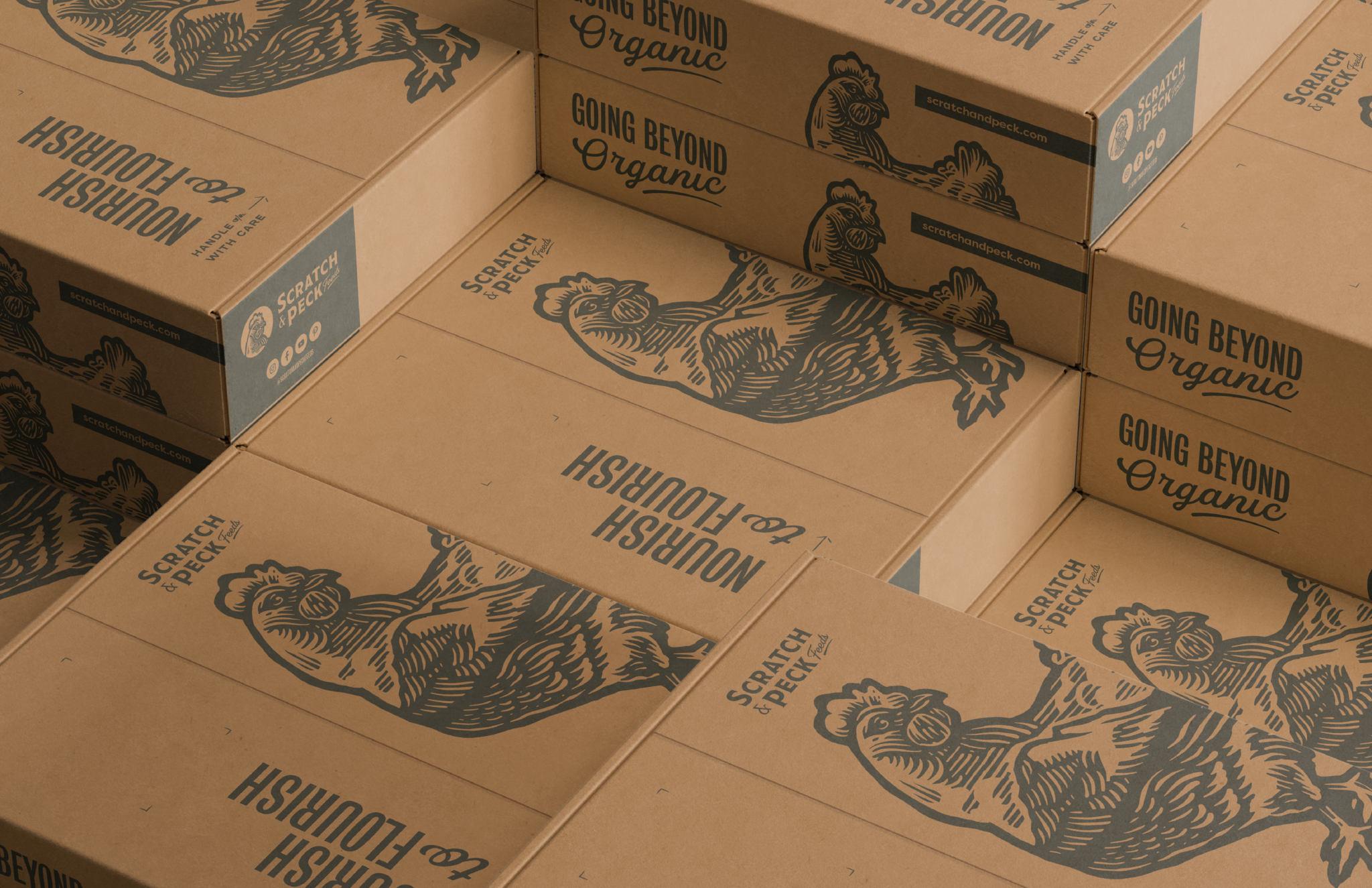
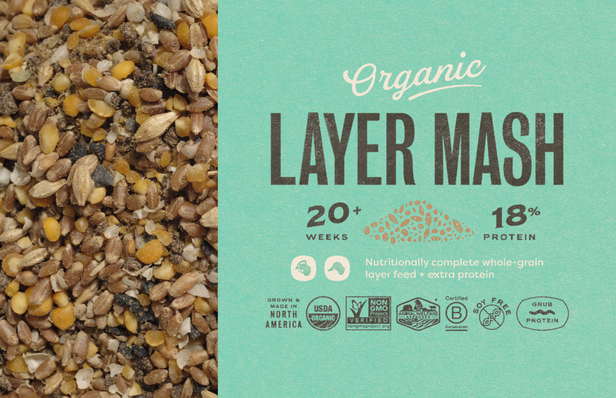
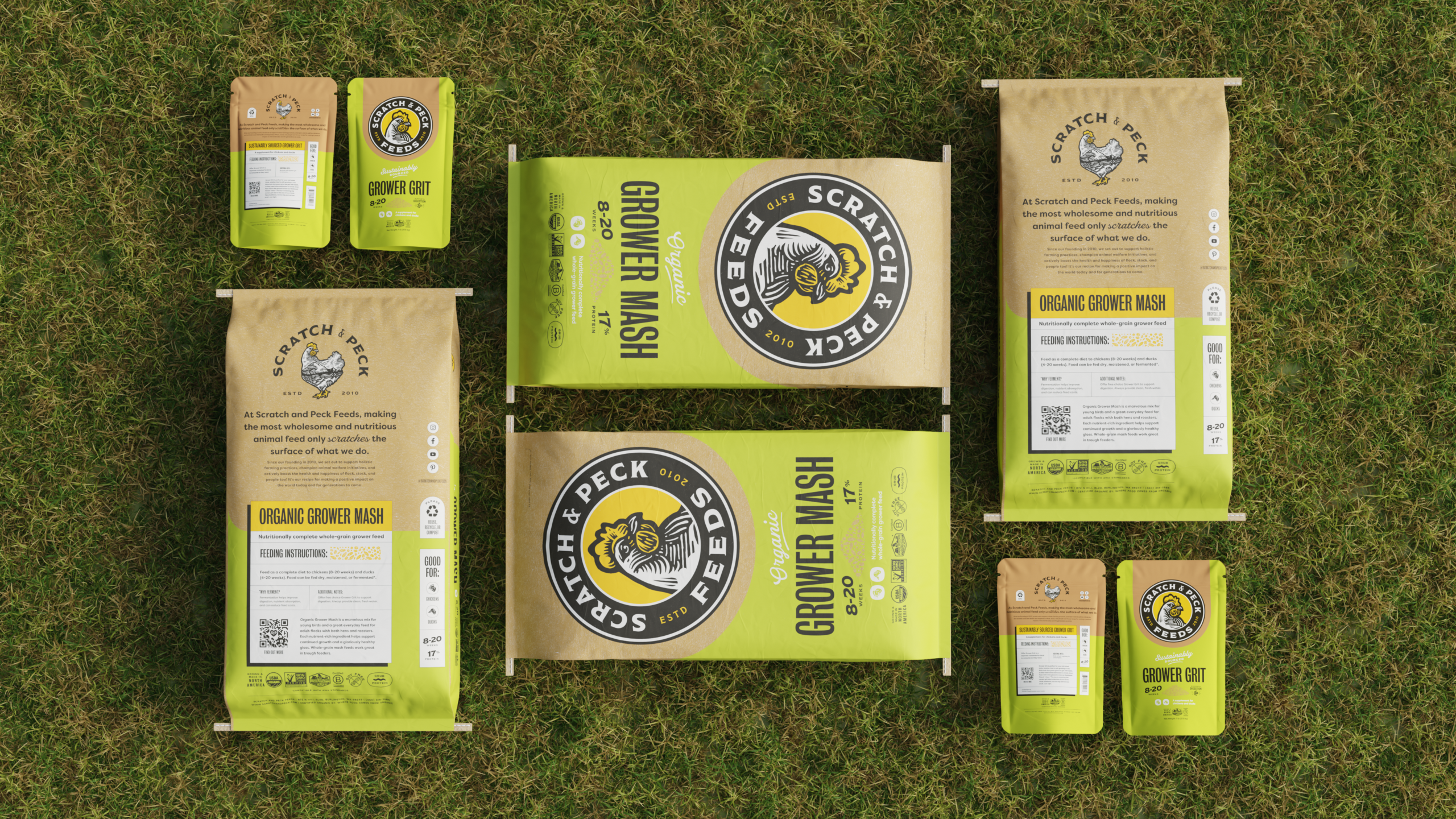
Packaging Design
Kraft texture bags are a stand out on the shelf compared to other feed bags, so we leveraged this and included it as a prominent piece of the design. Overall we sought to make the packaging feel wholesome and reminiscent of a homestead.
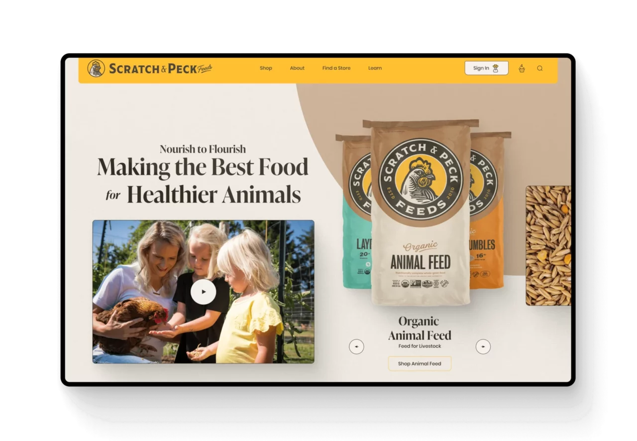
Website Strategy
Scratch and Peck already had a robust eCommerce system with tens of thousands of customer accounts. They offered wholesale services, subscriptions options, products bundles, an influencer program, and more. We worked with them closely to rethink core systems and integrations. We built a custom eCommerce system using WooCommerce that continued to service their existing customers, while adding new features and functionality.